- Suited for Beginners: HTML5 eBooks [PDF Download]
- For Intermediate and Advanced Users: HTML5 eBooks PDF Download
- Knowledge base
HTML5 as being developed as the next major revision of HTML is opening new doors to web professionals. With its unparalleled functionality, it actually boasts exciting new features and capabilities. Now to facilitate more advanced web development, we introduce HTML5 books PDF download. They deliver all the HTML5 related valuable information you need to get up and running with building next-generation HTML5 websites.
Plus, we’ve arranged these resources in a special way so you could find the eBook according to your experience level. You’ll see a compilation for HTML5 beginners and then a round-up of eBooks for HTML5 intermediate and advanced users. Each guide, in fact, has proven itself to be very helpful and highly resourceful. So, let’s get them fast-track you toward accessible standards to harness the power of HTML5 and embrace its cutting-edge features.
But before we start, here’s a stunning Dive Into HTML5 eBook available online for you to read absolutely for free. In our opinion this is the most essential eBook that every web professional should be familiar with. A very good option to start with.
Alternatively, you can check our other articles in which we compiled 70 spectacular HTML5 websites and Website Design eBooks.
By the bye, we have a new subscription service that allows you to get any item from TemplateMonster platform for only $19 a month! With ONE Subscription you can download any item from ONE package without any limits! Just imagine how much money you will save with the subscription. Instead of buying a single template, you have an opportunity to get a lot of them within one month for a so low price! Download what you want to! For creating eye-catching eBooks for HTML5, visit the page HTML Templates that are available in ONE pack. If you are a reader of MonsterPost, you have such a benefit as a 5% discount with the promo code BecomeThe1.
Suited for Beginners: HTML5 eBooks [PDF Download]
Introducing HTML5
by Bruce Lawson, Remy Sharp
Written by developers who have been using the new language for the past year in their work, this book shows you how to start adapting the language now to realize its benefits on today’s browsers. The book concentrates on the practical problems on how to work with HTML5. As well as talking about the well known new features of HTML5 such as audio and video, canvas and forms, the authors also delve into such diverse topics as ARIA (for accessibility), data storage, offline applications, the (nasty) drag and drop API and even the geolocation API (even though it's not strictly part of HTML5).
A Guide to HTML5 and CSS3
by Ashley Menhennett
The book covers the basics of web development and it’s a great starting point whether your plan is to make websites, HTML5 mobile apps or games.
Beginning HTML5 and CSS3: Next Generation Web Standards
by Christopher Murphy, Richard Clark, Oli Studholme
If you are a web developer, then this book is your introduction to new features and elements of HTML5 – all the leaner, cleaner, and more efficient code you’ve hoped for is available now with HTML5, along with some new tools that will allow you to create more meaningful and richer content. For everyone involved in web design, this book introduces the new structural integrity and styling flexibility of CSS3. For all forward-looking web professionals, this book provides you with an in-depth look the new capabilities—including audio and video. You’ll learn about the new HTML5 structural sections, plus HTML5 and CSS3 layouts. You’ll also discover why some people think HTML5 is going to be a Flash killer, when you see how to create transitions and animations with these new technologies.
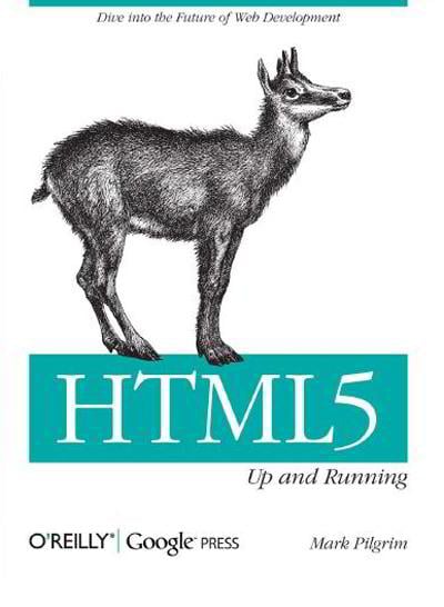
HTML5: Up and Running
by Mark Pilgrim
This book provides practical information about how and why the latest version of HTML5 markup language will significantly change the way you develop for the Web. The book provides your first real look at HTML5's new elements and attributes and carefully guides you though the important changes in this version with lots of hands-on examples, including markup, graphics, and screenshots. You'll learn how to use HTML5 markup to add video, offline capabilities, offer a drawing canvas for dynamically generated 2D graphics and more – and you’ll be able to put that functionality to work right away.
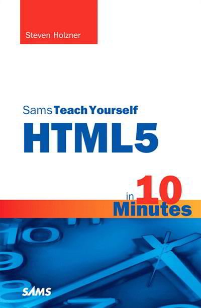
Sams Teach Yourself HTML5 in 10 Minutes
by Steven Holzner
Teach Yourself HTML5 in 10 Minutes offers straightforward, practical answers for fast results. By working through the book's clear, step-by-step examples, web designers or developers new to HTML5 can learn everything they need to know to quickly and easily get up to speed with HTML5. It’s for sure a quick, clear guide to using the exciting new features of HTML5 today. With step-by-step directions showing how to implement HTML5 video, drawing, drag and drop, forms, and more, the book also makes sense of all the competing claims and misinformation about what HTML5 is or isn't.
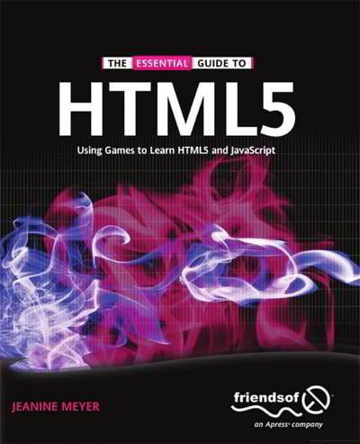
The Essential Guide to HTML5
by Jeanine Meyer
HTML5 opens up a plethora of new avenues for application and game development on the web. Games can now be created and interacted with directly within HTML with no need for users to download extra plugins, or for developers to learn new languages. Important new features such as the Canvas tag enable drawing directly onto the web page, the Audio tag allows sounds to be triggered and played from within your HTML code, the web sockets API brings the facility for real-time communication.
For Intermediate and Advanced Users: HTML5 eBooks PDF Download
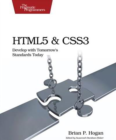
HTML5 and CSS3: Develop with Tomorrow's Standards Today
by Brian P. Hogan
This book gets you up to speed on the new HTML5 elements and CSS3 features you can use right now, and backwards compatible solutions ensure that you don't leave users of older browsers behind. It gets you started working with many useful new features of HTML and CSS right away. Gone are the days of adding additional markup just to style a button differently or stripe tables.
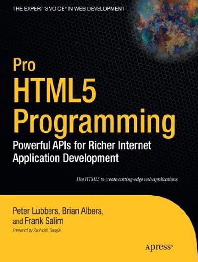
Pro HTML5 Programming: Powerful APIs for Richer Internet Application Development
by Peter Lubbers, Brian Albers, Frank Salim
In this book, developers will learn how to use the latest cutting-edge HTML5 web technology-available in the most recent versions of modern browsers-to build web applications with unparalleled functionality, speed, and responsiveness. The book explains how you can create real-time HTML5 applications that tap the full potential of modern browsers, provides practical, real-world examples of HTML5 features in action, etc.
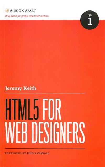
HTML5 for Web Designers
by Jeremy Keith
In this comprehensive user’s guide, the author cuts to the chase, with crisp, clear, practical examples on what accessible, content-focused standards-based web designers and front-end developers need to know to harness the power of HTML5 in today’s browsers. This workshop will help you get to grips with the new features in HTML5, from audio and video to more powerful forms and new structural elements. You’ll gain an understanding of the new semantics and get an insight into how new features should be used.
Smashing HTML5
by Bill Sanders
With 'Smashing HTML5', you have everything you need to get up and running quickly with great new HTML5 features, including new content-specific elements, audio and video playback, canvas for drawing, and many others. Smashing HTML5 provides comprehensive coverage – from how to get started with HTML5 to optimizing media on the Web. You will learn how to use text, graphics, audio, video, and navigation in HTML5 web pages running in compatible browsers.
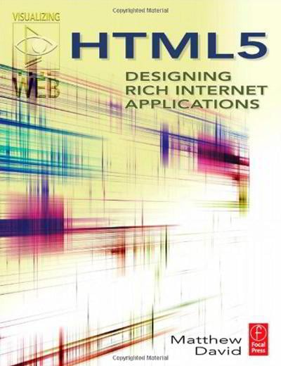
HTML5: Designing Rich Internet Applications (Visualizing the Web)
by Matthew Devid
With 'HTML5: Designing Rich Internet Applications' eBook that will be easy to implement the powerful new multimedia and interactive capabilities offered by HTML5, including style control tools, illustration tools, video, audio, and rich media solutions. You will reinforce your practical understanding of the new standard with demo applications and tutorials, so that execution is one short step away.
Knowledge base
Padding
Padding is an amount of space around a content and its edge. With other words, padding is a white space or a clear area around a text or an image. It generates the white space inside of the element's edges. The padding comprises padding-top, padding-right, padding-bottom and padding-left properties. In such a way you get complete power over the padding.
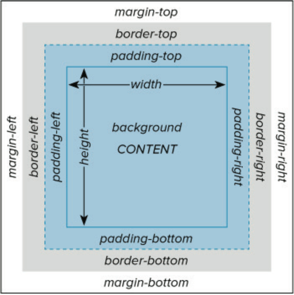
The thing is that the padding values can be set up in px, pt, cm, em, etc. or set as a percentage. Bear in mind, it’s better to use relative sizes such as em and %. The thing is that such relative units perform great on different screen sizes and browsers. Some elements have their own default built-in padding values, but it’s better to control it yourself. However, negative values are false.
The padding property can point out one, two, three, or four values. In case you need a boxed element with all four sides equal, set one value which will apply to all sides.
If two values are used, the first will apply to [top-and-bottom], and the second will set to [left-and-right] values.
Three values define first to [top], then to [left-and-right] and third to [bottom]. If you set each side using unique four values, it will start applying clockwise to [top], [right, bottom ] and [left ]. Use shortcuts to make your coding simpler.
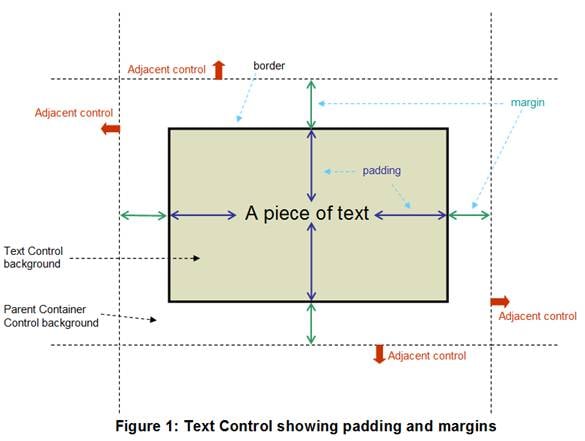
When the value is set as a percentage, it is relevant to the [width] of an element. Keep in mind, the total breadth of the element corresponds to the width property plus the width of any padding area. In light of this, the width is recalculated each time the padding is adjusted.
The padding property supports all modern browsers such as Chrome, Firefox, Safari, Opera, Internet Explorer, Android, and iOS.
Unlike margin, any padding can have a background color or image. The color of the padding area is defined via a [background] property. In case the element has a background color, the padding will inherit that color. Thus, if you need your background color to continue on into the space you design, the background will continue on behind the padding.
Resolution
Image resolution is the number of detail an image holds. The term applies to raster digital images. Higher resolution means more image detail.

A raster image is an image consisting of the array of pixels. A pixel is the basic element of the two-dimensional digital image. At the same time, a pixel is also the physical element of the display matrix. With the help of pixels it’s possible to create a picture of any complexity. In the raster format images are displayed on the most of the image output devices: monitors, printers, cell phones, etc. The width and height of the image in pixels are the image size. And the number of pixels per inch (PPI) is the resolution of the image. The higher is the resolution, the more pixels are located in one inch. And the smaller a single one will be. Thus, the more precise will be the details of the image.
High definition images are a consequence of a greater resolution. Resolution determines the clarity of the objects and text on the monitor. At high resolution objects on the screen become smaller and look sharper. Monitors usually have standard (4: 3) or widescreen (16: 9 and 16:10) dimensions. This is the screen ratio. The number of pixels horizontally and vertically is the screen size. To know the monitor’s PPI we need to divide the monitor’s height in pixels by it’s height in inches, which can be calculated knowing the ratio and diagonal size. For example, the 16:9 monitor with 1920x1080 screen size and 24’’ diagonal will have the screen resolution of 92ppi.
In printing the resolution is measured in DPI, dots per inch. For the photo to be of a normal quality, a resolution must be at least 300dpi. Knowing this, it’s easy to calculate the size of the digital image in pixels for a specific paper size. For example, to print a photo on the A4 piece of paper (210x297mm) or 8x11 inches, we need to multiply 8 by 300 and 11 by 300. And get 2400x3300px. This should be the minimum size of the picture for printing on A4 sheet. If the size will be smaller, the printed image will be fuzzy and blurry.
Resolution of various media:
- 352×240 : Video CD
- 333×480 : VHS, Video8, Umatic
- 350×480 : Betamax
- 420×480 : Super Betamax, Betacam
- 460×480 : Betacam SP, Umatic SP, NTSC (Over-The-Air TV)
- 580×480 : Super VHS, Hi8, LaserDisc
- 700×480 : Enhanced Definition Betamax, Analog broadcast limit (NTSC)
- 768×576 : Analog broadcast limit (PAL, SECAM)
- 500×480 : Digital8
- 720×480 : D-VHS, DVD, miniDV, Digital Betacam (NTSC)
- 720×480 : Widescreen DVD (anamorphic) (NTSC)
- 720x576 : D-VHS, DVD, miniDV, Digital8, Digital Betacam (PAL/SECAM)
- 720x576 : Widescreen DVD (anamorphic) (PAL/SECAM)
- 1280×720 : D-VHS, HD DVD, Blu-ray, HDV (miniDV)
- 1440×1080 : HDV (miniDV)
- 1920×1080 : HDV (miniDV), AVCHD, HD DVD, Blu-ray, HDCAM SR
- 1998x1080 : 2K Flat (1.85:1)
- 2048×1080 : 2K Digital Cinema
- 3840x2160 : 4K UHDTV
- 4096×2160 : 4K Digital Cinema
- 7680×4320 : 8K UHDTV
- 15360x8640 : 16K Digital Cinema
- 61440x34560 : 64K Digital Cinema
RGB Color Model
RGB color model (stands for Red, Green and Blue) is an additive color model in which those three main colors are mixed together to create other colors.

RGB color system is suited for surfaces that produce their own light. It’s used mainly on electronic display devices (TVs, digital scanners and cameras, computer monitors, etc). The screen surface of a computer monitor or a TV set is originally dark, so its original color is black. All other colors are obtained by using a combination of the three main colors, which in their mixture must create a white color. Experimentally it was proven that red, green and blue are the most suited for human eyes. Black color in this scheme is missing, since it’s the natural color of the screen.
As we know, the surface of the screen is not solid, it consists of small dots called pixels. Each pixel consists of three blocks, red, green and blue. By varying the brightness level of each block we can get different colors. The information about the brightness level is encoded using binary code. For example, the most common for modern displays 24-bit True Color system uses three bytes with values from 0 to 255 for each pixel on the screen. Absolutely red color will have a value 255.0.0. This means that the amount of red color is full, of the green is 0 and of the blue is also 0. Absolutely blue color will have a value of 0.255.0 and the green will be 0.0.255. With different combinations different colors are formed: bright-violet is 255.0.255, the black is 0.0.0 (no color at all), the white is 1.1.1 (red, green and blue are all at full brightness).
RGB color can also be encoded with the help of the hexadecimal system. If we convert each of the numbers that corresponds to a particular color into the hexadecimal system, we’ll get another form of color recording: FFFFFF is 255.255.255 or the white color, where FF is number 255. If the color is recorded in the hexadecimal system, it’s customary to put the “#” character before the numeric value: #FFFFFF. Here are some standard colors:
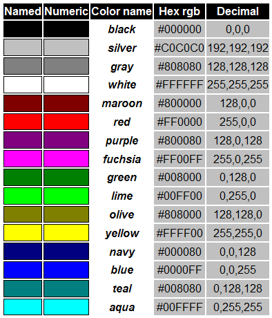
This color system is called additive. In other words, we take black color (no color) and add primary colors to it, mixing them all the way up to white. This way we can encode 16 777 216 colors, which is more than enough for human eyes.
What is an image Alt?
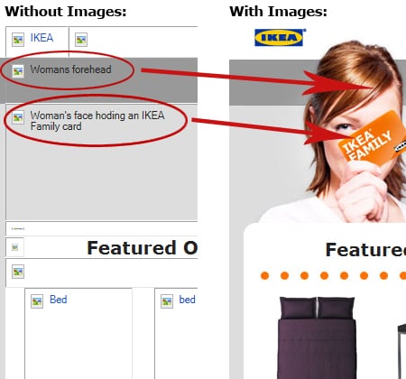
Basically, ‘alt tag’ is a term, which is commonly used to describe a word of a phrase used both in HTML and XHTML documents in order to identify some alternative text (= alt text) that is to be rendered when the element to which it is applied cannot be rendered. In a word, alt tag is an abbreviation of what is essentially an alt attribute on an image tag showing a nature or a content of its image. That is why each image on any successful website has its alt tag that describes what is actually on it. As a result, various screen readers will make the image from your website accessible while reading out this alternative text. To illustrate the situation, that is an example of a complete HTML image tag:
And this is how alt text works:
Why do we need alternative text for the images?
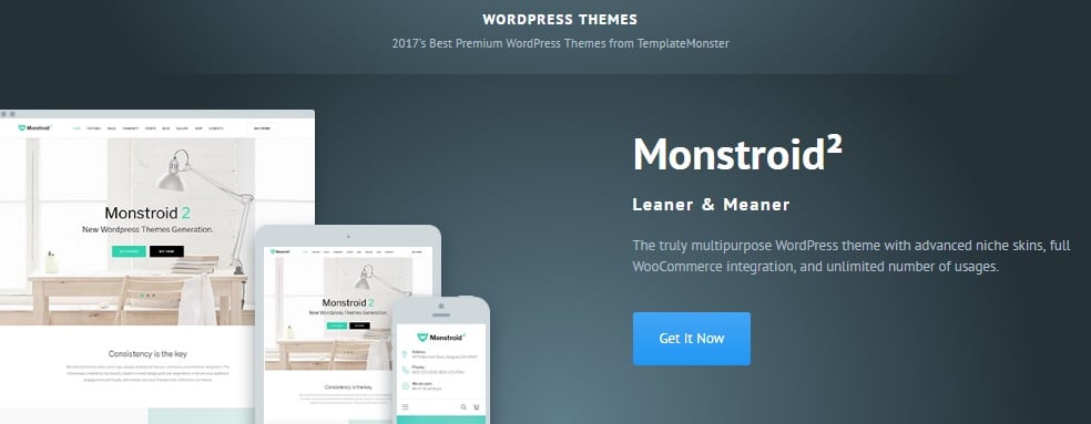
So, why does one need alt text for their images? Let’s figure it out together! As it has already been mentioned, the alt text literally tells what an image depicts as well as describes the main function of this image on the web page. To make a long story short, let’s imagine that you would like to use the picture of an attractive call-to-action-button, which propose a visitor of your online project to do the next action – ‘Reserve Your Seat’. In this case, the alt text for such button would say the next: ‘button to reserve a seat’. Generally speaking, you just propose a person to use some services or buy some products that you provide with the help of this button. Thus, its alternative text simply explains what the button is used for. As you can see, there is nothing complicated. Here is another simple example of using alt text. As you can see from the screenshot below, this blue call-to-action button lets a person get a shown website template right now.
What is more, talking about the image buttons, you could also put some extra call to action text to it. Actually, it is quite popular policy, so I am sure that you have seen such things a plenty of times while surfing through the web space. For example, you can easily propose the guests of your website to take an item for some price, (it would be something like: ‘Get this dress now only for $29!”) as the title attribute is always shown as a tooltip when you hover over the element. Below you can see the next example of this function.

Keep in mind that every image you want to use for your online project should have its own alternative text. Yes, it is a vital thing for Search Engine Optimization (SEO) purposes, but not only for these reasons. In point of fact, visually impaired and blind visitors of your site will also use alt in order to figure out what an image or a button is for. What else should you know about it? Well, although a title attribute is a helpful item, it is not actually required, so don’t be upset if you leave it out.
Ok, now you know a lot of information about the pluses of alternative text. Still, I know what you are thinking about right now: what should you do in case your image does not have a clear purpose? Without a doubt, it is a logical question, so let me tell you a couple of words. First of all, remember that the images that you would like to use simply for the design of your website should be in your CSS and never in your HTML code. Secondly, if you still have such images in your HTML and don’t want or can’t change it, I suggest you to give them an empty alt attribute. Shortly, the empty alt attribute looks like this:
<img src="/image.jpg" alt="">
To make things clear it is here to make sure that screen readers will pass over the image that has no purpose.
Let’s summarize!
For today it was all the information about alternative text. To sum everything up, below you can see the list of the main functions of alt text.
1 To start with, alt text is read by screen readers in the place of the images that allow the content and function of an image to be accessible to people that have visual or other disabilities.
2 Moreover, alt text gives a description and a semantic meaning to your image that will be read by various search engines.
3 What is more, this description can also be used to later determine the content of your image from page content alone.
4 To finish with, in case the image file in not loaded when a person decided not to view images, alt text is shown in place of an image in browsers.
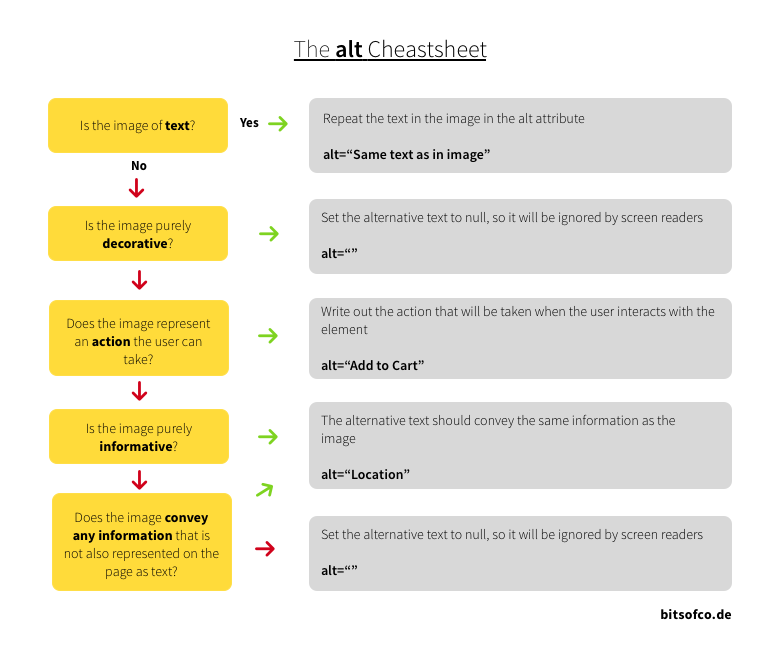
Thus, giving your images an alt text is an easy but important thing. Don’t forget that a winning alt text should be succinct and represent the function of your image as well as its content. On the other hand, keep in mind that alternative text should not be redundant (I mean be the same as your body text) or consist of such phrases as ‘the picture of something’, ’the image of something’, ‘the graphic of something’, etc. In addition, remember that this text may be provided in the alt attribute or in the surrounding context of your image. I hope you will remind all the given points because they are the main rules of a successful alt text creation. Also, you may watch this video from Matt Cutts that was made in order to help you with a nice alternative text creation.
Wait! Still want to know more about alt? In this case, I have a lot of useful articles to share with you! Thus, in order to learn more information about the subject of this post, don’t forget to check the next pages: alt tag and title tag optimization, this awesome post about alt text and this one that was made by Google team to help one to create a great alt text for their website’s images.
All in all, don’t hesitate to leave all your thoughts and questions in the comments below this post. Furthermore, I would like you to tell me your own definition of alt! Maybe you have something to add? For this simple reasons, just leave your comment below!
Finally, it’s time to learn other terms that are related to alternative text!
Related terms: HTML, XHTML, SEO, Screen reader.
References and further reading:
- HTML (Hypertext Markup Language) is a standard markup language that is commonly used for the creation of different web pages as well as for various web applications. Naturally, it is one of three main components of the cornerstone technologies for World Wide Web (the others are Cascading Style Sheets and JavaScript). To make a long story short, HTML makes the structure of any web page semantically and originally included cues for the document to be appeared.
- XHTML (Extensible Hypertext Markup Language) makes a part of the XML markup languages’ family. In a word, XHTML just mirrors the versions of the commonly used Hypertext Markup Language in which the web pages are formulated.
- Screen reader is a popular software application that is used to convert text into ‘synthesised speech’ that allows a user to alternatively listen to content in case they are not able to visually check the content of a web page.
- SEO (Search Engines Optimization) is the name of the process that makes some websites or some web pages visible in the web search engine’s unpaid results.
CMYK
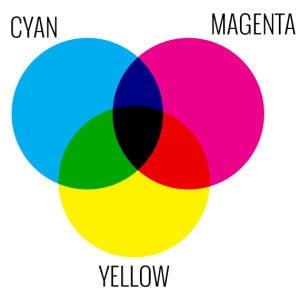
To begin with, CMYK (cyan, magenta, yellow, key) is the abbreviation for the name of the scheme, which combines the primary pigments. Thus, C means cyan (aqua), M means magenta (pink), Y is for yellow and K stands for the key. As you may know, these days K color means black in the modern printing world. Still, things have not always gone this way. Historically, there were other colors used for Key: brown and even blue. Honestly speaking, people used the color that was the cheapest ink to get for their needs.
How does it work?
Generally speaking, CMYK pigment model looks like a version of RGB (means red, green, and blue) color model that is upside-down. That is why today there are a lot of various draw and paint programs that are able to make use of both mentioned color models. Still, keep in mind that the CMYK model is usually used for the creation of the printed color illustration. On the other hand, the RGB color scheme is mostly used for the computer displays.
The difference between color and pigment
Without a doubt, there is a difference between color and pigment. What is more, it is a fundamental one! To make things clear, a color depicts the energy that is radiated by a luminous object. For example, LED (a light-emitting diode) and CRT (a cathode ray tube), so red (R), green (G), and blue (B) are meant to be the primary colors. Consequently, a red area that you may see on a cathode ray tube will look red, as it radiates a big amount of light in the red portion of the electromagnetic radiation spectrum (that, by the way, means nearly 750 nanometers), and there is much less light radiated at another wavelength. Talking about the pigments, they are opposed to the colors and represent the energy that is not absorbed by a substance (such as paint and ink). As it has already been said, the primary pigments are cyan, magenta and yellow. In addition, from time to time black (Key color) is also may be a primary pigment. All in all, black can be easily made if one combines the mentioned below colors in the large and equal amounts. So, keep in mind that if you see magenta (pink) ink on some pages, it looks so because it literally absorbs a big amount of energy at all the visible wavelengths except in the pink part of the spectrum, where is reflected the biggest part of the energy.
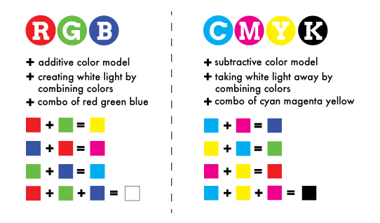
By the way, did you know that the primary colors and the primary pigments are mathematically related to each other? As a result, if one combines any 2 pure radiant primary colors (that still are red, green and blue), the will produce radiation, which will have the appearance of 1 of these pure non-black primary colors (that are cyan, magenta and yellow). On the other hand, if you combine any 2 non-black primary pigments, this action will give you a substance that will have the appearance of one of the pure primary colors written above. As you can see, there is nothing complicated.
All in all, don’t hesitate to leave all your thoughts and questions in the comments below this post. Furthermore, I would like you to tell me your own definition of CMYK! Maybe you have something to add? For these simple reasons, just leave your comment below!
Finally, it’s time to learn other terms that are related to CMYK!
Related terms: API, GRU, legacy application, hue, saturation, and brightness, RGB, CRT, color wheel.
References and further reading:
- API means application program interface. Generally speaking, API is a code, which allows 2 software programs to communicate with each other. This code defines the proper way for a person to write a program, which requires the services from OS (operating system) or other important apps. What is more, now APIs are implemented by function calls that are made of nouns and verbs.
- GRU means graphics processing unit. In a word, GRU is a computer chip, which performs rapid mathematical calculations, mainly or the purpose of rendering images.
- The legacy application is a software program, which is outdated or obsolete. By the way, although a legacy application still works, it can be unstable because of the compatibility issues with the current OSes (operating systems) and IT (information technology) infrastructures.
- Hue, saturation, and brightness are the aspects of color in the red, green and blue (RGB) color scheme. In general, these terms are mostly used in reference to the color of every pixel in a CRT (cathode ray tube) display. To continue, we can specify all the possible colors according to hue, saturation and, of course, brightness, (that may also be called brilliance) just as the colors can be shown in terms of the R, G and B components.
- RGB means Red, green and blue. To make a long story short, the RGB term refers to a system for representing the colors to be used on a computer display. Thus, red, green, and blue can be combined in various proportions to obtain any color in the visible spectrum. Levels of R, G, and B can each range from 0 to 100 percent of full intensity. That is why each level is represented by the range of decimal numbers from 0 to 255 (256 levels for each color), equivalent to the range of binary numbers from 00000000 to 11111111, or hexadecimal 00 to FF. Logically, the total number of available colors is 256 x 256 x 256, or 16,777,216 possible colors.
- CRT means a cathode ray tube. Shortly, CRT is a specialized vacuum tube in which images are produced when an electron beam strikes the aphosphorescent surface. Most desktop computer displays make use of CRTs. The CRT in a computer display is similar to the"picture tube" in a television receiver.
- Color wheel(or color circle) is the name of the basic tool, which was made for pleasant colors combining. Historically, the first circular color diagram was created in 1666 by well-known Sir Isaac Newton. As you can see on the image below, the color circle was made the way that one may take almost each pair of the colors, included to the color wheel, and they will look awesome together. Needless to say, during the last years, there were made a lot of variations of the basic design. Still, these days the shown color wheel, which consists of 12 colors (based on the RYB, or artistic, color model) is the most useful and popular one.
DPI
Actually, a term DPI comes as an abbreviation for “dots per inch” phrase. DPI = 1PPI (pixels per inch). When it comes to a digital image resolution or its size, we pay attention to the number of pixels along the height and length of the digital image. In addition, the more pixels the image contains - the larger it can be printed or displayed on the monitor saving a perfect quality. If you want to print an image of a certain size, you definitely need to pay attention to a DPI. In fact, if you need to print a 10x10 cm image with 300 DPI resolution, you’ll get a 3.9 x 3.9 inches photograph. Speaking of the size of an image in pixels, you will get a photo with 1050 x 1050 megapixels.
It’s important to note that there is also another meaning of DPI. To save you from messing up, we will explain to you another side of this abbreviation.
DPI as a Deep Packet Inspection
Another meaning of DPI comes as a methodology of statistics data accumulation, approvement, and network packets filtering due to their content. This deep packet inspection can analyze not only various packet headers but also the full amount of content that reaches second and higher OSI models levels. DPI can easily detect and block viruses, moreover, it filters the info that does not meet any specific criteria. Deep Packet Inspection is often used by providers to take control over traffic, to block some protocols, etc. Using DPI, you can also tailor connection statistics for any user.
Related terms: LPI, SPI, display resolution, Twip, complete packet inspection, information extraction.
References and further reading:
- PPI vs. DPI: what’s the difference?.
- You Say You Want a Resolution: How Much DPI/PPI is Too Much?.
- Change DPI of Image.
- Understanding DPI, Resolution and Print vs. Web Images.
- Content Intelligence – A New Frontier for DPI.
- The Perils of Deep Packet Inspection.
- How Deep Packet Inspection Works.
FAQ
It is the fifth version of the most popular and most used mark-up coding language. The basics of all internet websites are built on HTML.
It is a book that is shared in digital format. Some of them can have paper copies and be sold in such a way, but an eBook is just the electronic version.
When we talk about coding language – yes, it is. Of course, you will also need lots of practice but learning theory from books is the simplest and fastest way to get along with HTML5.
Read Also
Free Pricing Table Snippets in HTML & CSS
What’s The Easiest Way To Add A Static HTML Page To WordPress?
100 FREE HTML5 CSS3 Registration/Sign-in Forms
Top Free HTML5 Animation Tools To Set Your Pages In Motion
Don’t miss out these all-time favourites
- The best hosting for a WordPress website. Tap our link to get the best price on the market with 82% off. If HostPapa didn’t impress you check out other alternatives.
- Monthly SEO service and On-Page SEO - to increase your website organic traffic.
- Website Installation service - to get your template up and running within just 6 hours without hassle. No minute is wasted and the work is going.
- ONE Membership - to download unlimited number of WordPress themes, plugins, ppt and other products within one license. Since bigger is always better.
Get more to your email
Subscribe to our newsletter and access exclusive content and offers available only to MonsterPost subscribers.


Leave a Reply
You must be logged in to post a comment.