9 Things That Will Make Your Sports Website Look Awesome
Milton Glaser said, there are 3 responses to a piece of design, - yes, no, and WOW! Wow is the one we aim for. What makes you think “Wow” when seeing sport design? What should you strive for when creating a web design for your own sports project? We’ll figure this out right now.
You’ll recognize a sports web design the first millisecond you see it and you’ll never mistake it for any other site like a blog or an agency. Why does this happen? What is so inexplicably distinctive about them? We’ve found 9 main points which make their design so telling.
But first, consider this question: what is it that attracts you in sports websites? After giving it some thought, you may understand that this happens thanks to the emotions and associations which web design evokes in us. If you’ve been in web design for a while, you may know that “selling emotions” is the only key to a successful website. (Please note that we are now speaking about web design, not about the product. Clearly, customers’ emotions will, later, depend on the product and service quality).
Just looking at a proper sports web design makes you hear the sound of a basketball pounding against the floor, feel the cold touch of gym equipment, smell a scent of your newly washed workout clothes and, most importantly, you get this feeling of excitement in your mind and adrenaline in your blood. It makes you feel competitive, enthusiastic and self-challenging. This is a drug that is both legal and useful for your health.
You may not know that our unconscious mind can’t tell if the picture it sees is real or fictional. This is why we feel so sympathetic when watching dramas, scared when watching horror movies and yes, so excited and eager to try out our sports skills when visiting a properly designed sports website. What constitutes the basis of the whole sports web design then? A customer projecting the emotions of the website on himself.
[tweet_box]What pushes a customer towards a conversion? A customer’s projecting the emotions of the website on himself. #webdesign #conversion[/tweet_box]Again, it’s all about emotions. Your task is to evoke visitors’ emotions the very second they get to your website. How can you understand which emotions you’d like your project to have?
You can divide all sports website design into 4 types.
- Aggressive web design (those which present gyms, basketball, wrestling, baseball WordPress themes, MMA clubs, etc.)
- Calm web design (yoga, pilates, golf WordPress themes, etc.)
- Extreme web design (skydiving, paragliding, snowboard, skiing etc.)
- “Relaxed table sports” web design and related activities (billiards, chess etc.)
Based on these classifications, ask yourself: exactly what message do you want to convey? Is it aggressive, calm, extreme or relaxed and unhasty?
For each of them, there’s a specific set of criteria which defines a particular viewer's perception.Depending on the message, among the following website features, you should pick the ones which suit your project.
Depending on the message, among the following website features, you should pick the ones which suit your project.
We’ll list the 9 main features which have a huge impact on the way a sports website is perceived by you. For your convenience, they are illustrated both by website template designs and live websites. Check them out and be inspired.
COLORS
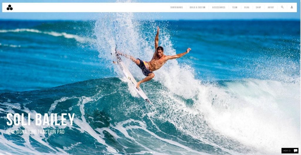
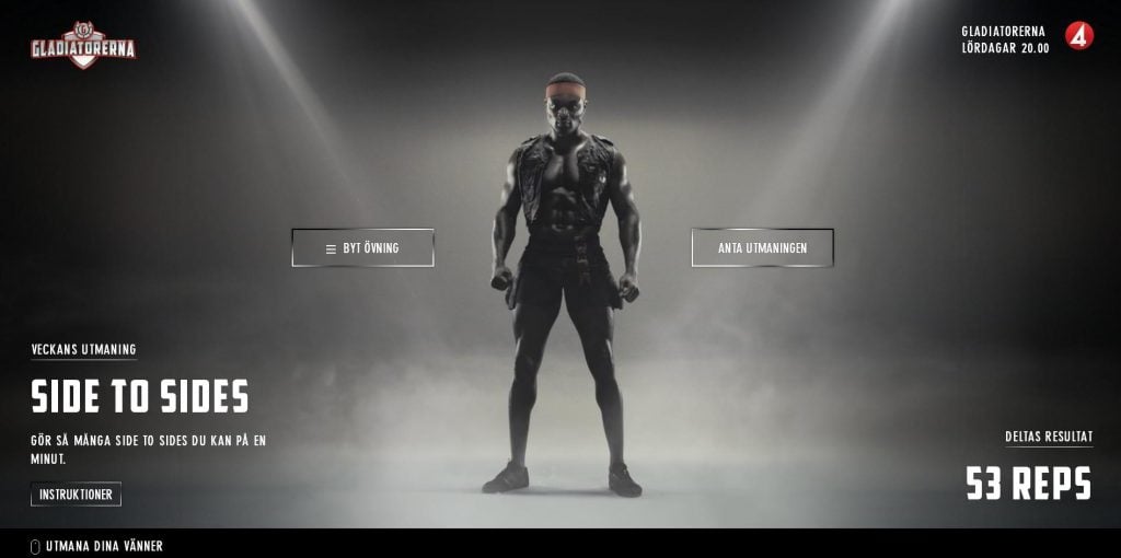
Aggressive Website Design
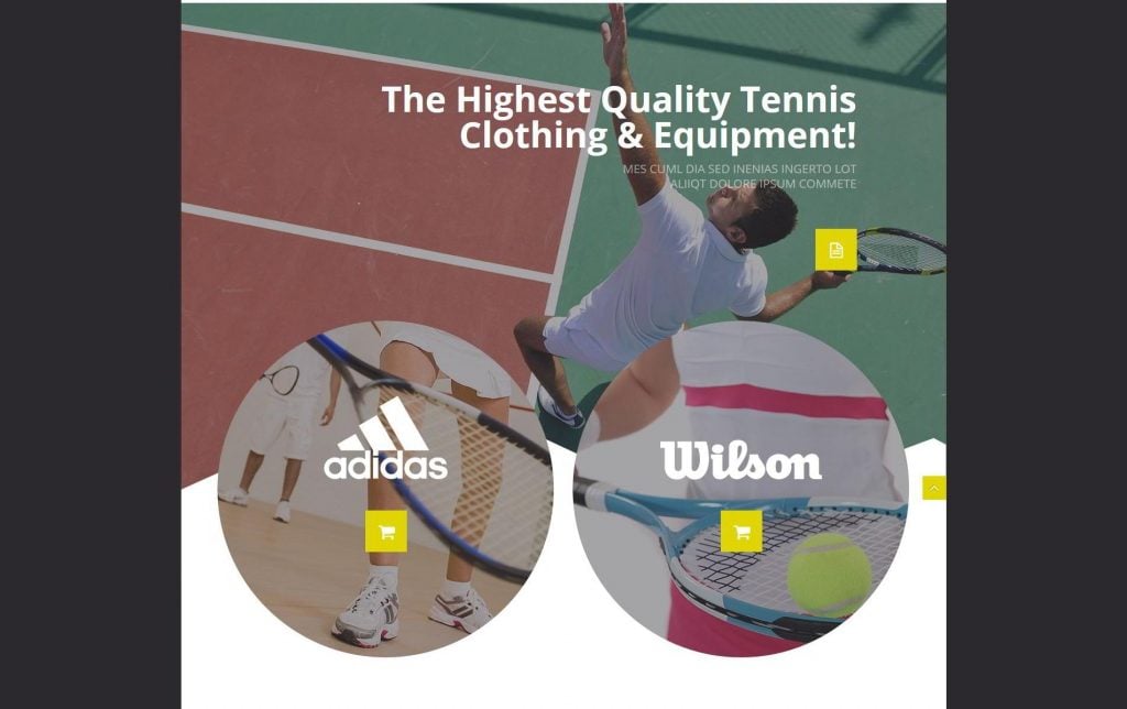
Colors: black/dark, red and shades, orange.
Projects: gym, MMA, wrestling, basketball (contact sports mostly).
For contact sports websites aggressive colors are usually used. Those are dark colors - black, red and its shades. Dark colors mean authority, power, stability and strength. Red is a color of energy and power. Logically, a combination of these two powerful colors evokes this feeling of strength and power. A visitor projects these emotions on himself and becomes emotionally involved.
Calm Website Design
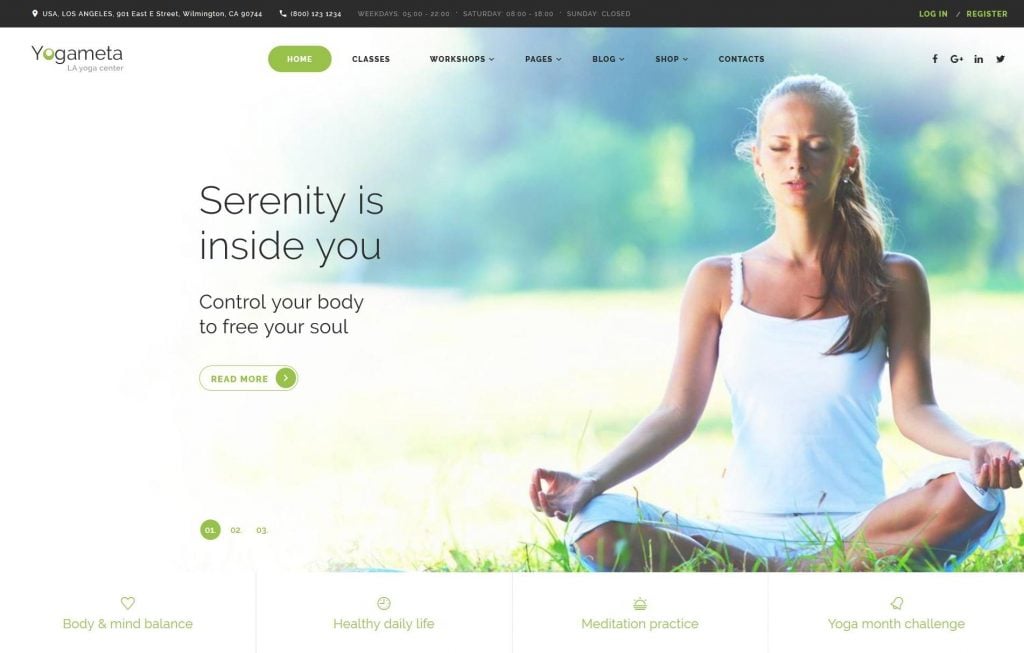
Colors: green, blue, white, light grey, pastel colors.
Projects: yoga, pilates, golf, *bicycle websites etc.
Usually, they have blue, green and white colors.The soothing effect of these color combinations summons the most peaceful associations, related to the calmness of mind and tranquility in your soul.
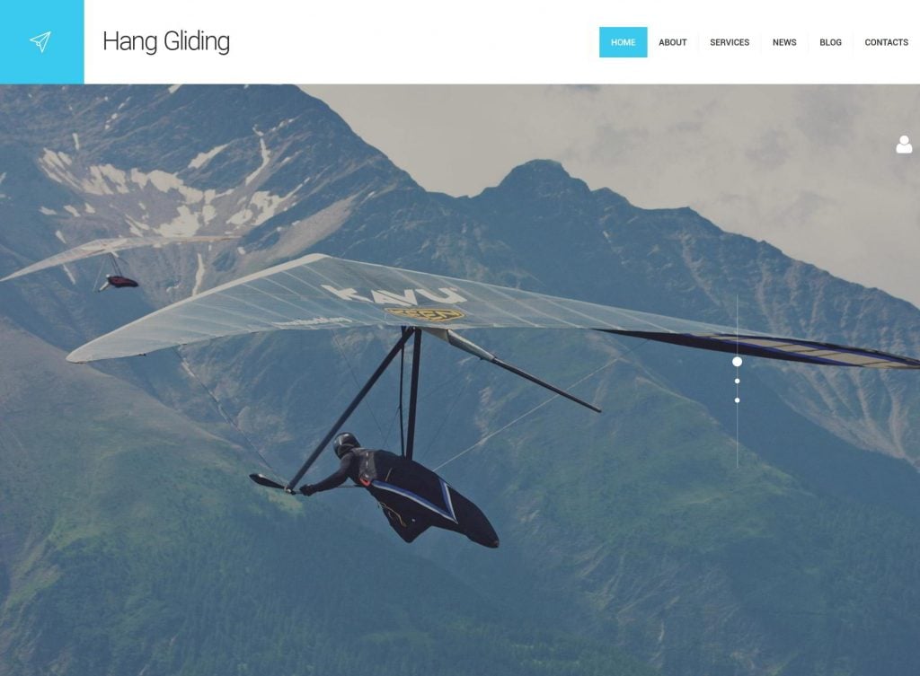
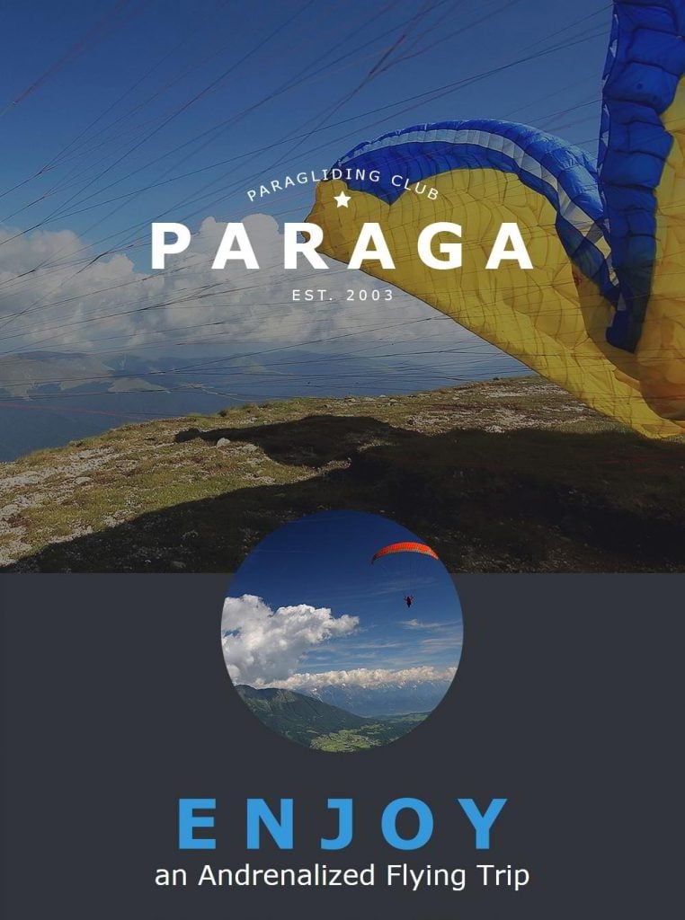
Extreme Website Design
Colors: blue, white, green, yellow, rarely dark.
Projects: skydive, paragliding, snowboarding, skiing, surfing etc. Our golf wordpress theme also use this style.
[tweet_box]Here a simple principle works: the colors are usually those which relate to the environment where this sport takes place. #colors in #webdesign[/tweet_box]Skydive websites often include the colors blue and yellow (sky and the Sun), winter sports design has a lot of white and blue (snow and the sky), surfing websites have a lot of blue and green (the colors of water). As a result of the in-built psychological impact, very often you may find your mouse hovering over the button “Book a parachute jump”, even if you’ve always been afraid of heights. That, means that their web design works, guys.
You may ask, what about motorcycle design? It may not contain those colors, but still the rule of the “surroundings color” still works - the color of the black leather is inevitably present in this web design.
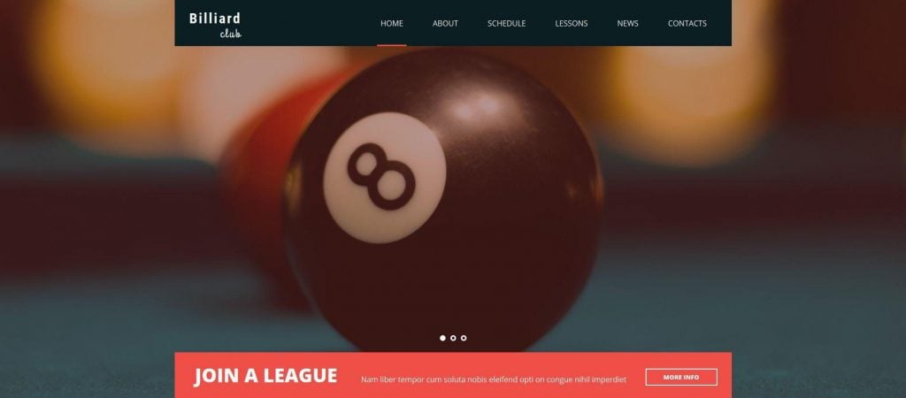
“Relaxed” Table Sports Design
Colors: black, white, beige, green, etc.
Projects: billiards, chess, bowling and so on.
As these are the sports (or the games?) which involve playing in rooms, you are more likely to see close up photos of chess, game items, like a billiard ball which is positioned as close to the camera lens as possible. One cannot say anything about there being any sort of logical color patterns for this type of project, as the variety of color combinations for this type of website are endless.
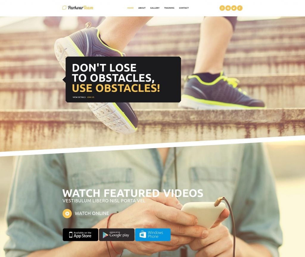
SLOPE LINES
Using slope lines in design is another trick which is often used for sport-related web design projects. Here are several reasons why slope lines work well for them.
- they channel a viewer’s attention to a call-to-action, a banner or whatever you need them to see.
- they are not used too often in web design, thus the design becomes more memorable
- they establish associations (they symbolize mountains in a winter sports website, remind us of slope surfaces in parkour projects.
Slope lines represent dynamics, movement, action - these things are just what you need for a sports website.
POLYGONAL DESIGN
A broken glass effect, in other words.The polygonal structures consisting of numerous corners, make a subcase for the slope lines. They also represent dynamics, movement, and action. Additionally, they comprise separate design details on the website which may help you create some volume (by placing them closer together or a little further apart, for instance).
Big Overlapping Design Elements
Whether they are banners or just textless design elements, they instantly grab the attention of the visitors. You get a feeling as if something were stuck on the main design. We are used to reading notes on our fridges - here the same principle takes place. We are paying a little bit more attention to something that doesn’t belong to the main design.
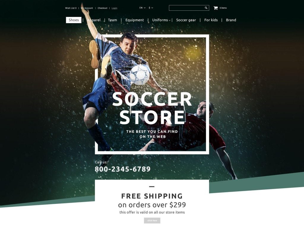
Powerful Sport-Related Imagery
Great images => emotions evoked => conversion.
If you aim at projecting web design emotions onto the viewers, including great imagery is how you can do it technically. Image galleries and image albums with breathtaking sports views get you irrevocably hooked. Adrenaline images cause an adrenaline rush, and when you are controlled by your emotions, your subsequent actions are pretty much pre-determined.
Most Sport Web Design Sites Use Simple Fonts
From their historical beginning, sans-serif fonts were created and used as a device for emphasis in newspaper headlines in order to attract attention, being as easy to read as possible. Paradoxically, in web design, they are used in order not to distract attention from all of the above-mentioned features. They carry a visually elegant message, while the imagery, overlapping design elements, and appropriate colors seduce you into a website conversion.
A Simple Call-to-Action
A simple, clear call-to-action. This point may be considered as being one of the general criteria of properly designed websites, but without it, no sports website would look adequate. Or else, it might look good, but wouldn’t necessarily perform well. Anyway, a neatly made CTA button with proper text on it (which is as important as a good button design) is a must.
Parallax
By nature, Parallax represents motion and depth in design. It would fit the widest range of sports websites, as it may be associated with surfing, snowboarding, baseball, weight-lifting etc, in other words, anything, A small dose of Parallax scrolling never hurts, and many sports websites include it.
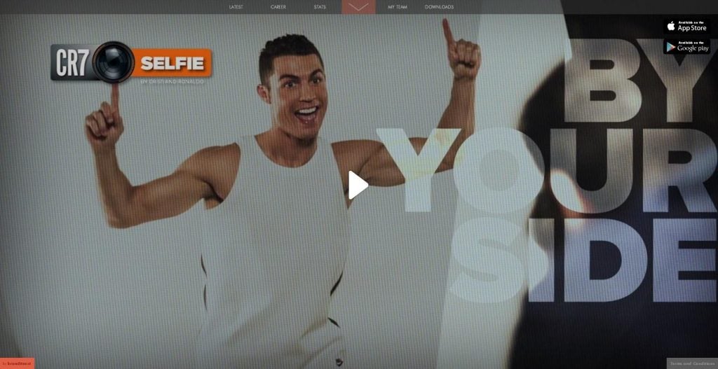
Video
Why create an impression of motion, if you can actually add some motion to the website? Including a video is a great way to hook your visitor for longer. Many sport-related websites use this trick. The videos aren’t long, but very informative.
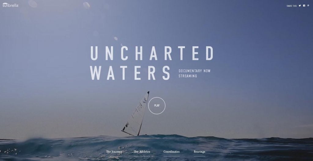
Take a look at the Cristiano Ronaldo website example:
Here are 7 examples of the websites. Pay attention to the first things you notice in the design, which tell you that it is a sport-related website.
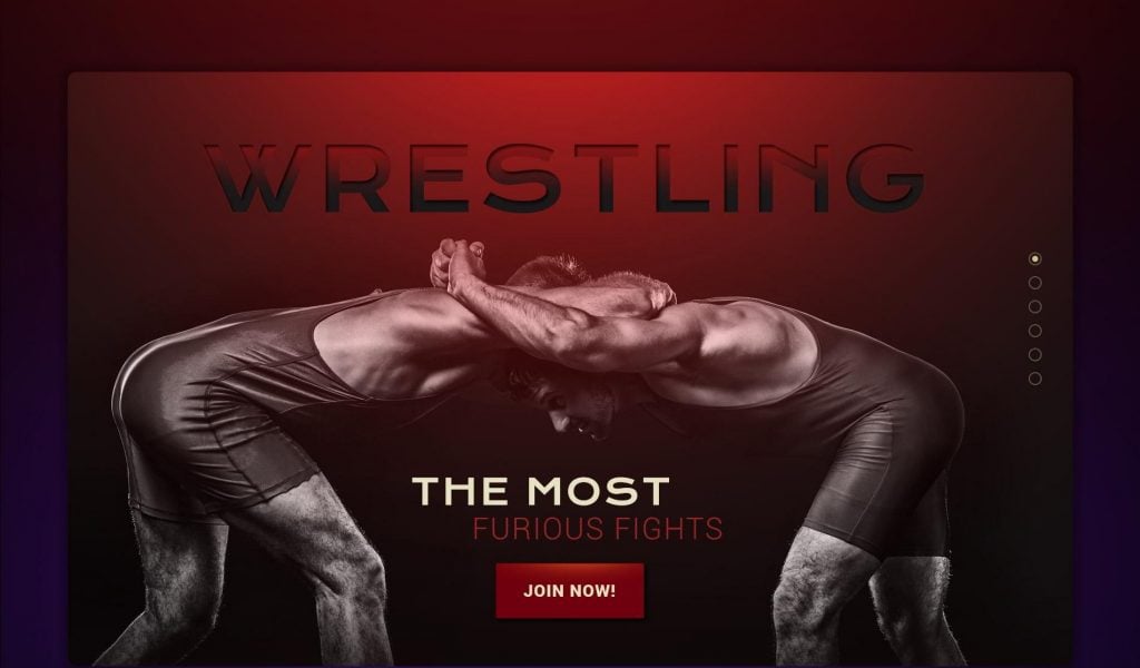
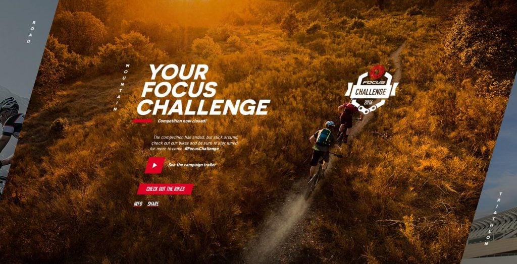
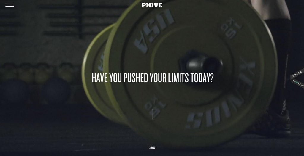
Pay attention to the dark colors used in the design and clarity of the call-to-actions. “Read more” buttons on the blog posts, “Read Harrison Story” on a light “stripe” as you scroll down and “Join the Team” alongside with big social media buttons as a final call-to-action at the bottom of the website. Dynamic images also create a great motion effect.
- Dark colors
- Clear call-to-actions
- Powerful dynamic imagery
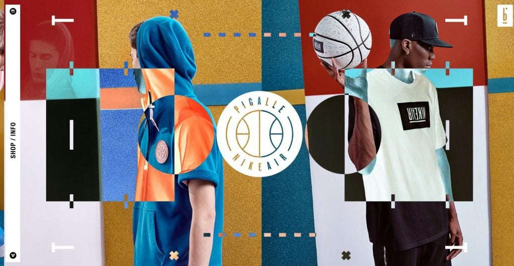
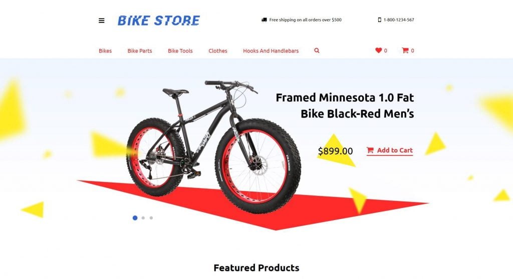
This eCommerce website is a great combination of big sticky overlapping design elements with a Parallax effect (which also reveals a “negative photography effect”). It has a unique design thanks to the above-mentioned features, bright color combination, and a logo which speaks for itself. However, it’s the diversity of the design features which can get you confused when figuring out what you should click.
- Big sticky overlapping design elements
- Parallax effect
- A logo shaped as a ball
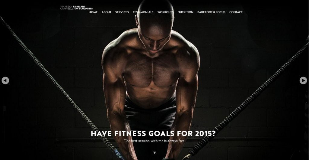
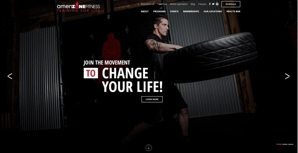
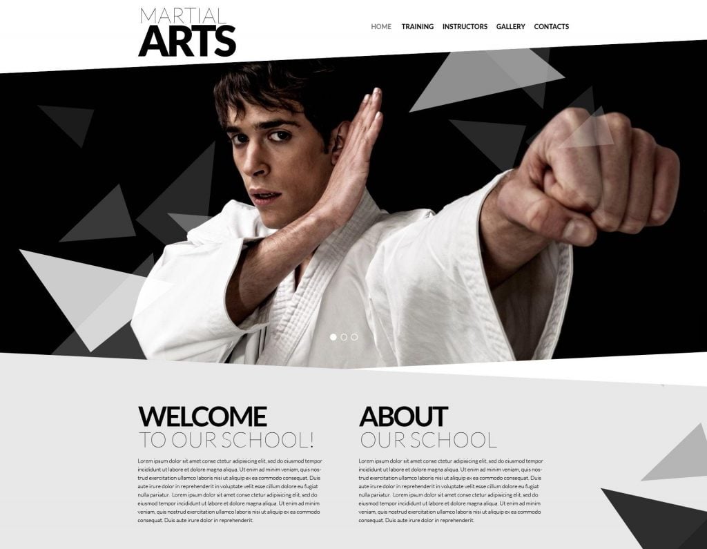
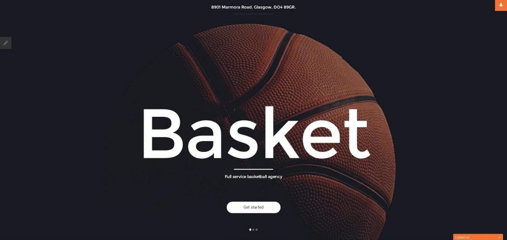
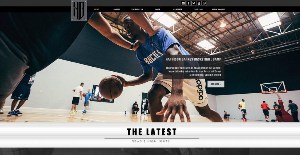
This is a classic example of a fitness website. Dark colors, minimalistic full-screen images, elegant image slider, and the look of the model directed at the scroll sign. The latter is a great way to channel your website visitor’s attention to suggest the desired action.
- Dark colors
- Parallax effect
- Powerful imagery
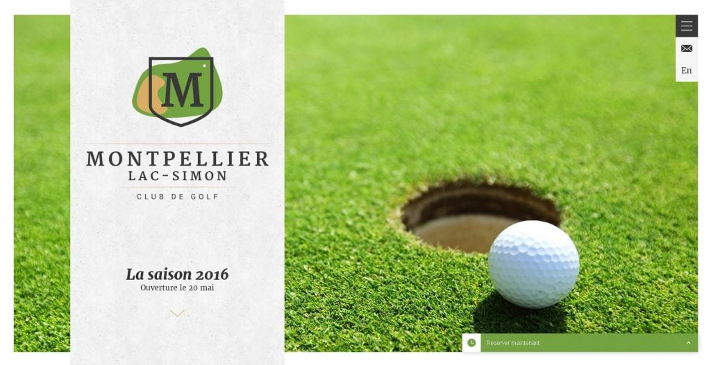
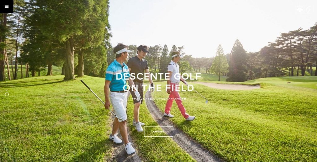
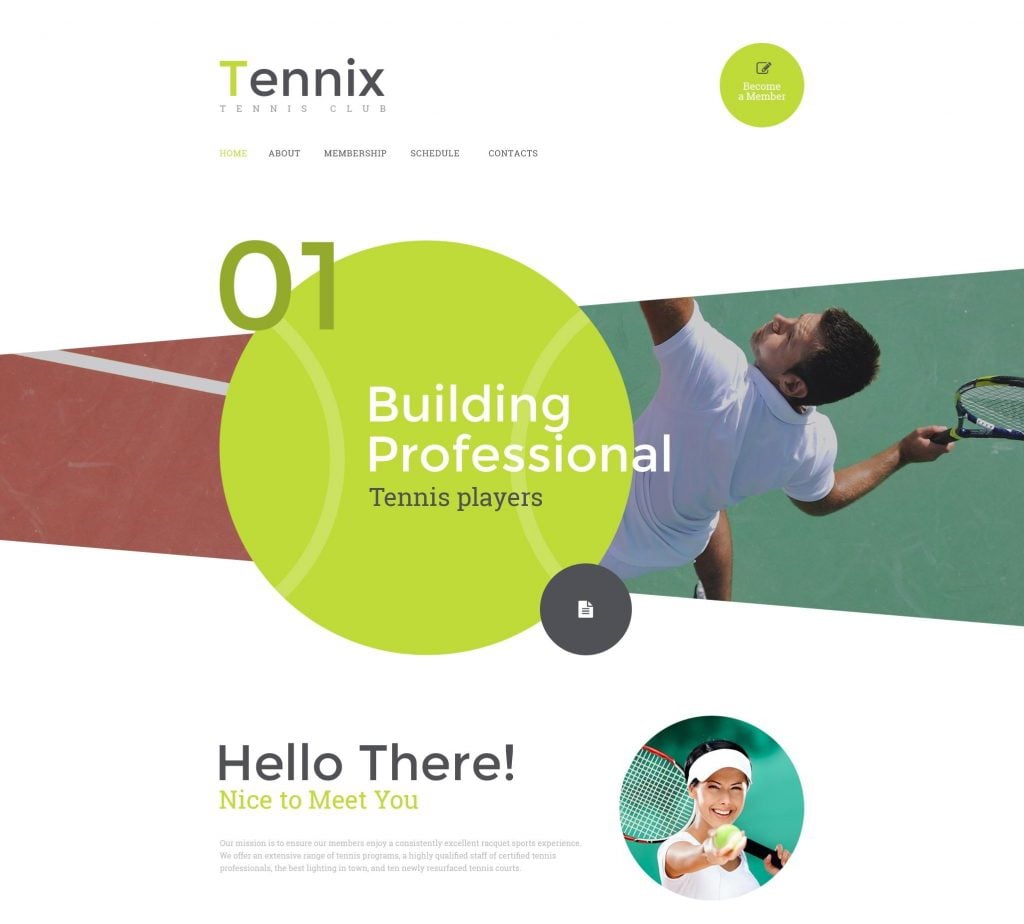
Looking at this website, you not only understand that it’s a sport-related one, but you also understand to exactly which sport it is related , even without reading. Calm colors, the photograph with a close-up picture of a golf ball, a logo which includes the color green, all of these features make this design incredibly compelling.
- Calm colors
- Great imagery
Take a look at how a red banner gradient fades towards a call-to-action button, while a white logo is placed on a solid red color. Slope lines narrow down to a call-to-action button, making it more visible.
- Slope lines
- Red color
- Powerful imagery
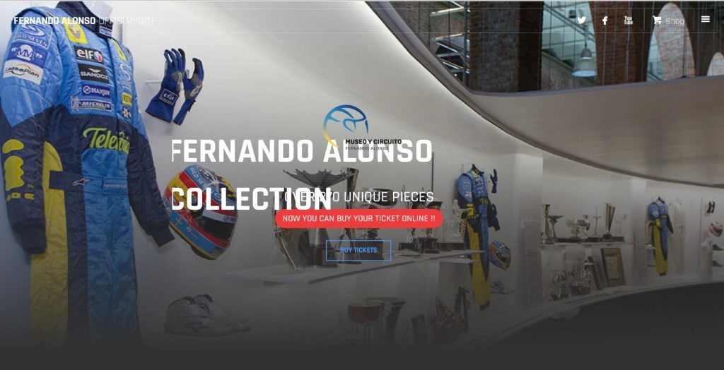
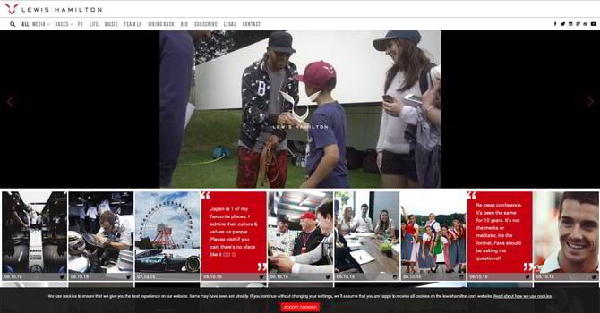
This design proves that you can convey a message just by correct placing of the right images. What makes us acknowledge this website is related to sport? The images. Well, and a well-known name, of course.
Have a look at several vertical call-to-action buttons which are repeatedly placed through the website.
- Powerful imagery
- Clear call-to-action buttons
- Calm colors
 "
"
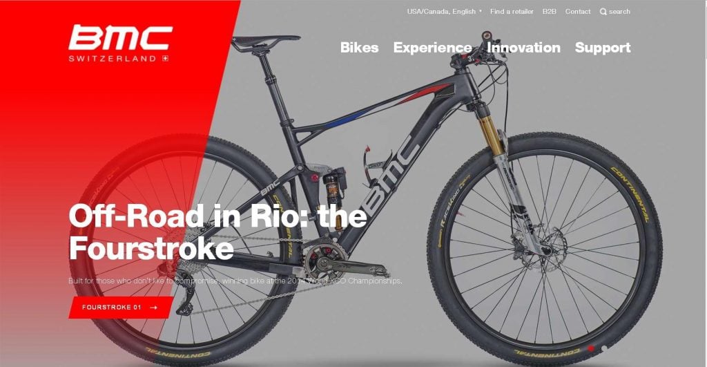
*Bicycle websites are different. Depending on the message the author wishes to convey in the design, it may also belong to the class of aggressive designs.
Don’t miss out these all-time favourites
- The best hosting for a WordPress website. Tap our link to get the best price on the market with 82% off. If HostPapa didn’t impress you check out other alternatives.
- Monthly SEO service and On-Page SEO - to increase your website organic traffic.
- Website Installation service - to get your template up and running within just 6 hours without hassle. No minute is wasted and the work is going.
- ONE Membership - to download unlimited number of WordPress themes, plugins, ppt and other products within one license. Since bigger is always better.

I like putting things in order and sorting stuff to make it easier to find something useful. That's why I like creating template listings. Besides that, I do researches on different interesting topics on web design and seek topics that could inspire readers. LinkedIn
Get more to your email
Subscribe to our newsletter and access exclusive content and offers available only to MonsterPost subscribers.

Leave a Reply
You must be logged in to post a comment.