Interview with Arturo Toledo, Experience Architect and UI Designer

You don't need to be an artist to create great UI - most of the principles of user interface design are the same as the basic design ones taught in any elementary art class. The elementary design principles of composition, color, and so forth apply equally well to a computer screen as they do to a sheet of paper or a canvas.

But other than that there are tons of other things every designer should keep in mind. The importance of User Interface Design is that you want to create a website or app that is easy to navigate, efficient to use, and gives your users a really pleasurable experience. It should also be as free from errors as possible. This is how you can more easily guarantee that they will continue using your products and will recommend it to others as well.

In terms of interface design we decided to ask a man who knows all the angles of this notion and that is Arturo Toledo.

Arturo Toledo is an Architect. He runs a boutique design studio attending clients in the United States, Europe and Asia. His work explores the convergence of human arts and science to give shape to an ever evolving design practice. With a particular commitment towards design education, Arturo is permanently engaged with the international design and development communities and often travels the world to exchange ideas about design with other designers and developers. Prior to his current venture, Arturo worked for Microsoft in Redmond for 7 years driving design evangelism.

***
Lilian Rigo: To begin with, tell us about your greatest achievement (regarding anything.)
Arturo Toledo: My greatest achievement? Hmm I hope I haven’t seen my greatest achievement in my life yet to be but so far I’d say it was probably making it to an ice hockey league as a right wing. You have to understand I am from Mexico. It’s like when Jamaica debuted in the 1988 Calgary Winter Olympics with a bobsled team! So, yeah, it felt pretty good being on the ice and driving the puck around and scoring a few goals.
Alex Bulat: We know that you worked at Microsoft for a while. Tell us please about your job interview there. They say applicants are asked some weird questions, what were they like?
Arturo Toledo: Before my interview I reviewed tons of sites that talked about the hiring interview in Microsoft. I read all the crazy questions would get. Why is a manhole round? How are M&Ms made? How many traffic lights exist in the U.S? – I was ready and prepared. Got to Redmond and for 8 hours and 8 interviews I never got such type of questions 🙂 I later realized those more strange questions were asked apparently to engineering candidates while I was applying for evangelism and marketing so I guess they didn’t care much about how M&Ms were made.
Lilian Rigo: You've been developing interfaces for Windows phones, but what's your forecast, which mobile platform will finally take over the world: Android, iOS or Windows?
Arturo Toledo: Well, iOS already took over. It’s the number one choice for 99% of startups I know or have read about. Android usually comes in second place in terms of the need for a startup to have an app for. Then Windows Phone. How do I see the future? I see Windows Phone (or any future Microsoft mobile platform) reaching a competitive 20% within 5 years. This means that startups and companies will have one out of five users using a Windows Phone. That’s pretty significant. I think this is the right time to jump into Windows Phone as a developer or designer because the enterprise, businesses, agencies and startups will every day, more and more demand more Windows Phone apps, and who’s gonna build them? Lots of creative and business opportunities in this space. All this said, I also think that in 5 years, the concept of a smartphone will have already migrated to the next stage of technological evolution. The attention will shift from “smartphone” – to “the next thing”… what will that be? That’s what we have to keep track off. The smartphone will not be the star of the show in less than 5 years so I hope Microsoft is not playing catch up and instead is inventing the future. I’m sure Apple is.

Lilian Rigo: What do you think are some of the main UI differences in designing desktop apps for PC and Mac?
Arturo Toledo: I haven’t had the opportunity to design a desktop app for Mac OSX but given OSX has embraced many similar concepts to iOS then I’m thinking the design mindset is similar. It’s about skeuomorphism. Or it has been. As we know, Jonathan Ive from Apple now owns both hardware and software design. Ive is a modernist (Vignelli, Gropius, Meier, Rams) so there is a general expectation that he will sponsor a new era of UI design in Apple. Let’s see what happens. My personal expectation is that Apple is working on enabling iPhones, iPods and iPads to be plugged in to large screens (24”-30”) immediately turning all these devices into “PCs” or “over the desktop computers”. This would be a massive shift in the industry as it would mean the conversation won’t be anymore about phones or tablets or notebooks but about the experience than spans across them. To accomplish this Apple (or Google and Microsoft) will have to have a unified UI layer and application platform across devices so the tiny Instagram in iPhone can leverage the real state of a 27” screen when plugged in. I personally think Apple and Ive might be leveraging this next stage of evolution to propose a new UI metaphor that is modern and not cheesy like today’s leather or wood texture driven UIs.
Alex Bulat: Is this your job? Tell us about an interesting project that you have completed in your current job.
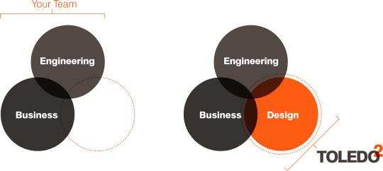
Arturo Toledo: My current job is leading a boutique design shop in Mexico City. We attend clients in the US, Canada, Europe and Asia. I work as an experience architect and user interface designer. I also do account management, sales, marketing, evangelism, blogging and twitting 🙂 Basically between my brother and I we do it all right now. You know? For one or a couple years I wanna keep it small. No hiring. I want to enjoy the moment of calm after having worked for Microsoft for 7 years. As part of our job we have the opportunity to participate in the full range and spectrum of software development, we are helping startups around the world with architecting and designing their apps, we are helping larger companies that have strong backend needs but we do it all from the point of view of a designer. We’ve had the chance to travel and talk about design and we will continue to do so. We mostly work for developers (engineers) acting as an extension of their team, as their design team. This means we don’t really work or are looking to working for clients like Nike, or Starbucks, or Procter & Gamble. We work for the engineering shops that work for them helping them be successful with UX and design. So far it’s going great and we are having a lot of fun.

Alex Bulat: What software, besides Creative Suite, are you using to design UIs?
Arturo Toledo: My number one tool to design UI is actually a non Creative Suite tool called Microsoft Expression Design. It’s like a mini Illustrator. It does 20% of the things you need 80% of times in Illustrator. I particular love how spectacularly fast it is to sketch out or wireframe ideas. I produce high fidelity comps with it as well. The two key features I love in Expression Design is the color picker which is a big panel, always open and available (compared to PS or AI where you have double click on the color swatch to access it). This makes the process of selecting colors very fast and easy. The other thing I like in Expression Design is it exports nicely to XAML which, if you are creating apps for the Microsoft platform it becomes a blessing when collaborating with developers. It has a terrific one-click export feature for selected objects and the best image slicing in the industry. I also use Photoshop a lot for bitmap editing, composition and creation.
P.S. I hate Illustrator… it feels more like a tool for print design not for UI or digital design.
Alex Bulat: Some people say that much of your success depends on your workstation. Would you please describe your workplace or share some photos?
Arturo Toledo: I work with my brother in a spacious room, all painted in white. One of the walls is made out of glass so we get some nice AM and PM sunlight. We have a bar made out of white desks along one of the walls. We both sit down on one and the other end of this bar. I like facing a white wall as it is neutral and allows my screens to stand out. I have a SONY VAIO notebook plugged to a 27” screen. That gives me dual screen capabilities. I have a JAWBONE Jambox (black) where I play my favorite tunes. That’s it. I like to keep my desk clean. I like visual neutrality as I feel that helps me focus on what I’m creating much better. In our little studio my brother and I have a dozen different devices, from iPads of various generations, iPods/iPhones of various generations, a SAMSUNG 7 series tablet where have Windows 8 loaded (I still have Win7 in my PC, my bro has Win8 in his PC plus he has a Mac). We have a number of Windows Phones (Samsung and mainly Nokia 800 and 920). We use all these devices to test everything we design in various systems and resolutions. We will probably expand this collection to a couple dozen devices this year as we get closer to the Android ecosystem.
Lilian Rigo: What music do you listen to while you work, or you prefer quietness?
Arturo Toledo: Right now I’m only listening to Justin Timberlake’s 20/20 Experience. Yeah that’s right JT for the win! But my repertoire is a bit more diverse. To me music is like food, sometimes you feel like getting a delicious greasy double cheese burger and other you feel like getting some nice fine sushi dinner. So you will hear me listening to pop, electronic (chill, trance, electro, dubstep), 70’s rock (i.e. Creedence Clearwater), as well as heavier stuff like Slipknot (this is when I have so much energy after a RedBull).
Lilian Rigo: What's your best time-saving trick? Any other tools or methods UI designers use to increase their speed and efficiency?
Arturo Toledo: Music + Headphones. That’s what really takes me into my own world. I also like going outside now and then to take the sun. I feel like a solar energy cell, I recharge and come back inside where it’s cooler. I’m very involved with Twitter, Facebook et al, so I really have to pull myself back throughout the day to focus on work without any distractions. Music is the key. My brother and I are getting to the point of being so in sync that sometimes we both feel like we need a break. We go to our lounge area and chat about the projects we are working on for an hours. Great brainstorming sessions.
Alex Bulat: Question on an abstract topic, have you seen the "Fight Club"? There was one interesting question "If you could take a fight with anyone? Who would it be?"
Arturo Toledo: With Brad Pitt’s character. SPOILER ALERT! I like the idea of fighting against myself. I’m my number one competitor and always try to do better than myself did yesterday, whether in design, running, playing drums or other things I do. I also think it is myself that sometime trips me into trouble or worry. I pay a lot of attention to being calm and centered. This allows me to leave more bandwidth for other people I care about. This is all something I try doing but not always succeed. It’s a constant fight.
Lilian Rigo: How would you comment on the following phrase: "The focus will shift from designing individual interfaces for particular devices to creating a proactive UI framework for the environment..."
Arturo Toledo: Totally agree. I mentioned this in a previous question and yes, we will quickly move from doing design for a single use to creating design systems that many designers can use to produce many apps that millions of people can use. Apple, Google and Microsoft are already doing this with their respective design guidelines and resources but I think we will see more of this coming out of the community little by little – most possibly in the shape of open source or collaborative efforts.
Alex Bulat: Can you mention some of your favorite UI/UX case studies?
Arturo Toledo: I’ll mention two of them. The first is Windows Phone itself. It was a breakthrough for the industry. It attempted to adopt the modernism movement design principles (think Massimo Vignelli, Walter Gropius, Jonathan Ive, Richard Meier, Josef Muller-Brockmann) in a product that is accessible to millions of users (granted Microsoft would like it to be in the tens of millions). As an experience, Windows Phone has been awarded with numerous design prizes for its bold commitment towards a modernist approach to user interaction and user experience. Windows Phone changed not only Microsoft as a whole (all products now intend to follow the same design principles) but is recognized industry wide as a product that kicked off a design trend. I would just to take advantage of this opportunity to clarify something. Windows Phone and it’s Metro design language (or Microsoft design language) is not “minimalism” and it is not “flat” design. Both minimalism and especially “flat” are incorrect terms that unfortunately many authors and design have adopted. The right term to describe this design is Modernist (as in the Modernism design movement that started in the 20th century).

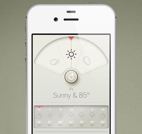
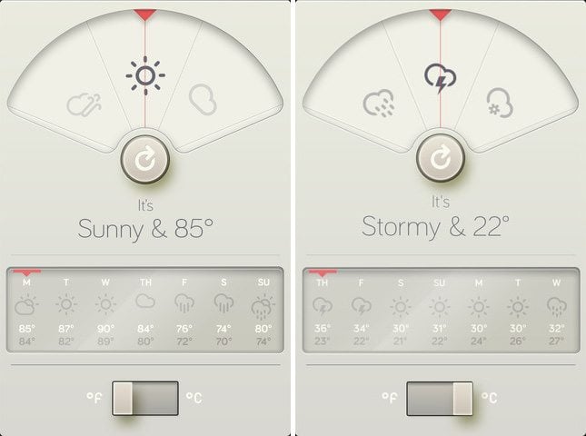
The second example is in the iOS field. The WTHR app for iPhone is absolutely gorgeous. I like it because it tried to break with the traditional iOS design guidelines and attempted a more Dieter Rams design principles. Other apps in this category are Path and Clear. I think all these apps illustrate a clear trend in the iOS world where designers are recognizing Modernism as a more reliable approach to UI design than the leather, wood, rusty metal like skeuomorphic approach we’ve seen coming out of Cupertino in the past. Luckily, today we have Jonathan Ive taking care of both software design and hardware design at Apple. He is a Modernist. No more leather stitches with him as the skip 🙂

Lilian Rigo: "The UI should be there, but not begging for attention…The UI should almost blend into thebackground.” What do you think should rise to the top of the visual hierarchy – content, form or what?
Arturo Toledo: The best UI is the one that is not needed. Have users operate directly over content. Content, not chrome. Totally agree that the UI should not be the star of the show. The user is the star of the show, and the number one thing a user wants to manipulate, produce, edit, compose, share is content. Content is king. Users are not static entities; they move, talk, evolve and change so in order to successfully make content king, designers have to rely more and more on storytelling. If you are a design or work with a design who can’t tell stories – run away, run to the mountains, because you want a designer than can help you tell user stories that are fun, engaging, smooth. So in a nutshell, this whole UX/UI professional activity is more about story telling than UI design per see. In our design studio we spend way more time telling stories than designing UIs. UIs come naturally when you get the story straight. This in turn enables you to have the minimum set of UI elements on screen to accomplish a task.
Lilian Rigo: Do you feel a new tendency in UI towards a flatter and more graphic type of design? Away from skeuomorphic elements, mimicking some real-life things.
Arturo Toledo: As mentioned previously, it’s not about being “flat”. That’s an incorrect term. It’s about following Modernist design principles as established in the 20th century by lighthouse creative minds like Massimo Vignelli, Dieter Rams or Walter Gropius.
Lilian Rigo: What about this pinch thing? Do you think there is any future for a pinch interface?
Arturo Toledo: I personally consider pinch just another gesture. So no, I don’t think the pinch gesture will take over the world. What I think is our vocabulary of gestures is still quite limited and primitive and I think that throughout the years the world will be “trained” little by little to deal with more complex gestures. Think about it, Apple’s iOS is almost 100% about single taps to accomplish tasks. Some swipes and pinches here and there but most it’s taps. Very simple yet powerful. Then look at Windows 8… It is a “finger ballet” – you have all these gestures, you swipe from edges and each edge gives you something different, you slide, you tap, you pinch, you expand and contract… One of the reasons I think people have in general (not everyone) found Windows 8 more complex to use UI wise is that the gestures to accomplish success are more complex than in the iOS world. To be honest, Windows 8 gestures are not that hard but the little bit harder or more complex they are I think raise the instant gratification curve significantly. Don’t get me wrong, I’m no Jakob Nielsen or Don Norman who are fundamentalists IMO when it comes to dismissing the Windows 8 UI as something unusable but what I think is that the Windows 8 gestural metaphors might be a few years ahead of its time. I know it’s also cliché but have my mom learn to operate a Windows 8 tablet and then have her use her iPad where everything gets done with “a tap” (or at least it is perceived as if) and she will end going for an iPad. Imagine going back to the 1980’s and giving yourself an XBOX 360 control to play in your new Atari system which has one joystick and “one” button… same thing. You’d be puzzled with all the joysticks, pads, buttons and so on that this “ahead of time XBOX control device” has. It is incredible to think that we humans take so long to adopt technologies… On one side back in 2005 no one had smartphones. Today everyone does. 8 years. Not bad. But maturing on new UI paradigms is complex.
Lilian Rigo: What do you think is the next UI design trend?
Arturo Toledo: It’s almost a cliché but I would continue to embrace the concept of thinking in terms of experiences and not devices. Don’t think about the app for sailing, or the app for banking or the app for running… think of the experience of sailing, banking and running. This experience is by definition not restricted to a phone, a tablet or a desktop… it transcends all these devices. So as designers we have to think without constrains. I also think that Design as a profession will continue to evolve. The title of Architect (Experience Architect) will rise as part of the obvious need to understand and execute design from a more architectural view as design systems continue to grow. You call it trends but I think trends is not what it is about or will be in the future. I think Microsoft, Apple, Google, Samsung, Sony and hundreds of startups are all creating their own design languages. I think this is what will be big, not designing an app or two but creating a design system, a design language that enables that company or startup to build a consistent experience across screens. Look at Facebook and Twitter today. They are already after this – whether you are using an iPhone, Windows Phone, Android phone, a tablet or the desktop, what they are designing is “the Facebook experience”.

***

So, this is what Arturo wanted to tell everyone about what has happened in the sphere of interface design, how things are shaping up with Windows 8 app design. Anyways, if you feel that you want to know more, as always, express yourself and ask questions in the comments.

Contacts:

Website: www.toledo2.com
Twitter: @arturot
LinkedIn: http://bit.ly/arturot


Alex Bulat

Writing a blog post or building a micro niche WordPress website is something Alex can do bare-handed. You're welcome to contact him via Telegram, Facebook, or LinkedIn.

Get more to your email

Subscribe to our newsletter and access exclusive content and offers available only to MonsterPost subscribers.

From was successfully send!
Server error. Please, try again later.

Leave a Reply