10 Things to Pay Attention to When Choosing eCommerce Website Templates
Think that looks don’t matter? Think again.
You go to the supermarket to buy a box of oatmeal for breakfast, and you judge the product by the package. You log into Amazon to find a new book, and again, you choose it by the cover. Why? Because the package is what initially attracts you to pick it up from the store-front, be it offline or online.
The same is relevant for your eCommerce website. What your visitors see when they enter your site for the first time has a direct impact on their next steps. They either proceed to the checkout, or press the red cross button never to come back again.
So you need to choose the right eCommerce template to ensure your online store is making a good first impression. And it’s not only a color scheme that should be taken into account. A perfect universally appealing website design is about careful selection of fonts, an appropriate theme that fits the products you sell, page loading speed, retina-ready images, responsive easy-to-navigate layout and many other things combined in one place.
After all, a web store dealing with baby clothes would look weird on a dark template with a charcoal black background, wouldn’t it?
So what should you take into consideration when choosing the right template for your eCommerce website?
For me, choosing the right eCommerce design theme is like oil painting — you have to understand how colors work when blending them together. Or like choosing the ingredients for your dish — you will never add garlic into your chocolate cream pudding, just as it’s silly to add sweetened condensed milk into your salmon soup.
It’s just the same with design.
You need to wrack your brains a bit before you choose the right template that would make your drop-in visitors fall in love with your business and become regular customers.
Don’t worry. It is not as hard as it may seem. Though a myriad of eCommerce design themes, available on the web, can be mind-blowing, you won’t have to be up all night in a marathon effort to choose the one you need. A few simple tips can help you make an informed decision and select the template design that will present a clear image of your online business. Let’s jump right in:
1. Your template design should create an excellent experience for your customers, making them come back over and over again
First and foremost, your website template design should reflect the nature of your business — your industry, location, whether you sell services or products and the list goes on.
You should have a clear idea of what your customers need and give it to them straight away, in a timely manner, with no delay. Your shoppers should come to your site and enjoy every part of it.
Think of Starbucks, for example. What makes people spend an extravagant sum of money for just an ordinary cup of coffee and an uninspiring piece of cake? The magic behind this brand lies in its ability to create an ideal customer experience. The employees are trained to connect with their visitors on a personal level and immediately respond to their feedback, even if it’s negative. They use the “Latte method”: Listen to the customer — Acknowledge his problem — Take action to deal with the problem — Thank your customer — Explain why the problem occurred.
Think of Optimizely. The moment you land on their homepage you see the greeting customized to the location and time zone you are in. It is 9 am here, so I see a cup of piping hot tea and a good morning message. So nice to feel that they know a little bit about me.
Your website design should be no exception. Because if the design is lame, it means that your eCommerce store along with the products you sell is equally lame. Make your visitors believe that they are welcomed on every page they load, guide them through the most crucial steps and let them feel you care.
Then word of mouth will do the rest.
2. Intuitive interface on all pages, including checkout, homepage and product page, will improve your conversions
Intuitive design is invisible but putting it into action may take much of your energy and attention.
That’s why it’s important to know a few nuances which should help you achieve the sought-after results with a minimum of conscious effort.
First, efficient design is simple. By replacing sophisticated interface with simple user-friendly and minimalistic elements, you will make your users’ journey fluid. Keeping the number of UI elements, such as font styles, font sizes, icons, to the minimum will also improve the overall user experience.
Then, high-grade website design is intuitively understandable. If the layout is pretty hard to comprehend, users will get puzzled over it. The best way to check the usability of your interface is to ask your grandma to test it. For example, ask her to put an item in your cart. Was it easy for her? If not, there’s much to improve.
Third. The selection of icons, fonts, colors and other UI elements should be consistent.
When all is done, check it out. If your users complete their tasks without any interruption and thought, it means you scored a goal, and your interface is perfect. Visitors should find the item they are looking for easily, be able to inspect the details and seamlessly process the payment. And if any of these three steps fail to delight them, your reputation is partially ruined.
However, you can easily avoid these problems if you choose to use ready-made templates with a well thought-out user-interface.
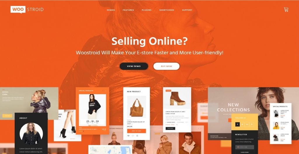
3. Responsiveness is what makes your online store look good across all devices
Now let’s talk about the recent trends.
These days, more than ever, designers focus their attention on creating a flawless mobile website experience. And they are right as, according to Google’s official statements, more than half of Google’s searches happen on mobiles.
No wonder. Say, you’ve just landed in a foreign country, and you need to find a hotel. What do you do first? You grab your mobile and Google it. Or you are cooking a tasty pie for your evening guests and have forgotten a single ingredient. It’s silly to boot your computer, so you use your mobile phone to find out what you overlooked.
On the other hand, the other half of Google’s searches happen from desktop computers. And you shouldn’t forget about those, too.
So it’s crucial to make your website easily accessible from all sorts of devices and scale to every possible screen, be it a laptop with retina display or the latest iPhone.
4. A good template should load fast enough to make Google fall in love with your eCommerce website
You should also take it into account that mobile users are usually in a hurry.
So, ideally, your eCommerce template should be not only responsive but also lightweight. You’ve got no more than 3 seconds to load your site. Otherwise, your client will sneak out of your arms into those of your savvy competitor’s.
Utilizing the best coding practices is what makes the layout fast-loading and easier to navigate. Utilizing responsive templates, fine-tuned for the best performance across all devices, is what makes your life easier and takes this load off your mind.
Choosing any template from X-Cart developers, you can be sure that all the resources are minimized, requests are reduced, unnecessary code and unneeded features are removed. None of these bootstrap themes is overburdened with a ton of features — you’ll find only the things you need.
And, of course, you know perfectly well that fast-loading websites are adored by Google. So you can have your cake and eat it, too. You delight your customers with a speedy web store and catch Google’s fancy.
Isn’t it great?
5. The ideal template works for SEO and lets your positions in search engines improve
Search engine optimisation is like usability. No one sees it (except, of course, for Google who sees everything that is done behind your password protected admin area) but it exists.
Do your SEO the right way, and you will make your content highly discoverable. Ditch it, and you will hardly ever dominate the SERPs.
Luckily, there exist the so-called Google-friendly templates, created with SEO in mind. The latest semantic HTML5 markup and CSS3 are used here to make your site fast, clean and easily-discoverable by search engines.
Also, new coding standards allow you to add different tags to your content, attach Google rich snippets for posts and reviews, set up Google authorship and create other sorts of SEO magic that can help search engines flawlessly index your pages and you — stand out from your competitors.
By the way, X-Cart design templates are also search-engine friendly. It means you are free to add relevant keywords to specific elements of your site and make other incredible hacks to make your site easily-discoverable by new users.
6. If your template is ready for marketing activities, then you are ready for sales
Launching your eCommerce store is only the initial step you take when plunging into the world of eCommerce. Then goes marketing in various forms and shapes, with all the bells and whistles it usually comes with. And knowing which design theme is the most effective for that purpose is crucial from the very start.
But you should understand that marketing opportunities coming with design schemes are a bit different from marketing in general.
Marketing features integrated into design themes come in the form of banners, blocks of featured products, pop-up ads, image carousels, and so on and on it goes.
All the above gimmickries are here to help you implant ideas into your customers’ heads and win a place in their hearts.
Let’s have a look at product badges, as an example. You can stick them to your products to indicate their status — products on sale, recently viewed, coming soon, new arrivals, free shipping, you name it. These small yet eye-catching labels are very effective for promo purposes.
7. Your choice of e-commerce template should make social sharing trouble-free
There’s so much hype around social media these last years.
No wonder. They let you easily share the things you like with your friends.
Let your customers enjoy this process to the full extent and choose the eCommerce template that comes with social sharing integrations.
8. Honed to perfection site search and autocomplete is a way to improving your UX
Lightning-fast search and filtering option is another gorgeous way to create a memorable user experience. It comes in handy when you’ve got lots of different products in stock and browsing them one by one may turn out to be too tiresome and time-consuming.
Smart search and dynamic variant and category-specific filtering make the process of choosing an item as easy as pie.
But what I like most of all is that some templates offer real-time suggestions. For example, your shopper is typing:
[ toy… ] he will then see a toy car, a toy robot, a toy dress or… Toyota (if you sell any, of course) offered to him.
Using autocomplete options, you may read your users’ thoughts, or at least predict what they are looking for in your store.
Spell-checking is also a good option. If anyone accidentally googles turtle sweater instead of a turtleneck, your shopping cart is wise enough to understand him.
Even Google cannot make it out sometimes, hah:)

9. The ability to customize your store to match your brand
Choosing a good design template is also closely related to website branding. It’s about giving your business personality, which puts into action the benefits you offer and lets your shoppers identify with you.
This is created through the careful selection of colors, fonts, and a perfectly-developed logo.
Fonts, colors and the overall layout should evoke associations with the company they represent and should be easily edited with such tools as WYSIWYG and layout editors.
The logo is the biggest chance to make a memorable impression on your user. It needs to be recognizable. Look attentively at Gillette’s logo — the letters “G” and “i” are razor-sharply cut, which indicates the sharpness of the Gillette razors.
The ideal design theme is easy to customize.

10. Good template evokes warm feelings inside your customers’ hearts and souls
I know, I know, this point is somehow related to the first one about customer experience, but I’ll add it here anyway.
While choosing the design template for your eCommerce business, try to lift the veil of illusion and peep inside your shoppers’ brains.
You can ask them, too. It’s even more effective.
The look and feel of your website should resonate with your audience, be trendy and… cool.
Great Examples of a Wonderful Web Design for an eCommerce Store
Now that you have a clear strategy of choosing the right design template for your eCommerce business, you are all set to go. Start browsing the available options thoroughly and select the one that floats your boat.
The good idea is to take a paper and sketch out a plan. What features do you need? Put down everything from SEO tools that you think should level up your site in Google (or Bing, Yahoo, whatever) to marketing options that will grow your audience.
Then cross out the options that seem redundant. If you are not sure about these features now, you will unlikely to use them in the nearest future.
This way you will end up with two or three choices. And the problem of choice is not a problem anymore.
Have a look at these X-Cart templates also available on TemplateMonster:
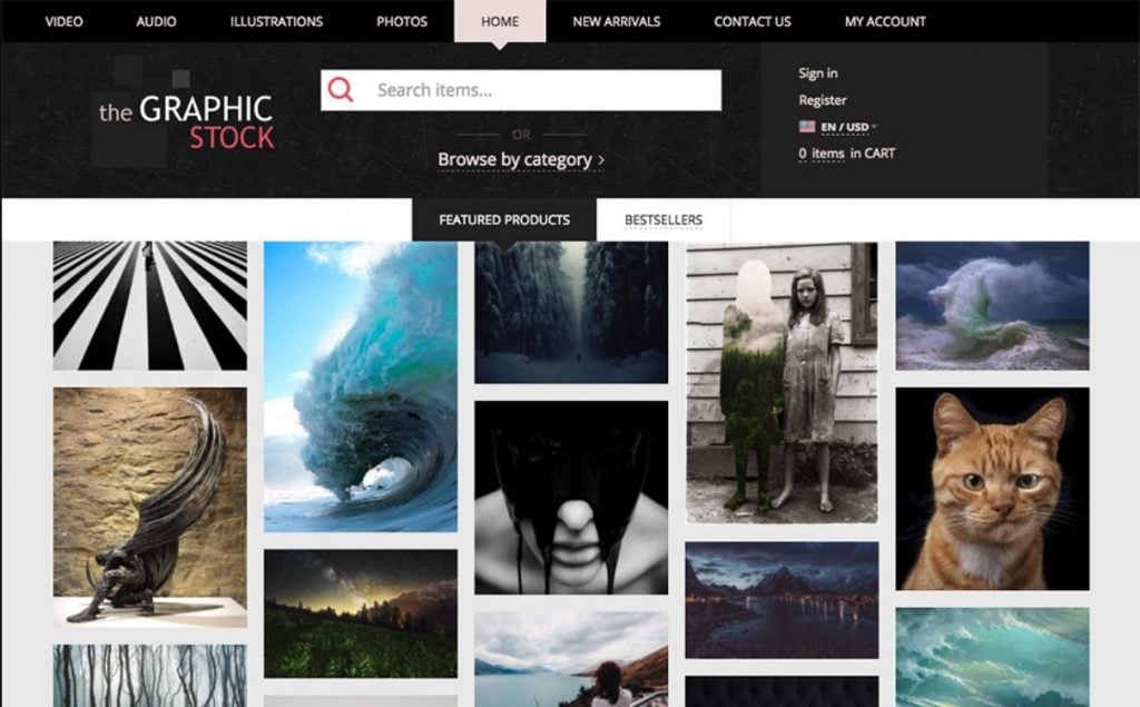
Graphic Stock X-Cart Template
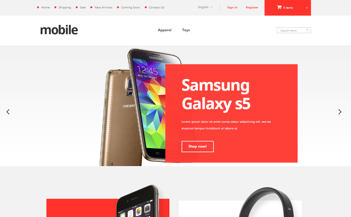
Mobile Phones X-Cart Template
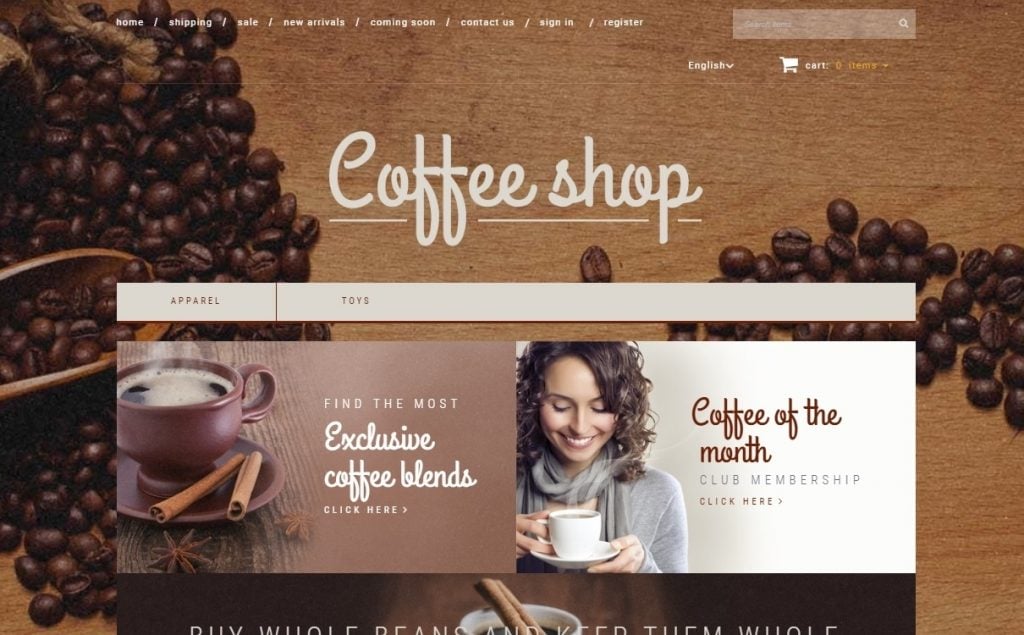
Coffee Shop X-Cart Template
Trendy Fashion X-Cart Template

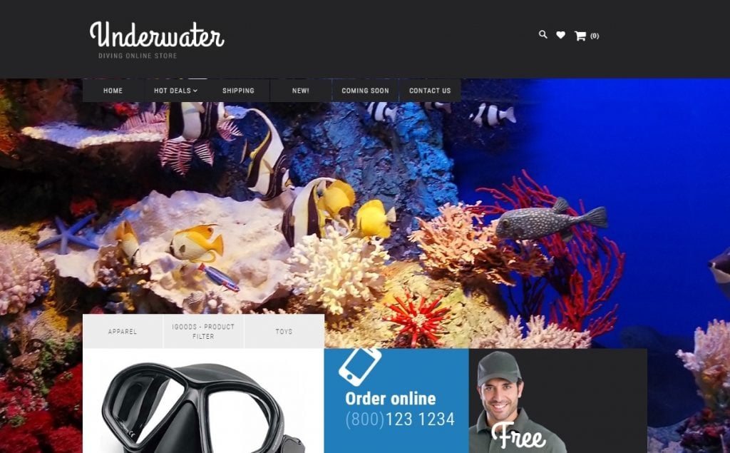
Scuba Diving X-Cart Template
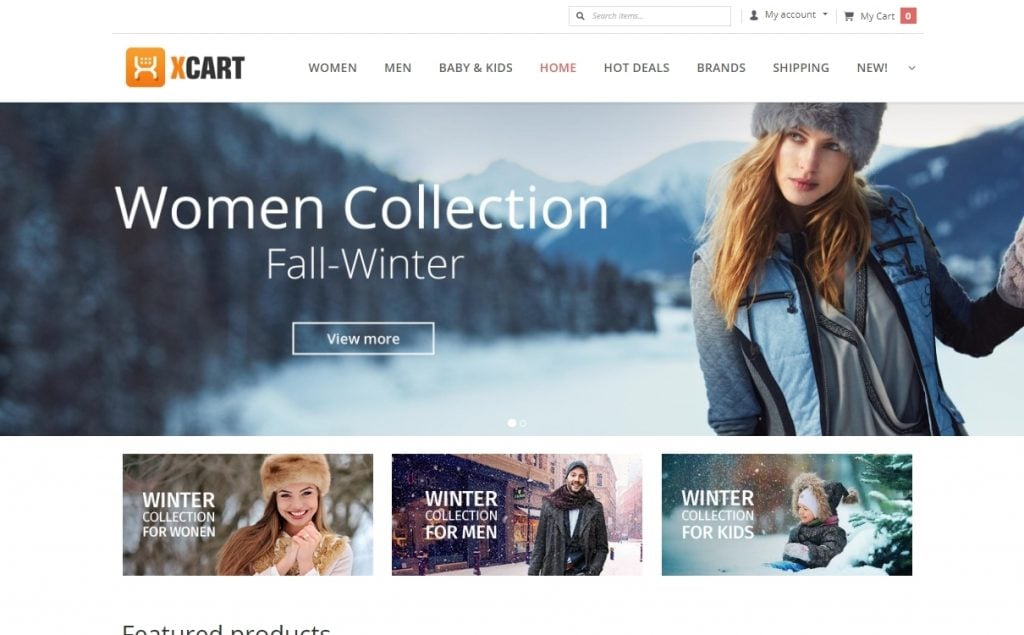
Fashion House X-Cart Template
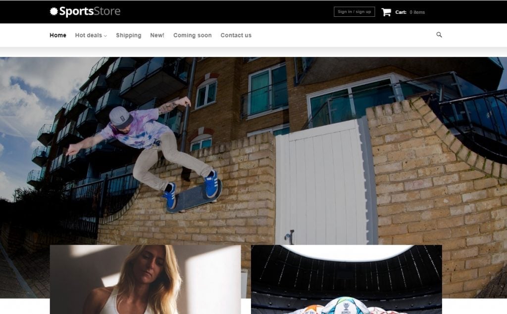
Sports Clothes Equipment X-Cart Template
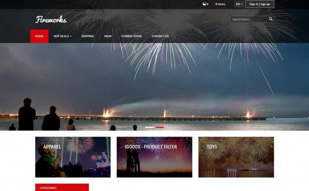
Fireworks X-Cart Template
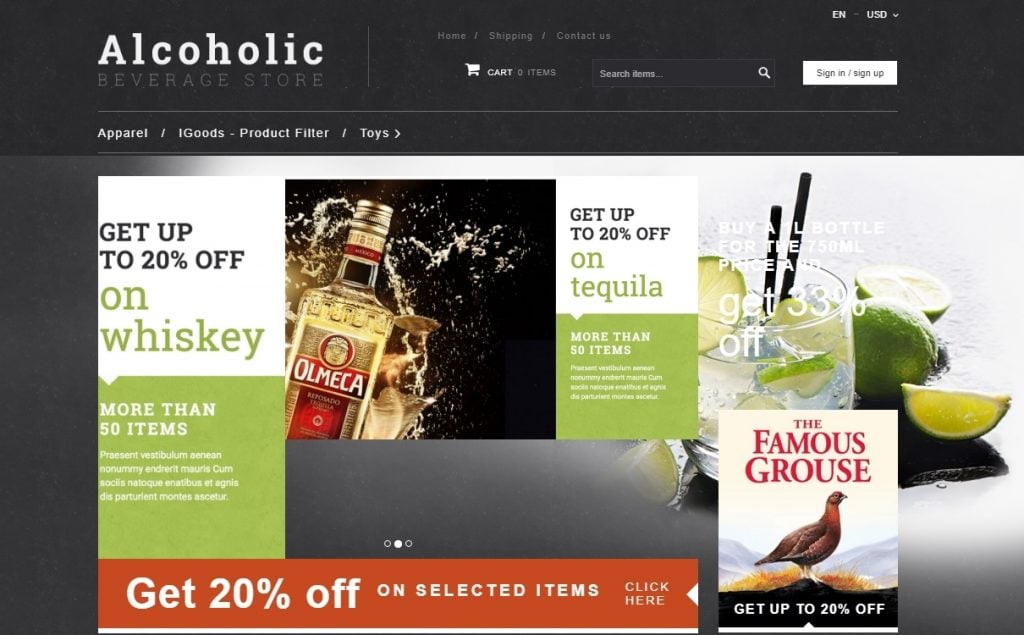
Alcoholic beverage X-Cart Template
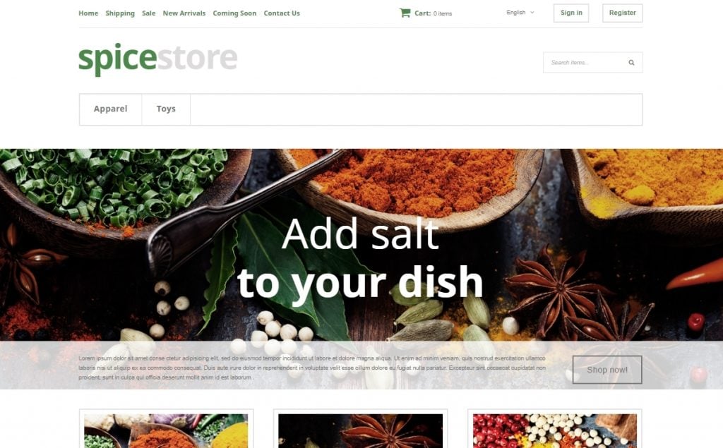
Grocery Store X-Cart Template
Why Choose X-Cart Templates For Your Business?
Your eCommerce store deserves a top-notch template employing the latest technology and design practices, optimised to boost your sales and delight your customers with an unmatched user experience.
X-Cart developers combined all the above features and technologies in each of these themes, so you can be sure that you will be able to give your customers an enjoyable experience. No matter what.
Last Words About Choosing an eCommerce Template
As you know, first impressions are most lasting. Spare no pain and effort to choose the template that perfectly fits your business. This is your “little black dress”, your “high heels” and your “killer look”, that attracts overall attention and creates the first impression. You crave for a good one, don’t you?
If the tips above don’t help you much and you still have any questions, ping me anytime. I’m here to bury you under a mountain of ideas.
Related Posts
Designing the Perfect eCommerce Store Checkout Page
Free eCommerce UI for Welcoming Online Store Designs
Top 6 Backlink Building Tricks For eCommerce Stores
10 Super-Fresh WordPress Solutions for your eCommerce Online Store
Get more to your email
Subscribe to our newsletter and access exclusive content and offers available only to MonsterPost subscribers.

Leave a Reply
You must be logged in to post a comment.