Everything You Want to Know about Comparison Infographic
- What Is a Comparison Infographic?
- Creating a Comparison Infographic
- Comparison Infographic Tips and Tricks
- How to Use Colors in Comparison Infographic?
- Using Charts in Comparison Infographic
- Comparison Infographic Templates
- Final Word
Whether you are working on a product or a company presentation or just making an annual report, you might run into a problem, such as organizing data. Certainly, the best way to present some important numbers, dates, as well as any other key aspects that are essential to your report or presentation is to use an infographic.
In fact, there is a huge variety of different infographic types that includes statistical infographics, timeline infographics, informational infographics, geographic infographics, and many more. However, perhaps the most important kind of infographics in the business world is comparison infographic, so let us take a closer look at it.
What Is a Comparison Infographic?
A comparison infographic is a visual representation of the main features of two or more products, companies, events or time periods as opposed to each other. As a rule, it is a chart that summarizes the main information about the compared objects, which is aimed to help other people to get a better understanding of these objects and, as a result, come up with their opinion about them.
Comparison infographics are rather useful since they make any presentation or report easier to comprehend. But how do you create a decent one? Let’s figure this out together.
Creating a Comparison Infographic
You can create a comparison chart in PowerPoint, Word or Google Docs. But these software won’t create a great infographic. To come up with something truly fancy, you probably want to try and use one of these lovely infographic templates. Well, here is how you create a comparison infographic with a template:
- Find the template you like and download it.
- Use drag and drop canvas to rearrange the items on the template according to your needs and desires.
- Add your data to the template.
- Customize the color, icons, and fonts as needed.
Well, that’s pretty much it. Your comparison infographic is ready to go. That was easy as it is, wasn’t it?
Comparison Infographic Tips and Tricks
Certainly, there is a whole bunch of stuff that can both make your infographic simply awesome as well as let you down. To avoid a fiasco, here are some ultimate tips and tricks that will help you to make the best comparison infographic in the world.
Use visuals. Everybody knows that visuals make any sort of information easy to digest, and a comparison infographic is not an exception. So, do not be afraid to add some little pictures to your infographic; you will only benefit from them.
Make sure your comparison chart is visually-appealing. The comparison chart should look simple and easy to understand, so you want to make sure that it is not overloaded.
Use horizontal layout to show “the leader” and “the outsider” of your comparison. Place your so-called winner on the top of the slide or page and the loser on the bottom, so that you will visually demonstrate the dominance of the product you need to promote over the other product or products.
Don’t forget about Venn diagrams. Well, what can demonstrate better than a Venn diagram? Pretty much nothing, so go ahead and use a template with these diagrams.
Use timelines for comparing processes. If you need to compare journeys or particular processes, the best way to do that is no doubt a timeline. So do not underestimate this type of comparison infographic and definitely consider using it.
Use charts for numbers. If you have a lot of numbers in your comparison, then a chart is perhaps the only way to go for you. Numbers in charts look much neater and, as a result, people would apprehend them better.
Emphasize the important data with bold fonts. Even though there are pretty much only key points in the infographics, there is still something you can highlight and emphasize. So look through your infographic and think of stuff such as numbers or dates you need to highlight.
Set a fancy background image. A great way to make your infographic even fancier is using background pictures to illustrate the theme of your information or the topic of your whole report.
Use percentage rating scales to be more convincing. Percentages always have a great impact on people, so go ahead and use some to convince them that your product is the best in the world faster.
Keep it short. Do not make huge comparison charts, since it takes so much time to create them and in the end, nobody is going to read them. Keep it short and simple, especially if you have to make a comparison infographic for social media.
Illustrate the information with icons. Simple vector icons can help you to visualize your main concepts as well as make the whole comparison much easier to comprehend. Moreover, images will help your audience to remember certain key points better.
Well, this is actually quite a long list of tips and tricks for such a seemingly simple thing as comparison infographic, isn’t it? Yet there is indeed a lot of stuff to work on, so next time you make a comparison of products, companies, or anything else, make sure you used some tricks because they really can bring your infographic to the next level.
How to Use Colors in Comparison Infographic
Colors can have a significant influence on the people who read the comparison, so you want to use them strategically. For example, green is usually associated with something good, beneficial or natural; at the same time, red symbolizes something dangerous, forbidden and generally bad. So you can certainly use these colors to show your services or products’ supremacy over your competitors’.
Besides, you can also use dark and light shades while comparing something. Just use vivid bright colors for the superior object and dark grey shades for the ones you do not favor.
At the same time, you can use colors not only to make something look better or worse but also to make some data easier to understand. You can color-code your data to make your comparison infographic easier to scan.
Using Charts in Comparison Infographic
Comparison charts are actually a classic way to compare products or pretty much anything. These charts are easy to scan and generally pretty easy to digest, which makes them the ultimate solution for numbers. Overall, a comparison chart is always a way to go, especially if you do not have time for coming up with something creative and unconventional. A chart will never let you down; just make sure that you do not overload it.
Comparison Infographic Templates
I have already mentioned how useful infographic templates can be. In fact, such templates will no doubt help you to come up with something creative and fancy, but what is more important, they don’t cost a lot of money. So let’s check out some lovely templates that you might fall in love with. Shall we?
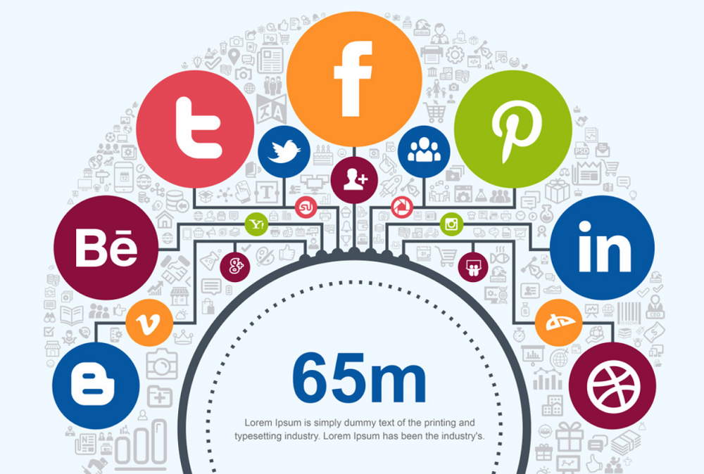
Social Media and Marketing Vector Elements Pack Infographic Elements

Price: $17
Features:
- 4 color options
- Infographic elements
- Vector kits
- Theme color switcher
- Support service
- Easy installation
Amazing Big Bundle Infographic Elements
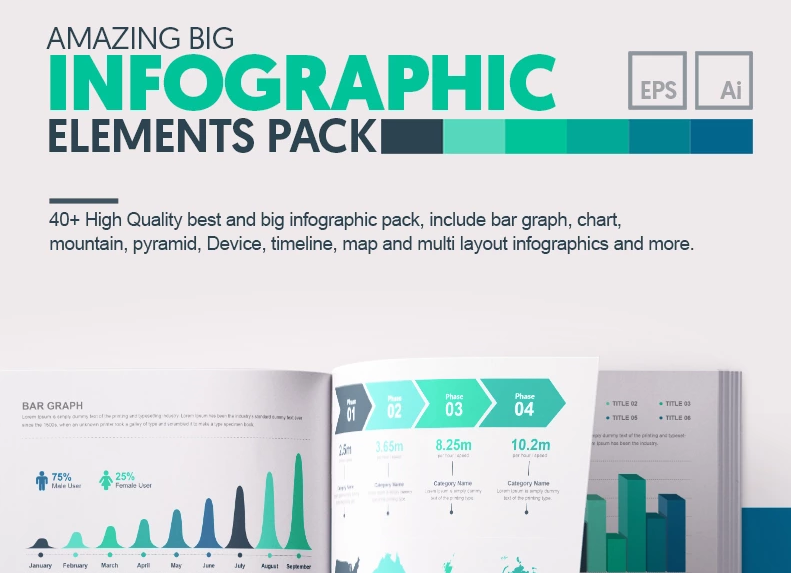
Price: $22
Features:
- Compatible with Adobe Illustrator CS5
- Over 40 infographic elements
- Unique vectors
- 24/7 support service
- Easy installation
Tree Bundle - Infographic Elements

Price: $17
Features:
- 4 color variation EPS and AI File
- 10 unique tree infographic elements
- Compatible with Adobe Illustrator CS5
- Support service
- Compatible with PowerPoint
Conceptual | Part 02 Infographic Elements

Price: $20
Features:
- Easy customizable
- High-resolution design
- Live editable text
- Fully layered
- Vector AI file with editable text
- Vector EPS10 file with live text
Infographic Bundle | 900+ Vector Infographic Elements

Price: $39
Features:
- 4 color variations
- Compatible with Adobe Illustrator CS5
- Contains AI CS5 and EPS CS5 vector files
- Editable text/font and colors
- CMYK color used
- One-click color customization via swatches
Final Word
Comparison infographic is indeed an extremely important element of all presentations or reports. Moreover, you can take advantage of the product comparison charts for promoting your products. In fact, presenting a product in comparison to another one (usually the one that is worse) is a common marketing strategy, so why couldn’t you use it? Work on your comparison infographic colors, layout, and don’t forget to pick a fancy template to create the ultimate infographic that will no doubt bring you to success.
Do you use comparison infographic in your presentations and reports? Do you prefer standard PowerPoint options or premium ones? Let us know in the comment section below!
21 Easy Tips To Create A Powerful Presentation For Your Business [Free Ebook]
By clicking the button you agree to the Privacy Policy and Terms and Conditions.
Read Also
Business Infographic — Making Hard Things Easy
Infographic Templates: Instead of Splashing a Thousand Words
Infographic Icons to Spice Up Your Infographic Presentation
Find Your Perfect Infographic PowerPoint Template
Don’t miss out these all-time favourites
- The best hosting for a WordPress website. Tap our link to get the best price on the market with 82% off. If HostPapa didn’t impress you check out other alternatives.
- Monthly SEO service and On-Page SEO - to increase your website organic traffic.
- Website Installation service - to get your template up and running within just 6 hours without hassle. No minute is wasted and the work is going.
- ONE Membership - to download unlimited number of WordPress themes, plugins, ppt and other products within one license. Since bigger is always better.

Get more to your email
Subscribe to our newsletter and access exclusive content and offers available only to MonsterPost subscribers.

Leave a Reply
You must be logged in to post a comment.