Let me ask you a question: Do you consider your company as a serious one? Alright, but do you have a style guide for your brand? No? Then sit down and listen! I’m gonna tell you why this is so goddamn important for anyone who has its own brand.
I believe that every brand has it’s own core values. They usually include the vision of the team, the message that they want to deliver while communicating with the audience. Basically, these values define the soul of your brand and the way it’s represented in the media and on the market.
That’s where the brand bible comes handy. These are not just fancy words, it’s called the ‘Brand Bible’ for a reason. This is a strict set of rules and guidelines that should be followed while working with your brand’s identity.
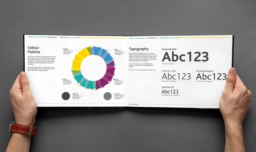
Example of a brand style guide
These rules are essential and they cannot be overridden even in some exclusive and unusual situations. Let’s just say that this is the source where you may take all the needed information to create anything connected with your brand: a website, a memo, an advertising banner or a product feature image.
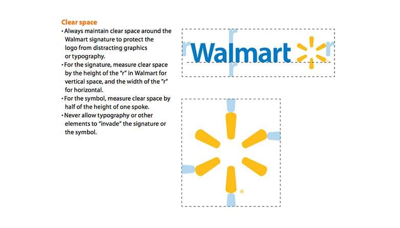
An excerpt from the Walmart style guide
Prepare your brand for a style guide
Prior to starting the guidelines development, you should determine a few key things about your brand. It may sound obvious to you, but you need to know your brand very well in order to create a guide that will fit your brand perfectly. Let’s review the components you need to define:
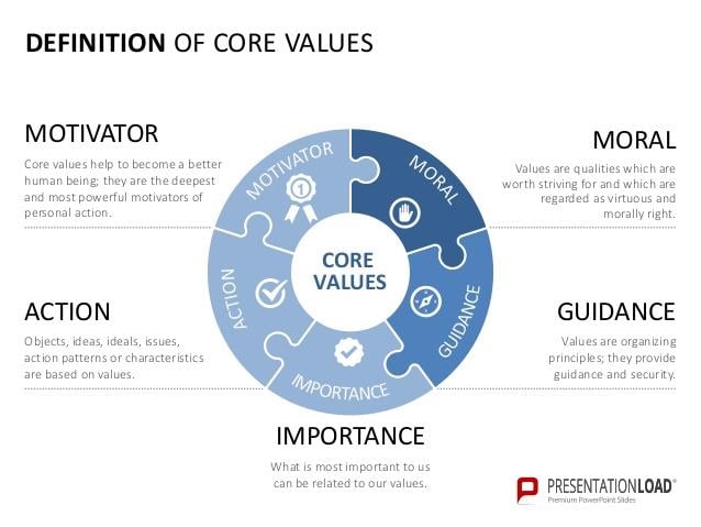
I have mentioned this term earlier and it should definitely be clarified. These are the main principles that drive your company’s actions and decisions. That’s like a ‘Bro code’ that gives you basic moral and ethical understanding of how you should operate. Create a list of things that your brand values, talk this out with your team and make sure everybody sticks to it.
Personality
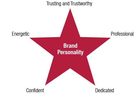
That’s pretty easy: try to find the words that describe your brand perfectly.
For example:
We are serious and ambitious / young and productive. Keep in mind that you’ll have to keep up with those words and comply with what you’ve said about yourself.
Audience

Defining your target audience is one of the whales that will hold your company. In case you understand the audience you need to reach out to, you are halfway down the road to success. This is the key point where you should do a deep research and determine the typical customer that uses your services. It will help you to position your brand properly and deliver the product or services right where it’s needed.
Mission

Why did you start this company? What do you want to deliver?
These are the question you need to ask yourself and give strict answers. A company cannot exist without a global mission and goals, these are crucial in forming your brand’s purpose of existence.
For example:
We have started a design studio in order to bring the top-notch designs to the market. Our main mission is becoming the biggest design studio on the East Coast and trying to reach to the top 20 design companies on the whole market.
Ambitious goals like these are giving a great understanding of your company’s principles, hunger to succeed at something that makes your company truly attractive to a customer, it makes him believe that you will bust your ass all the way up and do your job properly.
What makes a good brand bible
Now, when we discussed what is the brand style guide, it’s time to dive deeper and make sure you understand what kind of guidelines you should establish in your brand bible in order to ensure your brand’s consistency.Logo
This is the most important element of your brand style. In order to keep everything in order, you will have to dictate everyone how to use your logo correctly: what kind of font is used, what sizes are forbidden, what colors should be used and what colors cannot be used, etc.
As an example, let’s take a look at the TemplateMonster brand book. Besides the fact that they have a few pages dedicated strictly to the fonts, colors, and sizing that can and cannot be used, they have a separate page that shows different forbidden combinations. These are similar mistakes that everyone should avoid in order to keep up with the basic rules that the brand book established.
Color palette
Your color scheme cannot vary depending on your mood, cause color is something that makes your brand appearance memorable to a customer. Once you have selected the color scheme, you should stick with it further.
It’s very important to give all the color codes along with the list of all the shades that can be used.
Each time when someone decides to create an internal memo, a banner or a project web page, he will have to look up to these colors. It will ensure that all your projects and brand products keep the same style and impression.
Fonts
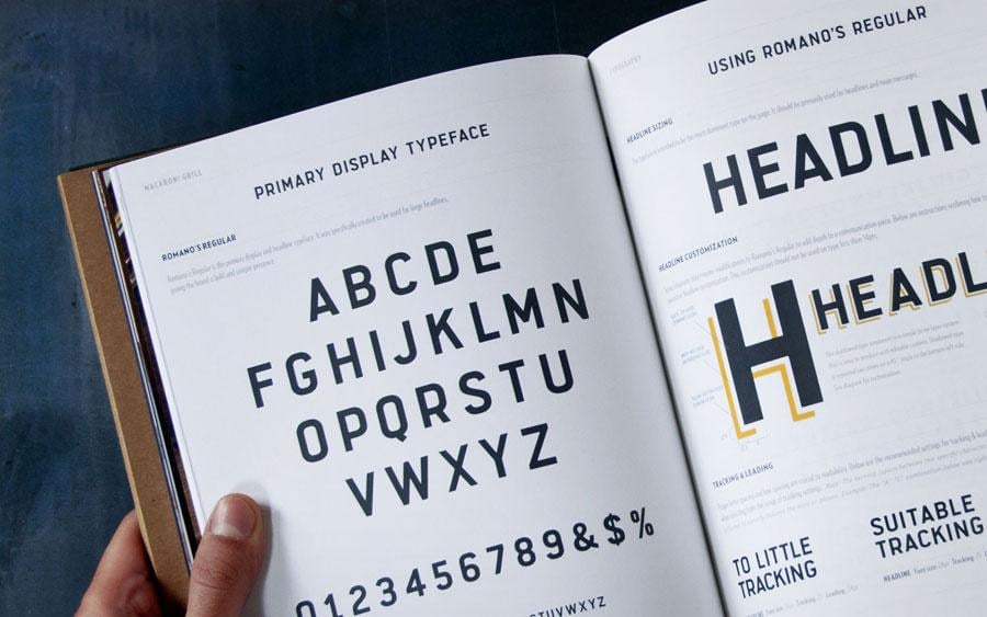
Make no mistake, it’s not just a page where you define the main font that should be used everywhere. That’s one of the most important sections that should include the following information:
- What typefaces can be used
- When is it okay to use each of the typefaces available?
- Can anyone use shadows and outlining?
- What sizing, kerning and leading should be used?
Iconography
Many brands, especially those who work with different web projects, have their own iconography rules.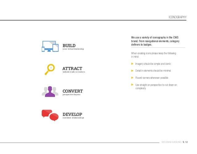
This is one of the examples when company’s brand book specifically asks everyone to keep some basic rules while working with icons or badges. I believe you saw many times how often people combine two completely different type of icons in one block and it looks ridiculous and undermines the brand’s style completely. It’s like when someone puts flat icons along with the shiny ones, it’s simply unattractive and shameful!
Photography
This is my favorite part of the brand book, but it’s often misunderstood by those who create the guidelines. First of all, no… It’s not a set of pictures that you like.
Photography guidelines are created for one basic reason: to give out the basic rules that should be followed while performing the photo shoot for your brand.

The brand book is not just about structuring the overall brand style information, it should help your brand become more memorable and recognizable. So that is why while writing and showcasing the photography style guidelines you should call everyone up to following one style.
Pick all the photos that can be used as an example of your company’s photography style and write a short paragraph outlining the basic principles that should be considered.
For example:
We shoot only B/W or each and every photo should be HDR, etc.
Good examples to look up to
I think that everyone should be shooting for the stars, so in this section, I’m happy to show you the exemplary top-notch brand guidelines from famous companies. Trust me, no one honors the rules more than Apple, Adobe or Nike.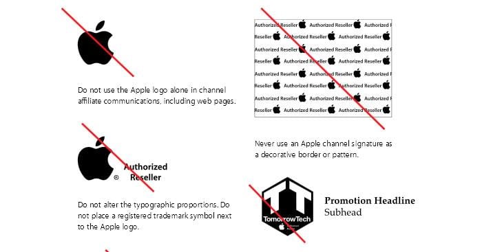
Nike Football Guidelines

NASA Brand Identity Guidelines Circa 1976

Skype Brand Guidelines
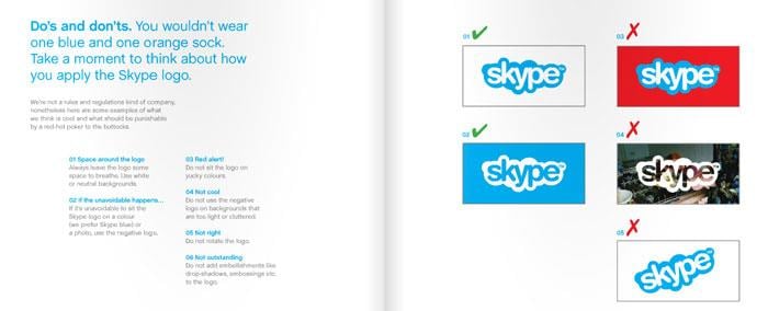
New York City Transit Authority

As you can see there is so much you can do in order to make your brand more attractive. One of the huge steps in your brand’s life is making a statement that you are a serious brand and not some garage brand anymore. Creating a brand style guide is something everyone should consider as a way to develop your brand’s identity.

Before making up your mind to build a design studio, check out these design studio templates.
Get more to your email
Subscribe to our newsletter and access exclusive content and offers available only to MonsterPost subscribers.


Leave a Reply
You must be logged in to post a comment.