

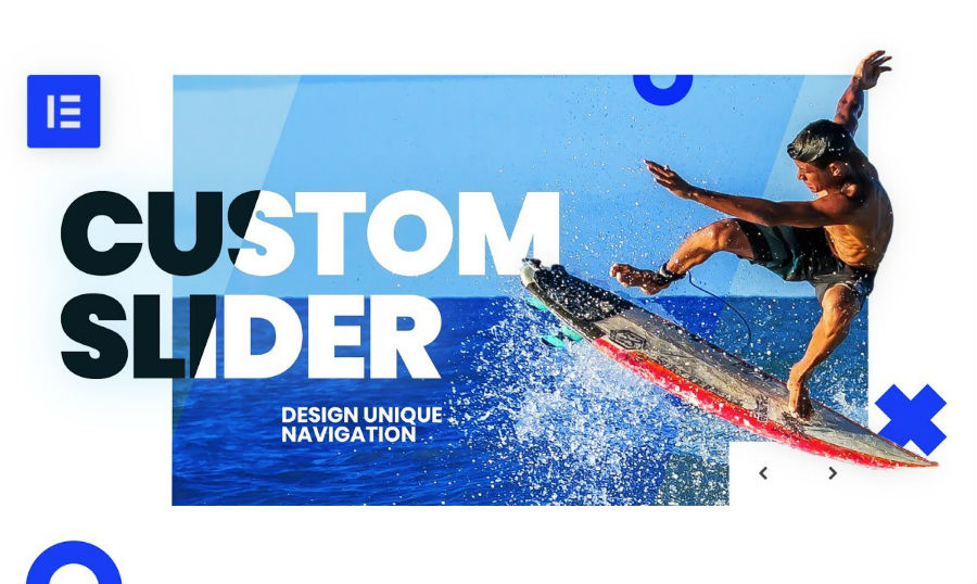
Elementor Slider. The default Elementor Pro "Slides" widget doesn't give you much control over the design of your image slider. Do you want to design a custom Elementor image slider? All you need is a bit of custom CSS code, and some inspiration. Modifying this code you can easily change the color and size of the arrows and move them around. The cool thing about this slider is that it is fully responsive and mobile friendly.

Keep in mind, if you're adding custom CSS to a slider which is a part of a third-party Elementor Add-on (e.g. JetElements), you might need to go and pick the arrows classes using the Inspect tool, because they might be different from those shown in the video. If you're looking for Elementor themes, check our vast collection.
Whether you are using Elementor PRO or some Elementor add-on, sit back, relax and learn how to create an Elementor slider in 15 minutes with this simple trick.


We’ll show you how to set up a full-page slider if you want to have it in 2 column layout.

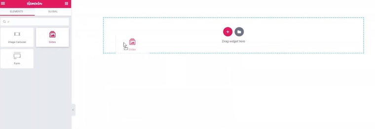
1. Start out by dropping the slides widget into the section you need.

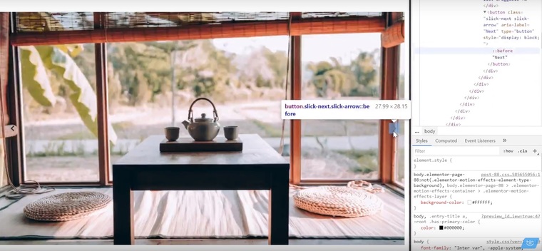
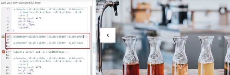
Jump to the preview and press F12 or just right-click and click “Inspect” to see the source code of the page > Hover over this arrow.


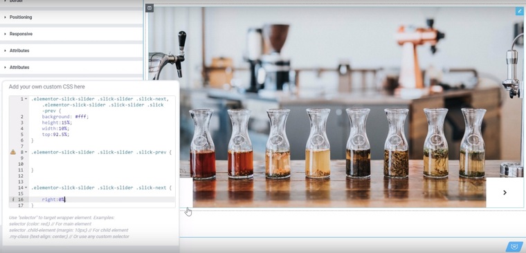
2. Go down to the Styles tab > Copy the code of these arrows.

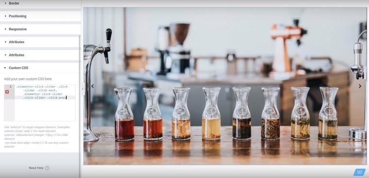
3. Jump to the Elementor editor > Paste the copied portion of code.

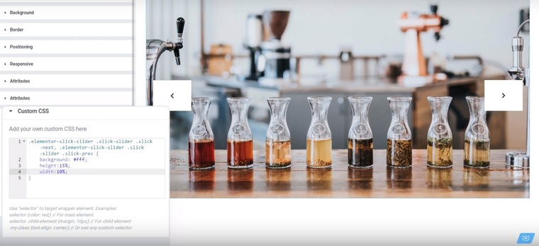
4. Open the curly brackets to write some styles for our arrows.
5. We used white background color in this tutorial, but you can use any other color you like.
6. Set the height and the width properties of the container itself, which wont affect the size of the arrows.

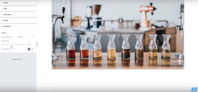
7. You can change the size of the arrows in the Styles tab.
Note that the size of a slider and its elements depends on the Viewport.

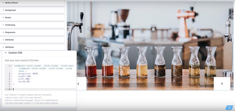
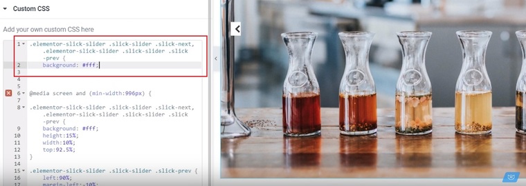
8. Set the property top: 92.5% to move the arrows down, since our arrows have the position absolute as it is written inside the source code.
Note that you need to fine tune this percentage in order to avoid the overlapping of the arrow background when you move the elements with the absolute position.
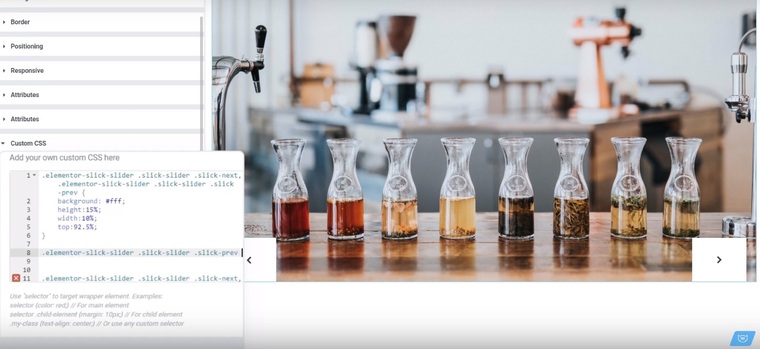
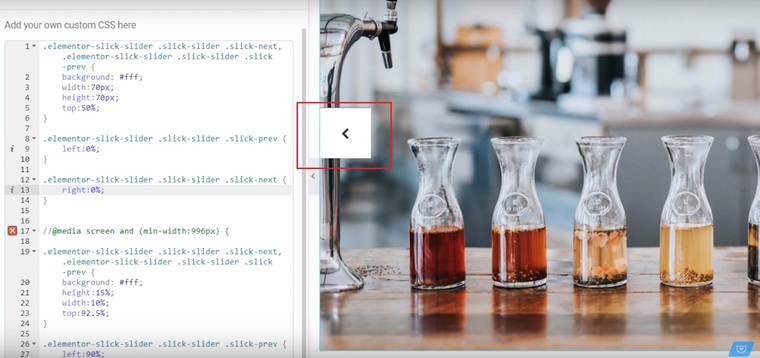
9. Copy the code of the arrows separately one by one and paste it below.
10. Enter the right property 0% of extra space to stick the first arrow to the right edge.
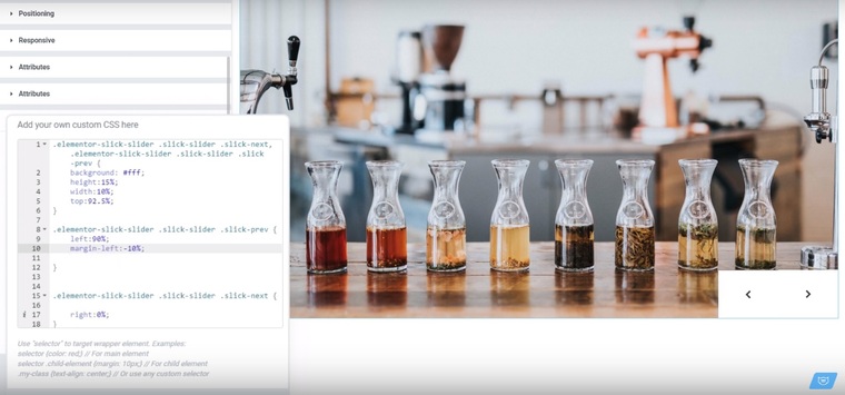
11. To stick the second arrow to the first one you need to use the left property 20% and the negative margin -10% . Update the page.

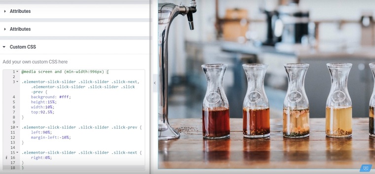
12. We’ll use the media query to make our design responsive. Set the minimum width 996 pixels, so our code will work on the screen sizes bigger than this breakpoint.
13. Put the code into the curly brackets > the media query will turn green.

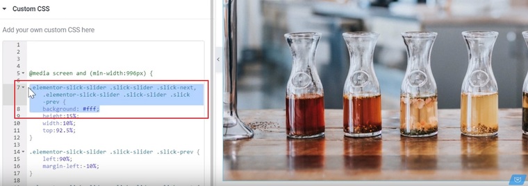

14. Now we’ll write the styles for the tablet devices. Copy and paste the arrows code with the property of the background color, as it remains the same.

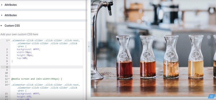
15. Set 70 pixels for the height and the width properties.
16. Use the top property of 50% to move the arrows to the middle of the slider.

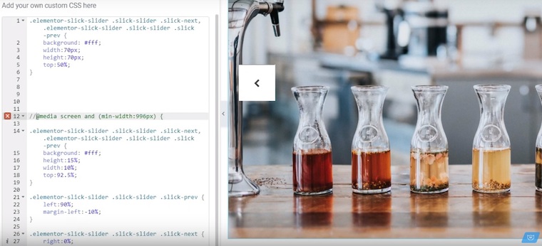
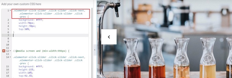
17. Put two slashes to disable the code that is written under the previous media query.


18. Finally we’ll write the styles for the mobile devices. Copy the code snippets of the arrows one by one and paste them separately.

19. Set the properties left:0% and right:0% correspondingly in order to move the arrows to the edges of the slider.

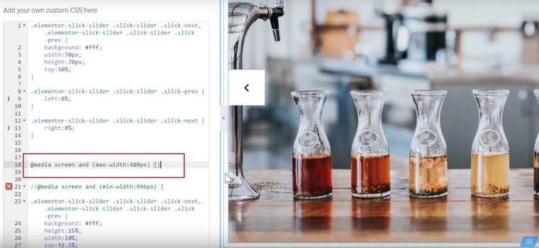
20. Use the media query again and set the maximum width with the breakpoint 480 pixels.
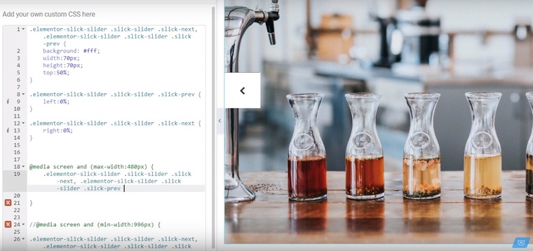
21. Copy the code snippet of the arrows and paste it in the curly green brackets of the last media query.
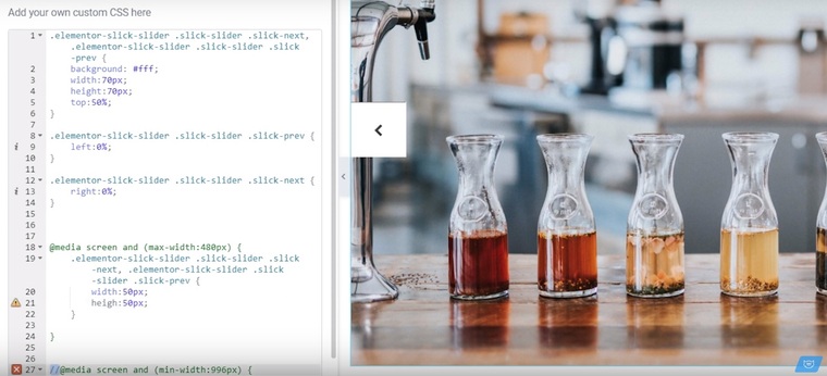
22. Set the width and the height 50 pixels.
Keep in mind that the touch targets on the mobile device have to be at least 40 pixels. Though, we shouldn’t make it too large so they don't take up too much space covering other elements.

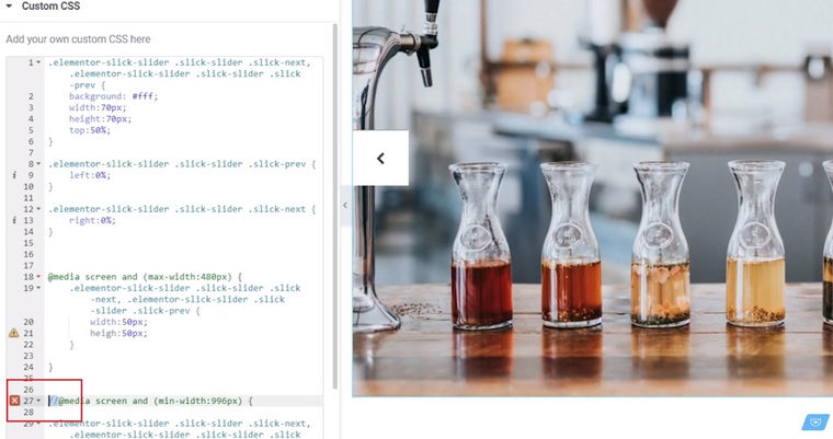
23. Remove these two slashes and update the page.
Get the ready-made code from our card in the video tutorial. You can easily adjust the slider to your layout design, change its dimensions for tablets and mobile devices or move it over to a two column layout, and that’ll require just some minor changes of the parameters. Take a look at our collection of design tutorials with plenty of tricks and our Elementor themes to inspire.
Read Also
How To Add A Background Video To Your Pages With Elementor: Elementor video background Tuts
Create a Responsive WordPress Website with Elementor [Free Webinar]
Elementor Image Slider: How to Add it to Your Website with Page Builder
100 FREE HTML5 CSS3 Registration/Sign-in Forms