
Buttons are tiny but important parts of the website. With the right design, they can increase the conversions:
- it’s a catchy UI element that calls a visitor to action – Subscribe! Order! Live your email!
- it contributes a lot to user-friendly navigation – it’s easier to click a Home Page button once than clicking several times on the Return button. A catchy button that draws the visitor’s attention will lead him/her to the right action/page.
- stylish buttons can complement the design of the website.
Buttons are middlemen between a person and a product. It will give the clue of what to do next to achieve something (add a product to cart, get more information about the product, buy it, etc.).
Thus, buttons are an irreplaceable part of the website. The next question comes to the question of design.

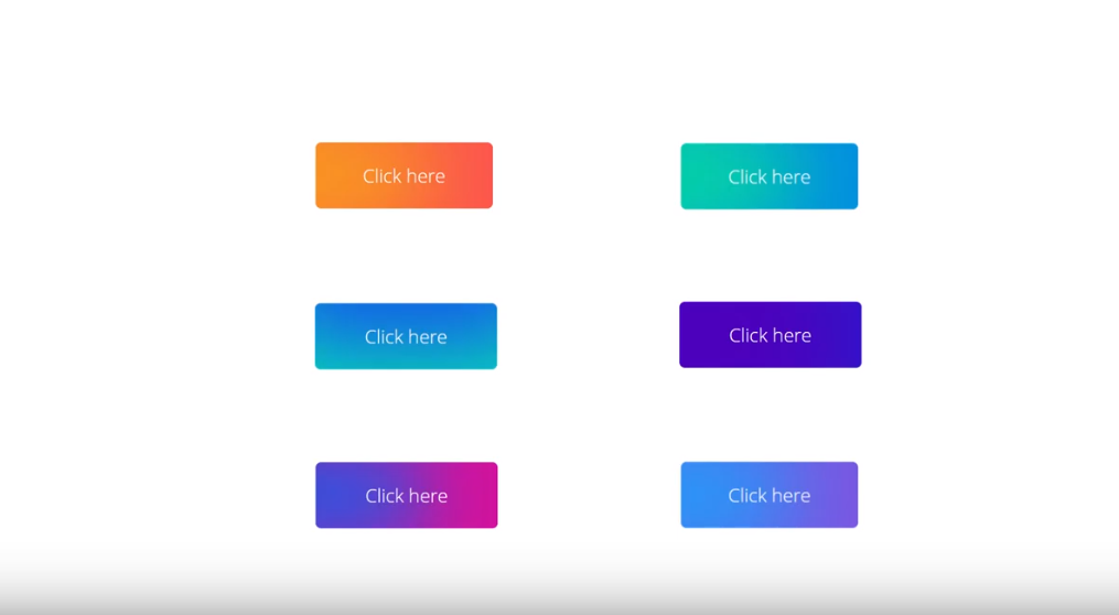
A button must fit the conception of the website. It must supplement the picture and not be an unsuitable puzzle. One of the most beautiful variants of the buttons is the gradient ones. With the right choice of colors, they can become a cherry for the cake.
The good news is that you don’t need to have coding skills to create a gradient button. You don’t even need to have any paid tools. You can create a gradient button in Elementor. For free.
In this article, I will tell you how to create a gradient button without any extra:
- add-ons
- plugins
- Elementor Pro
What you need is only a basic free Elementor version.
How to Design a elementor gradient button
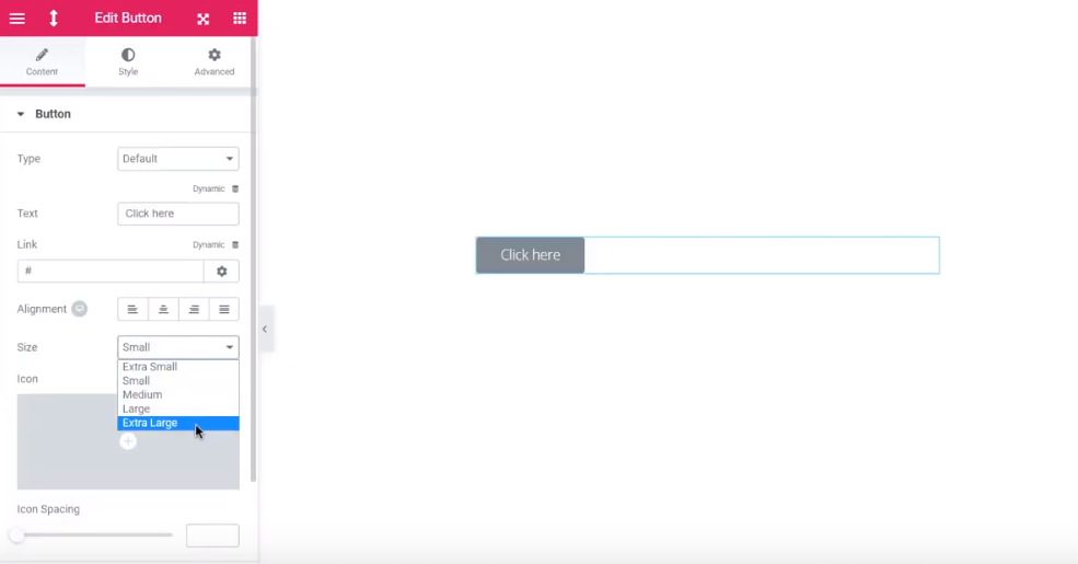
First, you need to open Elementor, click on the button widget and drop it into the effective area. Choose a large size to feel comfortable during editing.

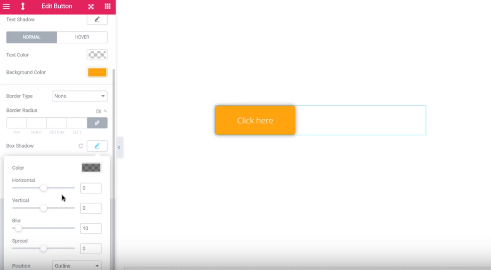
Now, go to Style > Box Shadow, where the magic will happen. We will create a gradient button exactly here.

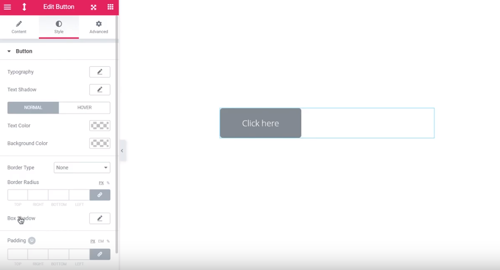
To see the difference, add a background color. Let it be orange.

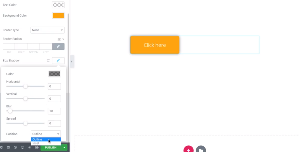
Now, let’s go back to the gradient. First, change the position from the outline to the insert. It will move the shadow from outside of the button to inside.

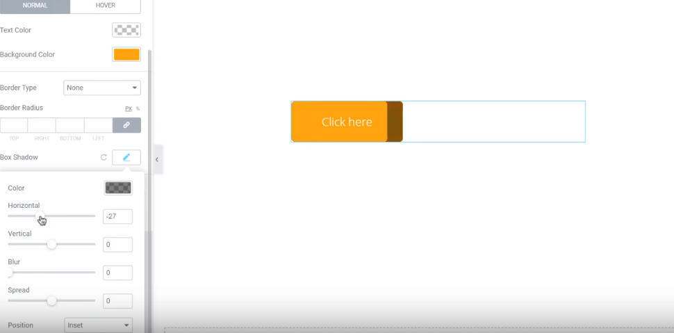
To see the changes better, reduce the blur to the minimum. By changing the position of the horizontal or vertical slider (depending on the type of gradient you want), you will change the “gradient” area.


Then

The spread also increases or decreases the area under the shadow.
So, to move to the final steps:
- Choose the area of the button that the shadow will take up (moving the spread slider).
- Move the horizontal or vertical slider to set the start of the gradient effect.
- Adjust the intensity of the blur.
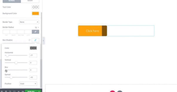
- Add the second color by clicking on the pen icon. Choose the color and adjust the sliders again. The library consists of hundreds of colors.
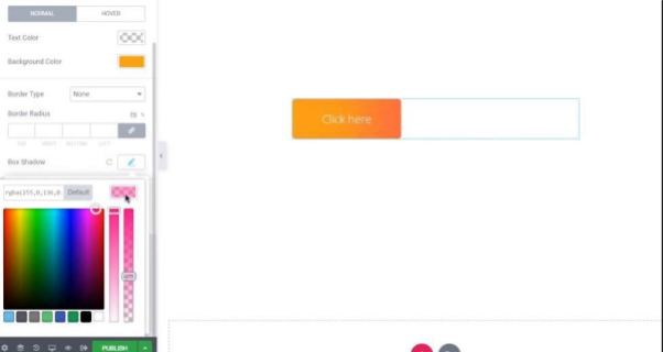
- Play with colors. Change the horizontal and verticle sliders to change the angle of the gradient.


And that’s it! Your gradient button is ready. Save it and insert to the website.
If you are interested in more Elementor products, there is a marketplace with a wide choice. There are plenty of perks for web developers and designers. Once you enter the market, you couldn’t get enough of it!
As a bonus, here is a short checklist of things to consider before placing a button.
1.Make it look clickable.
As a designer or, let’s say, a creator, you know every tiniest detail. The visitor sometimes needs time to decode the meaning of one or another element. To avoid misunderstandings, try to use familiar forms for a button (square or round). A good idea is to add a shadow. A rounded square with a shadow seems clickable. A good idea would be to add a micro-interaction when a person hovers over the button.
2. Don’t make people search for the button.
First, most of the users know where to find the common buttons. An “Add to the Cart” button is usually somewhere near the product. Plus, you can help the visitors to find the button by using contrasting colors. The advanced level would be in following the user’s expectations. For that purpose, ask specialists for advice. You can also visit a couple of websites and track your reactions and thoughts about buttons. First, feel like a user. Second, convert your experience into user-friendly navigation.
3. Don’t make users guess what the button means.
The person won’t likely press the button that says “Cancel”. What will you cancel – the whole chain of your actions on the website or just the last one? A good button always contains a short explanation of its function (up to one line) – Cancel the subscription/the booking.
4. The size matters – don’t make a too big or too small button.
Recently, actually, in 2003, MIT’s Touch Lab found out that most of the fingertips are 8-10mm wide. It means that a good button shouldn’t be smaller than 10mm. It is especially actual for mobile screens. Too small buttons are super uncomfortable to click while using a smartphone. Too big buttons look disgusting.
And last but not least – you don’t need a button for everything. Too many options often make people overwhelmed. Don’t make a person feel like he/she is a pilot with dozens of God-knows-for-what buttons. Be logical.
Read Also
Creative Text Animations with Motion Effects in Elementor PRO [Free Webinar]
How to Create a Hamburger Menu with Elementor Page Builder and JetBlocks Add-On
How To Design Buttons In Elementor | 17 EASY Elementor Button Styles You Can Create in Under 5 Min
The Ultimate List of Add-ons for Elementor