


Creative Presentation Ideas. We all have seen those awful PowerPoint presentations with colorful standard slides, unattractive images, and yeah...a LOT OF TEXT.
Not that I absolutely hate standard PowerPoint design - I simply dislike it (as much as we all do). Truth is, templates offered in PowerPoint are out-of-fashion and perceived as a “poor-quality product” nowadays.
Meanwhile, the presentation itself is a powerful business tool, whether it’s an annual financial report or presentation of a new product.
In this article, I will bring up some PowerPoint examples with cool presentation ideas and creative design techniques. And also, you will learn 10 efficient tips on how to improve your PowerPoint presentation.
30 Creative Presentation Ideas [With Examples]
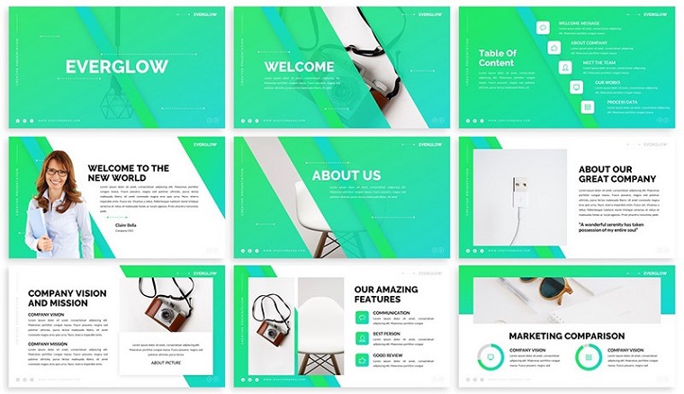
1. NEON COLORS
Bright neon colors help your presentation look “energetic'' and that retains the viewer's attention. You can use neon as a background or highlight its important elements. The main thing is not to go too far with the contrast: you do not need a neon rainbow but rather a bit of neon color to place an accent.
Everglow - Gradient PowerPoint Template

2. TRENDY MINIMALISM
A minimalistic composition is a great way to stand out from other presentations. The trick is to exclude all the extra elements and focus on significant slideshow ideas and visual details. The minimalistic design creates a feeling of calm and confidence. The real struggle, however, is the ability to spot the difference between minimalism and boredom.
Stylish Minimal PowerPoint Template


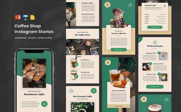
3. VERTICAL SLIDES
We are used to horizontal presentations as a generally accepted standard. But with the popularity of Instagram, vertical stories have come into our lives faster than the 2020 pandemic. So why not start creating vertical presentations for its better perception in social media? Vertical layout is just one of the known tricks, you can easily combine it with other unique presentations ideas.
Coffee Shop - Social Media Instagram Stories PowerPoint Template

4. EXQUISITE VINTAGE
Get your presentation a vintage look if you want to be original. This would be a relevant theme to creative businesses where non-traditional design is more than welcomed. Vintage vibes relate to sepia-toned. The other important moment is a relevant color scheme: pastel turquoise green, ochre yellow, and washed-out blue and orange.
Retrospective PowerPoint Template


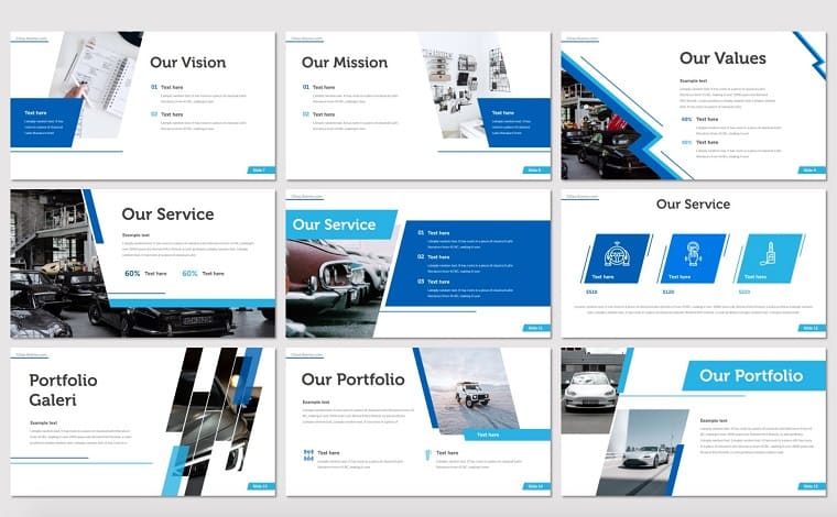
5. UNUSUAL PHOTO CROPS
Inserting a rectangular image, or even a circled one (still considered as something creative) in your plain-white presentation is boring as hell. There are a hundred other options to shape photos in your slides: from triangles to polygons to letter shapes and a brushstroke. Depending on the message of your innovative presentation, different options should be considered. The most important factor is giving your image the shape that works best with the overall design and content.
Citax PowerPoint Template

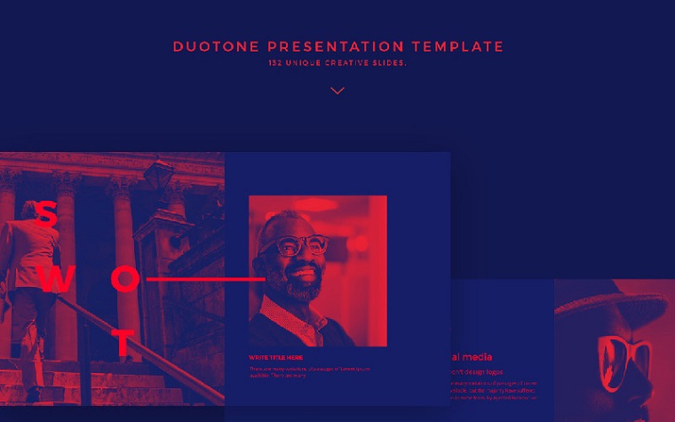
6. DUOTONE
Duotone is not among the most common creative project presentation ideas. The duotone effect is achieved by combining two contrasting tones of different shades, and it really looks bold and modern. Yet, many people consider it a “heave” design solution.
Duotone PowerPoint Template

7. MONOCHROME
Monochrome is about the same color tones, but with different saturations. The paler shades can be used as a background, while the brighter ones for headings and decorative elements - or vice versa. You can even apply the selected tone to photos to make the presentation look harmonious. Just like here:
Sunrise City PowerPoint Template


8. UNUSUAL IMAGE FRAMES
Depending on the idea of your presentation, you can choose a more rigorous or, conversely, playful image frame. The main thing is that collages and frames do not distract the viewer from the information on the slide. I would recommend using a ready-made PPT template with photo frames that were already organically set - just like these two:
Multipurpose Business PowerPoint Template


Genuises Creative Business PowerPoint Template


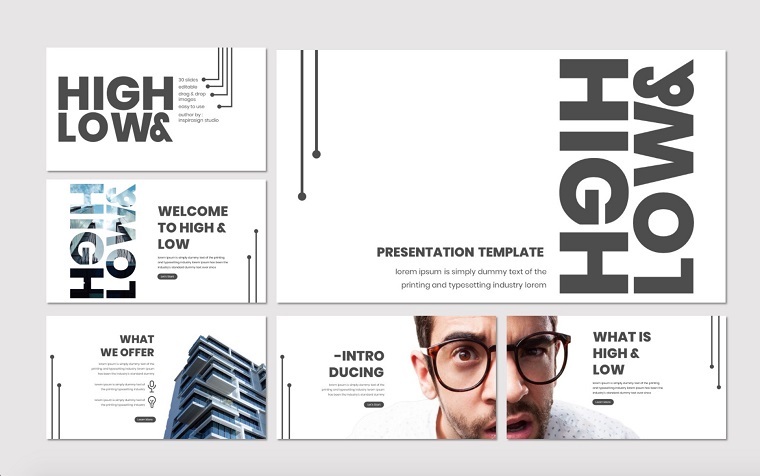
9. BRIGHT and BOLD FONTS
The large and wide print will draw attention to the headline. If you want to enhance the effect, you can arrange the labels vertically or slightly push the title over the edges of the slide.
You can play with different types of fonts. Which ones are right for you: angular and strict or rounded and cute? Remember, though: large and bold types will look great on slides with the least text:
High & Low - PowerPoint Template

10. CIRCLES
A circle represents integrity and a natural sense of completeness. Circles can also mean eternity and constant movement. Circles help the presentation design to look more friendly and emotionally attractive. You can use circles for decoration or as image frames:
Brishio PowerPoint Template


11. RIPPED PAPER
Sometimes visual details help to create the right mood. Jagged edges and the effect of ripped paper creates the feeling of handmade presentation. Most likely, it won’t look relevant for corporate identity presentations but will be a good element to less-official slides. Take a look at the example below:
Walkout PowerPoint Template


12. BLACK-AND-WHITE
What can be better than classics? Black-and-white style always looks elegant and sophisticated. Also, it perfectly complements the minimalist design with 1-2 additionally implemented colors:
Blanked - Minimal PowerPoint Template

13. COSMIC STYLE
You might think: “This is not for my presentation - it has nothing to do with space”. Well, it shouldn’t be about space - it’s more about bright and abstract backgrounds featuring dark galaxies, nebulae, and bright stars. Give it a try and you’ll be amazed by how well it looks in any of your presentations:
Brain Structure PowerPoint Template


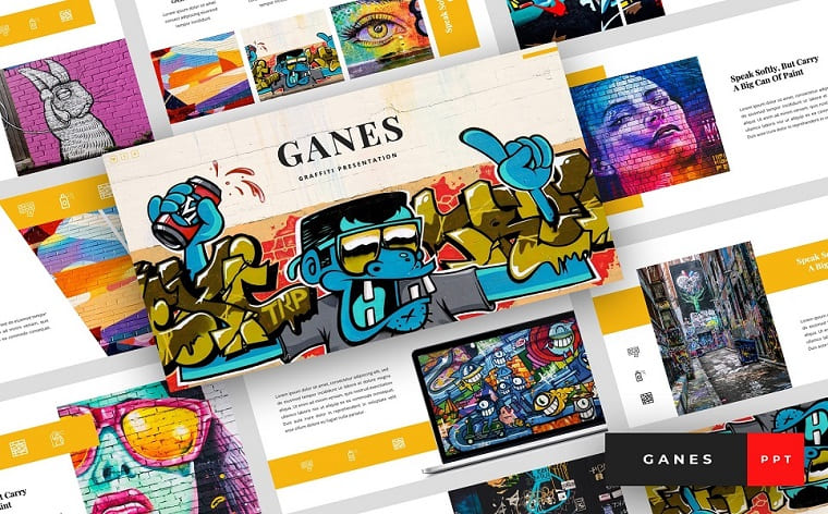
14. GRAFFITI
Bright and colorful graffiti is a great way to make your presentation closer to modern trends and give it a vibrant look. Street art can be used not only as a background: you may also experiment with graffiti fonts or shapes:
Ganes - Graffiti Presentation PowerPoint Template
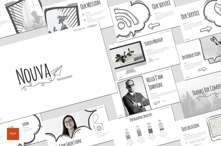
15. POLAROID
You can use a polaroid photo in a vintage design or as a trendy modern element (reborn by Instagram). Polaroid theme will be a universal solution, believe me:
Nouva PowerPoint Template

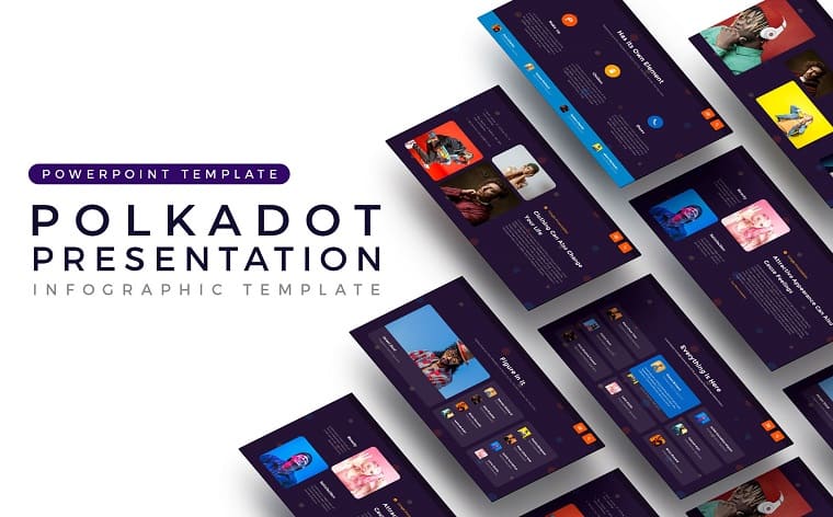
16. POLKA DOT
The polka dot pattern is a simple and universal technique that will spice up even the most boring data slide. Dots can be used as a decorative element: small and pale ones will create depth, while large and bright would be a great emphasis:
Polkadot PowerPoint Template
17. TIMELINE
A timeline is a great way to visualize a series of events or an action plan. You can place such a scale on a separate slide or use it through the entire presentation. One way or another, they make it as one of the not-so-obvious-but-still-awesome multimedia presentation ideas:
Barra Minimal PowerPoint Template


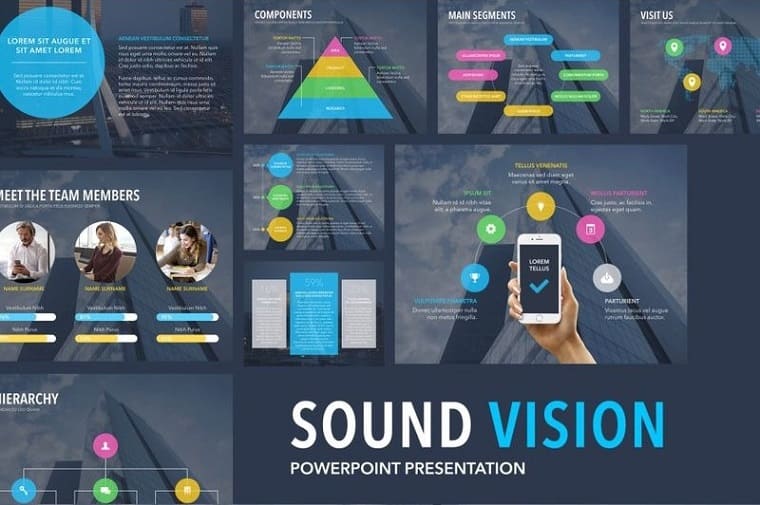
18. DATA VISUALIZATION
If you have too many numbers on the slide, you risk overloading the viewer and losing one’s attention. One way to solve this problem is to turn numbers into simple and clear schemes. Visualizing helps you present your data in a more interesting and a more clear way. At the end of the day, we would always choose to read infographics instead of bulky text:
Sound Vision PowerPoint Template
19. MIND MAPS
Mental maps visualize complex concepts and can be of different forms: pie chart, tree, flowchart, structures, and more. Each type of a mind map serves its own purpose; for example, a “process” helps to visualize a step-by-step plan, while a “tree” shows viewers the unit structure:
Puzzle & MindMap-Slides PowerPoint Template


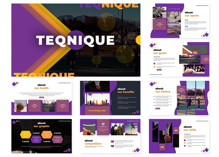
20. CONTRAST COLORS
The contrasting colors help important details “jump out” of the slide - made in a good way, of course. Before choosing the contrasting colors, you need to know the laws of color combination. Such tools as Adobe Color or ready-made templates with set-up color combinations will be helpful for newbies like you:
Teqnique | PowerPoint Template

21. TREE DIAGRAM
A tree chart is a great way to classify and organize information. A “tree” means each subsequent thought continues the previous one, and information that’s close in meaning can be grouped into “branches”. The tree diagram is used to visualize cause-effect relationships or multi-level systems:
Team Hierarchy PowerPoint Template


22. CHALK and BLACKBOARD
Chalk and blackboard are mostly associated with the school classroom. Nonetheless, it’s a spectacular and flexible design style to go for. A blackboard background and a beautiful handwritten font are all you need to create a harmonious design. Add some fonts and shapes with a chalk texture effect and you will kill the game:
Chalk PowerPoint Template

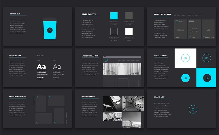
23. BLACK BACKGROUND. WHITE FONT. COLOR ACCENTS.
All the colors look brighter on a black background. The white font is perfectly readable, and bright colors will come in handy for accents. When choosing a color palette, make sure the chosen colors do not conflict with each other and with the black background:
BrandBook Brand Identity PowerPoint Template
24. STRIPES
Stripes make a classic design pattern. They can be used both as an unobtrusive texture for the background and as a powerful accent. Stripes look relevant both as one of the school presentations ideas or as elements of corporate presentations:
Clean Colorful Presentation PowerPoint Template


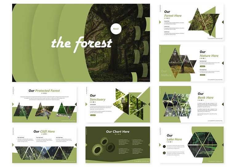
25. NATURAL
Natural elements will always look organic and it’s not always that your topic has to do with nature. Images of leaves, palm fronds, green color, and shades create a harmonic design that fits almost any content (provided it doesn’t focus too much on the nature elements):
The Forest | PowerPoint Template
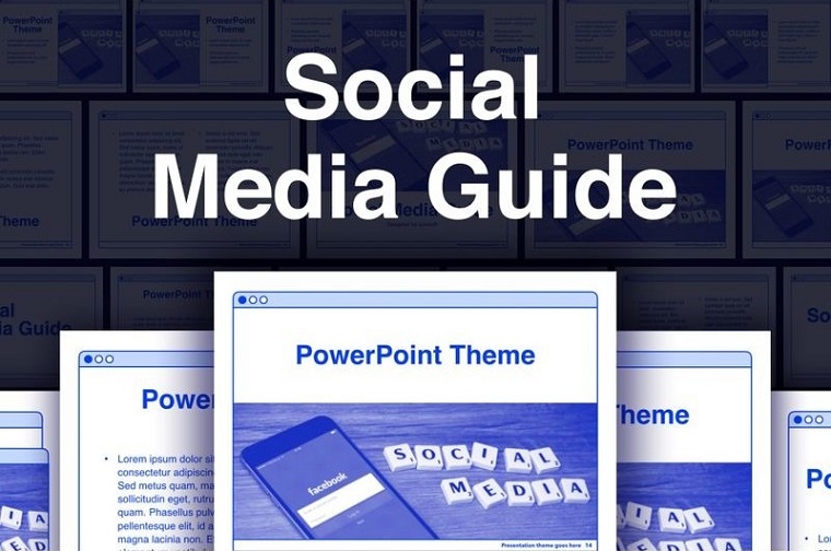
26. SOCIAL MEDIA STYLE
Social media templates aren’t something innovative today but it looks great anyway. You can insert any of your content in the template and it will look fresh.
Social Media Guide PowerPoint Template

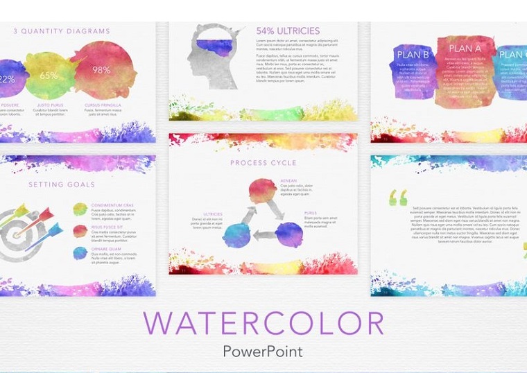
27. WATERCOLOR
Watercolor looks super fresh in terms of coloring. You may have a watercolor background or separate strokes as if paint left some strains on your slides. Watercolor is suitable for almost any topic - it’s rather about choosing between calm or more vibrant colors. Warm, light shades look gentle and feminine, while saturated and bright strokes add creativity and energy.
Watercolor PowerPoint Template

28. BRIGHT and FUN COLORS
Choosing vibrant colors is highly recommended if it’s relevant to your topic. This technique is great if you are ready to create, experiment, and go beyond rules. Select a harmonious palette of 5-6 colors and use them for painting shapes, blocks, fonts, frames. Ready-made templates will help you combine colors harmonically:
Smash Animated PowerPoint Template

29. ARROWS
Arrows symbolize the direction. They will be a great addition to your charts, diagrams, and graphs. Arrows can even form the basis of your design. Depending on the color, size, and thickness, they can carry different messages. Choose the style that complements your project presentation ideas.
Arrow - Infographic PowerPoint Template
30. JIGSAW PUZZLES
Pieces of a jigsaw puzzle can be used to make charts, infographic diagrams, or interlocking frames. The idea behind puzzle pieces is that things come together to form a whole and this concept can be used for any slide and any kind of presentation. Make sure to use a suitable color palette that matches your theme and the rest of the presentation.
Puzzle - Education PowerPoint Template

Take a look at the original resource that describes 100+ visual presentation ideas that will delight your audience and include other non-design tips for a successful presentation.
10 More Tips to Boost Your Presentation
According to Alan Goeman, the creator of eSlide.com, the issue is that most companies stick to one standard presentation template and fear to try new design approaches.
They ignore the fact that an engaging presentation should have visual dynamics: a bright cover, a photo with a thesis statement, rich slides with graphs and accents, complex layout, etc. This approach can be straining for the audience but that is just the actual point - cheering people up with your performance and visual accompaniment.
What’s important first is to throw out the hackneyed rules from your head. The text on a dark background is NOT hard to read, red and black does NOT mean something negative, and the font size CAN be different on different slides.
A killing presentation is a combination of great design and content. We got it all clear with the design, so now we have 10 more lifehacks considering the content:
- The first slide should display the main value for the client that your business can offer. A person should see your first slide and understand: “Wow! This is exactly what I want! I am interested to watch this presentation until the end." Oftentimes, first slides showcase reports on current campaigns or partner proposals. And it’s just NOT something a client is eager to know.
- Do not use the same slides. Let me guess: your last business presentation had 10-15 identical white slides in a row with a company logo placed in the corner. “Why not? My presentation looked minimalistic and helped viewers stay focused on the text!” - you may think. Well, reality works a little differently. Slides have different functions and different types of content. This is not a book that conveys a message with the text only, but rather a more interactive visual tool.
- Explain the value of your business idea. Oftentimes, presenters describe the product/service without specifying its value. Clients will be more pleased to hear who exactly would need it and for which purpose.
- The image is king. People love images. Even if your presentation consists of dry analytics or it’s a super-serious presentation that can’t have interactive elements, know that it CAN.
- Use contrast. The whole design is built on contrast. Big numbers and words, different font sizes, and colors - anything that catches the eye will stay in people’s memories longer.
- Add some air. Just like music consists of notes and pauses, the design is not only an object but also free space in between. Do not place important objects close to the edge of the slide: no one will read your conclusion placed at the very bottom of the slide.
- The design goes last. First of all, you fill the slides with content in accordance with goals, objectives, and audience. Working on design should be your last stage.
- If you are going to perform, do not linger on the slide for longer than one minute. Otherwise, the presentation wouldn’t be less dynamic. The one-hour presentation should contain approximately 60 super-dynamic and light slides. You can stay longer on some important slides with statistics or interesting cases, but going over 15-20 minutes is a NO.
- Practice makes perfect. You don’t need an audience to practice your presentation - doing it “for yourself” is also an option. Practicing will give you a clue what content you better emphasize on and which one isn’t worth to be mentioned. This would be helpful when you go through analytics, tables, or graphs.
- Finish with the CTA. A call to action is the whole point of why you’re doing this. Who cares about “Thank you for your attention” or other nonsense they usually say in the end? Smart presenters give an appeal, something like “Let's have a meeting and discuss the details, or “Let’s launch a test project, these are our contacts”.
Conclusion
A PowerPoint presentation is not just a simple visual accompaniment. If you take care of your design and content, it will become an important emotional trigger for your potential partners, clients, or investors.
Think about it: if the presentation doesn’t catch your eye, would it be of any interest to everyone else?
Read Also
15 Purple PowerPoint Templates 2020 as a Way to Appeal to Your Audience’s Emotions
10 Popular Fonts You Should Absolutely Avoid Using In Presentations
100 Best Business Presentation Templates 2020. Cool! Great! Awesome!