CSS Media Queries for All Devices and Browsers (Including IE7 and IE8)
CSS3 keeps on impressing and frustrating web designers and developers. It brings a lot of possibilities and resolves a lot of problems. However, there happen to be some drawbacks in CSS3 still annoying the tech geeks. This is where CSS media queries may come in handy. But, before moving further to consider the advantages they bring, let’s start with determining what media queries are.
Simply put, media queries define the modules in CSS3 which enables rendering so that the content adapts to different conditions like screen resolution. Media query is built on media type and one or more expressions that include media features. The latter determines if the result of the query is true or false. Generally, media queries allow for creating responsive layouts and adapt them to users who browse from different devices without changing the content.
With CSS media queries defined, it’s time to consider them in action.
In CSS3, web developers/designers can define a media type such as screen or print, and specify the look of the content by setting conditions such as width, height, or orientation. A CSS media query combines a media type and a condition that shows how web content will appear on a particular device.
CSS Media queries are an excellent way to deliver different styles to different devices, providing the best experience for each type of user. A part of the CSS3 specification, CSS media queries expand the role of the media attribute that controls how your styles are applied. For example, it’s been a common practice for years to use a separate style sheet for printing web pages by specifying media="print".
Making Your Website Responsive What Are Your Options [Free eBook]
CSS Media queries take this idea to the next level by allowing developers target styles based on a number of device properties, such as screen width, orientation, and so on. Following table demonstrates CSS media queries for all browsers in action. They all show the same web page as it's viewed in a desktop browser, tablet or an iPod touch.
There's a thing about media queries, you don't need to use them if you opt for a ready-made website template that is already optimized for all possible devices and screen resolutions.
/* Smartphones (portrait and landscape) ----------- */
@media only screen
and (min-device-width : 320px)
and (max-device-width : 480px) {
/* STYLES GO HERE */
}

/* Smartphones (landscape) ----------- */
@media only screen
and (min-width : 321px) {
/* STYLES GO HERE */
}

/* Smartphones (portrait) ----------- */
@media only screen
and (max-width : 320px) {
/* STYLES GO HERE */
}

/* iPads (portrait and landscape) ----------- */
@media only screen
and (min-device-width : 768px)
and (max-device-width : 1024px) {
/* STYLES GO HERE */
}

/* iPads (landscape) ----------- */
@media only screen
and (min-device-width : 768px)
and (max-device-width : 1024px)
and (orientation : landscape) {
/* STYLES GO HERE */
}

/* iPads (portrait) ----------- */
@media only screen
and (min-device-width : 768px)
and (max-device-width : 1024px)
and (orientation : portrait) {
/* STYLES GO HERE */
}

/* Desktops and laptops ----------- */
@media only screen
and (min-width : 1224px) {
/* STYLES GO HERE */
}

/* Large screens ----------- */
@media only screen
and (min-width : 1824px) {
/* STYLES GO HERE */
}

/* iPhone 5 (portrait & landscape)----------- */
@media only screen
and (min-device-width : 320px)
and (max-device-width : 568px) {
/* STYLES GO HERE */
}

/* iPhone 5 (landscape)----------- */
@media only screen
and (min-device-width : 320px)
and (max-device-width : 568px)
and (orientation : landscape) {
/* STYLES GO HERE */
}

/* iPhone 5 (portrait)----------- */
@media only screen
and (min-device-width : 320px)
and (max-device-width : 568px)
and (orientation : portrait) {
/* STYLES GO HERE */
}
Media Queries Support
CSS Media queries are supported in Internet Explorer (IE) 9+, Firefox 3.5+, Safari 3+, Opera 7+, as well as on smartphones and other screen-based devices.
Although older versions of IE don’t support media queries, still there is a way you can make it work.
Even though everyone thinks that earlier versions of IE are already extinct, there is a great amount of people using them, her are some stats:
| 1 | Chrome 37 | 24.85% |
| 2 | Safari 7 | 10.60% |
| 3 | Firefox 32 | 8.03% |
| 4 | Internet Explorer 11 | 7.31% |
| 5 | Chrome 36 | 5.62% |
| 6 | Android 4 | 3.94% |
| 7 | Firefox 31 | 3.91% |
| 8 | Internet Explorer 8 | 3.66% |
| 9 | Internet Explorer 9 | 3.08% |
| 10 | Internet Explorer 10 | 2.34% |
Normally IE5 to IE8 do not support CSS3 Media Query. But at least IE8 should support CSS3 Media Query and that is very important for cross-browser responsive web design. Here I will tell you how you can solve the CSS3 Media Query issues for IE.
Here is a great jQuery plugin called css3-mediaqueries. It's very easy to use.
Download jQuery plugin and include downloaded script just before the </body> like this:
Or you can use the following way to include the script.
Then write media query in style sheet and check it in IE. It will work nicely with IE8, IE7, even in older versions IE6 or IE5.
Notes
It doesn’t work on @import’edstylesheets
Write media query the following way:
@media screen and (min-width: 980px)
{
/* CSS Document */
}
Use keyword 'and' in query (‘or’ is not supported).
One thing must be noted is that the "screen" is necessary:
@media (min-width: 481px) { /* ... */ } will not work, it must be
@media screen and (min-width: 481px) { /* ... */ }
HTML Themes Made to Look Good on All Devices
When looking for ready-made HTML web designs made with clean and clear CSS, look through the collection of themes in the TemplateMonster digital marketplace. All made to look stunning on all devices and web browsing applications, they deliver the perfect functionality in all web environments.
Multipurpose Intense - #1 HTML Bootstrap Website Template
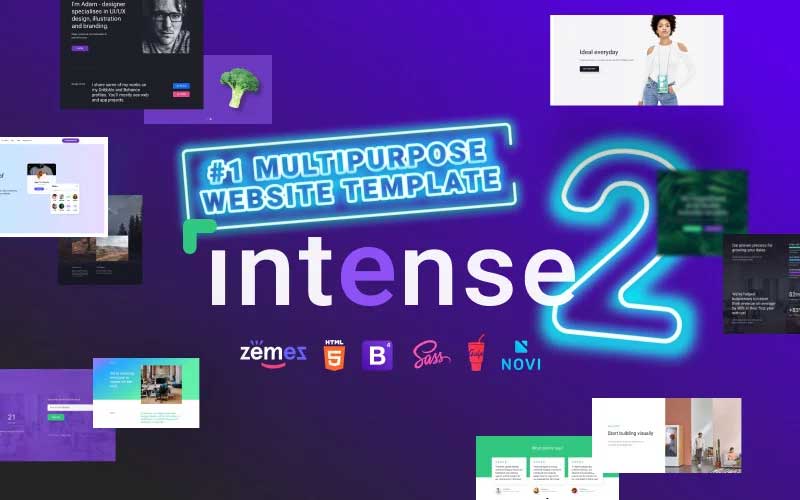
Intense is a fully-featured, multipurpose website template. It comes loaded with literally everything your website needs. Thanks to its clean design and trendy layout, it's highly flexible and dynamic. Also, the template can be easily tweaked to perfectly match your brand identity. Intense can greatly skyrocket your sales as well as attract more customers to your website. This responsive HTML template is pre-loaded with an extended set of pages that are 100% ready-to-use. For instance, they include over 30 Portfolio Pages, 50+ Blog Pages, 30+ eCommerce-ready Shop Pages, etc. Such a variety of pages can easily make your website more informative and attractive.
Hitech - HTML5 eCommerce Website Template
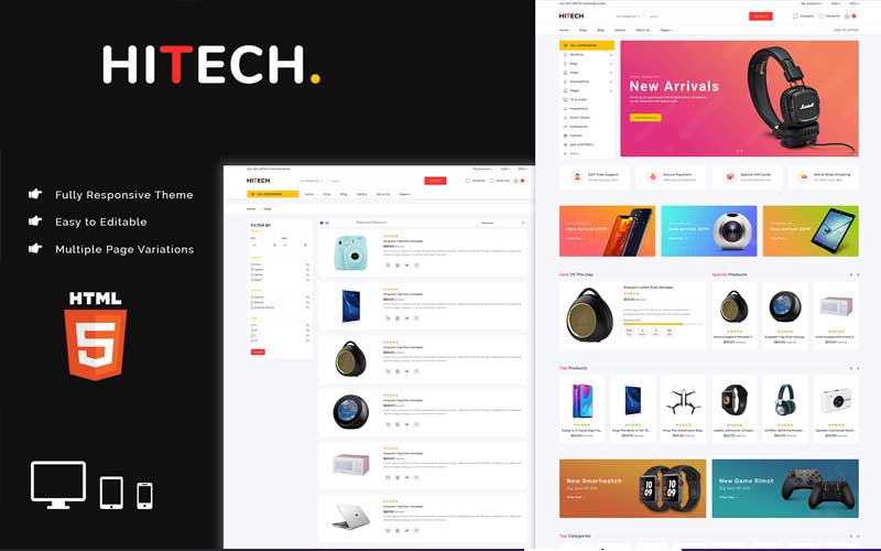
Hitech is Multipage Ecommerce HTML5 is the biggest template with a modern look. Hitech is super responsive template is suitable for any kind of Ecommerce Website. It is built using Bootstrap4 framework. Hitech HTML Template includes every possible option and section as you needed for a Ecommerce website. Fully customizable, responsive and optimized for performance, It's makes easier than ever before to present properly and create your website for user experience.
Brave Theme - Multipurpose HTML Website Template
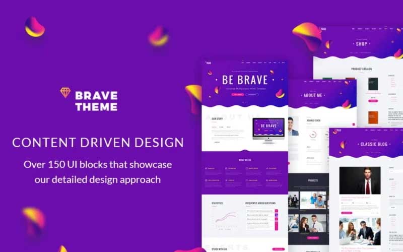
The Brave multipurpose HTML website template provides everything you need for building a website your business needs. Even if you are a freelancer, you might find something your website needs. With over 100 HTML pages and 12 niche layouts, there's a lot to choose from. Also, our solution provides a wide range of well-integrated features for your website.
DreamSoft - Software Development Company Multipage Website Template
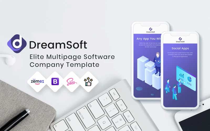
With the software development agency website template, you receive everything your company needs to succeed online. First of all, it includes an impressive design crafted by our team. Also, its informative layout is based on Bootstrap 4. It allows for high responsiveness as the template supports all modern devices & various display resolutions. Besides, our template offers a variety of useful features for your website, including:
- W3C valid & SEO-ready coding
- Cross-browser support
- Google Maps & Google Fonts
- SCSS & Pug source files
- Parallax effect
theFuture - Web Design Agency Multipurpose Website Template
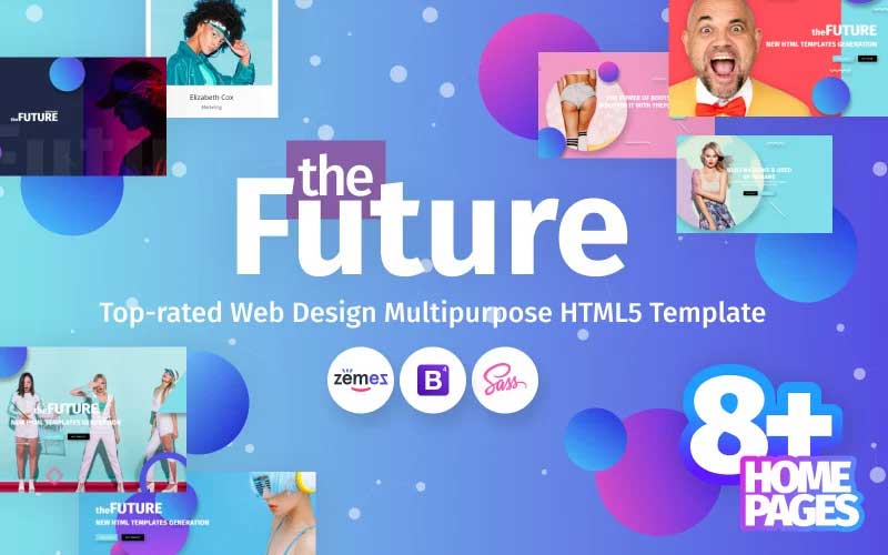
theFuture web design agency multipurpose website template provides impressive design for your site. It also comes with a variety of layouts designed for various types of content. With diverse page layouts and content sections, the possibilities are endless. You can describe your services or tell the story of your company with text, images, or videos. Moreover, we encourage you to use the numerous features of this template. Here are some of them:
- W3C valid coding;
- SEO-ready & responsive layout;
- Google Fonts & Google Maps;
- Impressive CSS3 transitions and animations;
- The smooth Parallax scrolling effect;
- Cross-browser support.
That's it, if you have some other ideas on how to use CSS media queries feel free to drop your ideas in the comments below. Have a great day.
FAQ
It is a function, added in CSS3 which allows the user to define the conditions when some rules will be used. For example, it allows changing the layout when the width of the screen becomes smaller. Or to download the file with printing properties only when users want to print something.
They allow adapting the content of your website to the specific device and browser so that all the users will have the best possible experience.
Internet Explorer (IE) version 9+, Firefox 3.5+, Safari 3+ and Opera 7+.
Read Also
CSS3 Cheat Sheet for Dummies Learning to Code
How To Make Stylish Checkboxes And Radio Buttons With CSS3

How to make your website responsive and how to work with Bootstrap like a pro? Check out in Ahmed's articles.
Get more to your email
Subscribe to our newsletter and access exclusive content and offers available only to MonsterPost subscribers.

Leave a Reply
You must be logged in to post a comment.