

- 3 tips to make your text legible in dark mode
- Dark mode: scientific proof
- What is contrast polarity?
- Dark mode readability issues for people with visual disabilities
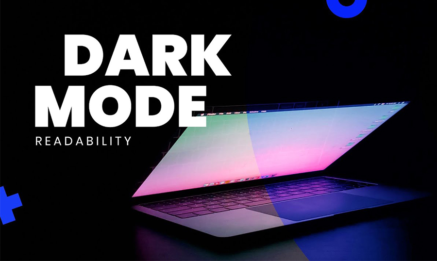
Speaking of the dark mode UI trend, we can’t help but mention readability. That is because readability is so dependent on contrast between the text and background. In our previous video on dark mode color palette, we've explained why picking similar colors for the font and the backdrop is not a good idea.
Still, even highly contrasting color combinations like black-on-white or white-on-black have their pros and cons. If you want to try dark mode UI trend on your website, check out TOP 30 Dark WordPress Themes 2020.
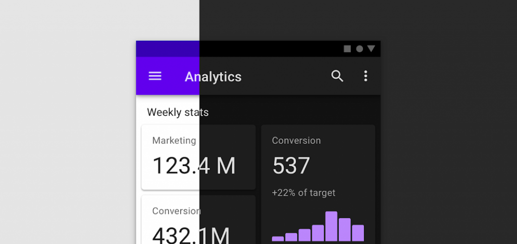
Research has proven that in most cases, black text against the white or light background is the most readable combo. However, it can put a strain on the user’s eyes for long periods of time. That’s the reason why text-heavy interfaces where the user will be reading for long periods of time often use the light text against the dark background combination.
This approach is often used in apps for programmers. When coding for hours at a time, they need a UI that will not cause fatigue and allows their vision to stay sharp.
3 tips to make dark mode ui text legible
- Mind the point size, kerning and leading.
- Adding more white space can help readability. and you might even try lighter weights, because light text on dark background tends to appear bolder.

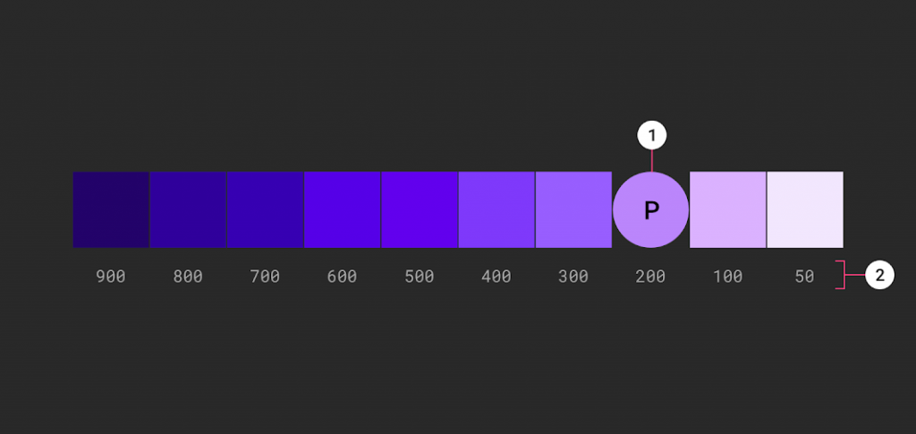
Use lighter tones (colors in the 200–50 range) because they have better readability on dark theme surfaces. Lighter variants won’t make the UI less expressive but they help you maintain appropriate contrast without causing eye strain.
3. Use “On” colors for text.
These are colors that appear “on” top of components and key surfaces. The default “on” colors for a dark theme is pure white (#FFFFFF). But #FFFFFF is a bright color and it would visually “vibrate” against dark backgrounds. That’s why Google Material design recommends using a slightly darker white:
- High-emphasis text should have an opacity of 87%
- Medium emphasis text is applied at 60%
- Disabled text uses an opacity of 38%.
Quick tip: Light text on a dark background can appear more bold than dark on light. That’s why you may want to use lighter font weights for dark mode.
Dark mode: scientific proof
Scientifically the light vs dark mode readability dilemma in modern UI design can be explained the following way:
“Recent research on the legibility of digital displays has demonstrated a "positive polarity advantage", in which black-on-white text configurations are more legible than their negative polarity, white-on-black counterparts.”
What is Contrast Polarity?
Contrast polarity is a term used by scientists to describe the contrast between the text and the background:
- Positive contrast polarity (light mode) refers to dark-font text on light background.
- Negative contrast polarity (dark mode) refers to the combination of light (white) text on dark (black) background.
So, black text against the white background is better than white text against the black background. The researchers from Germany studied two groups of adults with normal (or corrected-to-normal) vision: young adults (18 to 33 years old) and older adults (60 to 85 years old).
The participants had to complete two types of tasks:


- A visual-acuity task - the participants were shown a symbol similar to the letter “C” oriented in various ways and were asked to identify where the gap was (e.g., top, bottom).
- A proofreading task, which involved reading a short passage and identifying different types of errors.
The tasks were presented in different contrast polarities — for some participants, they were in dark mode and for others they were shown in light mode. Each participant saw only tasks in one contrast polarity (e.g., only dark mode).
The participants were asked to assess their fatigue levels before and after taking the tests. They were offered to rate their eyestrain, headache, muscle strain, back pain, and subjective well-being at the beginning of the experiment, as well as at the end.
As a result, light mode won across all dimensions:
- irrespective of age, the positive contrast polarity was better for both visual-acuity tasks and for proofreading tasks.
- However, the difference between light mode and dark mode in the visual-acuity task was smaller for older adults than for younger adults. Although light mode was better for older adults, too, they did not benefit from it as much as younger adults, at least in the visual-acuity task.
Dark Mode Readability Issues for People with Visual Disabilities
For people with visual disabilities, there is less of a consensus. Research has shown that people with “certain types of impairments (e.g., cataract) do better with dark mode,” with some users with visual disability reporting that preference.
For this reason, when it comes to dark mode, it is better to default to the old reliable black-on-white when you have a lot of reading to do. But if you really don’t want to give up on dark mode, there are a few tips you can use to combat decreased legibility.
In this respect, Apple’s Human Interface Guidelines suggests developers 3 simple rules to help increase the readability of dark mode apps:

Dark mode works well when you want to encourage the reader to quickly scan stats and focus on key data points, like when looking at stocks, charts, or graphs.
Salesforce study has shown that participants made decisions faster, and just as accurately, with the dark interface as compared to a light one.
Interestingly, that ran counter to participant’s impressions of the interfaces, as they had a better first impression and associated higher value with the light themes. In regard to usability and readability/legibility, dark mode isn’t actually better.
If you want more video tutorials and explainers on web design trends, make sure to subscribe to TemplateMonster's YouTube channel!
Read Also
Neomorphism Elementor Pro Tutorial
Elementor Tutorial: How to Create Video Masks in Elementor Free?
3 Easy Ways To Create Blob Shapes In Elementor
Create Elementor Slider with Custom CSS