What Digital Marketers Need to Understand About Their Target Audience
When it comes to marketing, there are many factors you must consider. One of the main things you’ll want to look at is your website. Not only can a good user experience bring visitors back time and time again, but a bad experience can drive them away forever — 88 percent stated they were less likely to return to a site after having a previous bad experience.
One of the keys to creating an excellent UX for your website is to understand your target audience, what they want and how to meet those needs. Understanding your target audience also helps with social media marketing and even email marketing. Some things you need to clearly understand about you target audience include:
Color Preferences

The gender of your audience matters on a lot of levels, including the overall look of your website. For example, both men and women tend to like the color blue, but women do not like the color brown as a rule of thumb. The color blue can pull your site visitor in and help reduce bounce rates.
A site with a young audience will likely prefer bold, vivid colors. A site aimed at women can be more feminine, while a site aimed at men can be more masculine with grays and dark blues. Use your common sense and combine it with what you know about color psychology.
Even beyond color preferences, the shade of a color you use can have an impact. For example, when Microsoft designed Bing, it tested the links that would turn up in searches by using varying shades of blue. It finally settled on #0044CC, and it credits that choice with around $80 million in added revenue thanks to more clicks on advertising links.
Color makes a huge difference — right down the shade variations you choose.
Aesthetics Matter Even More Than You Think
As a designer, of course, aesthetics matter to you, but they might matter even more than you thought at first. Site visitors judge how credible a site is based on about 75 percent on the site's aesthetics.
Aesthetics involves not only color, typography and balance between text and photos, but also the overall spaciousness versus crowing of a page, the angles and curves, and even the repeated visual elements.
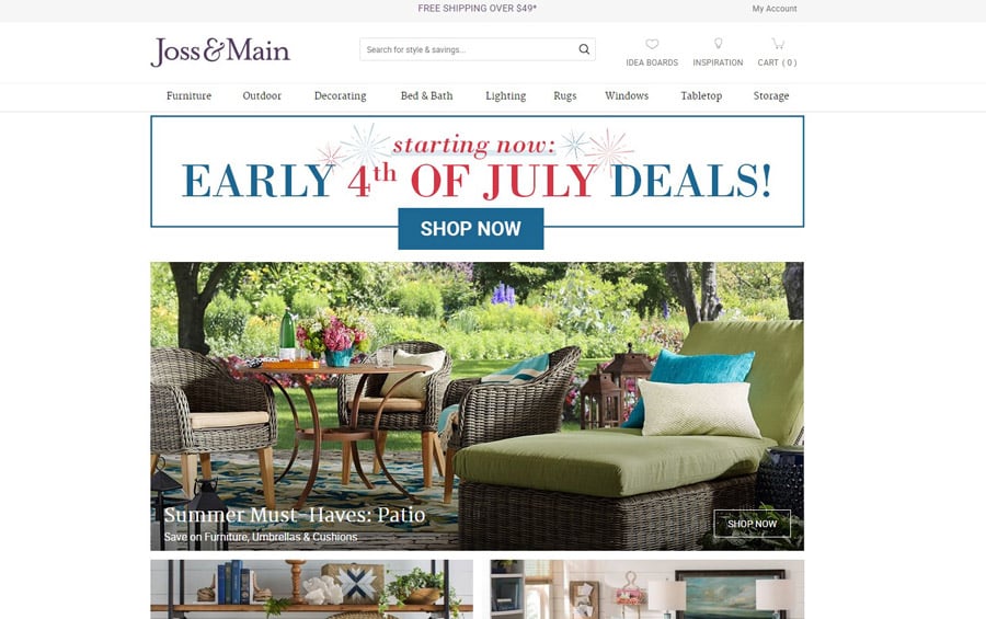
For example, take a look at the home shopping site Joss & Main. The design itself is fairly simple, with a typographic logo, clear navigation, and images of the items for sale, all encapsulated into neat rows.
However, looking past those basic design elements, you can see there is an interesting balance between the negative and positive space that draws the reader's eye to specials and products available.
Understand Your Audience’s Needs
A site visitor may not always know exactly what he or she is looking for. There are any number of reasons they may have landed on your page. Some visitors will just be curious and browsing around. This is where it becomes vital that you can put yourself in the shoes of the person visiting your site.What are the different reasons someone might land on the page, and where would they then want to go from the landing page? What if the person isn’t sure why they landed on your page? How can you draw that person in? By using personas and common sense, you can easily figure out where to add call-to-action buttons and other signals to move the visitor through your site.
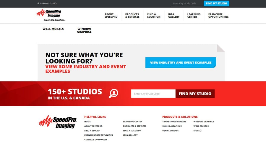
One example of a site that thinks ahead to user needs can be found at SpeedPro. Take a look at the bottom of the page where it says "Not Sure What You're Looking For?" This is a great way to pull in site visitors who aren't sure where to go next. SpeedPro offers some samples to get you started.
Understand Habits
When working on social media campaigns, it is truly vital to understand the habits of your audience as well. How often is your typical customer online? Is your target demographic mainly women? Then, you will want to consider that even in the social media platform you choose for marketing. Pinterest may be a good choice for you.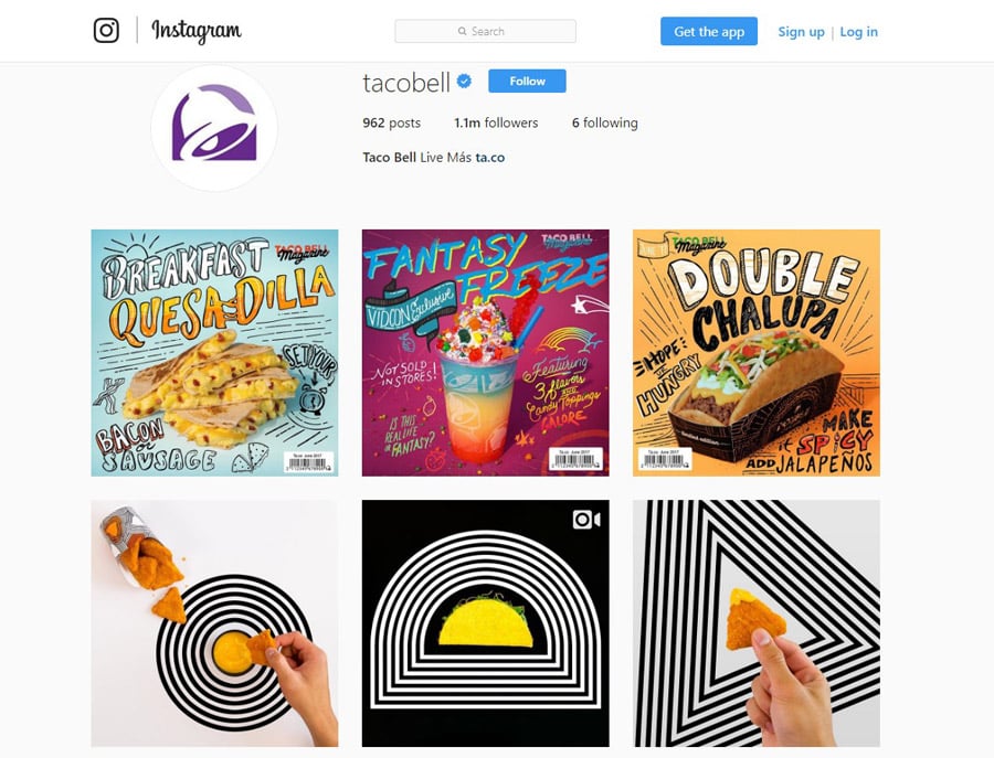
One example of a company that seems to understand the type of person who visits its site is Taco Bell — it uses Instagram to reach its target demographic. Taco Bell offers cheap, fast food, and much of its audience is high school and college-aged people. This age range tends to hang out on Instagram.
On its Instagram page, you'll find fun, trendy images of different foods it serves. This is an excellent way to entice the audience to come into a local Taco Bell for one of these foods.
Get Responsive

More and more people are using mobile devices to access the internet. Part of understanding your audience is knowing how many people are coming to your site via a mobile device and making sure your site is responsive to a smaller-sized screen.
Not only should your mobile site be as good as your traditional site, but about 85 percent of people think the mobile site should be even more intuitive. There are some key features to keep in mind to make sure your mobile site is intuitive. The site should be easy to navigate, tell a story, load quickly and show your brand off to the best advantage possible.
As a digital marketer, you likely already understand just how many different elements go into creating a complete marketing plan that will reach an audience where they are. Ensuring your website will work for them when they reach you, and knowing how and where to reach potential site visitors, is a big part of the battle in winning them over. Once you’ve done that, you should see your conversion rates skyrocket.
Don't forget to check out mobile marketing website templates.

I am a blogger, writer, and designer. Interests: web design, fonts and typography, UX/UI, logo creation, fiction, and non-fiction. Meet me on Quora.
Get more to your email
Subscribe to our newsletter and access exclusive content and offers available only to MonsterPost subscribers.

Leave a Reply
You must be logged in to post a comment.