Efficient Header Design for Magento eCommerce Websites
The header is the first area the user looks at immediately after entering a website, so it is probably one of the most important parts of the latter. The first impression is usually the most memorable, that’s why your header should be awesome. In this entry, we will try to make a brief analysis of essential elements, which should be present in e-commerce website header.
Thank God, the times when headers were small and narrow have passed. Today we observe large, informative, even oversized headers which are extremely convenient for elements placement and grabbing user’s attention. It has become a trend in modern web design.
A typical header usually includes a company logo, descriptive tagline (slogan), a search box, promotional offers, utility links for various stuff like email subscriptions, account sign-in, and the shopping cart.
The logo shouldn’t necessarily be very large, but it should inherit your brand style and colors. In the future, the users will recognize your company among many others due to this memorable experience. The logo is usually positioned front and center. Sometimes the logo goes together with a tagline or slogan. A short, powerful, accurate text characterizing your company and its services are extremely good for search engines.
The search bar is often incorporated into the header in the left or right upper corner. It’s important to make sure that the element is easily accessible for the customers. Besides the location, the designer should foresee enough empty space for inserting keywords. The call-to-action button might be named “search” or “go” or contain an image of a loupe, which is understandable and easy to click.
The header is a great place to advertise special, limited-time offers and convince the users to buy from you today cause the customers directed to your store by search engines might never see your home page, as they find themselves right on the product page at once.
Customers expect to see useful utility links such as View Cart, Order Status, Help, Checkout, Contact Us, Email Offers, Catalog Request, Shipping, My Account, and Login in the header. This list can differ for particular websites as essential links for one e-commerce project may be absolutely inappropriate for another. The links are very helpful as they show the customers their current status, interact with them and provide quick access to important information.
For instance, after the Login process, there appears a welcome message making the customer understand that he/she is logged in now.
The shopping cart displays the number of items selected by the user or says that it is empty.
To make the above-stated points visual we would like to show you some creative and efficient header designs of TemplateMonster’s Magento templates. We sincerely hope that this information and examples will help you make your header catching and get the most of its design!
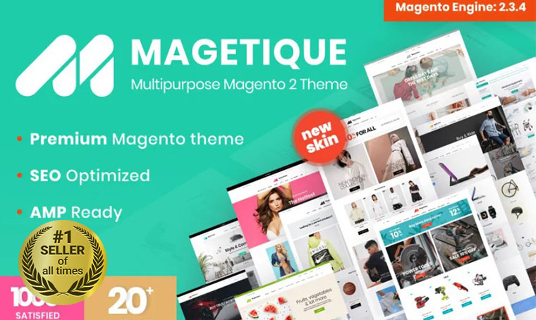
Magetique - AMP-Ready Multipurpose Magento Theme

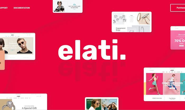
Elati - Multipurpose Fashion Magento Theme

SM Ecogreen - Magento 2 Organic, Fruit, Vegetables Magento Theme

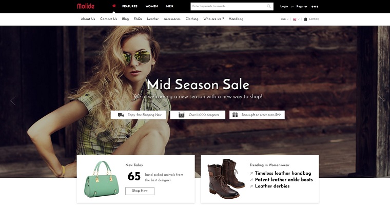
Malide - Multipurpose Responsive Magento 2 Theme

Also, check out our Best Free Magento Themes.
Get more to your email
Subscribe to our newsletter and access exclusive content and offers available only to MonsterPost subscribers.
