The Necessity of Emotional Design for Small Businesses
- What Is Emotional Design?
- Why Emotional Design Is Important
- How You Can Implement Emotional Design
- Examples of Emotional Design
- Bottom Line
What Is Emotional Design?
The purpose of emotional web design is to focus on developing products that invigorate and reflect adequate emotions to create a good experience for the customer. However, to do this, product designers take into account the link they can create between customers and the products they use, and the emotions that can surface because of using them.
The positive or negative feeling a particular product or service elicits can fundamentally influence the overall perception of the said products/services in the minds of the users.
There is entirely no doubt emotions play an integral role in human capability to comprehend, absorb and learn about the world. Satisfactory or positive experiences capture our curiosity and drive us to learn more while bad experiences are stepping stones for not repeating the same mistakes.
There are three stages in emotionally connecting a user with any object: visceral, behavioral and reflective. A product designer or an organization must consider all three phases and address each one of them in anything they manufacture and market. They have to address these elements of the human cognitive capability to harness an appropriate emotional response and to give birth to a positive experience.
A satisfactory experience can include a variety of emotions such as sheer joy, relief, trust, and pleasure. While negative emotions may consist of annoyance, anxiety and fear – for example, a console game such as Silent Hill PT (a horror video game).
- Visceral Design: This appeals to the initial response our brains give when we see something that piques our interest – it can be any product. It deals with the overlook and feel of the product – which leads to a perceived quality we form in our mind – for example, feeling the fabric of a t-shirt from a big brand compared to that of a budget-friendly brand. The sheer luxury, softness, and practicality of the merchandise are enough for us to determine that "hey, this is something I gotta have!"
- Behavioral Design: This refers to the flexibility, practicality, and usability of the product you are interested in. You will first assess everything – let's take the same example as above – you will first want to try it on to see how it looks on your body, where you will be able to utilize the product (sports and casual wear), and whether or not it functions as per your specifications. At the behavioral stage, you will probably have made up your mind regarding the justifiability of buying the item.
- Reflective Design: Finally, the third stage refers to your ability to imagine the overall impact of any product on your life in the long term. For example, how will the product make you feel when you wear it or hold it or use it any other way, or the type of values you will seek in it or attach to it in retrospect? This is primarily where designers must streamline and maximize the target audiences' desire to buy that product.
Why Emotional Design Is Important
In simpler words, small businesses require a target customer base to commit to a trusting and loyal relationship with. Web page views, subscriptions, mail list signups, and product buying are all contingent on this essential engagement.
However, to make sure that happens, you need to show your customers that you value their relationship above all else and that they can put their trust in your organization for a greater result – which is forming an emotional connection with them. That is where you turn a potential customer into a sales lead, then a repeat customer, and finally a loyal customer.
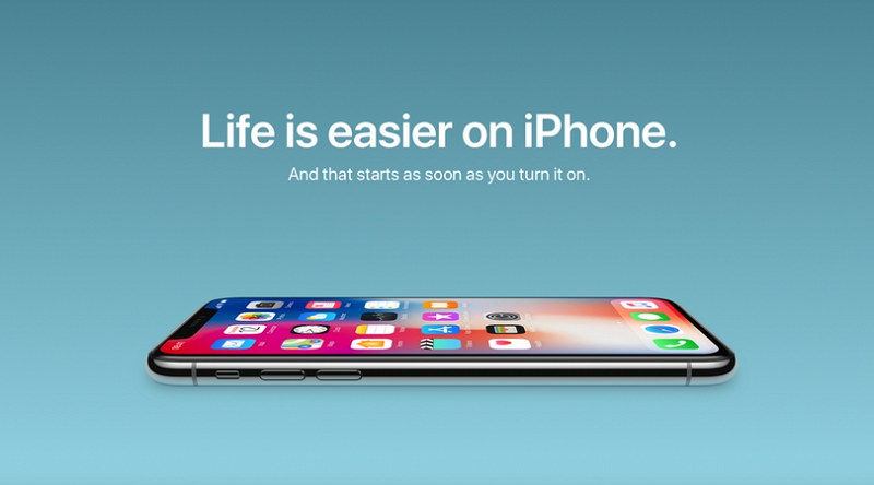
In addition, let’s not forget that you too are a consumer and have become attached to online shopping experiences ideally designed for you. Sure, you don’t necessarily have to be a web or graphic designer to understand what looks great, what doesn’t and what can be more rewarding in terms of aesthetics. Take Apple for example, just one look at their marketing, their ads and the final product that is about to be launched and people are already sold on the merchandise.

Conversely, if the aesthetics and visuals of your website or products don’t come close to being visually attractive and come off as mundane or monotonous, you will never be able to form a relationship of trust and value with your target audience.
The majority of small companies and startups are now focusing their resources on developing a brand personality – incorporating story into the website they create. What this does is elicit a robust emotional reference from any visitor. You would be amazed to learn how combining personality and your strive for excellence can pump life into a dying brand or a dull corporation. The key is to relate to your demographics.
The most beautiful thing about emotional design is that resources (or a lack of them) don’t limit it. This means any business from startup to small and medium-sized e-commerce companies can embark on this journey to create value from the get-go, just by incorporating a genuinely invigorating and legitimate story.
Precision-Based Emotional Design Has the Power to Convert Potential Customers into Brand Evangelists
Since the era of marketing and advertising began, expert marketers and advertisers have integrated human emotion to market products and sell them to garner trust. You will notice how great commercials always sell you some feelings and emotions before selling you the product - they market the idea of it more than promoting the product itself.

Take the famous Chipotle brand, for example. The significance of their scarecrow reaches far beyond just selling their delicious burritos. It is a rollercoaster of emotions and hard work – and that is what sells the most. At the core of marketing any product, emotional design plays an instrumental role of empathizing with the audience. Great product and website design always focus on putting the target audience first before anything else – before your mission as the company's boss or the long-term objectives of your business. Do that and you won't have to worry about people spreading the word around.
How You Can Implement Emotional Design
The smartphone applications you use on a day-to-day basis or the websites you surf aren't just about user-friendliness and functionality – not anymore. What they are and should be about is eliciting a genuine emotional response from the people visiting them or using them.
There is no question that human beings are emotional and curious beings. We love to interact, seek, discover, finding memorable items or elements that appeal to us – but we also like things that are responsive and invigorate user-friendly engagement. People are always seeking ways to quickly, seamlessly and effortlessly connect.
However, the question is - how do you implement a precision-based emotional design strategy? Well, that is simple. Take a look below:
- Mimic the Emotional Response: Do you know what type of emotions you are trying to elicit or inspire? Is it pure happiness, joy, contentment, fear or perhaps hope? This is something that you are going to have to brainstorm with your team. Draft on-site pages with particular color tones, user-friendly, open and corresponding words, design a layout that comes across as severe but casual at the same time.
- Focus on the Microcopy: The devil is always and will always be in the details – from button labels to labels in general, error messages, notifications and everything in between, has to be customized and tailored to represent your target audience. Never go default no matter what. You have to be meticulous to drive emotion and spark a positive and long-term reaction.
- Always be Caring and Responsive: This fundamentally points to critical error messages, downtime notifications, search results pages and frustrating, confusing situations where the customer needs you the most! Always be gentle, calm and patient while addressing these situations and try to compensate for them and don’t forget to engage with your customers.
- Delightful Design: Your website design must be exclusive, meticulous and something indeed out of the box. You have to look and feel different than your competitors. So try to alter the website and ensure shape, color, emojis, content placement and typography of the site is functional yet drives your customers on an emotional level.
- Always Show Your Appreciation and Be Polite: Never forget to leave a "thank you" message or a "We are sorry for the inconvenience" note to show that you genuinely care.
- Humor and Product Personality: As human beings, we naturally like to interact with other human beings and not machines. Communicating with machines can be tedious. So, add a pleasant tone to your products, some gifs or funny animation to always keep them interested.
Examples of Emotional Design
1. The Contentment of Having Achieved Something
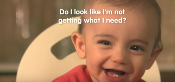
Businesses use a variety of software, such as Trello, MailChimp, and Intercom to categorize, simplify and complete project related tasks or to streamline communication and increase operational efficiency. It is essential to understand that feeling content with doing something does not necessarily have anything to do with completing the overall project or milestone. Just merely transferring a couple of files from your to-do list to a completed folder can inspire productivity and enhance motivation. Look at how Cow and Gate does it.

2. Getting a Feel for the Website
There is no doubt products can drive happiness and pique interests – only when the target customer can immediately check the product out. When launching a website, always make sure that your target audience will be able to get an initial sense of what you are offering and interact with your items online. However, it is also important to understand that this strategy may not work for physical products. Remember, interaction with any product will always drive an experience.
3. Become Entertaining
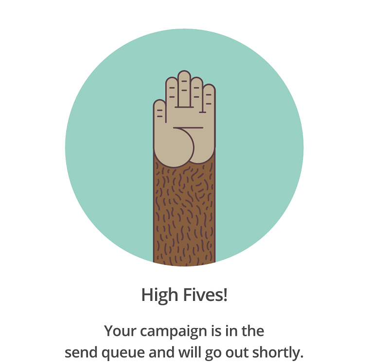
Personalize pop-ups and try to entertain your target audience every step of the way. No matter how professional or casual you are with the tone of your website – you have to make your audience feel relaxed. MailChimp can be a great example here.

Bottom Line
Human emotions are powerful elements that can determine the success or failure of what you offer and have the power to get your point across the entirety of the globe in a matter of seconds. They can motivate, turn into a bond and enhance your image across the internet.
Understand that functionality has taken a backseat today. Now your website mustn’t just be functional – it has to inspire, it has to relate to the experiences of your target demographic and elicit a positive emotion.

Read Also
The 80 Best Small Business Ideas [August 2018]
Why Do We Need Emotional Design?
20 Effective Recipes To Become a Real Chef On The Web [April Online Courses Edition]
Second to None: Why is Millennial Pink Still so Popular?
Red Color in Web Design [Infographics]
Don’t miss out these all-time favourites
- The best hosting for a WordPress website. Tap our link to get the best price on the market with 82% off. If HostPapa didn’t impress you check out other alternatives.
- Monthly SEO service and On-Page SEO - to increase your website organic traffic.
- Website Installation service - to get your template up and running within just 6 hours without hassle. No minute is wasted and the work is going.
- ONE Membership - to download unlimited number of WordPress themes, plugins, ppt and other products within one license. Since bigger is always better.
Get more to your email
Subscribe to our newsletter and access exclusive content and offers available only to MonsterPost subscribers.

Leave a Reply
You must be logged in to post a comment.