How To Ensure A Web Design That Never Really Looks Old?
Have you wondered how easy it is for the user to abandon the site in just 10 seconds and how tough it gets for the entrepreneur to lose one potential client just because of few silly reasons? Popups, Pagination, Autosound, Interstitials, Woeful navigation, Immediate registration demands, Cookie cutter websites, Rubbish fonts, A lack of clarity, boring, unprofessional, outdated and so much to count on.
“Outdated” – One such reason to highlight is out of trend.
“You look at the pictures from the 1990s and wonder “what the heck are they doing/wearing?” Change in trends is constant but giving a revolution to the website every now and then is not. New web trends easily roll in and ultimately we end up with the boring/outdated website design that needs to make the exit.
The graph from widerfunnel.com explains this issue –
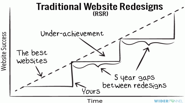
On the other side of the coin, in the realm where first impressions count it is essential for a company to showcase right message. Your brand image largely depends on how your website really looks. You cannot compromise on the look and feel of your web presence. An old and outdated website design clearly entails an apathetic approach, hence it is important to always present a modern and fresh look.
But how can you ensure your website will continue to look awesome irrespective of the changes that are taking place in the world of web design, user expectations, new standards in the user interface and pertaining technologies?
How can your website really remain adaptive and responsive to these changes? Obviously, when your website looks old and forlorn over time, your brand loses the luster and its essential value for the audience. How can you prevent such a thing? How can you ensure that your website looks vibrant and fresh without really needing to go through the frequent redesign? How can you ensure a web design that never really looks old and outdated?
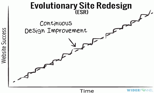
Umm…. the solution? Well, I better say it’s time for evolution not revolution.
The graph from widerfunnel.com explains the solution –
Well, here we are going to introduce some of the most effective and time-tested tips and principles to give your website an evergreen countenance.
1. A Flat Design
Just think of the huge popularity of flat design that literally took over the entire app and web world like an indomitable force and survived for close to five long years. You can argue over the little changes that happened to the flat web interface over the time but hardly you can doubt that the basic principles of the flat design remained the same over the years.
Ever since it was introduced, it only became better and richer over time and eventually became the most effective design to foster user engagement and quick traction. The most dominant element of the flat design is its focus on the contents. Yes, thanks to flat design the contents once again took the center stage. With flat interface what matters most is the easy access and readability of contents.
Flat design gets even better with the use of soft and illuminating shades of color to augment the navigation features, CTA buttons and various areas of the design layout. Another important thing in the flat design convention is the use of typeface to boost the readability of the contents. Instead of grabbing attention to the font itself, the typeface should help readability and be guiding attention to the contents.
The website reflecting a clean, simple and flat design principles have engaged visitors that spend required time on the site because they enjoy exploring the information. Basically, such flat design sites will give the information they are looking for in quite concise and clear manner.
2. A Clean Design With Lot Of Negative Space Around
The second most important principle that helps a design breath easily is the use of white or negative space around each on-page element. Clarity is the invariable demand for most user interfaces these days since it is clarity that actually helps visibility, readability and user engagement as a whole. To ensure clarity throughout a design here we are providing a few important tips.
- First of all, keep the number of elements and contents per page to a minimum.
- Ensure offering a visual layout that helps to access the contents at a glance.
- Allow a lot of white or negative space around each piece of contents to grab the attention of the audience.
- Use a color scheme that perfectly optimizes the readability and quick engagement.

3. Keep Your Navigation Simple And Effective
From the early days of web design to the present time, navigation remains the most important element for any website or app. It is the navigation that helps the usability of a website or mobile app and it is the navigation that helps the audience to stay alive from one page to another for a longer period. Thanks to quality navigation the audience can spend more time on a website and this obviously results in better chances of business conversion.
- Keep the actionable links and elements like phone number, contact email, etc above the fold.
- Use bigger CTA buttons to help easy finger tap on mobile devices.
- Hamburger menu is good to ensure clarity while offering the menu items in a smart way.
- Ensure offering all the actionable and frequently clickable elements within the range of thumb for a single handed user. Most users these days hold the device and navigate single-handedly.
4. Loading Speed
Faster page loading speed is the biggest determinant factor for a quality web interface. Google since its last algorithm update is very particular about loading speed in respect of considering page ranks. Without optimizing page speed you not only compromise on the user experience but this also undermines your page ranking potential to a great extent. Here are some effective tips to ensure optimum page speed.
- Use the right version of image files to help loading speed
- Use latest techniques like lazy loading to ensure loading the page elements as the user scrolls down
- Do not use flash as it crashes too often and hampers the page speed.
- Test the page speed across multiple devices and platforms.
You must have wondered that I didn't mention anything about responsive or mobile friendly design in the present context. Actually, responsive design is no longer just a choice but a reality and well-accepted convention for web designers worldwide. So, for a future-ready design that never looks old, it remains as a ground principle.
However in the deed of following the points don’t forget that if the site design leads to confusion or simply doesn’t work, you need to completely rethink the concept and make sure above mentioned points are followed. It is highly essential that your design should reflect your service or product. Moreover, the basic formula of any rocking design is that a site’s design if for people not for the search engines. In this realm where SEO plays an essential role, it is important to make sure your design is balanced with efficient SEO content and other SEO elements in technical and information architecture.
The magic to balance SEO and interactive design principles is that you need to make invisible SEO practices for search engines. In this technology realm, the design should have multi-function, multi-skilled approach to bring in a lot of business.
Can say, “Balance is the key”.
The design standards shared above hold valid, less risky and a better method including the process of testing with improvements. I hope you improve visitor experience with these simple techniques.

I always try to keep up with the freshest changes in the world of design and especially web design. Nowadays, things get outdated really fast. If you don't want to miss something - check up my articles. LinkedIn
Get more to your email
Subscribe to our newsletter and access exclusive content and offers available only to MonsterPost subscribers.

Leave a Reply
You must be logged in to post a comment.