Niche-Specific Website Design – Designing Your Niche Nirvana
Do you understand the future users of your website?
What will those users want?
What features will elicit the best reactions in those individuals?
Your website design can only be Nirvana for a few people. That must be your target; to design a Xanadu-like space where those of a particular bent can congregate. Users will only stay on site and be receptive to offers if you are pushing enough of their buttons.
There are two aspects to niche-specific website design:
- Knowing your site visitors
- Knowing which buttons to press to turn your website into their Seventh Heaven
UI Tips For Web Design Enthusiasts [Free eBook]
Knowing Your Site Visitors
Your site is not for you or your customer, but rather, it is there to serve its eventual users. Your design will be judged according to how well it meets pre-agreed criteria, such as lead generation, sales, or feed subscriptions.
You will have a good idea of your typical customer avatar or persona. Success depends on bonding with that client. Most real-world users will differ from the typical customer persona in one or more areas, so you will not press all their buttons. No matter, you only have to push enough to keep visitors on the site.
The customer avatar is the key to good niche-specific website design. You can only proceed with your site design once you have a fully-specified avatar you can visualize. You will then be able to work out exactly what your ideal persona is looking for.
This article gives you a worksheet to help find your avatar. Add niche-specific questions to it, and you will then have a focal point for all your design thinking.
You need to make your emails stand out from the truckload of dross that hits everyone’s email address every day.
<img class="size-full wp-image-113638 aligncenter" src="https://monsterspost.com/wp-content/uploads/2017/09/image2.jpg" alt="what is a niche" width="600" height="406" />
One way to do that is to take full advantage of the signature space in your email. Include a photo, your social links, and even links to your latest tweets. Doing all that manually is hard work, but you can get email signature templates like the ones above that will do the job for you.Knowing Which Buttons to Press
Put up pictures of your customer avatar all around your office and think about that person’s reaction to any design decisions you make.
There are five factors to take into consideration when you are designing your niche site Nirvana.

1. Design
The same principles apply in niche website design as always apply: Usability is the prime factor in good design. A page design may look beautiful to the artist in you, but if users cannot find what they are looking for in two seconds, it’s a poor design.
You and your team are the only people who will ever read the pages on your website. The rest of the world will scan your pages for the things they are looking for.
Your website must match your target users’ expectations. That’s why you can find WordPress themes designed for musicians, and others designed for environmentalists.
Google has directed the searcher to your page in response to a search query. The person is looking for help. The purpose of each page must be as obvious as a zebra’s stripes would be on an elephant.
<img class="size-full wp-image-113639 aligncenter" src="https://monsterspost.com/wp-content/uploads/2017/09/image2.jpg" alt="niche definition" width="600" height="357" />- Use the F-shaped typical scanning pattern in your design
- Kill any clutter
- Use lots of negative space
- Limit the links to your desired actions
- Don’t misuse pagination
- Make Clickable areas large enough for mobile users
- Make subheadings informative and concise
- Cut copy to the bone
- Maximize page speed at every opportunity
- Test, test, and keep on testing: No testing leads to failure
2. Colors
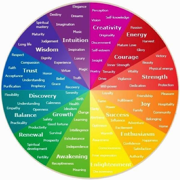
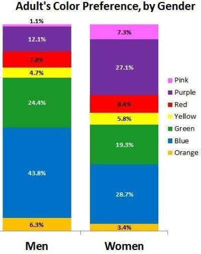
We all link colors with emotions, so much that we will pay extra for a car in our preferred color.

Screenshot source
What emotions are you trying to evoke? What emotions will drive the sale?

Your customer persona will include color preferences. Test, test, and keep on testing. Start by using the favored colors in the charts above, but these are only a guide and might not apply to your users. Test different shades and hues and keep on A/B testing each and every component of your website, even after you have reached ‘perfection.'
3. Fonts
Visitors make decisions about you based on the font you choose. You need to pick a font and font size based on how you want website users to perceive you. A large font may be more readable for those with poor eyesight, but most WordPress themes use a default font 25% smaller than that recommended by W3.org
Avoid sizes in em smaller than 1em for text body, except maybe for copyright statements or other kinds of "fine print." W3.org.
1em translates to 16pt if you are using fixed font sizes.
A traditional serif font like Times New Roman is easy to read and appears both human and professional. If you were advising on a site design for a humor site, then a large Comic Sans might work, but for a website for a legal company, a better choice would be 1em Times New Roman.

4. Language
There are websites that proudly use profanity at every turn. It repels some people, but those users do not align with the target persona. These sites have chosen to target users who identify with bad language, and they set themselves apart by that choice.
A legal site would avoid any language that would cause offense to any user. The target persona here is someone who expects lawyers to be careful in their choice of words.
5. Your Image
It’s not what the owner wants; it’s about what the user expects to see.
You will need a photo of the website owner that users will identify with. A motorcycling site would have an owner’s photo showing him or her on a bike, a legal site would show the site owner in a respectable suit and tie, and a site aimed at rock music fans might use a photo of the proprietor in a tee-shirt and jeans.
Web Design Essentials For Non-Designers [Free eBook]
Takeaways
You can never press every single button. But if your avatar’s buttons correspond to your customers’ then you can push a good few.
It is always better to be unique and be the dream destination for your perfect customer than to be just another boring site that tries to appeal to everyone. Make your design choices and stand out from the herd of sleep-inducing sites with Arial and blue/black design choices.

P.S. Just to make sure you will get web design templates in the right place.
Get more to your email
Subscribe to our newsletter and access exclusive content and offers available only to MonsterPost subscribers.

Leave a Reply
You must be logged in to post a comment.