Font Psychology: What Your Font Says About Your Website
“The secret of type is that it speaks.”
Paul Claudel
Someday typography study was a real science. Nowadays we can download various fonts from the Internet and adjust them according to our needs. Using graphic editing software we can make our fonts bolder, change their size and do whatever we want. As a rule, we get a mixture that doesn’t always reflect the sense of words, nor does produce the adequate psychological reaction of consumers.
Nevertheless psychology of type is not always given the necessary level of importance especially in web design where text plays major role in the whole presentation. Thinking over this idea, ask yourself a question whether fonts presented on your web resource reflect your brand identity or do they reflect the promise you wanted to deliver the users.
We also have good powerpoint presentations examples. Use any to your benefit.
By now this question can be hard to get an answer to, so keep reading and till the end of our article you’ll be able to figure out what emotional reactions and psychological perceptions the font of your web resource evokes.
The Psychology of Type
When selecting a font, there's a 100% guarantee that you rely on its aesthetic virtues. Do you know that every font has its own psychological impact? Any font you take feels different. Here's a proof!
Open one of your recent text documents, press Ctrl+A and change the font to Times New Roman? Take a moment and realize how the page feels, now change the font to Arial? Do you feel anything? Seems like the whole text presentation turned into less formal and spacious, doesn’t it? You can do this trick with any other font you like.
Let’s make some more tricks with your text, open the paragraph panel - here you can change the space lining between the lines of text. Use different options and try to remember what you felt when the spacing increased or decreased. At some points, the text may be a bit cramped, at others become loose. You can also play around with the "After" option which refers to the space after each paragraph. Try deleting it to see how important the gutters between paragraphs are – without them you can’t tell when a new paragraph begins. You may not notice that but in web design there exists such a motto: "Whatever you do visually has an impact."
All elements of design you produce affect user experience. Typography has a major role in user interface; after all, what else do your users interact with more than with what they read?
Visual Rhetoric of the Text

Semantic Memory

Web Design Trends and Typography

Interfaces with high level of attractiveness increase emotion arousal and are perceived easier and produce high level of harmony for the user.
Typeface selection can influence not only emotional state of the users but also their cognitive state.
Now, let’s have a closer look at basic groups of fonts to see how they are perceived by users and what emotions they arise.
Serifs, Sans Serif, Script & Decorative
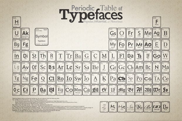
Since the first printing machine was invented there were developed a huge amount of fonts. Typographers fulfilled a great job when categorizing the fonts and according to their styles all Western types were divided into four categories: Serifs, Sans Serifs, Script and Decorative.
Serif Fonts
Looking at the letters of fonts like Times New Roman you can notice short lines at the top and the bottom on each letter. These short lines are called serifs – so if a font contains those lines, it's definitely a serif font. Serif fonts usually have a formal feel, that's why they are commonly used in formal correspondence where prestige and classiness are important. For example if we used in formal correspondence fonts like Comic Sans the effect produced on the reader would be totally opposite. Serifs provide a better user experience in print than they do on the web. Be careful using them on a screen, they work well in headings, but when used in body copy, make sure they are large enough and spaced for a fluid reading experience. Serif fonts are perceived by users as a rule as delicate, beautiful, expensive, warm and old.
Sans Serif Fonts
A group of fonts that do not have serifs are definitely sans-serif fonts. In comparison with others groups the sans-serif font are best to be used on the screen. While serifs interrupt the flow of reading from a screen (though they create the flow in print), sans-serif fonts create a clean and intuitive reading process on the screen and they are perfect for headlines and body copy. The whole group of sans-serif font produces an informal feel. The fonts of this group are not that good for legal websites, but are perfect for blogs and personal websites. Usually readers perceive these fonts as rugged, ugly, cheap, cool and young.
Script Fonts
The fonts of a script group are cursive fonts and are best for the screen use. These fonts produce an elegant feel and are appropriate for headlines and some decorations. These fonts cannot be applied to the body copy, unless you are creating some specific designs that require script fonts. Emotionally these fonts may produce various effects considering the specifics of the text they are used in. Some of these fonts are very close to the handwriting what makes them look very informal when most part of others will suite only wedding invitations, personal correspondence or St. Valentine’s Day greeting cards. As always you can try out those fonts whether or not they fit the overall look of your resource. Readers usually characterize these fonts as the most feminine, beautiful, expensive, soft, delicate, relaxed, quiet, happy, weak and warm.
Decorative Fonts
When you see the font that cannot be referred to any of the groups mentioned above than it’s definitely a decorative font. Mostly, decorative fonts are custom creations. The Web abounds with various decorative fonts and almost all of them are free. There are some very interesting and creative fonts out there that you can find. As a rule these fonts are used to build a visual theme for your design. They are great for headlines but are almost senseless for the body copy. When speaking about the emotional feel they produce on a reader it's hard to define the whole range of emotions because all fonts of this group do not look alike, some of them may produce joy while others make the reader feel disgusted.
Tips on How to Improve Typography Parameters
Line Spacing: one of the most important factors of convenient reading is the line spacing. The most appropriate for the eyes of a reader is 30-60% the size of your font. If you use a 12px size font keep the 4-6px gap between the lines. This will make your text easily readable.
Line Length: affects the readability of your text blocks the same as the line spacing. The longer you make your lines the more likely that reader will not get to the end. If you make them short enough this will make reader’s eyes jump back and forth through the text, which is not good. Though there is a golden mean – 45 to 65 characters pet line (7-10 words, can be more if you have a wide layout).
White Spaces: let’s compare your web design with a city map, your lines are the blocks of the city and your white spaces are the roads, if you make enough space so that the reader will “travel” easily from one block to another than you’ve succeeded, but if your white spaces are not wide enough than the whole text presentation will be cramped.
Vertical Rhythm: imagine you have an 18px wide grid at the back of your design; the point is to create a “consistent flow of the content” from the headline in the header to the footer of the page. This flow will create a rhythm that your readers will experience while scanning the page.
Vertical Hierarchy: this concept comes out of the vertical rhythm and serves the reader as an outline of the web page content. Most users do not read the whole body copy, they just scan through while something does not pop out. The concept of visual hierarchy guides them from the headline till the last line of the effectively organized content in a scanner friendly format.
Fonts That Play Nice Together
Combing several font faces in one design can be a challenging task especially if you are not sure if they will “play nicely together”. In pair they need to look as if they belong each other, does it remind you of anything? For some font it happens naturally, but for others you need to start dressing them up, though in some cases it is either senseless or impossible. Here are some more tips how to do it well:
- Try not to mix fonts of the same type, variant or style at the same level of your hierarchy. Each level should be specific and unique.
- Strive for sufficient contrast. When they look similar, even at different levels, it will result in a confusing and unclear presentation.
- Combine serifs with sans-serifs, don’t ask why, just do it.
- You used serif in the title, use sans-serif in body copy and on the contrary.
When you need to pick a font for a bold headline this may become way harder than expected. The headline' font needs to be eye-catchy, you can address following round-up of the best free fonts for bold headlines.
For most documents the typeface does not have a strong effect on the perception; legibility is the deciding factor. However, for marketing-related copy the most appropriate typeface usually shares similar personality characteristics as the product advertised. Anyone who designs documents for the web copy should choose carefully the typeface. It brings its own personality to the document and impacts overall presentation regardless of the content.
Get more to your email
Subscribe to our newsletter and access exclusive content and offers available only to MonsterPost subscribers.


Leave a Reply
You must be logged in to post a comment.