Website Footers as User Experience Solution
There is a common web design myth that people don't scroll. This myth originates from the mid 1990s when people actually didn't like to scroll but now we've entered an epoch where scrolling is an important part of user experience at any website. Imagine the situation when the user enters your website, starts scrolling and he/she reaches the bottom of the page. Then what? A. A person gets bored and leaves the page (not an option for you, right?). B. Stumbles upon an interesting link or a catchy graphic solution in the footer and takes a decision to explore more. Footer is your last hope to convince a user to stay on your website and browse further trough it.
Of course it is a difficult task to compound all that boring information about copyright and other stuff with usable elements that call your visitors to take proper actions. The main problem is to choose the right methods to keep the client's attention. There are few ways to make your footer more usable and attractive, they're listed below. And while talking about those footer design approaches, it is reasonable to recall another popular web design myth - “the small details are not that much important for a successful website”. We assume that there is no reason to underestimate the role of small design elements because these will help you with the footer enhancement for sure. For example, excellent typography, original graphics or even smart text will become the reasons to stay longer.
The main idea behind an awesome footer is to combine the usability with styling ideas and design trends. Also you should remember that your footer must provide maximum useful information and various options for the user. We decided to put up together what we think are the most recent techniques and methods in usability on one hand, and are inspirational examples that perfectly demonstrate style on the other hand. So here go our thoughts on the way you should build effective and attractive footer, please feel free to share your opinions and thoughts in the comments sections to this post.
Tips and tricks for creating a fascinating footer
- make it a powerful navigation tool which will improve your website's usability;
- add a contact information or even a contact form to make it more informative;
- don't forget to add the social media section - it is a nice way to receive a feedback and engage your visitors;
- fill it with interesting and original content and don't forget about the updates;
- you may want to put a creative advertisement there to entertain the visitors;
- recap the main highlights of your website by placing them to the footer;
- use footer as an alternative to a sidebar;
- big-size footer with vivid boundaries will grab your clients' attention ten times faster than the small piece of text drowned on the bottom of your website page;
- use contrast to stand out against a background of other UI elements;
- creative illustrations in the footer may be another trump to convince your visitors to stay;
- use "back to top" button as a small navigation tip for the visitors;
Also we would like to provide you with some inspirational examples that perfectly demonstrate some of major approaches in creating successful footers. As we've mentioned before, your the main objective is to combine the original design with usability. We want to remind you that creative approach has no boundaries but you should never forget to stay cool and think twice on every design step you take.
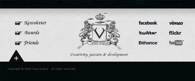
Footers as Site Map
* * *
* * *
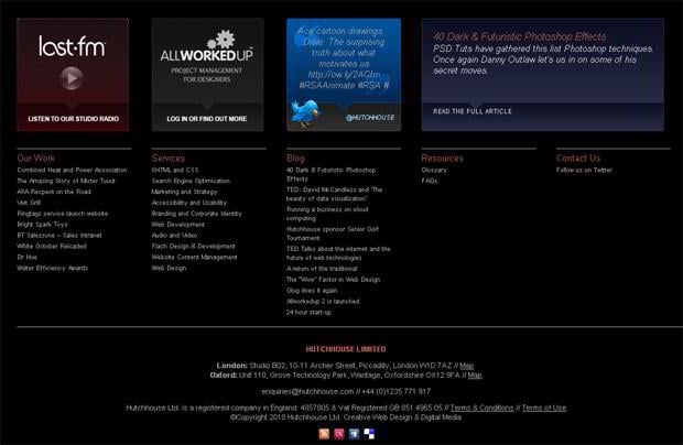
Hutchhouse
* * *
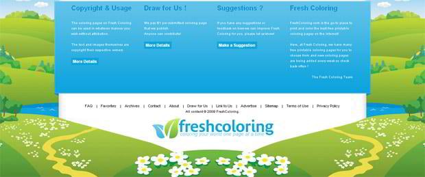
Freshcoloring
* * *
* * *
Footer as a Contact Form
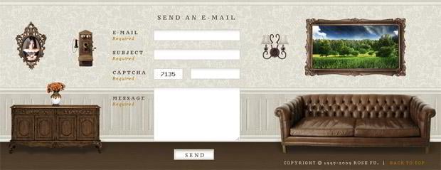
Rose Fu
* * *
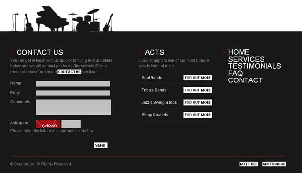
Cooperlive
* * *
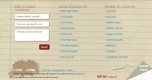
Griffinabox
* * *
* * *
* * *
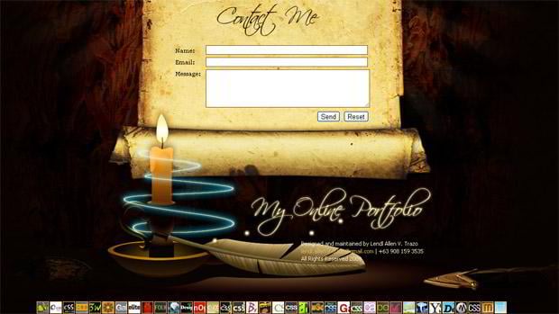
Lendlallenvtrazo
* * *
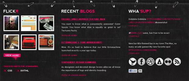
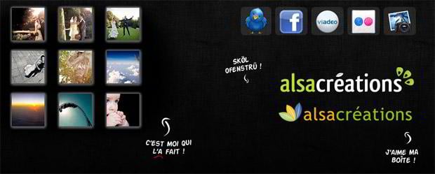
Social Media Footer
* * *
* * *
* * *
* * *
Lafraise
* * *
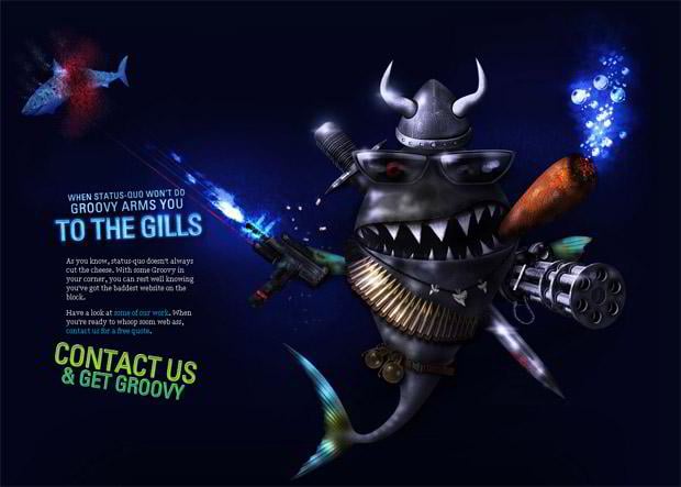
Styling Footers
* * *
* * *
Midnightersclub
* * *
* * *
Grzegorz Kozak
Don’t miss out these all-time favourites
- The best hosting for a WordPress website. Tap our link to get the best price on the market with 82% off. If HostPapa didn’t impress you check out other alternatives.
- Monthly SEO service and On-Page SEO - to increase your website organic traffic.
- Website Installation service - to get your template up and running within just 6 hours without hassle. No minute is wasted and the work is going.
- ONE Membership - to download unlimited number of WordPress themes, plugins, ppt and other products within one license. Since bigger is always better.
Get more to your email
Subscribe to our newsletter and access exclusive content and offers available only to MonsterPost subscribers.







Leave a Reply
You must be logged in to post a comment.