How to Enhance Your Web Presentations
"Just be yourself", they say. Wrong! If you want great results you need to present your best self" - Bianca Te Rito.
You can hardly imagine your business prospects without delivering a killing presentation. Training videos, online presentations, sales presentation, webinars, masterclasses, virtual meetings and tons of similar visual pieces of content are presented daily on the net. And some of us find out that they were born without any presentation gene. Preparing an online presentation generally takes more time and efforts than making a banner, but there are tons of helpful tools and guidelines to ease this tedious process. We'd like to share a few of them to save your head from banging against the wall.
21 Easy Tips to Create a Powerful Presentation for Your Business [Free eBook]
Presentation is impression, and we always believe in the power of visualization as a way to tell a story and impress. A good presentation is worth a thousand words. As soon as you learn to make powerful online presentations, efficiency of our interaction with audience will skyrocket.
Forms of Online Presentation
Presentations can be if the forms of videos, slideshows, animations, static images and wordings, even polls and surveys. Slideshow is used to sum up and outline your benefits. Make 5-10-image slides enabling viewers to grasp the main idea, include visuals that help people to memorize. Slides should look friendly and authoritative. Get rid of links and animations – you can include web addresses and emails in the notes box instead. Slideshow and static image is good for business area that is clear at a glance.
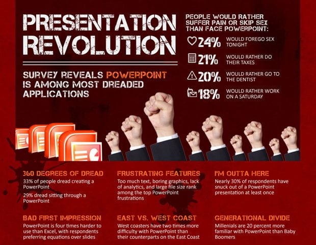
Some presentation experts consider Powerpoint to be outdated and this suggestion is not on their bare word:
The most dynamic and advanced are, of course, animations and video presentations - they comprise speech, a visual side, music and some special effects. You may use several different forms of presentation, combine and play with them in order to make a proper marketing effect.
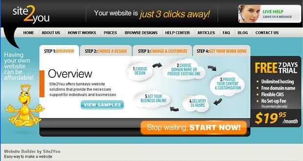
For example, TM partner site2you offers both animated and video presentations. The animated one is a nice Flash banner with tabs in the upper part of their homepage and video presentation provides more detailed info on Turnkey website's maintenance and updates at TM Turnkey websites category.
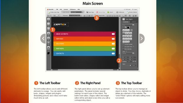
Our other partners MotoCMS.com make their presentation in the form of a demo page with static banners and step-by-step explanations. It guides customers through the process of Flash CMS website creation and displays Moto CMS back-end screenshots.
Presentation Components
Texts – you may order quality content on freelance sites or text broker sites like texbroker.com.
Graphics – use loyal clipart found on stock photo/image providers and proper image editing software like Adobe Photoshop, Adobe Illustrator or Adobe inDesign. Personally I would recommend InDesign – it's easy-to-navigate, universal and applicable for combining vector and raster elements. Besides, it is perfect if you want to make parts of your online presentation a print copy (brochure, magazine, business card, banner or poster).
Voice – for getting great artistic voices of any kind check out voice.com.
Animation – involves some flash developer's work you may get on freelance sites. This part of work is specific and requires much experience and creative vision, so it's better to purchase it from a third party than make it on your own.
Music – shovel tracks from West one music collection or involve freelance composers.
Tips On How To Enhance Your Online Presentations
I hope you'll find the following tips helpful for sharing your thoughts online through the video, slideshow or a simple graphic presentation. No matter if it is sales presentation, web conference, webinar, video blogging or organizing internal staff communications – these guidelines are universal for any way of presenting your talent!
Use presentation for referral purpose
Provide your partners and clients with the proper information at hand to help mention you to others. Presentations may be a strong referral tool luring more and more clients into your network. One of the ways of sharing your presentation is giving contented client the link to it and kindly ask them to share it with their friends.
Write a script
Compose a script/scenario right after you make a bulleted outline. This step seems obvious but is often missed. Prioritize and focus important content, outline your goals and write down key points of your presentation. What do you actually want to tell and show your visitors? What is the basic plot? What activities would you like to include? Perhaps you want to make polls or Q&A-style texts or invite guest speakers. Think over the presentation form thoroughly.
Make a clear structure
There is a theory that sonata in classical music and online presentation are alike in their structure: they both have exposition (beginning), development (middle part), and recapitulation (the end). Include some culmination point which is the summarizing thought or call-to-action flooding the whole presentation text. It could be the answer to epic viewer's question: "Why do I actually need this stuff?”
There's also the contrast keeping it all interesting. This knowledge is helpful both for musicians and for communicators. This structure concerns all components of your presentation: written textual content, audio speech and the video itself. E.g. sonata illustrates how speech should flow considering tonal, dynamic, and textural contrasts.
Use the power of words
Hire a professional copywriter to write up a great selling text for you. Use direct questions instead of open-ended hints or statements, though you can still use rhetoric questions to emphasize some thought. The speech strikes right into your clients hearts. Try not to leave your customers any choice other than your product/service!
Remember the great speakers like Steve Jobs and Abraham Lincoln and learn tricks from them. According to Jobs, the speech should be smooth and convincing, artistic enough to reveal some charisma. Keep your audience hanging on every important thought you include in your presentation. Check up more details in a book by Carmine Gallo about Steve Jobs’ presentation style named “The Presentation Secrets of Steve Jobs: How to Be Insanely Great in Front of Any Audience.”
Besides, you can derive some techniques on brilliant speech writing from Abraham Lincoln. Remember the major points he suggested: “keep it short, abandon the formalities, have purpose, connect to your audience’s hearts, speak to larger truths, create a picture in people’s minds through your words, recall more famous lines, revise it plenty of time, end with strong line people will remember”. The main recipe is addressing to people's emotions since it is not a logical argument.
Make use of storytelling
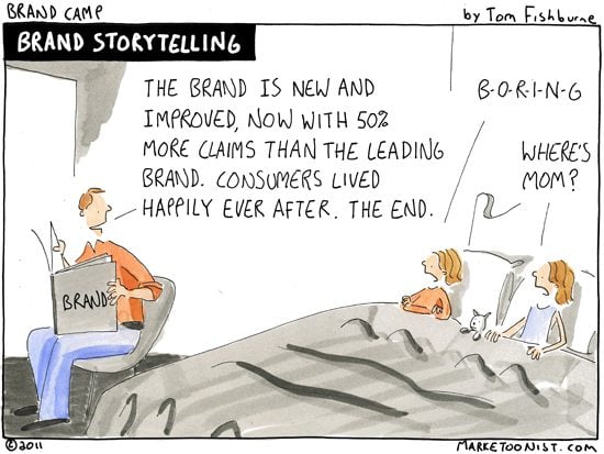
Telling stories is another method of making a stunning online presentation. Stories are a powerful tool of grasping and holding listeners' attention. It's not just an old Plato’s wisdom saying “Those who tell stories rule society.” Creative writing instructor Robert McKee is also convinced that “story telling is the most powerful way to put ideas into the world today.” Compose a credible, plain and surprising story with solid facts and names, spice it with emotions and make an instant effect on your audience!
Keep it simple but interesting.
Avoid extra stuff, especially audio information because listening is always harder than reading. Include markers, pointers, sounds and effects to help site visitors read, listen and memorize. Use clear readable typography. Make it a clear structure. Use images to illustrate your story. The awesome presentation should involve both right and left sensory channels of our brain (words, sentences with graphs and pics). Emphasize important words with color. Play with design to change the order of eye scanning.
Research audience perception
Track surveys, statistics and follow the simple conclusions:
- "Listeners" listen somewhere between 25% and 50% of the time;
- Short-term memory holds only 5 to 7 points;
- People remember only 10% of what they hear versus 50% of what they read;
- These and much more interesting observations are found in the lecture “Designing Presentation Visuals” provided by Robert A.l. Mortvedt Library.
Look good online
To make an awesome video presentation you need to purchase some basic pieces of affordable equipment. You don’t need to be Tim Burton or David Fincher and use the latest high-tech equipment but try not to use laptop webcam or cell phone camera. To make the decent impression on your audience you need at least 3 pieces of equipment:
- HD video camera with a remote control for filming yourself and jack to plug in an external mic. A rotating LCD panel is a great bonus- it makes it easy to view yourself while filming. It's nice to have a small remote control to be able hide it in your palm. But the main thin is HD which is vital for image quality. Taking low budget cams Canon camcorders are good enough. You may find a good cam for less than $500 on Amazon and ebay.
- Tripod is preferred to be a 72-Inch one and comprise bubble level (approx. $20). Serious filmmakers will have to get some portable studio lighting (that cost you around $100)
- Lapel microphone like newscasters usually have on their chests ($25). A special integrated 20-feet cable will easily connect your mic to your camera. Another option is wireless connection but it costs more.
Apply online tools
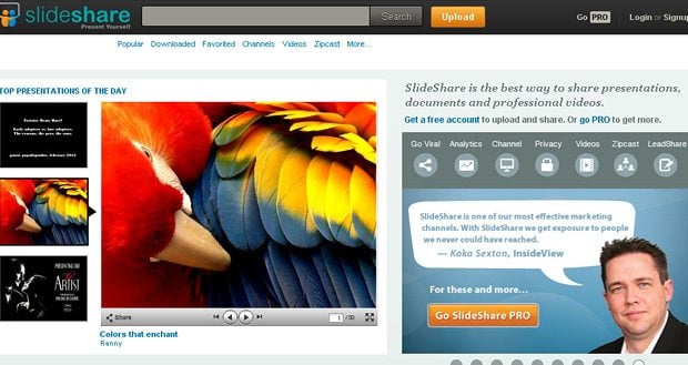
Check out the following online presentation tools when you need a quick and quality solution to make up a presentation: Empressr, Imageloop, myPlick, PreZentit, Flixtime, Photopeach, Prezi, Screenr, authorSTREAM, Sliderocket, Slideshare, BrinkPad, Storify etc.
Include Call to Action
Make sure you have explained your goals to your customers, since web presentation should end with a memorable call to action. Compose it in such a way to make viewers react immediately. Make it short, catchy and precise. Explain why and how should they do what you want based on your target audience research. And keep it up!
***
And finally, put links for downloading your presentation file and sharing it with a friend via email or any social media. All these tips reveal peoples' psychology which hasn't changed much for ages and therefore can be efficiently used for your online presentations.
And now a guide on how to make an EPIC FAIL presentation:
Get more to your email
Subscribe to our newsletter and access exclusive content and offers available only to MonsterPost subscribers.














Leave a Reply
You must be logged in to post a comment.