How Too Many Ads Can Screw Up Your Website
Hi, reader, we’ve got to talk.
This is an intervention…
Unfortunately, you put too many ads on your website and we feel like we need to help you, have a seat.
As a marketer, I wear too many hats here, so looks like I am also an advertising mentor now, what’s next?
Alright, alright.... Let’s talk real business and figure out how to fix your problem.
I have recently visited Hong Kong and while walking down the streets I thought of your website.
You wanna know why? Take a guess.
Just like these people do not see the clear sky because of all these signs, I don’t see the content through the ads on your website. And to be honest with you, while these signs have a kick-ass neon look at night, your ads look lame as fuck 24/7.
I am just too tired of seeing the websites with the wrongly positioned ads and it made me step up and talk. Unfortunately for you, you are the one I ran into and I’ll show you that I know the score.
Let’s face it: advertising became less attractive since the invention of the social media. Nowadays each and every ad spot on the internet looks like a cheap and tasteless billboard that’s gonna showcase any kind of shit for a reasonable price tag.
But the real problem now is a number of ads on some websites, some of us only care about ad quantity, not the content quality.
Being a few years in this business I’ve seen a lot of projects going down because of the greediness. Advertising is a great way to make your website profitable, but shouldn’t you do everything smartly?
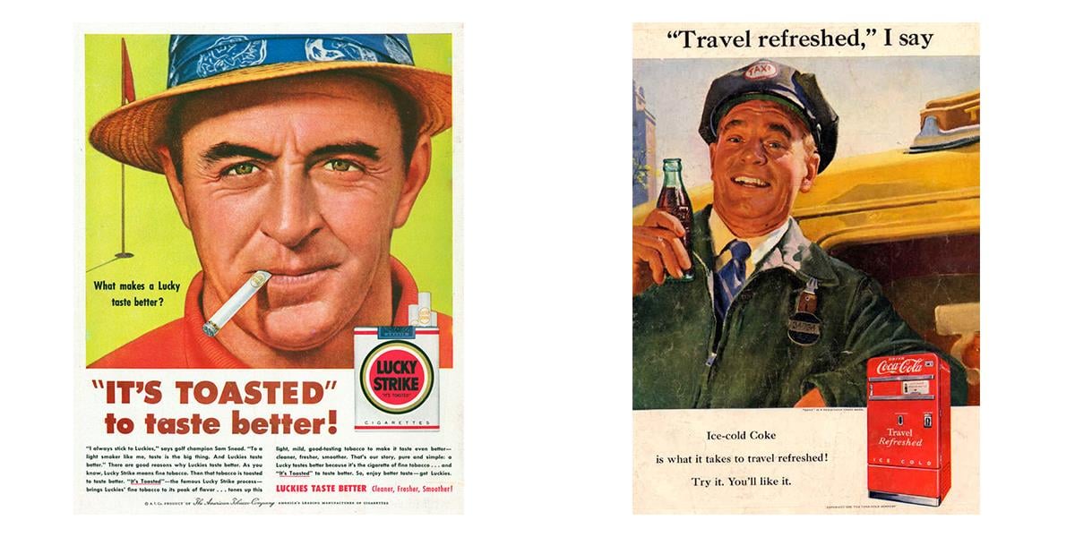
Oh, what’s that? Just looking at those ads made you want a glass of coke and a cigarette? We’ll give you the coke, but no cigarettes here, pal... We are not in 50’s anymore, we’ve got rules here.
Let me tell you one thing about me: I love reading the printed versions of the magazines and I do not care whether it’s cool or makes me look like an old dude. According to the latest polls, it appears that customers have the highest tolerance to the ads in the printed magazines. These readers show a great loyalty to the publisher and this approach of making the magazine profitable.
By the way, I went to my attic and took a few pictures of the ads in the old New Yorker issues I have on hands.
This stuff is so sick and stylish, isn’t it?
While serving as an advertising platform for the modern companies, you will not get the luxury of having these amazingly designed ads. Nowadays it’s more important for a company to deliver the message rather than deliver the aesthetic pleasure. That is why the customers show the lowest tolerance for the website ads, mobile apps ads, and online banner ads. In fact, their tolerance is so low that each and every day more and more customers start using the ad blocking plugins and apps.
I believe this fact speaks for itself and gives you an understanding of how crucial is establishing the good relationship with your readers and work on presenting the ads to them softly and partially. There is no need to throw ads in their faces and spoil the whole reading experience for them.
There is no need to throw ads in their faces and spoil the whole reading experience for them.
3 Reasons to cut the number of ads on your website
Let me make it simple and break this problem into 3 reasons why customers hate your website ads. Just take a look at your website from the user’s perspective, do you like it? Do you enjoy the user experience?
Reason 1: Too many ads annoy users
One of the most popular reasons why customers hate ads is the fact that they find ads very annoying and interruptive. I don’t recall a situation when someone would tell me how much he loves the pop-ups and banners that distract them from reading the website content.
Basically, this concern stands behind the creation of the ad blocking apps and plugins. According to the latest stats, more than 30% of users have AdBlock installed or some other blocking plugin and this number is actually growing.
In this circumstances, we should all accept the rules of this game and work on making the user’s website experience more pleasant and less annoying.
Reason 2: Too many ads may create the security concerns
The story I’m going to tell you now is very popular, but the popularity doesn't make it less cautionary.
Since most of the websites work with the ad publishers and leave the ad space for them to use and fill with whatever they want, sometimes you may look like a real fool.
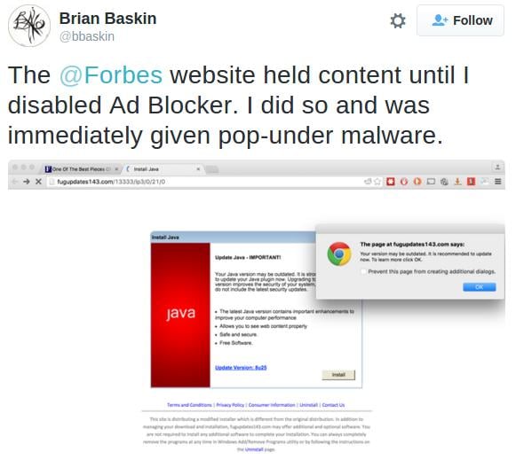
This story is about the well-known Forbes’ trouble with the ads on one of their pages. They have the tool that forces customers to turn off the ad blocking plugins in order to continue reading. Once one of the users turned it off, he was given a malware.
It doesn’t matter to the reader whether it’s your fault or the ad publisher. Of course, all the negative feedback has been directed to Forbes. Lots of news magazines had to review their advertising policy after this story. It also had a huge impact on those who thought of the ads badly, now they hate it even more!
Reason 3: How good is your website load time?
This one is tricky, cause not only the ads affect the load time. However, I genuinely believe that lowering the number of ads on your website will make it load faster.
Numerous of polls show that customers want to see the website load in a few seconds. The abandonment rate for the slow websites is huge! Just think about it: 76% of customers leave the website in case it loads more than 5 seconds to load. This is insanity! But it’s still the reality, so we’ll have to adapt and work with what we have.
Ads will alway make your website load slower due to the fact that many of those are pictures and some of them are even animated. Consider cutting the number of the ads on your website in case you want to make the customers’ engagement higher.
What is wrong with you?
You can't expect loyalty from people who would do anything for money.
Greediness is one of the worst things in business, it can crush you in a blink of an eye. If I start listing websites I saw being screwed up by its owner in a chase of a big fat check from the ad publisher, I’m not sure we’ll be able to have a dinner, cause I’ll be able to go on for a few days.
Your problem is simple and it’s not new… You saw the opportunity to get a lot of money and you chased it like a dog chased the postman after he delivered your morning correspondence.
Increasing the number of ads on the pages is the easiest way to get more money, but it will dramatically affect the customers’ engagement.
Treatment plan
It’s time to cut the crap and offer a real solution. That’s why we are here, my friend, we’ve got you covered and prepared the plan on how to use ads on your website in the most efficient and smart way.
Step 1: Kill the pop-ups, it’s not the medieval times
Everybody hates the pop-ups, do not consider using those if you want to see anyone scrolling around your website. I’m gonna tell you more: even Google doesn’t like pop-ups and considers them as the annoying garbage.
The only purpose you may use the pop-up is getting your customer subscribed to your newsletter. Personally, I don’t like it either, but studies show that it works and helps you to increase the number of subscribers.
Step 2: Clear the article area from noisy banners
Make sure your content is easy to read. Bumping into a big blinking animated banner in the middle of a longread is pretty annoying and discouraging.
Step 3: Work with the ad blocking audience with patience and understanding
Listen carefully, cause I’m about to drop some wisdom.
Your goal should be quality, not quantity. Instead of increasing the number of ads, you should consider a different approach: keeping the ads amount in a reasonable zone and give your customers a reason to turn off the ad blocking plugins and apps.
This approach is used by many websites nowadays, but I think that not all of them are doing it right.
For example, Forbes just tells you to turn off the ad blocking plugin by closing the website for you entirely. Personally, I don’t like such attitude, I simply don’t like when someone tells me what to do.
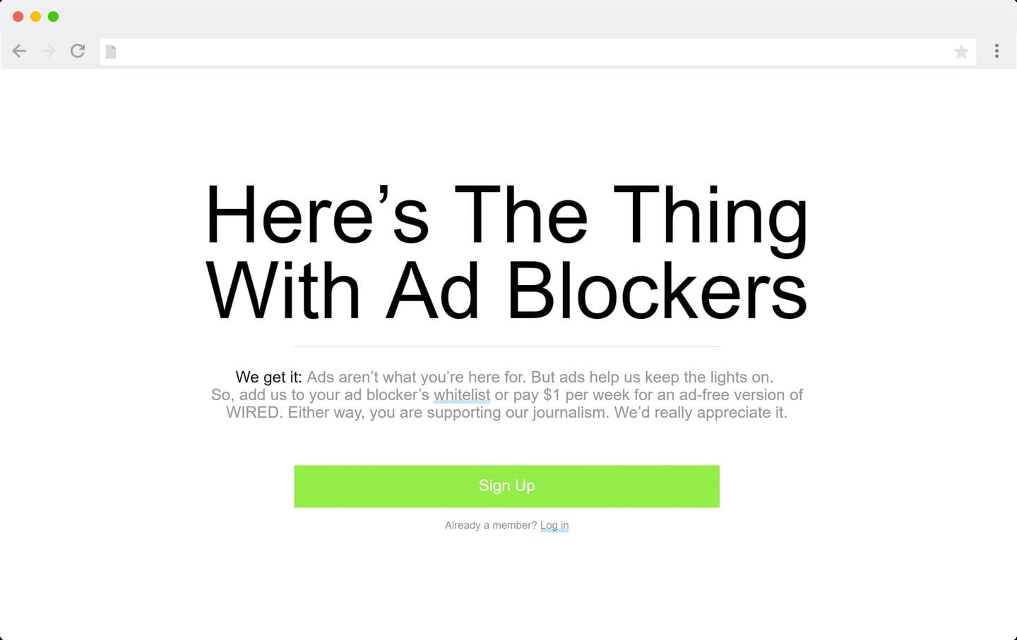
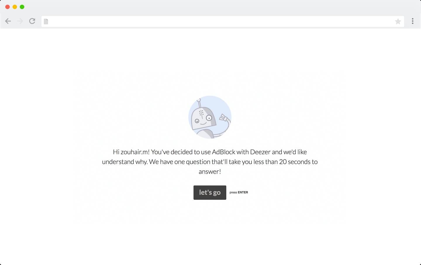
That’s where you should take a look at an opposite approach from Deezer and Wired, they do it in a friendly manner by giving their customers an explanation why they should turn off the ad blocking plugins.
Between those two, Deezer is the one you should definitely learn from. These guys give you a message saying that they simply do not understand why you still want to use AdBlock even after admitting that you like their services. So they ask their users for the feedback, they ask them to tell the real reason why they are using it.
Working with your audience in a friendly manner and giving the reasons to stay with the full version of your websites is smart and convenient.
Running your own website is taking a lot of energy and your personal time. As a matter of fact, it’s completely okay to make it profitable, cause everyone needs a motivation to keep going. But at the same time putting a little bit more effort into your advertising campaigns and a reasonable amount of ads, banners, and pop-ups will make your website more user-friendly.
User friendliness is a valuable thing to offer and your customers will definitely appreciate it by coming back for the new portion of content.
Here at TemplateMonster we have a lot of templates that allow you to place the ads in the most efficient way. Feel free to check out our catalog of the ready-made solutions, choose the one you like and enjoy!
Get more to your email
Subscribe to our newsletter and access exclusive content and offers available only to MonsterPost subscribers.

