Memphis Design Movement Is Having A Moment Again
- Things You Should Know About Memphis
- Memphis Comeback: Design Trends
- How To Use Memphis Design In Your Project
- Conclusion
Things You Should Know About Memphis
Memphis design was founded in Milan, Italy in the 1980’s by designer Ettore Sottsass when the group meeting took place. Team members were listening to Bob Dylan song called ‘Stuck Inside of Mobile with the Memphis Blues Again’ and the word ‘Memphis’ jammed.
Sottsass Associati group wanted to revolt against the minimalist and unified aestheticism of the 70s and honored everything others found wrong in design.
Because the movement got so much significance, the Wall Street Journal called it ‘a major source of inspiration.’ You will quickly recognize this design: it is characterized by using bold, sometimes conflicting colors, chaotic placement of geometric forms in web design templates and laminated plastic.
Interesting Facts
The original Apple watch offered in 1995 as a bonus for everyone who bought Mac System 7.5, came with Memphis style minute, second and hour arrows.

Such clothing lines as Christian Dior and Karl Lagerfeld drew the inspiration from Memphis designs.
How You Can Recognize Memphis Style
- Laminate and Terrazzo have been used on floors for tables and lamps.
- Squiggles or so-called ‘Bacterio’ print was developed by Ettore Sottsass and became trademark design.
- Bizarre Geometry distinguished by using circles and triangles instead of rectangular shapes (e.g., chair legs or armrests).
Memphis Comeback: Design Trends
The Memphis concept was used in different trends for about a year starting from 2005 to 2006. Yet it seems that the direction has not attracted general public and disappeared till September 2013. Since that moment it has become widespread not only in fashion, interior designs and web development. We are going to share some good examples below with you.
Memphis In Graphic And Print Design
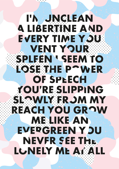
Crayon Memphis-encouraged palette of colors created by Carmen Nácher:
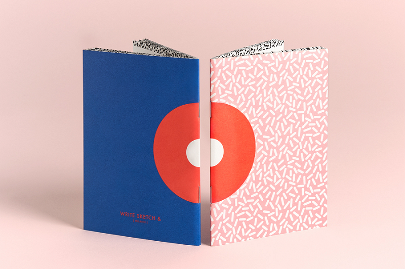
A wide range of handheld notebooks by Officemilano:
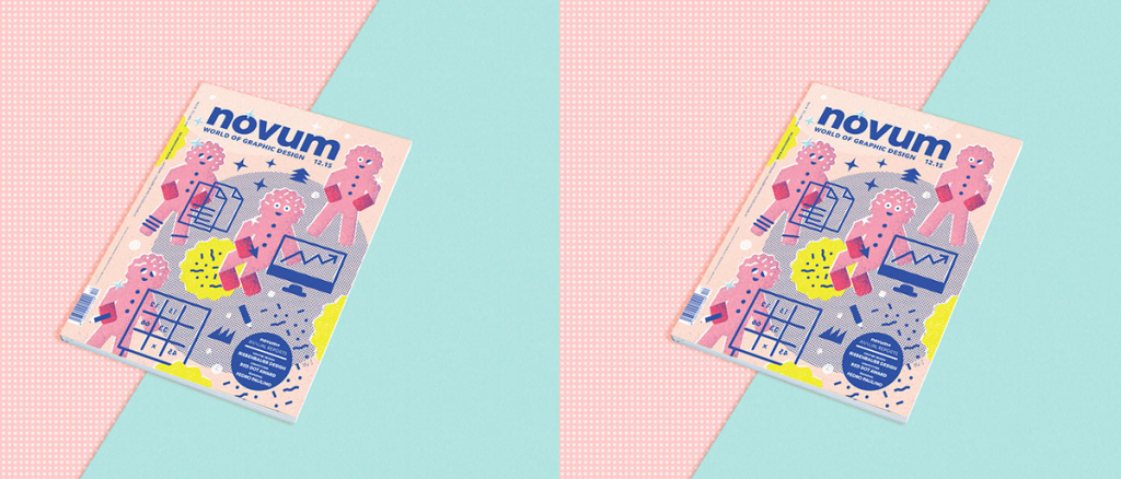
Artwork project for Novum Magazine:
Memphis In Web Design
Diane Lindquist has designed credit-card checkout flow rate inspired by geometry and vivid mood of Memphis:

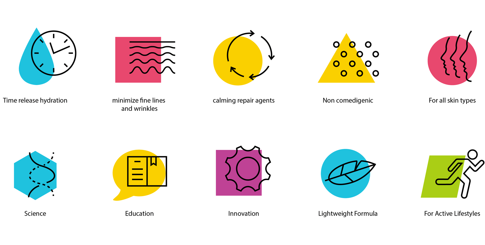
Memphis-encouraged icons by designer Nate Tate:
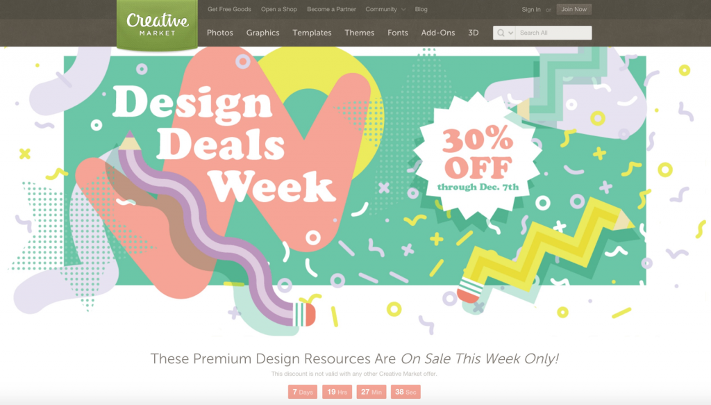
Memphis-like deals week design on Creative Market website:

Memphis-Like Templates In WordPress
Here you will find font packages along with a designer portfolio WordPress theme which has something alike with Memphis concept.
- Trixie is a multilayer typeface inspired by geometry and multiple impacts. You will get the latest futuristic font layer including upper and lower case symbols, multilanguage characters, figures and punctuation marks. If you are a creative person and would like to make your project eye-catching, Trixie typeface is what you need. It applies to graphic design, print, icons, branding, motion graphics and many others.
- VicHax is a fully responsive design portfolio template which can be used for developers of all sorts. Are you searching for a spectacular template to create out of the ordinary portfolio and represent your professional knowledge with taste? This WordPress theme will meet your needs. With the help of Live Customizer and Page Builder, you will be able to make any adjustments matching corporate manner. Operated by Cherry Framework, the template is supplied by various useful plugins identifying your business line for your potential customers.
How To Use Memphis Design In Your Project
You are ready to begin a new project and want to add some highlight to it but do not know where to start? Here are some ideas you can come along with:
Typography together with Art Deco encouraged typefaces embodying sharp edges and sleek curves.
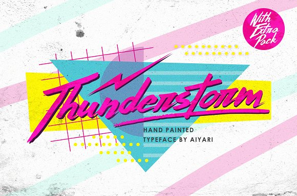
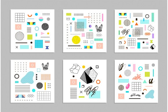
Patterns and vectors where the Memphis concept is used are characterized by placing thin direct lines in absolute opposite to seamless, free-flowing points and structural 3D forms. Combining contrasted things is difficult. Thinking about toys may help you succeed.
If you do not want to use restrained colors in your project, this is one more purpose to refer to Memphis genre. Its color scheme will add a dynamic and delight to your idea. Think out of the box and stop observing the rule ‘what is correct.’

Conclusion
If you want to stand out among your colleagues; if you are bored with monotonous design and faded colors in patterns, and want to make a breakthrough in your career, feel free to choose Memphis style. It may bring you popularity if used moderately and with taste. Even though it was found bizarre and ridiculous, it still caught so much attention and encouraged real fashion icons to come back.
You will not regret!
Read Also
Best Creative Gift Ideas For Graphic Designers And Fashion People
How to Market Your WordPress Web Design Business for More Exposure
eCommerce Store Optimization: 10 Effective SEO & Design Tips
5 Trust Signals You Need in Your Homepage Design
Top Design Disasters that Kill Your SEO Effort Completely
40 Free Material Design Resources for Designers
Don’t miss out these all-time favourites
- The best hosting for a WordPress website. Tap our link to get the best price on the market with 82% off. If HostPapa didn’t impress you check out other alternatives.
- Monthly SEO service and On-Page SEO - to increase your website organic traffic.
- Website Installation service - to get your template up and running within just 6 hours without hassle. No minute is wasted and the work is going.
- ONE Membership - to download unlimited number of WordPress themes, plugins, ppt and other products within one license. Since bigger is always better.
Get more to your email
Subscribe to our newsletter and access exclusive content and offers available only to MonsterPost subscribers.

Leave a Reply
You must be logged in to post a comment.