Best Ideas With Polka Dot Pattern in Web Design 2020
If you want to make a bright and catchy design, then use patterns! In this article, I will tell you when and how best to use them so that your web design would be remarkable.
As you already understood from the title, I am going to tell you about polka dot seamless pattern. Seamless patterns are patterns consisting of repeating elements, the border between which is not obvious.
Polka dot patterns are very popular as a background for:
- albums;
- for fabric and textile;
- fashion clothes;
- interior design (for example, on wallpapers);
- greeting cards and invitations;
- for children's design;
- packaging design or clothing design;
- and many others.
And even for web projects such as websites or web banners. Patterns in web design are very popular, if only because they can be created using computer technology. They are closely related to information architecture and coding. A pattern gives a twist to your site, the dynamics of its design.
These patterns can also be used as overlays on top of your Photoshop work to add texture.
Let’s find out more about the importance of patterns and especially the popularity of polka dot patterns.
Table of Content
- Unlimited Downloads of Premium Graphics
- What Is a Pattern?
- Difficulties of Choice: How to Choose
- What Are the Good Patterns?
- How to Use a Dot Pattern in Web Design?
- Why Is It Important to Know as Many UX / UI Patterns as Possible?
- Where to Get These Libraries That Are Important for All Designers?
- How to Create a Dotted Background Using CSS
- How to Create a Dot Background in Adobe Illustrator
- Websites With Dot Patterns for Inspiration
- Conclusion
Unlimited Downloads of Premium Graphics⬇️
Get for Free in One Membership
How to pay once and get an unlimited number of products? Lots of developers and web designers, as well as site studious, are occupied with this question. For this reason, we’ve created ONE Membership. This kit for digital projects allows you to subscribe for a month or year and use dozens of items for free.
Moreover, there are no limits for subscribers. Download any premium templates for $17/month, choose extensions, and don’t forget about visuals, like stock images, infographics, patterns, icons sets, and others. Then, repeat it again and again?, as the amount of downloads for all the products that are in the subscription is really unlimited! That is very comfortable and sparingly, especially when you work on diverse projects.
Join us!?
What Is a Pattern?
Patterns are repeating elements that help convey the brand value to the target audience, make it recognizable and memorable. It can be a wide variety of patterns, lines, shapes, animals or stylized products of the company. Patterns can be used everywhere: business cards, packaging, stationery, promotional materials. There are many ideas for use. And patterns look great in website design. As for the websites with a polka dot, they are popular thanks to its universal design.
Polka dots mean a symmetrical pattern of filled circles. And if you think that such a pattern can be present only on girl's dresses or costume butterflies, then you are very mistaken. Recently, peas have settled comfortably in a men's wardrobe, conquering both the catwalks and street fashion.
Today, this pattern adds to any subject a fleur of youth, light charm, playfulness, and elegance. And web design is not an exception.
Difficulties of Choice: How to Choose
- Pastel colors. Since patterns have a greater visual weight than a plain background, use calm pastel tones in the patterns. Too bright or distracting drawing shifts the focus of attention to yourself and everything else is simply lost. Now the trend is patterns that are more simple and are perceived more like a texture. Although one can find a very successful use of bright flashy patterns if these characterize the brand. But these are rather individual cases.
- Minimalism. Use minimalistic patterns. They are easy to read and functional. It is impossible to remember what cannot be understood from a first glance. A simple and stylish pattern (provided that it is harmonious and thoughtful) will certainly become the brand's trademark.
- Geometry. Simple and complex geometric shapes in all kinds of combinations and styles have not been losing their position for years. Geometric patterns are interesting and modern. But it is worth remembering one thing. You can add any number of shapes and lines to the design in pursuit of an unusual intricate pattern. But is it worth it? Take a step back and look objectively. The drawing should be visually interesting, but not oversaturated.
- Logo pattern. The simplest, but at the same time a very successful option. It is possible in those cases when the logo is based on simple geometric shapes and there is no complex detailing, and the sign itself contributes to its repetition.
What Are the Good Patterns?
They give the site dynamics, form a unique style. In addition, various textures are actively used in the patterns, which gives them an additional degree of diversity.
Textured patterns can be used to create absolutely any projects, from corporate platforms to personal blogs. The only question is the right choice. In the first case, it is better to give preference to restrained geometric and minimalist patterns, and in the second one should start from the subject of the resource.
3 main features of patterns:
- They are unique! Each pattern is a special story about the company. The pattern helps to stand out from the competition, attracting attention and helping the client accurately identify the brand.
- They are universal! As I have said, they can be used literally everywhere. On business cards and the packaging of your product, in templates for email newsletters and on letterheads, in social networks, in presentations and promotional products (banners, booklets, banners).
- They are flexible! The pattern can be used both as a whole and its individual elements. They perfectly fill the voids on the website, are used as a background. You can play with the sizes, mix elements and get the same recognizable pattern in a completely new, fresh image.
A familiar pattern immediately associates with a particular brand. And it doesn’t matter whether the person saw him on the site, in advertising on social networks or on a branded pen. This element of corporate identity is designed in such a way that it can be used everywhere. And so that it looks beautiful and harmonious.
Web Design Features Using Patterns
When using patterns, they resort to two methods: simple and obvious.
In the first case, the pattern is used to diversify the plain background.
The second method involves the use of a detailed pattern suitable for the theme of the site. It is necessary to choose complicated (saturated with texture) patterns very carefully so as not to distract the user's attention from the controls and not to reduce usability.
A pattern can enhance the design and appearance of the final product. But it must be used wisely to avoid a complicated layout or unattractive design.
How to Use a Dot Pattern in Web Design?
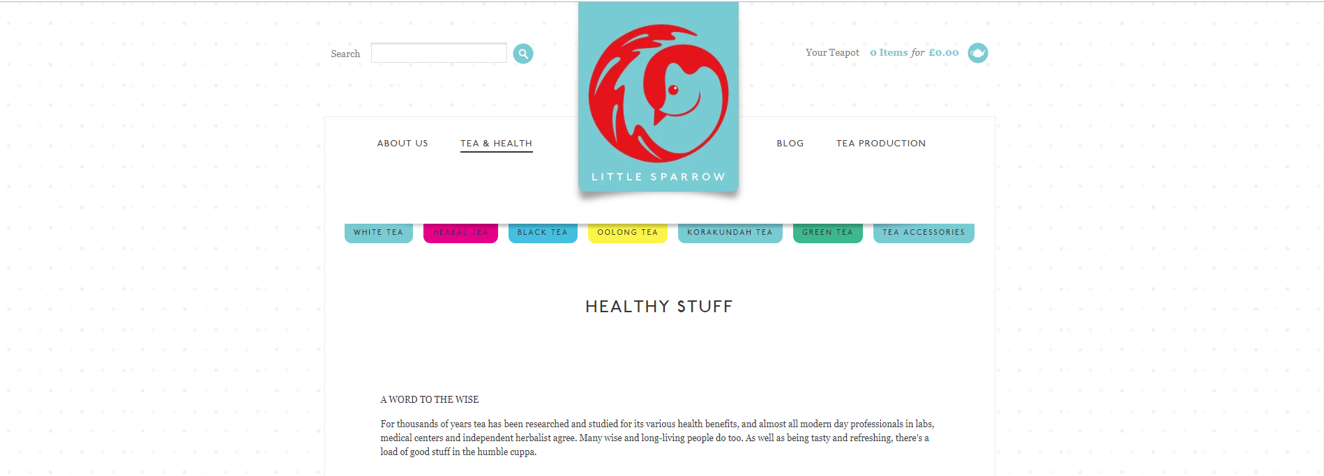
As a background — Little Sparrow
As a decor for a top header — S**t kingz
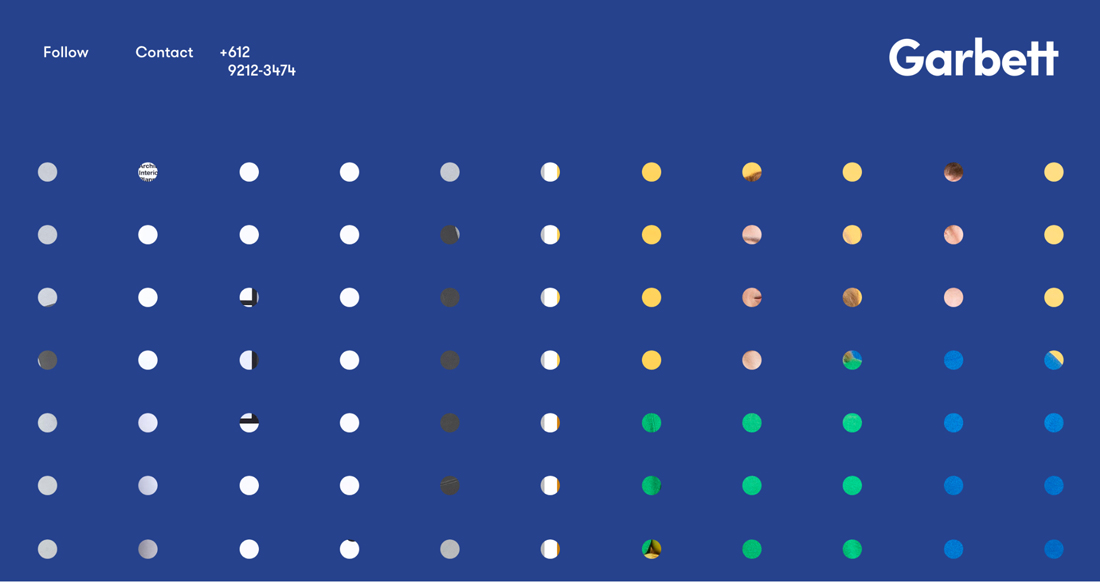
As a web design concept — Garbett
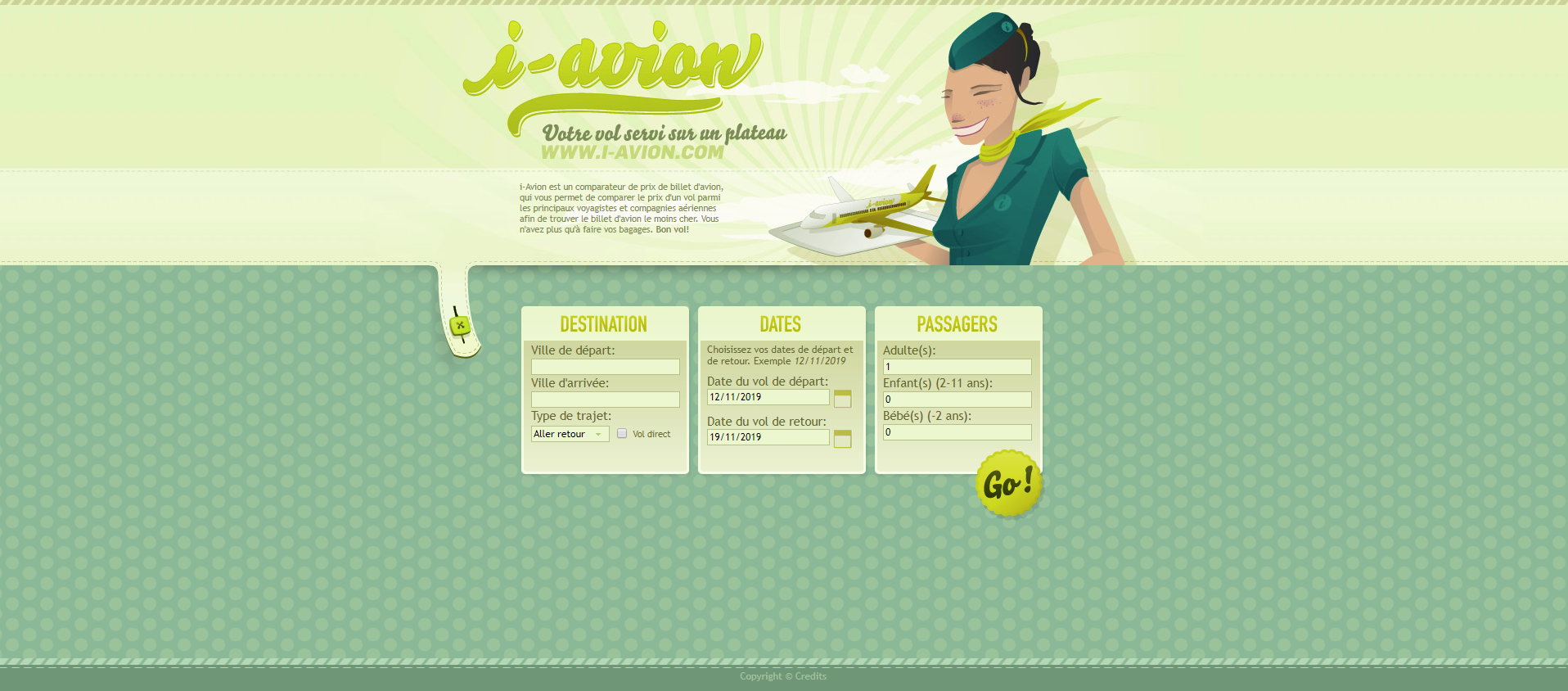
As a combination with graphics — i-avion
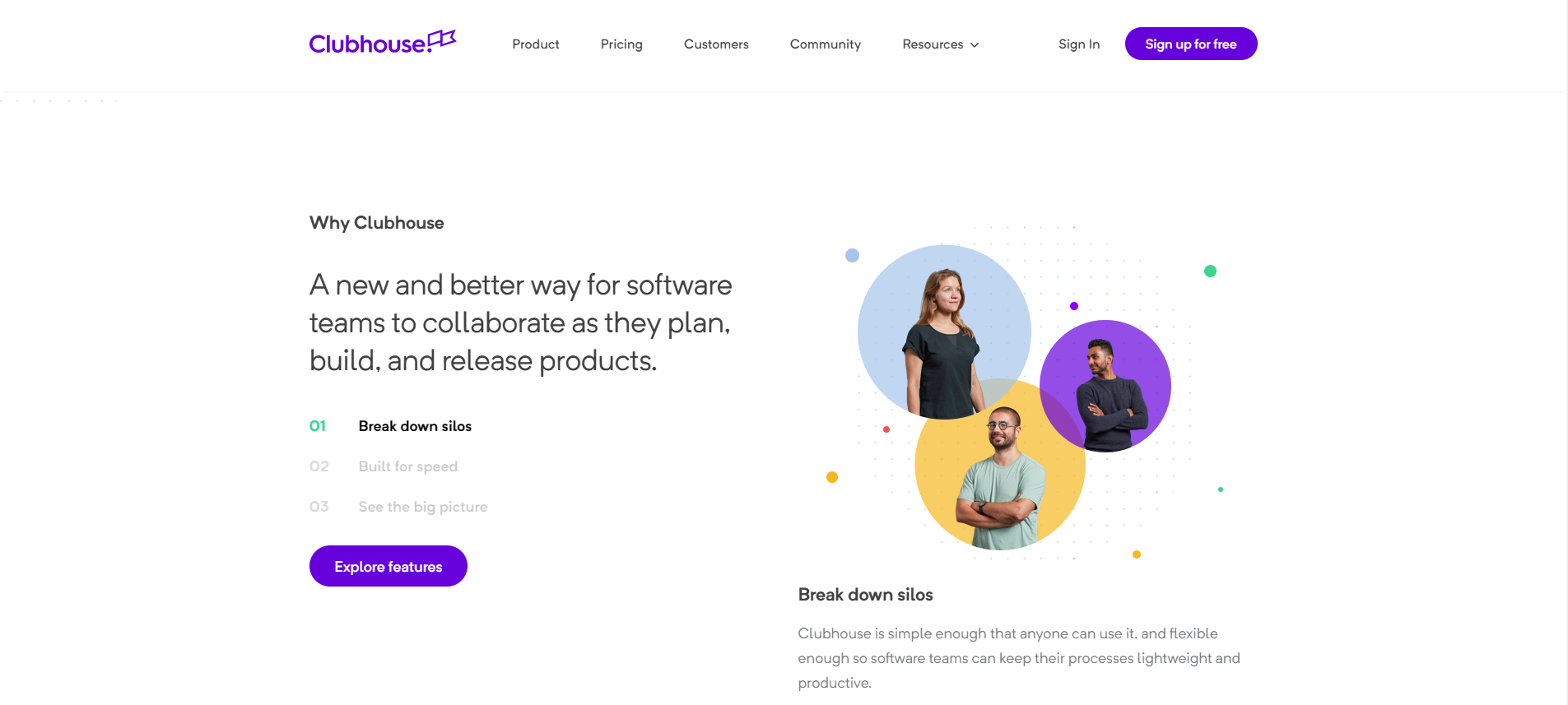
As an emphasis on a section — Clubhouse
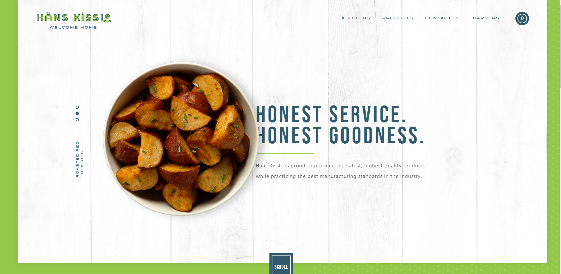
As a combination with textures — Hans Kissle
Why Is It Important to Know as Many UX / UI Patterns as Possible?
The more patterns you know, the easier and friendlier your sites will be, the easier it will be for users to be on them, the more sales will be, the more you will be appreciated as a professional. This chain can be developed for a long time, but I think you understand the meaning.
It is important to understand that coming up with one's own pattern is a very difficult task and not always necessary. Here's a banal explanation for why this is not worth it. Suppose a user visits a website unfamiliar to him, and each element in the design takes time to figure it out. The more elements for understanding, the harder it is for a user. Accordingly, Accordingly, it becomes a complicated task and the site closes. As a result, this user will never return. This is, of course, just an example.
It’s not bad when sites/interfaces/applications are similar to themselves, it’s even better, you just need to add a tiny detail that will set you apart from others.
As a result, when you know a lot of patterns, it will be quite easy to understand where people leave and do not reach their goal, and where they get what they want.
Where to Get These Libraries that Are Important for All Designers?
There are many such libraries. How to learn all of them? Just take and memorize these principles. When you visit sites these patterns will pop up with a picture in your head and you will learn how to correctly recognize these signals. How to check if this pattern is correct or not? I don't know. I suggest, that it’s worth focusing on giant companies.
And here are some useful libraries:
- Mobile UI Design Patterns — an e-book with 46 of the most successful UI patterns for mobile devices. There are detailed explanations for their use.
- Pttrns — a neatly organized database of patterns containing the coolest UI patterns since 2012.
- Good UI — a huge library of patterns, which was created based on A / B testing
- Web UI Design Patterns — 63 patterns with cases of their use from the guys who created their service for designing UXPin
- UI Patterns — The creator of this library is Andres Toksbu. All items were hand-picked.
- Colour Lovers — Almost one million seamless pattern for any taste.
- Inspired UI — the base of patterns for Android, iPhone, and iPad, which is easy to use thanks to a simple drop-down menu.
- Subtle Patterns — many different HQ patterns for free.
Polka dot background patterns - freebies
Here you can find some polka dot background images for free:
- Pixabay — tons of copyright-free photos, videos and patterns.
- Freepik — a large set of different polka dot textures and patterns for free.
- Toptal — One classic black and white dot background pattern with live preview.
- DeviantArt — You can find here many dotted patterns with positive feedback.
- Vecteezy — Over 36000 free dot pattern vector.
- Pngtree — Many dotted patterns of different sizes and designs.
- My Photoshop brushes — In this set are 29 dotted patterns, which are free for commercial and personal use.
- Brusheezy — 29 Photoshop dotted patterns in high resolutions.
- All free designs — 250 polka dot background images for free.
Also, you can create a pattern by yourself
Seamless Background Generator is designed to create seamless background images from pre-selected elements. Thus, the imagination of the designer is almost unlimited. The service library contains the most recognizable images that perfectly blend together. The user can create a variety of patterns by adjusting the number of pattern elements, as well as changing the transparency and background color.
The Pattern Cooler tool is designed to create seamless background images. The possibilities for this web service are very great. With its help, you can create thousands of unique backgrounds. Each image can be edited, change the color and nature of the patterns, achieving the perfect combination of background and other design elements. With Pattern Cooler, you can quickly create beautiful backgrounds for Twitter, Tumblr, or a WordPress blog. Small seamless patterns can be downloaded for free, but if you need large backgrounds for use in commercial projects, you will have to pay a subscription.
How to Create a Dotted Background Using CSS
You can create it with a simple HTML tag. I will explain it to you on CodePen.
- Create a circle. You can make this by using a radial gradient as a background.
- Choose two colors with equal color-stop values.
- Write the percentage of color-stop. It can be from 100% (edge of gradient) till 0% (center of gradient).
- Give the same height and width.
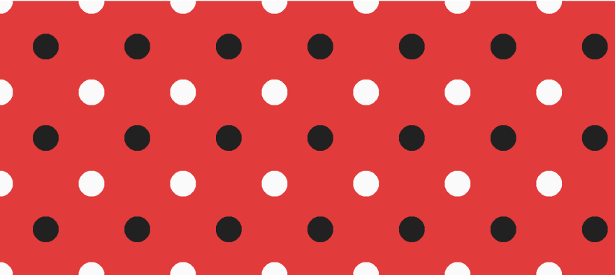
Now it should look like this:body { background-image: radial-gradient(#212121 20%, #e53935 20%); height: 100px; width: 100px; } - Repeat the circle. Change a position to the top left with
background-position: 0 0
- Set a size. Write
background-size: 100px 100px
- Change the width and the height to repeat the effect of our image. For example, 300px and 100px. To stop repeating change the value to
background-repeat: no-repeat.
- You can stop here or add a diagonal row. Add a new background-image by separating it with a comma.
- Add some transparency to each gradient. Add transparent 20% and set a background color. So, the second row will not be hidden behind the first one.
- Give each gradient different position values. Add background-position after a coma, and give a size (for example 50px). So, we are creating a diagonal spacing effect.
The ready CSS tag should look like this:
body {

  background-image: radial-gradient(#212121 20%, transparent 20%),

     radial-gradient(#fafafa 20%, transparent 20%);

  background-color: #e53935;

  background-position: 0 0, 50px 50px;

  background-size: 100px 100px;

  height: 300px;

  width: 100px;

}
This is our result CSS dot background.
How to Create a Dot Background in Adobe Illustrator
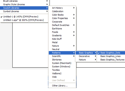
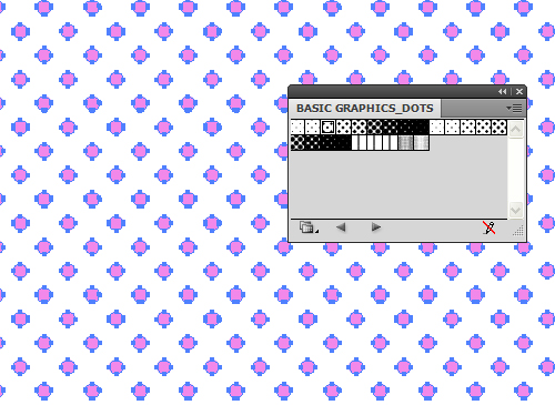
Use the standard Swatch Libraries Adobe Illustrator. To open the standard swatch library, follow these steps: Window > Swatch Libraries > Patterns > Basic Graphics > Basic Graphics Dots
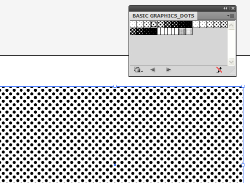
Next, draw a rectangle of arbitrary sizes and click on the circles you like in the Basic Graphics Dots palette.
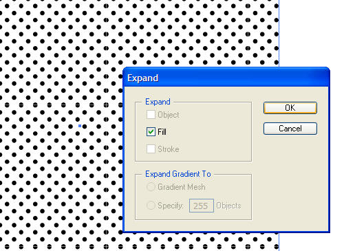
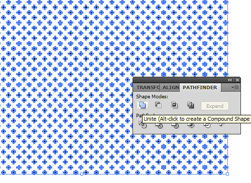
To repaint the polka dots in a different color, we need to parse our Pattern into separate objects. To do this, select the pattern and execute the command Object <U+2192> Expand, checking the box next to Fill. Without removing the selection from the group of circles, click on the Grop icon, and then on the Unite icon in the Pathfinder palette.
Now we can repaint the polka dot pattern in any color we like!
Websites with Dot Patterns for Inspiration
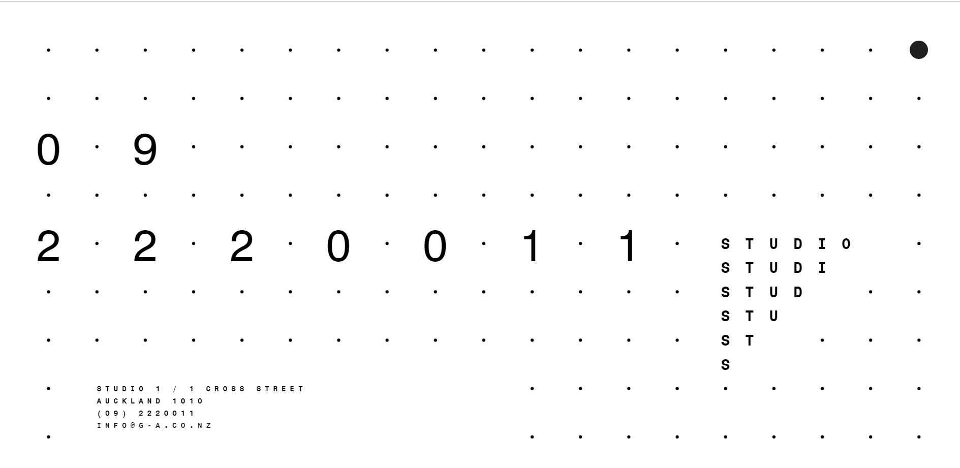
Glamuzina Architects
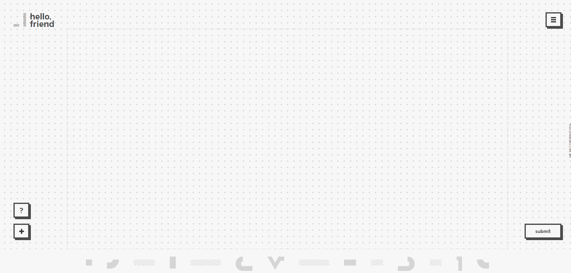
Mr. Milu
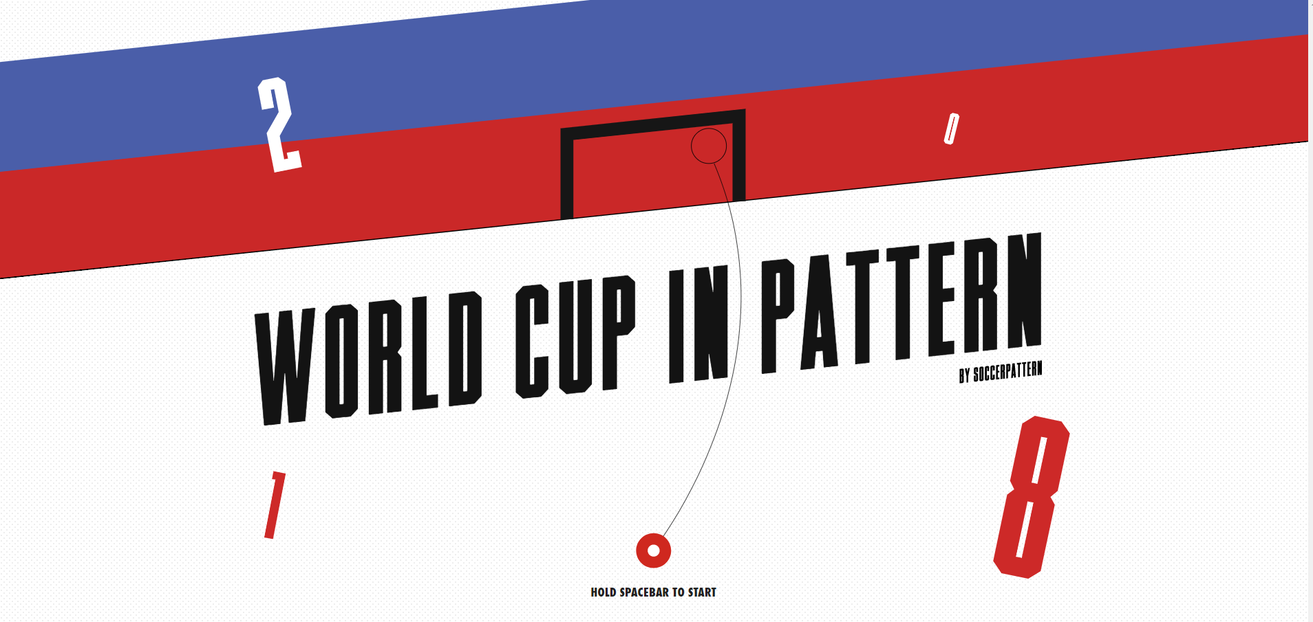
Soccer Pattern
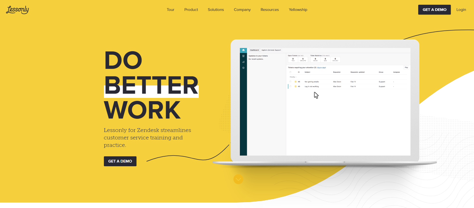
Lessonly
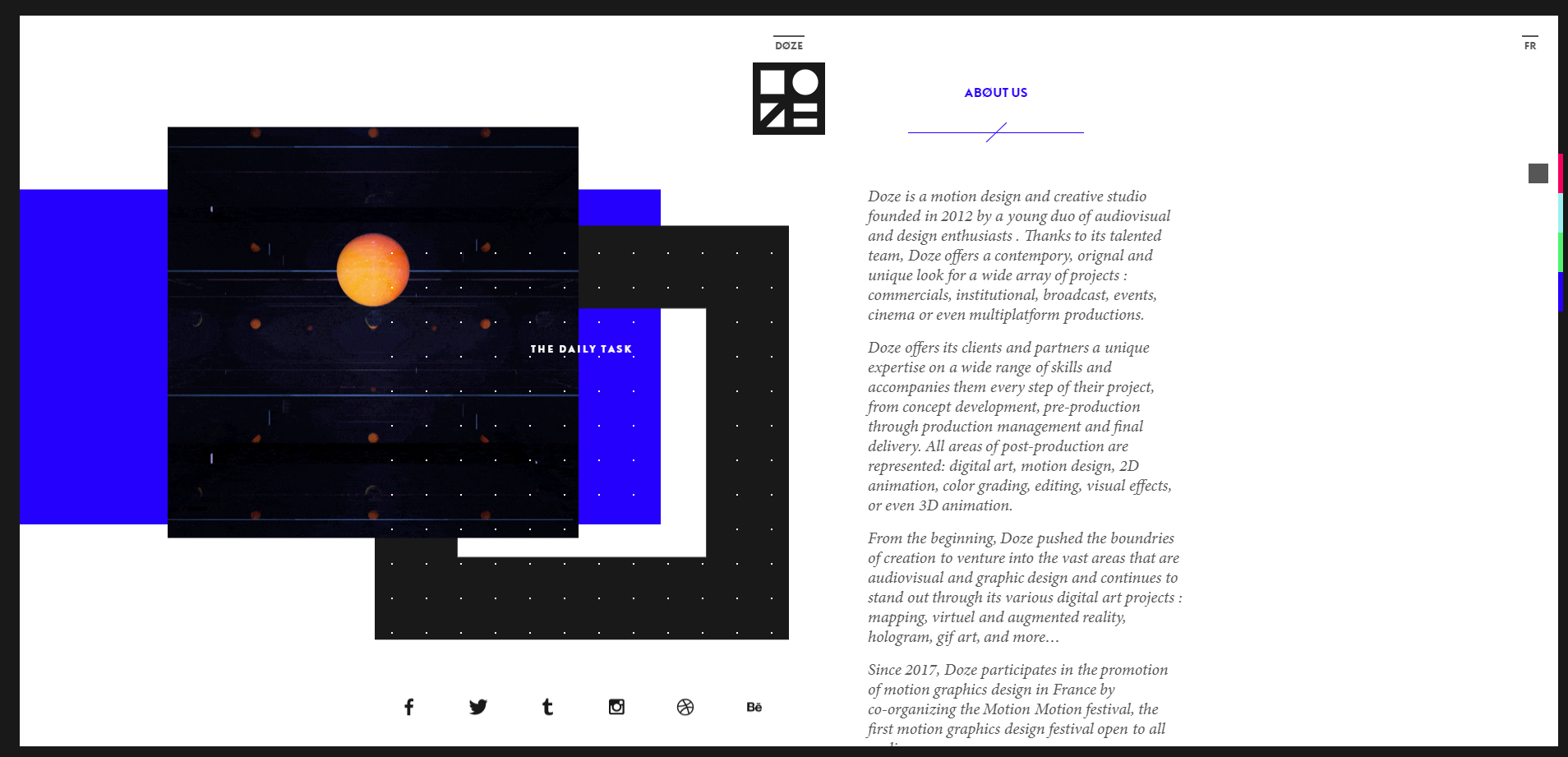
Doze Studio
Conclusion
When you want to make everything faster, brighter (to outshine everyone) and cheaper, the output may turn out to be not a great product and in some cases even repulsive. And all because sometimes patterns are just pictures that are not based on anything. They are not viewed through the prism of the brand, they do not reveal its essence, and they do not tell its unique story. There will be little benefit from such a design.
A pattern is not just a stylish picture. It is intended to reflect the mission and values of the company, to be its continuation, to have a certain meaning for others. The identity of each brand is like its own whole world. And the pattern can act as one of its important components.
Don't be afraid to use identity patterns for your brand! This is important and necessary. But, as in any other business, the right approach is needed here. A competent and modern pattern developed by specialists will become an integral part of your corporate identity.
I hope this article was useful to you. Leave a comment, if you have any questions.
Read Also
Follow Website Design Trends with Futuristic Hexagon Patterns
Honeycomb Patterns, Design, and Website Development
How to Create Seamless Patterns in Adobe Illustrator
25 Free Grunge Photoshop Patterns to Spice Up Your Designs
Don’t miss out these all-time favourites
- The best hosting for a WordPress website. Tap our link to get the best price on the market with 82% off. If HostPapa didn’t impress you check out other alternatives.
- Monthly SEO service and On-Page SEO - to increase your website organic traffic.
- Website Installation service - to get your template up and running within just 6 hours without hassle. No minute is wasted and the work is going.
- ONE Membership - to download unlimited number of WordPress themes, plugins, ppt and other products within one license. Since bigger is always better.
Get more to your email
Subscribe to our newsletter and access exclusive content and offers available only to MonsterPost subscribers.



Leave a Reply
You must be logged in to post a comment.