Stunning Presentation With no Design Skills? We’ll Show You How!
We’ve all seen them, the boring and poorly designed PowerPoint presentations, those cluttered and distracting ones that seem to have no actual purpose. Accompanied with long and undecipherable speeches they are tough to sit through.
In fact, these awful presentations are so infamous that most people are afraid they will deliver the same horrors whenever they need to make a presentation.
I’ve heard this more often than you can imagine - “I don’t know a thing about design, I will inevitably make an awful presentation”. Fear not! I’ve created a comprehensive guide following which you will easily create a stunning PowerPoint presentation even if you have no design skills whatsoever.
Colors
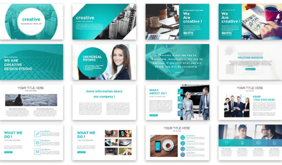
A beautiful and capturing presentation is always done in a balanced color palette. Just like in the stunning example below, colors compliment each other, and none of them clashes with the others.
Creative Presentation PowerPoint Template
All the lines, frames, and other design elements are done in the same color palette.
The important parts of the text need to be highlighted in the same color throughout the whole presentation, this makes the whole experience flawless and the perception easy.
Fonts
Since I mentioned text above, let’s discuss the fonts now.
It is generally considered that sans serif fonts are easier to read on screens, these are the fonts like Verdana, Helvetica, Tahoma. While serif fonts, like Times New Roman and Bookman, look better in print.
The truth is - serif or sans serif does not really matter. It has nothing to do with perception. What does impact perception is density and height? You don’t want a font that makes your letters overlap.
And you obviously want the text to be readable, and you want it to be readable even from the back of the room. So pay attention to the size of the fonts you choose for your PowerPoint presentation.
Try to stick to one font, two at the most.
Fonts have a personality of their own and different fonts can evoke different emotions, so be careful and make sure the font you choose matches the purpose and tone of your presentation.
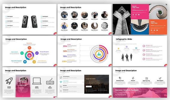
Genius Presentation PowerPoint Template

Images
Images are vital for creating a truly great presentation. They help capture the audience, retain their attention while you deliver the information that might not be that interesting, help you illustrate your point, make the impact of your words stronger and a lot more.
Citra Style Creative Presentation PowerPoint Template

Try to use vivid, “lively” images, the ones that evoke emotions. Make sure the images you choose are done in one style and complement each other, not clash with one another.
Also make sure the images you use are of high resolution, you do not want all your efforts to go to waste just because the images are low-quality and look undecipherable on the huge presentation screen.
Don’t get carried away with the images, you are not making a photo album after all. Stick to one awesome picture per slide.
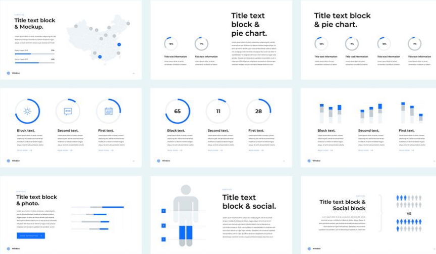
Icons
This one is very simple - always use icons from one pack. They are done in one style and color palette.
Business Plan Presentation PowerPoint Template

Geometry
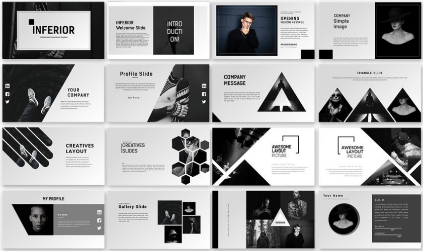
Using geometrical shapes is an awesome design technique which does wonders for creating a strong total look for a PowerPoint presentation. You basically add a design element and use it throughout the entirety of your presentation, and it becomes the visual linchpin holding it all together.
Inferior Creative Presentation PowerPoint Template
Alignment
Nothing makes a presentation look terribly unprofessional like a differently aligned text and images on each slide. It also makes a presentation hard to decipher. If your picture deflects from one slide to another you have to rethink the alignment.
Alpha Presentation PowerPoint Template
Whitespace
To make your presentation easier to read and the information easier to digest leave more whitespace on the slides. Overstaffing a slide with text and pictures is what makes a presentation look cluttered.
Big chunks of information need to be cut into smaller ones to fit in several slides, not one. It is also a great idea to use charts, graphs, and diagrams.
Business 2018 PowerPoint Template
Background
The background has to be neutral so it does not distract the viewer from the slides, and it has to provide enough contrast for the text to be easy to read. Generally white is considered to be the best color for the background.
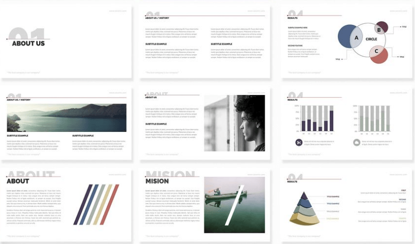
Century - PowerPoint Template
Final thoughts
Creating a beautiful and captivating PowerPoint presentation is not that hard. You know the main rules now, and you can always opt to use a professionally created PowerPoint template to get a great look.
So now that you know how to make the visual part of your presentation perfect, you can concentrate on creating the most captivating speech to accompany it.
Read Also
21 Easy Tips to Create a Powerful Presentation for Your Business [Free eBook]
PowerPoint vs Keynote: Presentation Tools Compared
The Best Presentation Templates For Your Chief’s Admiration
6 Rules of a Compelling PowerPoint Presentation
Create A Skillful Presentation Of Your Freebie With This Free One-Page WordPress Theme

Get more to your email
Subscribe to our newsletter and access exclusive content and offers available only to MonsterPost subscribers.

Leave a Reply
You must be logged in to post a comment.