Rules of a Compelling PowerPoint Presentation [Tips and Tricks]
This is the first lesson of our Ideal Presentation Free Ultimate Course. Want to get the whole course? Hurry up – follow the link and subscribe for it!
Table of contents:
- Choose the right PowerPoint presentation template
- Take care of the compatibility issues
- Use less text and more visuals
- Carefully select the fonts
- Keep it simple
- Brevity is the soul of wit
- Conclusion
By making your PowerPoint presentation boring you don’t simply decrease its value – you set it to zero. If you are planning to screw up your presentation, there is no reason for preparing it in the first place.
When it comes to the success of a presentation, four things matter:
- Design of the template;
- The content;
- The way the content is placed on the slides;
- Your performance;
If the content and the performance depend on you alone, the design of your PowerPoint presentation can be improved effortlessly following these simple rules. The essential hints below will help you avoid the most common mistakes made by PP users. Also, check out our free eBook with 21 extra tips to create a powerful presentation for your business.
Choose the right PowerPoint presentation template
As I have mentioned before, designs of presentations and websites depend on current trends and techniques. You won't argue that expecting a website to be created from scratch by someone with zero skills in web design would be a crazy idea. The same applies to the design of PowerPoint templates.
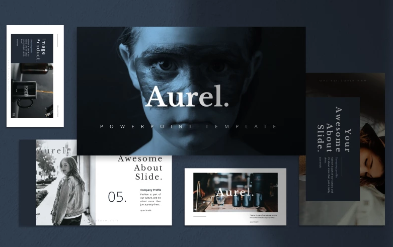
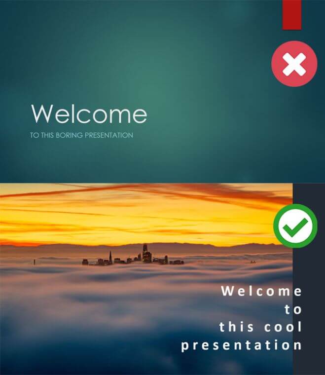
I strongly do not recommend you taking the default themes. Why? Everyone uses them! They are common, boring and not original. Chances are, that the part of your audience has already seen that design during some other presentation. You won’t be able to impress the listeners that way – it is better to find a professionally designed premium theme. For example, I will be using the Aurel PowerPoint template and one of the default designs.
Hundreds of such premium PowerPoint presentation templates can be found in the TemplateMonster marketplace. They are full of versatile, professionally designed slides, and complemented with customizable maps, charts, and infographics. In other words, they contain everything you need to create unlimited presentations for your projects. To see what they contain, if you are curious to know what’s inside each product, check out our latest review on the Pitch Pro PowerPoint presentation kit.
You can still mess the things up if you really want to, but with a solid framework, it will be much more difficult.
AUREL - PowerPoint Template
Take care of the compatibility issues
If anything could go wrong – it will certainly go wrong, so be prepared for it. The more depends on your own efforts – the lesser will be issues you are not ready to deal with. It is really great that we have Wi-Fi almost everywhere now but there could be no time to search for the software or app when the time will come to show your presentation.
If you want to make sure that your PPT file displays properly, better use your own laptop, or specify beforehand if the hardware and software of the PC are fully compatible with your presentation.
Another trick to improve the compatibility is to convert each slide into a flat JPEG file. However, it's not an option if you want to include animations and videos in your presentation.
Use less text and more visuals
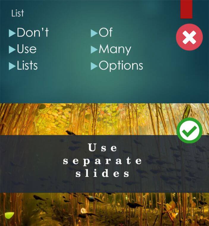
You might feel an intense, insurmountable urge to stuff 5 pages of Arial 12 text about air pollution in urban areas into a single slide. Don’t do that. The rule that always works for me is:
One message = one slide
Another thing you need to avoid is copy-pasting entire paragraphs of plain text. Come on, those people who sit in front of you gathered here to listen, not to read from the screen. Don't let the text steal your audience's attention from you. Besides that, the viewers won’t really read it. Keep it laconic – not more than six lines of text, so anyone will be able to read it in a second. That text will only support your speech, not replace it.
Use infographics instead of boring charts and tables. They are easier to digest, and that’s what you need to keep your audience focused.
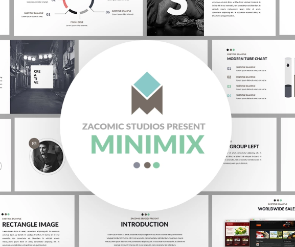
Minimix - PowerPoint Presentation Template
Carefully select the fonts
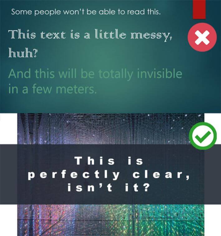
Sans serif fonts are always the best choice for digital presentations. They provide better readability on screens and are more versatile than serifs.
Don’t use the default typefaces such as Calibri, Cambria or Arial. Instead, consider Helvetica. Unlike the aforementioned fonts, it comes in a broad range of weights and styles and allows you to build your presentation using only one type of family and retain the integrity of its design.
The size of the text is also important. Yes, when you create a presentation on your laptop it will be much smaller than it will be on the huge screen. Remember about it when designing a slide. The people who sit on the biggest distance from the screen should also see what was written. Besides that, don’t forget about the contrast. The color of the text has to be 100% contrasting to the backing.
Also, don’t overlook such an awesome feature of PowerPoint as font embedding. With its help, you can include your own custom fonts and make your presentation stand out.
Keep it simple
Avoid clutter in your slides, and make them as minimalist as possible. Laconic design always looks elegant and will show the audience your excellent taste. Avoid using decorative icons and other stuff that will make slides messy. It is better to leave lots of empty space than overcrowding the presentation with unnecessary details no one will pay attention to.
Don’t turn your presentation into a painter’s palette: two or three colors should be enough to express your creativity without making it garish and unprofessional. It will look cool if some words will be highlighted with contrasting color but a text where all the words are painted in different colors looks ridiculous.
If you have several amazing pictures – don’t place all of them on the same slide. The rule “one message = one slide” works here too. A single Image will support the idea of the slide and emphasize it but if you put even two photos – the effect will be completely lost. And yes, it may be obvious but choose the images that will match the message you want to deliver to the audience.
Pitch Pro PowerPoint Template

Brevity is the soul of wit
This is, probably, not your doctoral dissertation, so don’t make it too long. Guy Kawasaki recommends keeping your presentation within 10 slides and 20 minutes. A typical presentation lasts no longer than 7-10 minutes. Hour-long presentations are almost never successful.
This is a rule of a thumb and it may not fully work for you, so apply it thoughtfully.
Give your audience a chance to contribute to your report by asking questions on the topic. This will not only prevent them from falling asleep but will also give you an opportunity to enliven the presentation, add a personal touch to it and make it memorable.
Conclusion
I hope that these tips will help you create and present a stunning presentation that will impress your audience and make them burst into applause. And don’t forget to check out our assortment of PowerPoint templates that will save you hours on preparing your presentation.
Read Also
Free PowerPoint Template for a Win-Win Presentation
Get Pitch Pro – A Free PowerPoint Template for Business
Create A Skillful Presentation Of Your Freebie With This Free One-Page WordPress Theme
22 Professional PowerPoint Templates to Use in 2017
30 Keynote Templates to Create Professional Presentations in Minutes
21 Easy Tips to Create a Powerful Presentation for Your Business [Free eBook]
Pitch Pro Free PowerPoint Template
Get more to your email
Subscribe to our newsletter and access exclusive content and offers available only to MonsterPost subscribers.



Leave a Reply
You must be logged in to post a comment.