Use Presentations to The Fullest: How to Make it as TED Speakers?
Thanks to Steve Jobs and TED Talks presentations have become another breathtaking performance.
If you are a professional marketer or going to become one, sooner or later you’ll have to make a presentation. So when this moment comes, you will have to make it exciting, eye-catching and informative at the same time. In this article, we’ll share some secrets that will help your listeners to remember your presentation for a very long time.
A good presentation follows its main goal, has a good scenario, a powerful story and a good design.
But what does it means? Let’s stop on each point and get this over with.
- Why do you need a good presentation?
- 5 types of presentations according to your goal
- How to build a powerful exciting scenario?
- The key factors of an excellent speech
- How to keep the attention of the audience during the presentation?
- What does the good design for presentation mean?
- Slide types and their goals
- Best presentation templates
Why do you need a good presentation?
Let’s start with the goals, as a rule, people say their goal is to “Inform the audience about...” or “Tell people what...”. But it doesn’t work. After listening to the presentations with such goal people usually, forget about them right after the coffee break. Ok, they listened to you and what’s next? Why did you make that presentation?
Most likely, you want people to give feedback, or just to make something for themselves, to change their opinion after listening to your inspiring speech, buy your product, invest some money, make a decision or whatsoever.
So, before you start preparing your slides, ask yourself these questions:
- What am I going to talk about?
- What’s the main idea that I want to reveal? How clear is it for people?
- What’s the audience and its level: will they understand the peculiarities of the topic, or will it be necessary to keep up to date from the very beginning?
- Will people be able to apply some information from this presentation on that very day?
- What emotions do I want to evoke in the audience? What emotions should people have when they leave the audience after the presentation? It’s dead important for the final slide of the presentation
- What personal experience will help the audience to convey thoughts through examples?
Before you start off creating your slides, graphics, writing text and thinking over your presentation, take some time to think it over. You should understand what should happen to people after you finish your speech. By defining the goal you can build the correct content.
5 types of presentations according to your goals
#1 Presentation-acquaintance
This type of presentation is good for complementing a website, working instead of it. It provides listeners with some brief information about a company or a person, as a synopsis for a movie.
Where to use: this type of presentations is good for lessons, meetings, and letters.
How long should it be: 1-5 minutes.
The number of slides: less than 15.
Goal: may sound like “To show how exactly this specialist/program/devise solves some specific issue”.
#2 Sales presentation
This one is good to be sent via e-mail to clients or partners. It’s not about a company in general, usually, it’s about one product or some special project.
Where to use: at events, websites or letters.
How long should it be: 1-5 minutes.
The number of slides: Less than 15.
Goal: May sound like “To convince the audience that this product will save them 40% off their annual maintenance budget”.
#3 Edutainment presentation
Means education and entertainment at the same time. It helps the speaker to keep the attention of the audience. It’s a good way to turn a complicated subject into something simple.
Where to use: lectures or closed-door meeting
How long should it be: 45-100 minutes.
The number of slides: as many as it’s needed.
Goal: may sound like “To attract more permanent residents to the club by interests in relaxing atmosphere”.
#4 Educational presentation
Such presentation is good for instructions. One slide - one action.
Where to use: training and workshops.
How long should it be: 60-150 minutes.
The number of slides: max 1 slide per minute.
Goal: may sound like “To develop skill in a concentrative atmosphere”.
#5 Motivational presentation
Such presentation may be used to help the speaker increase the audience’s emotions while the story flows.
Where to use: conferences and inspire events.
How long should it be: 20-60 minutes.
The number of slides: Max 1 slide per minute.
Goal: may sound like “To tell what makes me believe in myself after another failure”.
The number of slides depends on the way you speak, the timing of the event, the format of presentation (with a speaker or by mail). Usually, people perceive 1 slide per minute. There is no rule for a perfect presentation, but the shorter the better.
How to build a powerful and exciting scenario for a presentation
We want people to remember the information we provide them within a presentation for as long as it’s possible. Probably they will forget all the data from slides, but for sure they will remember a good story.
A good presentation means emotional connection with an audience. This can be achieved by means of storytelling. Even some boring presentation with tons of data can be presented as a good story. So let’s talk about how to make a good scenario for your presentation.
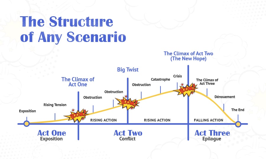
Creating a scenario is not an easy thing. The following scheme will help you to create your story. It’s the common way of any story flows:
Please note, there’s nothing about design yet. Only the story. While there is no design, it’s easy to correct your story and make changes, that’s why the story is primary. So, when you have a scenario, take a break maybe for a day. Make a presentation to someone, consider this as a usability test. This will help you either to add or delete something from your set of ideas.
The key factor of an excellent speech
Have you ever noticed that one speech can make people yawn while another makes them extremely involved? Neuroscientists have proved that during the presentation, in the brains of speakers and listeners the same parts are being activated. It means that people are feeling and thinking the same way as the speaker during the talk. The same goes for dancing, playing or acting. So if people yawn during your presentation, it means that you're also bored with your own speech.
How to make your speech lively and involving? Start off with sharing your own experience, it’s very important to keep your attention and involve your audience into listening, thinking, and feeling the same way as you are. People love stories, they would love to know what happened to you than to some other person, no one but you knows. You will also look and sound more authentic while talking about yourself.
How to keep the attention of an audience during all presentation
To keep people involved in your presentation, ask questions from time to time. And don’t hurry to answer. Let them think and find the answer on their own.
Questions may be even rhetorical. Your aim is to make the audience think that they are developing your speech with you. And with the help of questions, they will be interested in it. People like this feeling when they come up with something, it’s like watching or reading a detective. A good author will make you guess who’s the killer at the right moment. That’s why the reader will enjoy their brilliant intellect and will share this book with others.
So don’t give all the answers at once. Let people think for themselves. Ask first and then click on the slide with the answer. Don’t be lazy, play with the audience. They will sit like kittens waiting for the next time you ask their opinion.
What makes a good design for a presentation?
Good design is always laconic. To make your scenario visual, don’t be afraid to be metaphoric. Remember about unified presentation style and color palette. Align all objects in the slide by the grid. Use contrast from time to time to add interest to your speech.
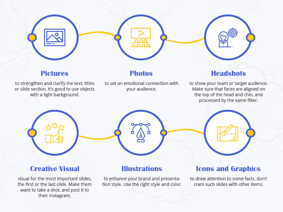
For your slides you may use:
PLEASE NOTE! The font size for slides is important. It depends on how many people will watch your presentation at the same time. Make sure all the people in the room will be able to see details on your slides.
Slide types and their goals
Any presentation can be reduced to 15 slides, making it only better. Any slide may have only one of the following 4 goals.
#1 Prompting the speaker what to say. It’s slide-prompter.
Contains a short phrase or picture that is needed to cover the question in 3-5 minutes. When creating this slide think about its format: will your audience hear or just read the presentation? Such a slide can be misunderstood without a speaker.
#2 To impress the audience and involve emotions. It’s wow-slide.
People should want to take a photo of it, share on Twitter, or just save it. It’s always an emotional slide. Here you can evoke the feelings you want people to have “Oh, that’s about me!”, or “How cute!”, or “That’s exactly what I need”. You should have a minimum of two wow-slides in your presentation: one at the beginning, and the second - near the end about your solution to the problem.
#3 To explain complicated data. It’s the smart slide.
Nobody likes when the presentation is only creative and bright. It should also be mixed with a tiny bit of boring facts. Smart slides should be informative, add some schemes or diagrams there. Without any pictures.
#4 To convince the audience by comparing arguments. It’s the daring slide.
It’s the most important slide. You should have a bunch of such slides in your presentation, especially in the last part with solutions. Add comparisons, service description or a brief. This is your final chance to convince your audience that you are cool 🙂
Look at any presentation. If the slide can be attributed to one of these categories - it works. If the slide is somewhere between two - it’s unnecessary. There are slides that can help change the topic or ask a question, but usually, you can do without them.
Best presentation templates
And here we go with the best PowerPoint templates and the best templates for Keynote. You can use them if you need a unified style and some hints for a good structure of your future presentation.
You can use these templates to create a presentation from scratch or to update the existing one.
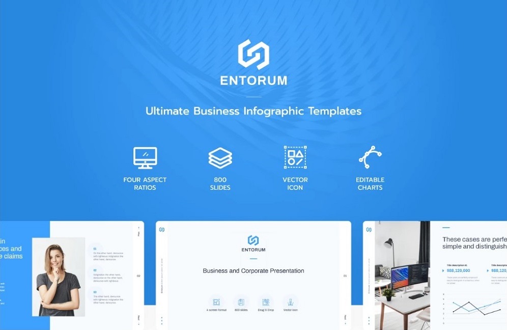
Entorum - Business PowerPoint template with customizable infographics
The content, the organization, and the delivery are those three main things you have to keep in mind when creating your PowerPoint presentation. Entorum is your innovative business template with flexible infographics and numerous customization tools. Tell the story of your startup idea, outline the picture of further development, draw the progressive steps of your company with the help of a number of effective slides for any business purposes. Thanks to 28+ analysis infographics, you can mix various layouts to show the projects of growth, price comparison, and much more to show unique opportunities of your business.
More features:
- Flexible charts and diagrams
- Dark and light stylization of the slides
- 4 different aspect ratio settings
- Editable custom vector objects
- Editable demo version
- Accurate documentation
- Guaranteed updates
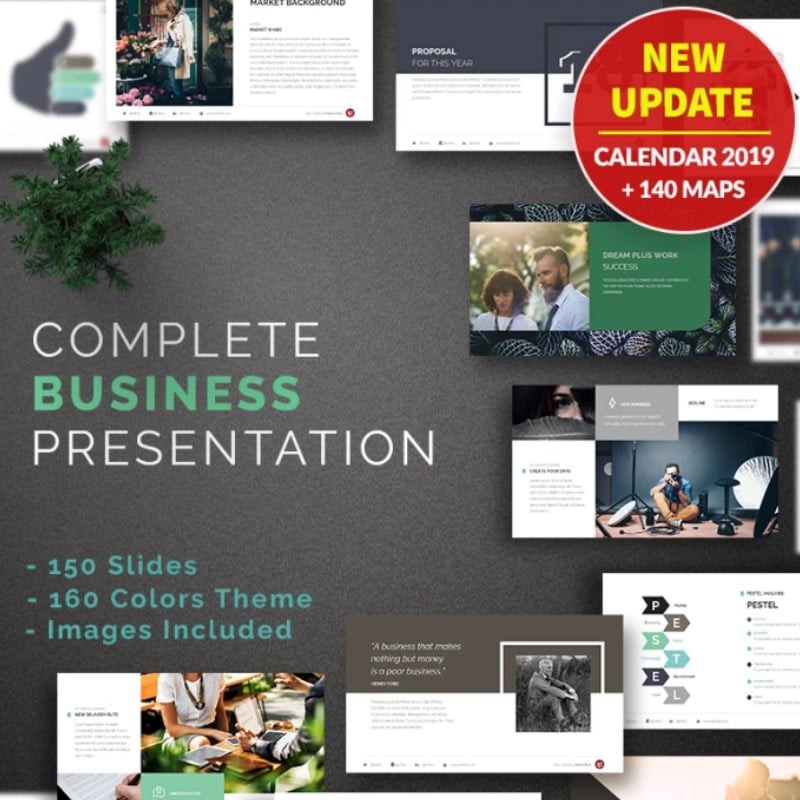
Complete Business PowerPoint Template
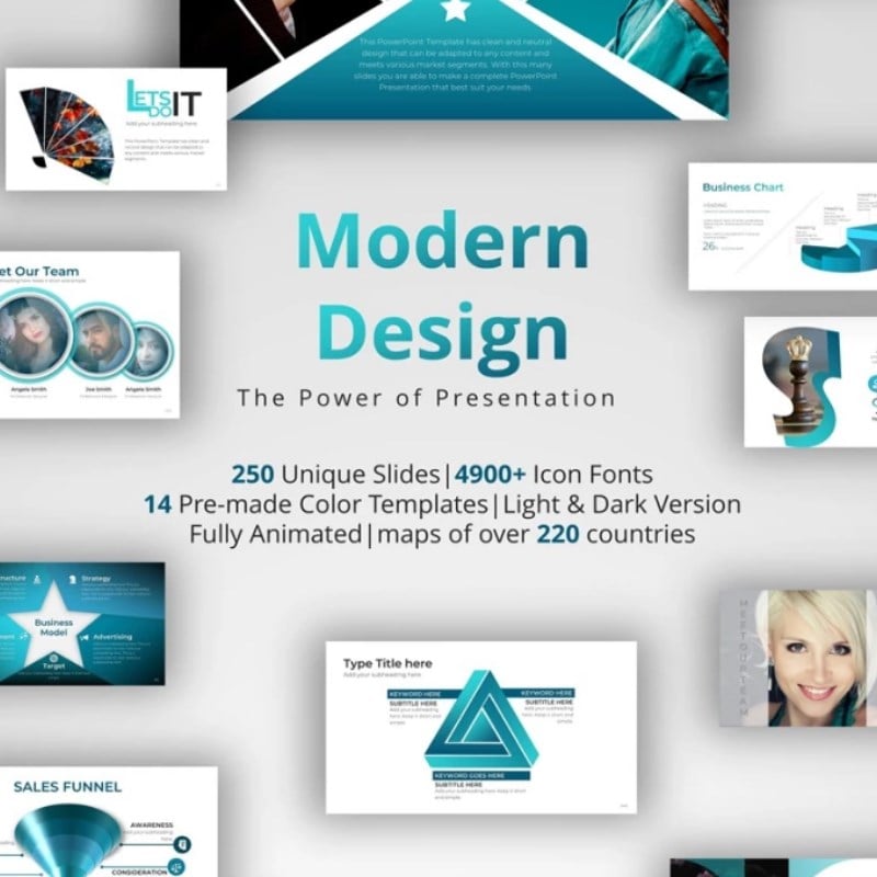
Modern Design PowerPoint Template
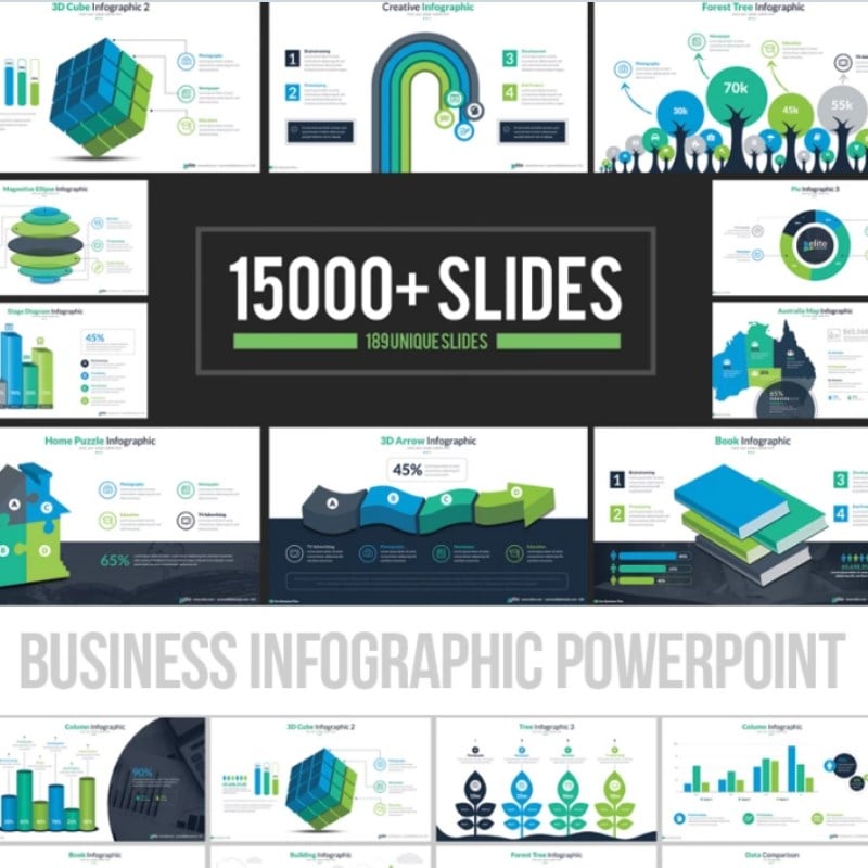
Business Infographic Presentation PowerPoint Template
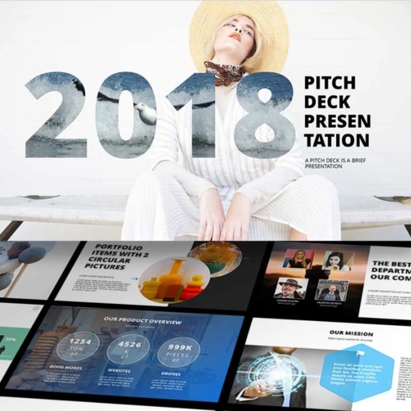
2018 Pitch Deck PowerPoint Template
Every - Minimal PowerPoint Template
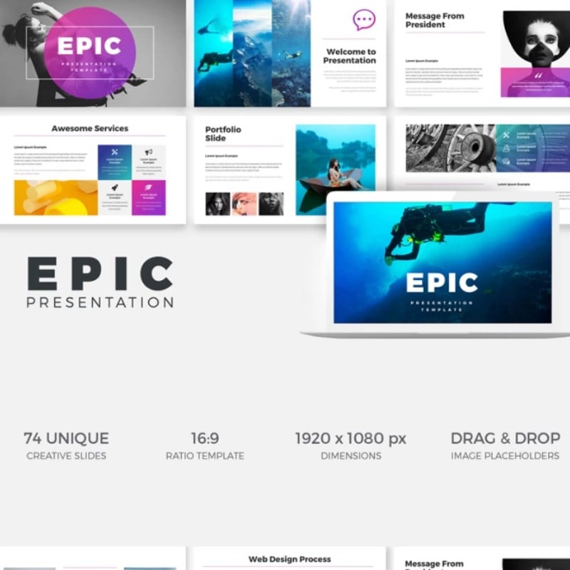
EPIC Presentation Keynote Template
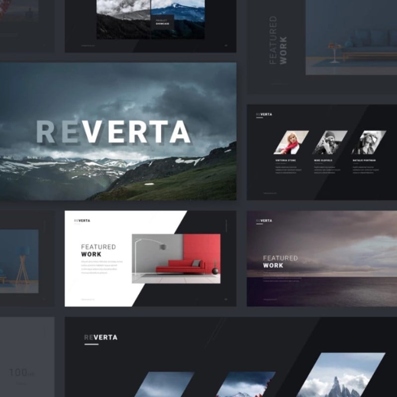
Reverta Keynote Template
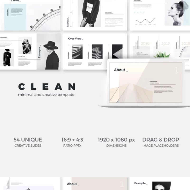
Minimal Clean Creative Keynote Template
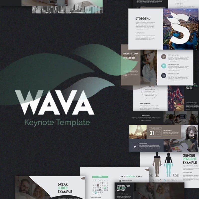
Wava - Keynote Template
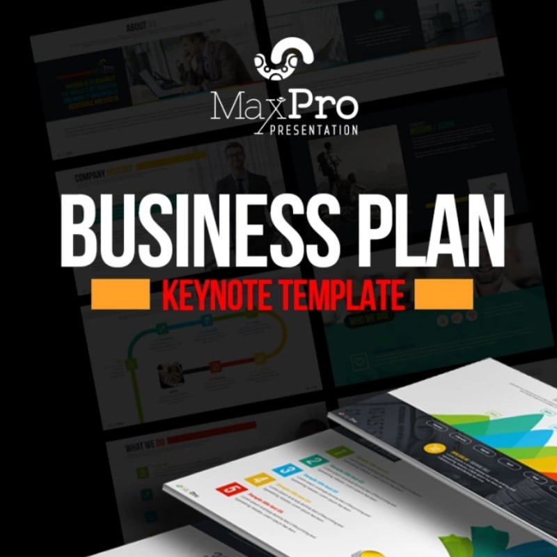
Business Plan Presentation Keynote Template
Read Also
25 Business PowerPoint Presentation Templates for 2019
10 Clever Color Combinations that Make Your Presentation Professional
10 Tips to Improve Your Presentations
Need a Custom-built Template for Your Event Presentation?
How to Make the Audience React? 10 Rules of a Successful PowerPoint Presentation
100 Best Business Presentation Templates. Cool! Great! Awesome!
Get more to your email
Subscribe to our newsletter and access exclusive content and offers available only to MonsterPost subscribers.






Leave a Reply
You must be logged in to post a comment.