Process Infographic Templates: Explain Complex Processes in a Simple Way
Some processes might be really difficult to understand. This is especially true if they are explained with the help of long detailed texts. That is exactly the case when process infographics come in handy. A method of breaking down a complex process into simpler and clearer steps makes it easy for other people to follow the process itself.
Here you will find tons of useful tips for creating process infographics. Plus we have picked a few beginner-friendly process infographic templates to try.
Table of contents:
- Everything You Need to Know About What a Process Infographic Is
- Why Is It Crucial to Use a Process Infographic?
- Tips on How to Build an Easy-to-follow Process Infographic

Everything You Need to Know About What a Process Infographic Is
Process infographics (otherwise known as flowcharts or “how it works” infographics) describe and show the way a certain process flows. In other words, by using a process infographic you explain how many, in what sequence, and what kind of steps should be taken in a particular process with the help of visuals.
Instead of writing detailed instructions, you can summarize and visualize processes and procedures making them easy to digest for your readers. Let’s face it–no one likes to read massive amounts of dry content. There's this child in each of us who simply refuses to read huge pieces of texts without a single picture. Images and infographics make whatever you are writing about more captivating and digestible. That’s a fact you can’t ignore.
When it comes to the visualization of such processes as recipes, how-to guides, business and marketing strategies, etc., process overview infographics fit the bill.
Why Is It Crucial to Use a Process Infographic?
Experienced marketers and webmasters understood long ago that images are way more convincing than words.
As we already mentioned, an infographic is the data visualization or, simply put, the art to transmit whatever information, statistics, and knowledge through the visual language of graphics.
Still doubt the influence of infographics? Look here:
- Over 45% of users will click on a link if this link leads to infographics.
- 30% of users will share an infographic even if it doesn’t provide them with important information.
- According to Google, the average monthly search volume for the term "infographic" is 132,000, and this is just in the United States.
- People are more likely to remember information from what they see than from what they read.
So, no matter if you are preparing a PowerPoint presentation or looking for a way to attract attention to your website, process visualization is the way to go.
Tips on How to Build an Easy-to-follow Process Infographic
It might be difficult to give a great deal of data an appropriate and convenient shape that would allow focusing on really important things without losing the connection between individual elements and a coherent whole. On the one hand, we have tons of information that keeps generating on a regular basis. On the other hand, there is a modern internet user who has a short attention span. The task is to break through this chaos to get your message out there. Infographics are the way out.
The truth is, to design process infographics from scratch can be quite frightening and more importantly challenging, especially if you have no design skills whatsoever.
Since this type of infographic helps readers get engaged in the process by making them follow the simple step by step instructions, your first and foremost task is to make clear, well-structured, decision-making infographics.
We will provide you with all the necessary tips to help you make a top-notch infographic mock-up:
- Choose circular process infographic layouts for cyclical processes
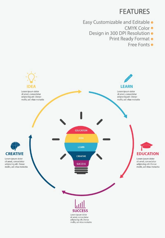
If you have a never-ending process (something like "what-came-first-the-egg-or-the-chicken" process) or if a process you want to illustrate repeats, then a circular infographic is more than suitable. Thanks to such an infographic, a process flow is clearly defined. To prove our point we suggest that you look at this education infographic template as one of the examples of processes that have cyclical nature.
Colors and arrows make the order of steps clear. Remember, the whole idea is to represent the key points of a particular process. You may or may not point out where the beginning of the process is.
However, if the process you are describing doesn’t have any specific order, the circle mind map template might be an option to go with.
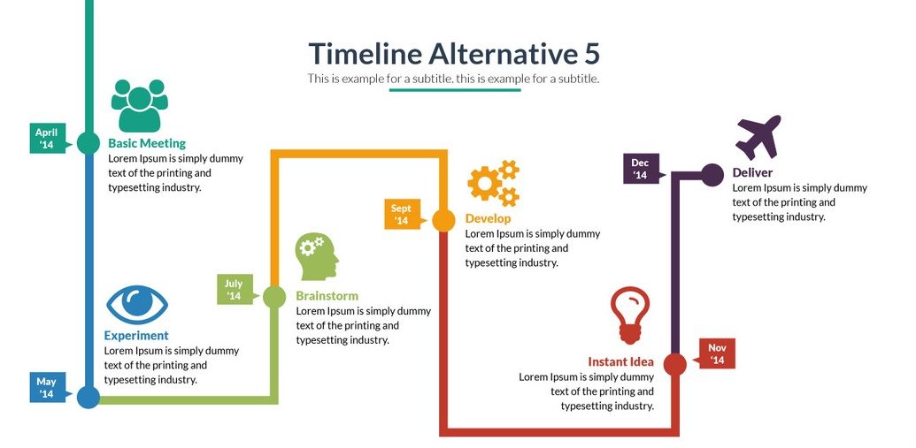
- Opt to a simple step-by-step layout for visualizing straightforward processes

When it comes to depicting straightforward process templates, the fewer elements you use, the better. The whole point here is not to overdo. Something like these step by step infographic templates (which are basically numbered steps shaped as a pyramid or shown as stairs) will be just fine.
The thing is, simplicity is very effective. And you need to stick to it despite what process instructions template you are working with. Using different colors for each step will help you highlight the stages of the process.
- Use icons and illustrations to visualize steps
To start with, infographics are about images and icons in the first place. Text is of secondary importance. However, it doesn't mean that you can add whatever illustrations you want. The icons and images should make sense and complement descriptions. Of course, a picture of a beautiful flower might look very appealing, but if it has nothing to do with the process of describing music production, don’t add it to the workflow infographic.
Not only do icons demonstrate process steps better, but they also prevent the overall design from turning into a textual mess. By clicking here you will find tons of cool and useful icons that suit any taste and purpose.
- Take advantage of space by going with snake-shaped process infographic
Want to make the most of the space on your page? You can opt to a layout with a so-called snake shape (shape of letter S). This trick will help you fit in more next steps images of a particular process in one infographic. Such a solution is ideal for envisioning a customer journey map or illustrating the process of car production. Here is the big infographic bundle in which you can find escalation chart templates, custom icons, and many more infographic elements needed to show process examples and how they work.
- Pick appropriate colors and fonts to suit your process infographics
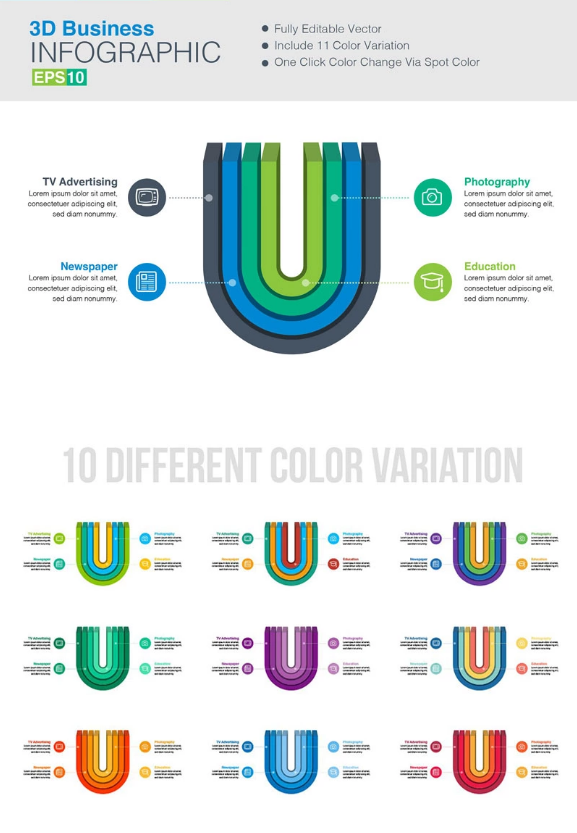
Thanks to the correct visualization, process layout examples gain clarity. What do we mean under “the correct visualization”? First of all, we refer to the choice of colors. And it’s not just about making a picture look attractive. It’s about the message the colors send. Provided you have picked your "as is to be" template. Now you need to divide certain groups in the process you are illustrating. What is the best way to do that? By the means of different colors, of course.
In these process graphics, you can see what color variations can be used to single out different steps, sections, and categories.
Things like easy-to-follow process map images as well as clear process guides are crucial for creating a compelling infographic, to say the least. However, the right choice of fonts also plays an important part in that. First things first, you need to decide on a general style for your target audience.
Let's take the hiring to work process as an example. Which fonts would be more suitable - traditional discreet fonts or contemporary ones with a more intricate design? Well, it's up to you. There's one little nuance though. Whatever font you pick for your infographic, make sure it is appropriate. Let's face it, using fonts like Algerian to explain to readers step by step procedures of preparing cheese from milk would be weird, agree? Always take into account things like the theme of your infographic and the category of people to whom you explain a certain process.
- Visualize a workflow or a process that has multiple paths with arrows and numbers
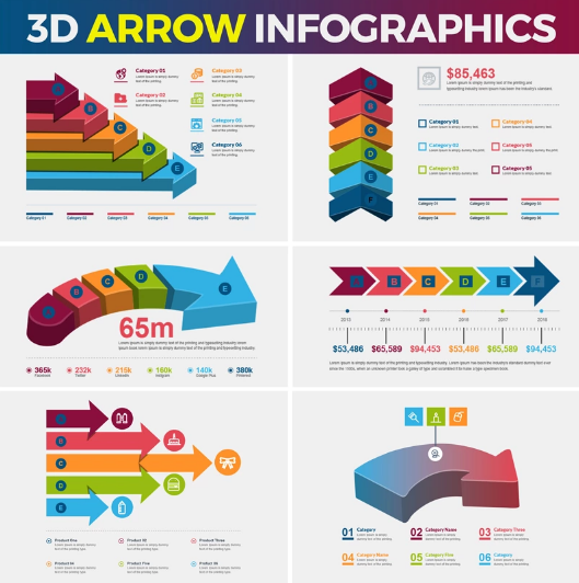
When it comes to describing workflows by the means of an infographic, arrows and numbers are everything and more. They help to build a clear structure. This is especially important if you have to deal with a process that has multiple paths. You don't want your readers to get lost trying to figure out which part of the process goes first. It is recommended to use visual cues such as arrows and numbers to get everything organized. Moreover, by providing a distinct structure, it is easier for you to influence decisions you want your viewers to make.
On the internet, you can find a great deal of free numbers templates (from 0 to number 9 templates). By using them, you can make complex process examples more structured. Also, we'd like you to get acquainted with this awesome set of vector arrows that can be used for infographics.
How to Work with Process Infographic Templates - Inspiration Included
Are you in search of unique, comprehensive, and attention-grabbing process description templates? Maybe you need step-by-step guide templates? We can offer you lots of different infographic templates, elements, and vector kits so that you can create your own process infographic. All the elements are easily editable and customizable. So, what do you need to create an eye-catching decision-making infographic?
- Decide on the idea and make it as simple as possible. Then, go back to this idea and simplify it one more time.
- Leave only the most valuable and gripping parts of the process you want to explain. There shouldn’t be too much text. Ideally, there should be as little text as necessary.
- Take a look at a ready scheme and decide whether or not it will be clear for your audience. If not, remodel it.
- Pick a process infographic template that would be perfect for visualizing the process you want to make clear for others. You may like to check out the infographic elements templates designed by TemplateMonster. There are quite a few of them to choose from.
- Use Adobe Illustrator or any other software for editing and customizing templates you have selected.
- Attach, take out, and reposition any steps in the infographic. Add your own text and images and customize the design by trying different colors and fonts.
- Enjoy the results.
In summary, infographics are an effective way to put text, imagery, and design elements together to describe complex processes in the format of consistent storytelling. We don’t see anything that should stop you from using them.

Hi! I'm Boryslava, a freelance SEO copywriter and content writer. Enjoy reading, running and learning new things. A big fan of Star Wars saga and corgis. LinkedIn
Get more to your email
Subscribe to our newsletter and access exclusive content and offers available only to MonsterPost subscribers.

Leave a Reply
You must be logged in to post a comment.