Best Practices for Product Listing Pages
Product pages are often a potential customer’s first impression of your eCommerce business. It is important to capture the buyer as soon as possible. To do so, you must create a unique and exciting shopping experience for online buyers.
We’ve put together a list of best practices to focus on to optimize your product listing pages. These tips will help engage existing customers, turn browsers into buyers, and boost your conversions.
1. Don’t Forget SEO for Product Pages
While most people in the e-commerce industry understand that SEO is important for content pages, some overlook the need for all things SEO on their product pages. Here are a few things to help ensure that your product pages are in great SEO shape:
- Develop an exceptional title that emphasizes the product name. Be sure to include the manufacturer name if you need to. Also, if the product is a component of a larger one (like a part, accessory, etc.), include the manufacturer number or similar product identification. People tend to search for the specific product identifications for parts, so adding these details to the title will help them locate your product.
- Write a unique description of the product. Each of your products should have a unique description rather than a copied and pasted manufacturer’s description. Depending on the specific item, the manufacturer’s description could be used by hundreds of other retailers, and Google doesn’t like duplicate content. Duplicate content could severely limit your visibility in search engines.
- Add an inviting meta description. Many online sellers overlook writing unique meta descriptions for their product pages, allowing Google to use whatever text it wants to show on the search results page (SERP). When you take the time to write original and inviting meta descriptions for product pages, you are encouraging potential buyers to click on your product page over all the other page listings on the SERPs.
2. Use High-Quality Photos
We’ve all seen it before – people scrolling quickly through search results images on their smartphones. How do you get them to stop and click on your products? Well, you need large, detailed, high-quality, and eye-catching photos of your items. See the example of exceptional photo quality with close-up details from Nike:
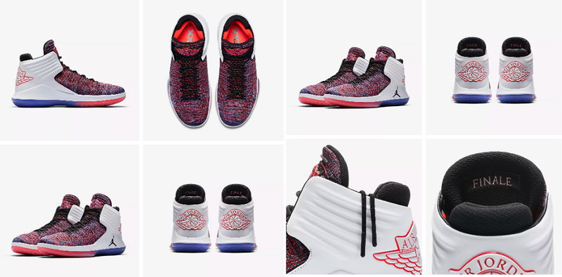
When you take the time to post great images of products, you not only catch buyers’ attention, but you also build trust and credibility with those potential buyers. Because your products are online, e-commerce shoppers cannot touch or hold the products, so you must show the details in your photos.
Also, to piggyback on our previous tip, you must use great alt tags to help Google index your product photos. Using alt tags will ensure your photos can be viewed on the search results pages.
3. Use Interactive Filters When Applicable
If you sell products with a variety of attributes, using interactive filters will help customers to quickly and easily find the specific products they want. For example, if you sell apparel, you should have filters that allow shoppers to pick the size, color, price, etc. for each type of clothing. See the below example from Under Armour:
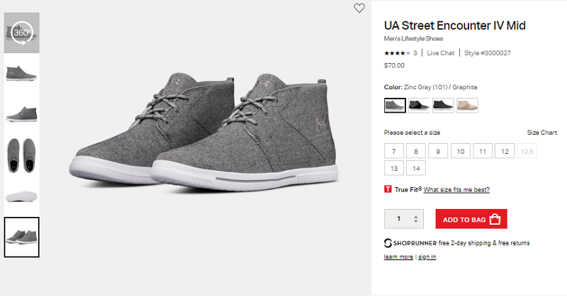
These filters make navigating and searching your site easy for shoppers. It also prevents shoppers from feeling frustrated when they search through pages of items they don’t want.
4. Improve Website Speed
When your pages load slowly, users are likely to simply click off and visit one of your competitor’s product pages. In fact, research shows that most web users expect a website to load within two seconds, and if it hasn’t loaded within three seconds, they will abandon the website. Moreover, when users have trouble reaching a site, more than three-quarters of them will never return to the website in the future.
Not only do consumers expect fast-loading sites, search engines do too. Page speed is also one of the top-ranking factors for search engines such as Google. If a product page loads slowly, your search engine rankings could suffer.
To ensure that your product pages and overall website load quickly, test your site speed and identify any issues that need to be resolved.

5. Make Your Call-To-Action Clear
Out of everything on your product page – images, descriptions, price – the single most important element is your call-to-action. A call-to-action (CTA) is a text or image that compels the user to take action.
In your case, a CTA would be the button that shoppers click to add an item in their shopping cart. If your CTA isn’t clear to the shopper, they most likely won’t buy anything.
To increase conversions, try the following ideas to make your call-to-action stand out:
- Make it big – Your CTA button should be the largest element on the product page (other than the images).
- Make it a bold color – Assign your CTA button its own bright color – one that cannot be mistaken for anything else.
- Make it stand out – Use a color or font that contrasts with its surroundings to make it pop on the screen.
Look at Van’s product page to see how vibrant their CTA, Add to Cart Button, is:
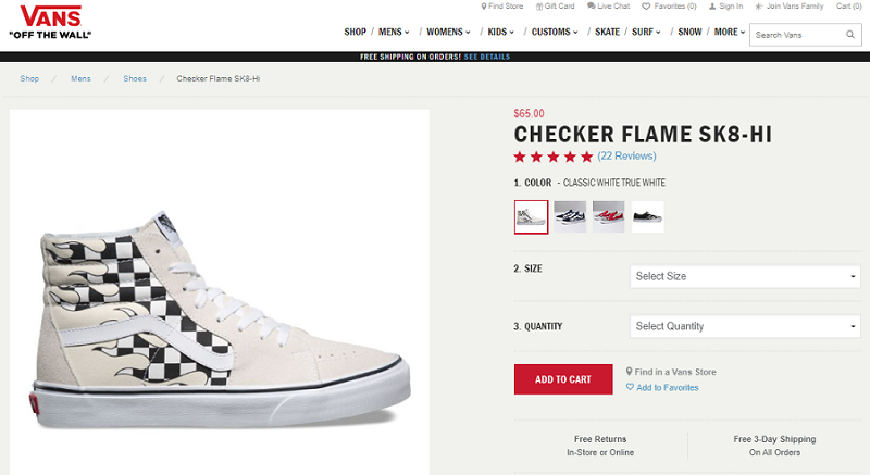
When the CTA button is easy to identify, your shoppers will see it and make a purchase.
The product page represents the end of the conversion funnel. Using slang, it’s where the rubber meets the road. If a customer is going to follow through with a purchase, this is where it will happen. But what do you do, from a design and development perspective, when you only have a limited amount of space in which to work?
How to Engage Visitors in a Limited Space
Today’s product pages are starting to mimic landing pages in the sense that they don’t allow for a bunch of extra details and content. Space often comes at a premium and designers and developers need to understand what it looks like to maximize what room they have available.
As you look to engage visitors within the confines of limited space, it helps to follow some key principles. Let’s check out a few specific ones.
Get Straight to the Point

Successful product pages don’t mess around. It’s imperative that you get straight to the point and avoid including unnecessary elements. When developing a page, ask yourself what purpose each element serves. If you can’t find a conversion-related purpose for a given element, it doesn’t belong on the page.
There’s also no room for messing around. A visitor should be able to see the product and make a purchase without every scrolling below the fold. This can be challenging, but do your best to abide by this principle.
Don’t Skimp on Product Info

Often, limited space leads web developers to skimp on content. This isn’t the solution, though. While you don’t necessarily need to incorporate chunky paragraphs of text into a product page, be wary of scrapping product descriptions. They play a critically important role in driving on-page conversions.
Take this product page from Country Mouldings, which is selling butcher block countertops, as an example. In the case of countertops, it’s not something a homeowner purchases all the time. By providing detail on different hardwoods, Country Mouldings assists the customer and makes good use of the space available.
Hit the High Points

One way to account for product information while still making the page visually pleasing is to summarize the high points in an easy to read format.
This product page from Fitbit is the perfect example. Notice how the page breaks down the entire functionality of the Fitbit into six specific value points. The product obviously does more, but only hitting the high points allows for optimal focus. It cuts out the fluff and helps direct visitors towards the end goal of making a purchase.
Extend Vertically
Responsive web design is obviously pretty standard these days, but it’s important to remember that a large percentage of website traffic now comes from mobile devices, this means that using a responsive website template will help you reach much wider audience. Users are accustomed to scrolling down. It’s very rare that they consume content horizontally. So, if you are going to develop a rich product page with lots of information, focus on ways to extend the page vertically. The previous Fitbit product page is a good example of this.
Make Trust the Ultimate Priority

Trust is everything. While a major eCommerce brand like Amazon or Walmart can get away with relying on brand equity and loyalty, smaller websites typically can’t. The only way to consistently drive conversions is to make trust a major priority.
There are obviously hundreds of unique ways you can instill trust via a product page, but classic social proof elements like customer reviews and question and answer sections tend to be the most helpful. The latter can be especially powerful, as they allow common customer questions to be addressed (by your customer support team or other customers) in a public format that’s accessible as a resource for customers down the road.
No Low-Resolution Images Allowed

The goal of a product page is to tear down all of the potential barriers that are traditionally present in an online transaction. Images go a long way towards helping you do this. But it’s important that you focus on high-resolution images that add value to the product (and don’t just take up space).
“When you’re taking photos of your products, make sure you are giving as much detail as possible,” marketer Breena Fain suggests. “Provide your visitors with the context they need in order to buy. Leave no question unanswered. Sell it like you would in a store and think of ways you can mimic that interaction on a product page.”
From Challenge to Advantage
It’s easy to view limited space as an unwanted disadvantage or challenge, but shift your way of thinking. In today’s internet landscape, users actually prefer simple and minimalist experiences. Instead of thinking about how much more you could do under different circumstances, look at this perceived “constraint” as an advantage. It’ll expose you to an entirely new world of opportunities.
Final Thoughts
For e-commerce sellers, the product page is where you win the sale. You may have a great product and a healthy marketing strategy, but it’s your product page that pushes shoppers off the fence to make them buyers.
Follow the above best practices to engage and entice your shoppers to complete their purchases.
Read Also
Top 45 Ecommerce Business Ideas for 2018
10 Things to Consider when Designing an eCommerce Website
10 Biggest Myths in SEO. What You Should Forget About in 2018
The Secret to Maximizing Space On Your Product Pages
How to Use Google PageSpeed Insights
Don’t miss out these all-time favourites
- The best hosting for a WordPress website. Tap our link to get the best price on the market with 82% off. If HostPapa didn’t impress you check out other alternatives.
- Monthly SEO service and On-Page SEO - to increase your website organic traffic.
- Website Installation service - to get your template up and running within just 6 hours without hassle. No minute is wasted and the work is going.
- ONE Membership - to download unlimited number of WordPress themes, plugins, ppt and other products within one license. Since bigger is always better.

Posting contributed articles about the major web design highlights and novelties. Come across a handful of useful tutorials and guides shared by experts in the web design and online marketing fields.
Get more to your email
Subscribe to our newsletter and access exclusive content and offers available only to MonsterPost subscribers.

Leave a Reply
You must be logged in to post a comment.