Why Sliders Are Slowly Killing E-commerce Conversion Rates + What To Do About It
Site designers are being pushed more and more to use things that bring a site to life. Movement and animation is in vogue. But, it’s important as a designer to understand the real needs of a client - What are the goals for their site?
Your e-commerce clients need a website that is both visually stunning and effective at converting visitors into customers. Sliders might look cool, but they are not helpful for your e-commerce site.
Sliders cause:
- Decision Fatigue - Your site’s visitors are seeing too many offers when they enter your site. This forces them to compare and work to come to a conclusion. Your site is supposed to make a buying decision easy, not more complicated!
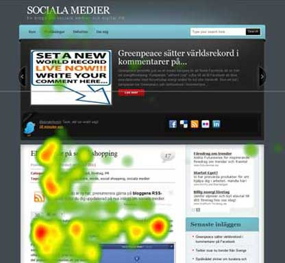
- Banner Blindness - Your site’s visitors have been conditioned to filter out anything that even looks remotely like an ad. Spoiler alert: Your pretty slider looks an awful lot like an ad. The graphic below shows where eyes naturally focused during a recent study of site design.
- Visitors feel stressed when they can’t control what they’re viewing. By having an automated carousel, you’re forcing the consumer to read content more quickly than they may feel comfortable with. Stress is the last thing you want if your goal is to convert.
I know, I know, they’re pretty, they excite your client, and you can fit more messages on a single page. Well, fine, if you’re going to stick to your guns and continue to use sliders, let’s at least try to smooth out the rough edges…
The Proof is in the A/B Conversion Testing
To find out if sliders are helping or hurting a site convert, you need to perform some A/B testing. I would start your testing on the most important pages for e-commerce.

Create two powerful landing pages. In one, use sliders. In the other, banish the buggers.
Next, you’ll drive traffic to your different landing pages by:
- Linking to each page in different places on your site.
- Pushing out separate social media posts on different days to promote site visits.
- Run a few PPC campaigns to put your traffic generation into hyper drive - dramatically improving the sample size of your test.
Measure both the volume of traffic and how well it converts on the different versions of your landing page. Google Analytics makes tracking A/B conversions pretty easy. And the data provided will help you win over clients to our way of thinking - sliders are bad for conversion on e-commerce sites.
And don’t forget to block Google’s site crawlers from seeing both page versions - duplicate content penalties are never fun.
Design Your Sliders to Function Well on Mobile - Or Get Out of the Way
I’ll be honest. There are few things that tweak me more as an online marketer than clicking a link on my smartphone, only to be greeted with a massive banner that runs off the screen. I can’t quickly get to the information I need, and I have to figure out how to navigate around it on a touchscreen - not always as simple as it sounds.
The best way to optimize a page that includes sliders for mobile viewing is by removing the slider from the mobile version of your site. You’ll save valuable screen real estate, and you will be able to fully optimize your first fold - improving conversions and the user experience.
If you absolutely have to have sliders on mobile....
- Use sliders that respond to natural touch and swipe input.
- Use CSS3 transitions to give the mobile viewer more control.
- Ensure that the slider covers less than 30% of the screen real estate in both portrait and landscape viewing mode.
Google’s mobile results slider is actually quite helpful and well-optimized for mobile viewers.
Don’t Automate Your Slider - Give the User Total Control
Automation is a buzz word that seems to be thrown about quite a bit in design circles. Don’t let this siren call lead you to automate the transitions between the different slides in your carousel. Instead, let the site visitor decide which slides they want to view, and when they want to advance to the next one.
I mentioned earlier that sliders add unhelpful stress to the user experience. One way to prevent your site visitor from feeling like they have limited time to consumer information is by putting them back in the driver’s seat. And, they’ll be able to feel like they’ve fully consumed your information before moving onto the next piece of data.
Use Text Snippets to Enhance Your Slider
There are plenty of free HTML5 image sliders. Images are more attention-grabbing and memorable than text. BUT, when it comes to sliders and designing an engaging hero box, you can create a more engaging site by placing text snippets within your slider.
For example, a popular trend is using a carousel to showcase positive customer reviews. This helps your site convey that your brand is trustworthy - especially if the glowing comments are from a reputable individual or organization.

Hint That Users Should Engage and Swipe with Incomplete Carousel Images
Showcasing product recommendations, personalized for individual users, is one of the better ways to utilize a slider on your e-commerce site. But, there's more to it than throwing a few clickable product images in a rectangle.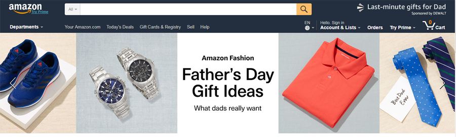
First, the products should be timely. In the screenshot above, Amazon is pushing products for last minute Father’s Day gifts. And, as you visually engage with the slider, you see visual cues to interact with the slider.
The arrows make manual manipulation of the slider super easy. And, the products spill off the edge of the screen - specifically in the directions that can be scrolled by the shopper.
In Conclusion: Should You Use a Slider on Your Site?
To use a slider effectively, you’ll want to invest in some A/B engagement testing. You might discover different sliders and carousel elements are more click-worthy for your market.
Ensure that your sliders are formatted in a way that is friendly for all screen sizes - and don’t be afraid to drop them from the mobile version of your site. It’s important that your site is inviting on every screen size - 38% of site visitors will leave if a site isn’t visually appealing.
Showcase positive customer reviews or other valuable text snippets alongside captivating imagery to help customers learn something at a glance. And use visual cues to encourage manual manipulation of your sliders. If new sliders are needed, after your project has been delivered to the client, MotoPress is a great tool to refer your clients to.
While I hope my suggestions help you use sliders more effectively, I’d rather see your site designs drop these evil conversion killers. In a last attempt to convince you and your clients, I’ll leave you with this observation: Only 1% of the 3.7 million visitors to the University of Notre Dame's website clicked on a slider, across their entire site. That’s one percent engagement with a key site element across a massive, popular website!!!


Posting contributed articles about the major web design highlights and novelties. Come across a handful of useful tutorials and guides shared by experts in the web design and online marketing fields.
Get more to your email
Subscribe to our newsletter and access exclusive content and offers available only to MonsterPost subscribers.

Leave a Reply
You must be logged in to post a comment.