Tutorial on How to Create Sticky Sections Overlap Effect with Elementor Pro
- Step-by-Step Tutorial on How to Create Sticky Sections Overlap Effect with Elementor Pro - [Variant 1]
- Step-by-Step Tutorial on How to Create Sticky Sections Overlap Effect with Elementor Pro - [Variant 2]

Step-by-Step Tutorial on How to Create Sticky Sections Overlap Effect with Elementor Pro - [Variant 1]
Intro
Animation in web design is an extremely useful thing not only for decorative purposes. Interface developers now often use animations to enhance usability and improve their workspace. The movement of elements can notify users that the object is light, heavy, flexible, or else. Animations should be used to provide users with a better understanding of the nature of objects and to contribute to the image of the project.
If you want to add creative animated effects to your site and make the user experience more engaging, consider building the overlapping sections on your main page, which is able to make a vivid visual impression on the viewer. The complete tutorial with the examples can be found in the following video on our channel:
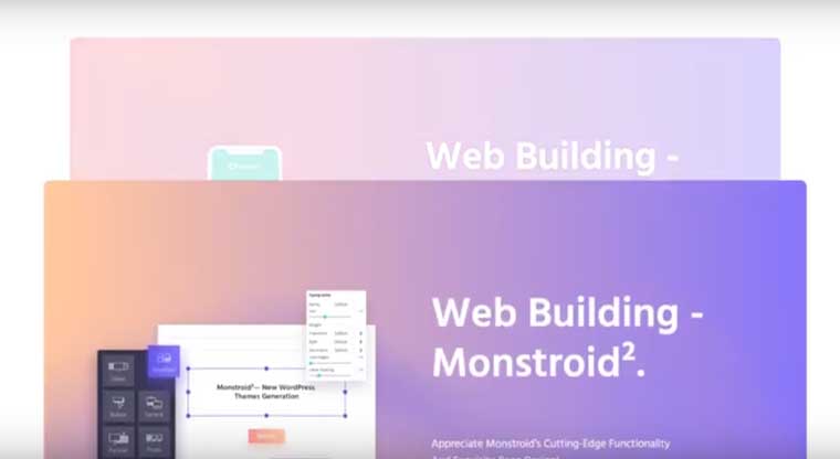
In case you prefer reading a written guidance, we have also prepared the following overview of the creation of an overlapping sections effect. We'll employ Elementor Pro and make it using our Monstroid 2 theme as an example. Notably, the discussed function is only available in the Pro version of the editor.Step-by-Step Guide
We want to develop the effect in which the next sections of a page overlap the previous ones when you scroll the screen down. And the section which appears underneath the next one decreases and disappears.
In our example, we will use three sections and will make them overlap.
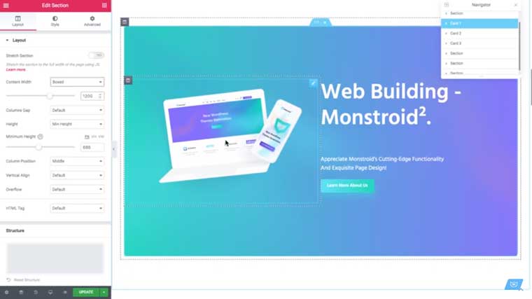
Step 1. We’ll only have a brief overview of the creation of the sections as this is not the main task on this tutorial. To make three cards, employ your Elementor editor, and we also recommend you to benefit from exploiting the Navigator as it will make it simpler to navigate through the cards and sections.
Develop the first section using the editor. We should set the width and height parameters the way so the card doesn't take all the size of your page. Here, you are free to establish your own measures depending on your page parameters.
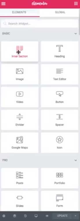
After that, devise an inner section, which is developed using the Inner Section widget.
Further, add two columns inside the section and set the background for these particular sections in the Style settings. Notably, the parent background should remain transparent. These are the main parameters for the card. In the next moves, develop the other two cards in the same way, or you can devise as many cards as you need for your project.
Step 2. Now, we can move to the core of our tutorial. First, we'll develop an overlapping effect when the sections slide on each other without other animation effects.
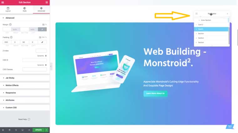
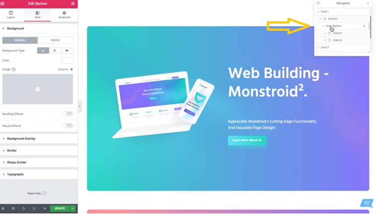
We should pick Card 1 in our Navigator and follow to the settings of the section clicking on the button as shown in the picture.
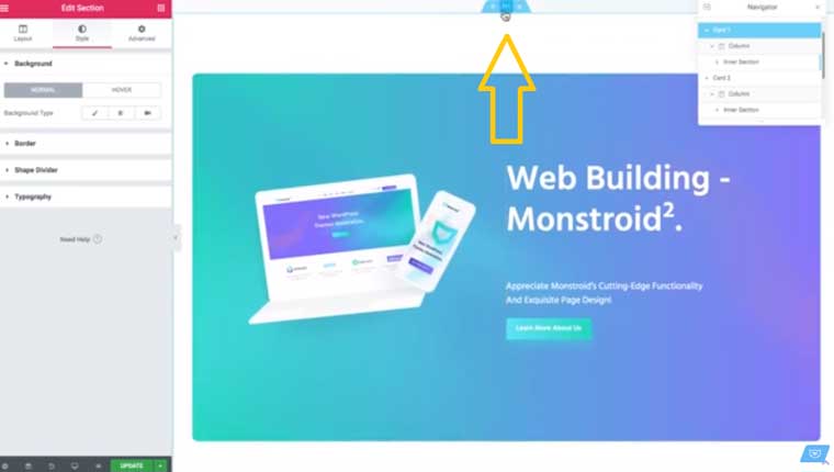
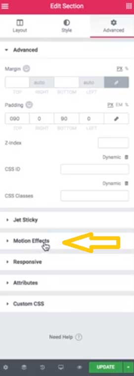
In the Edit Section, pick Advanced and find the Motion Effects.
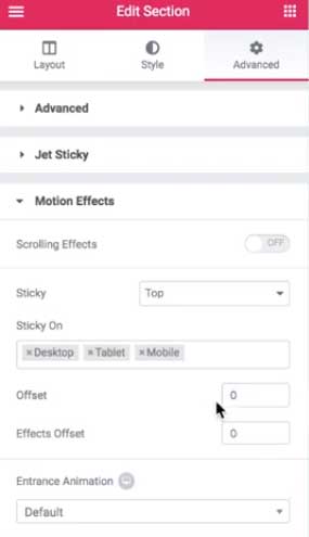
Find the Sticky options in the selected category and pick Top. Consider disabling the effect for mobile devices as it will have certain discrepancies on various screen types, but here, we'll also overview how to make adjustments for a neat appearance of the desired effect on smartphones.
You'll also see the Offset option, which is responsible for the space between the top of the page and the section. We will set it to the zero value.
Thus, we have achieved the point where the first card is sticky, and now the second card will slide underneath the first one.
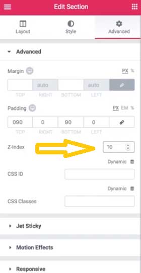
We also must go to Advanced settings and find the Z-index. We will set it to 10 for this section.
Step 3. For now, we are done with the first card and need to move to the other one. If you'll turn to the Navigator, you'll see that it has the list of cards and other containing sections, so it will be easy to move through these parts when developing the effects.
Click on Card 2, and you'll go to the settings of the second card.
We need to go to Advanced settings and set the Z-index. To make it overlap the first card, we'll need to increase the Z-index, for instance, to 20. Thus, the second card will appear on top of the first card.
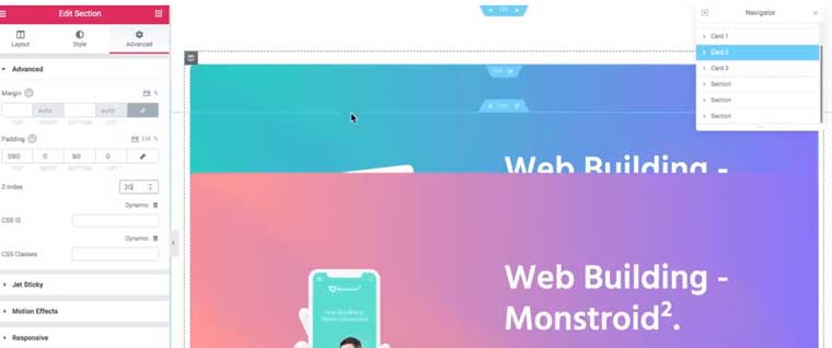
Further, we should make the second card sticky as well. We need to go to the Motion Effects – Sticky and set it to Top.
Now we can check and see that the second card slides and overlaps the first one and sticks there.
Step 4. The next action includes certain manipulations with the third card. But here we should set the Z-index higher than the one of the second card, namely to 30.
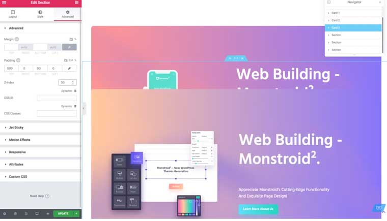
And we don't need to make the last card sticky as we are going to scroll down to the bottom of the site after viewing the last card. We also necessitate setting the same Z-index for the sections of the card.
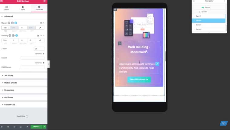
Step 5. However, for the moment, when we scroll down to the bottom of the site, we'll be able to view the other cards. To avoid this, go to Navigator – Section and find Padding – Top value and increase it to 500-800 and add some negative margins, -200-300.
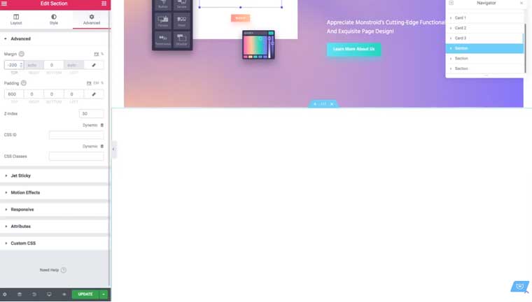
Here, you should play around with the values and see how it fits your page. You may also decrease the Z-index value, for instance, to 25. So the second card covers the first card but is underneath the third card. You may notice that these manipulations can be complicated and may not work on some other device screens. In this way, you should check how it functions on each screen type and play with the values.
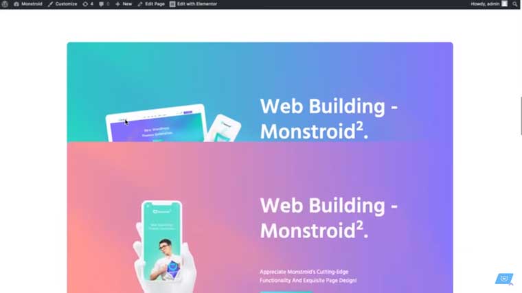
Now we may go to the preview option and view how it works. Notably, it should behave itself smoother than in the editor. The effect that we’ve created so far should look like the one depicted on the following screen. You can view the effect in action in the aforementioned video.
Step 6. Importantly, make sure that the Z-index of the rest of the sections of your page that come below the sections that we are working with is higher than the one of your cards.
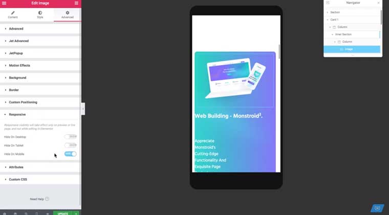
Step 7. Now we'll check whether we can adjust the overlapping effect to a smaller screen size, such as a smartphone. You can find it at the bottom of your editor panel - Responsive Mode - and click on Mobile.
The sticky effect is applicable to smartphones, but the sections might not look the best way. However, we can arrange the responsivity settings.
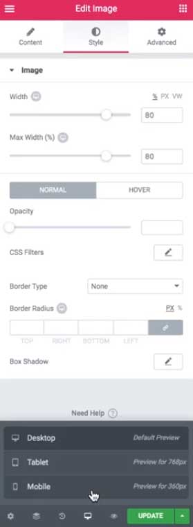
Pick Card 1, Inner Section and Image in the Navigator. Go to Advanced settings – Responsive – Hide on Mobile – and press Hide.
Go to the Content settings and adjust all the sections making sure they all look nice on the screen. Adjusting the settings for a mobile screen, you'll not change the other settings. Notably, here you should also play with the values of the negative margin and padding.
Step 8. Now we can go to the more advanced effects like shrinking and fading out of the card when the next one overlaps it. When you set the animation effects, you need to know that some of the values will depend on the parameters of your page.
Go to the settings of the Inner section that is inside our Card 1.
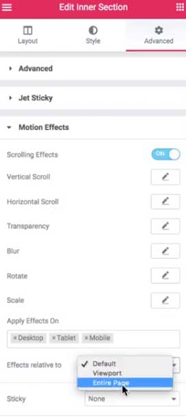
Find Advanced settings – Motion Effects. Here, you should push Scrolling Effects - ON.
Then, below, find Effects relative to and pick the value ‘Entire Page.’
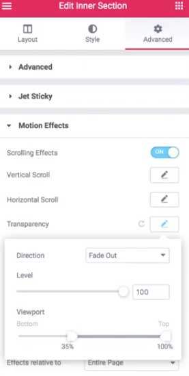
Further, go to Transparency, which is also among the options under the Motion Effects. We are going to make the first card disappear as the second card reaches it and covers it. Click on Transparency, and there you’ll see three values: Direction, Level, and Viewport. In the Direction, pick Fade Out, turn Level to 100%, and in Viewport, the first point should be 35% to make the card disappear where and when we need it.
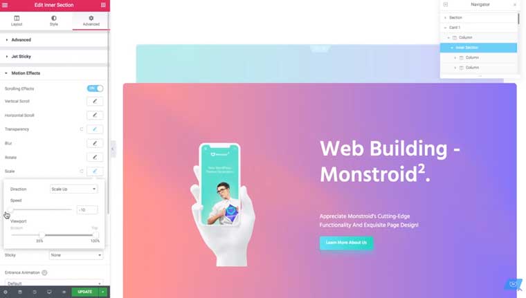
Further, let's go to the Scale options under the same Motion Effects, and in the Direction value, pick Scale Up. In the Speed – decrease to -10 to make the card smaller when disappearing instead of growing bigger.
Step 9. Now we need to deal with the second card, but we'll have to apply other values. Go to Motions Effects – Scrolling Effects - ON. Then adjust Transparency Direction to Fade Out, Level - to 100%, and increase the first point in Viewport to 53%.
Next, let's adjust the Scale options. The Direction – Scale Up, Speed to -10, and in Viewport – the same value as for the Transparency.
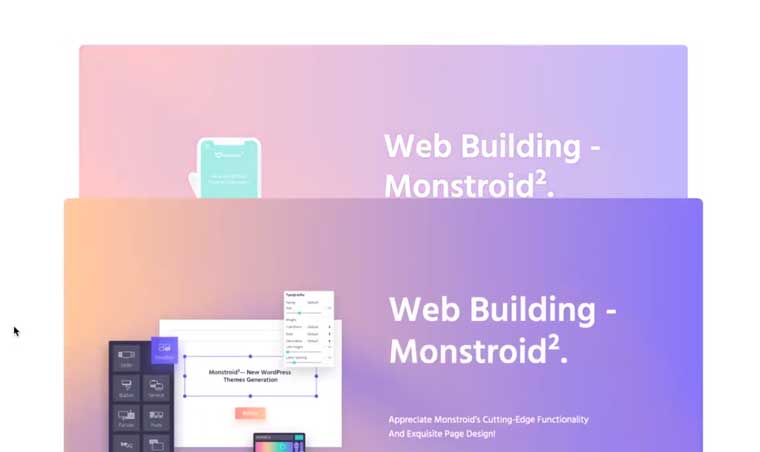
If you made everything according to the instructions, the effect that you’ve created must look like it is captured in the following pictures.
Conclusion
Now you have mastered this great and memorable animation effect that makes the sticky sections overlap and fade out. By adding interactive elements and capturing the user attention with animated effects, you can improve conversion rates on commercial sites and metrics. The visual impressions on your web page will contribute to the attractiveness of your site and will show the audience that your project is trendy and inviting. How do you think will this fit your online project? Share your impressions of this stunning effect achieved with Elementor Pro.
Step-by-Step Tutorial on How to Create Sticky Sections Overlap Effect with Elementor Pro - [Variant 2]
Intro
Every website owner wants to add as much uniqueness to his site as possible. The ability to create wow visual effects with Elementor Pro is huge. There is no need to postpone embodiments of your creative ideas since you can realize them faster than ever.
High quality and attractive design affect the aesthetic perception, as well as motivates and makes you want to click various website sections to read the text information. Animated website elements are one of the trends in web interface design. Its popularity is fickle but the animation is still present as an integral part of every site.
Elementor Pro allows you to design creative visual effects and add interactivity to your websites. Today we will learn how to create overlapping sticky sections effect with Elementor Pro.
Step-by-Step Tutorial on How to Create Sticky Sections Overlap Effect with Elementor Pro
If you take a look at Apple Music section of www.apple.com website, you can see an attractive overlapping sticky sections effect. I am going to use the Pro version of Elementor and Monstroid2 Elementor WordPress Theme to replicate the same visual effect.
First of all, let’s check how to build the cards which will overlap creating such an interesting visual effect.
- Using Navigator, you should select Card 1 (for example) and go to the Edit section.
- The Layout tab allows you to adjust the content width, minimum height, and other settings.
- Go to the Inner Section widget to work on the background. Style tab allows you to change background type, color, location, etc.
The Apple website shows the following - once you scroll down, every next card overlaps the previous one, and the card underneath just disappears. Are you curious about how exactly this effect is achieved? Let’s find out.
- Click the Settings icon on the top and navigate to Advanced tab. Choose Motion Effects section and set Sticky option to Top. Adjust Offset to 0. So far the next card slides underneath. That is obviously not the effect that we are trying to achieve.
- Go back to the Advanced tab and set Z-Index to 10 to start with.
- Using the Navigator, choose Card 2 and navigate to the Advanced tab again to increase Z-Index to the higher value, let’s say 20. Now this card slides on top of the previous one.
- To make Card 2 sticky as well, choose Motion Effects section, and set Sticky option to Top.
- Repeat the same process for Card 3. Navigate to the Advanced tab to increase Z-Index to 30 this time. If it is the last card, you should not make it sticky. Z-Index should be set to 30 for the sections of Card 3 as well.
- To make the previous cards disappear while scrolling down, go to the Settings of the section which is related to Card 3, choose the Advanced tab, and increase Padding to 600 to start with. Set Margin to -400 and Z-Index to 25. Do not be afraid to play with the values and check the result.
- Go to the Preview and check out how it works. As you can see, it moves smoothly.
Such a sticky effect should work on mobile devices as well, but you need to make sure it does not look weird.
- Access Responsive settings, go to Advanced tab, and drop all the settings previously set.
- To hide some particular image, choose Responsive section and enable Hide On Mobile option.
- Navigate to Content, Style, and Advanced tabs to modify all the settings to make sure the website content will look great on smaller screens. Do not forget to go through these steps for all the cards and test the effect after.
Now let’s see how to make our animation effect even more interesting. Note that you need to figure out your particular settings values depending on the size of your page and the number of cards on your page.
- Go to the settings of the inner section (not the parent section but the inner one which is inside the current section).
- Access the Advanced tab and Motion Effects option to play with Scrolling Effects a bit.
- If you adjust Effects related to Viewport and set up the height of the viewport to 100%, everything that is outside of your viewport will not be visible for you. If you set Effects related to Entire Page, this means the height of your entire page is 100%. Since our elements become sticky, they are going to stay at the top of the viewport. I will put Effects relative to Entire Page, but you should modify the settings to your needs.
- After Effects related to option is set to Entire Page, go to Transparency settings and adjust it to Fade Out with 100% level. In such a way we will reach the effect of the disappearance of the previous card. The value you set defines how quickly the previous card disappears. Viewport (Bottom) is set to 35% in our case.
- Go to the Scale option and choose Scale Up. Speed can be adjusted to -10.
- Get to the Inner Section of Card 2 and set Effects related to option to Entire Page, Transparency Direction to Fade Out, Level to 100%, Viewport (Bottom) slider to 53%. Change Scale settings for this section as well - Scale Up, Speed - 10, Viewport (Bottom) slider - 53%.
- Go to the Preview to enjoy the result.
Conclusion
Today, we are doing our best to design eye-catching websites to create better conversions and encourage users to buy, click, and view things we promote. Creative visual effects on your web page play a fundamental role in these conversions. Make a creative overlapping sticky sections effect while the visitors are scrolling down your web page. Hopefully, you have found this tutorial useful for future website development with Elementor Pro. It is easy to enhance the user experience with a few clicks of the mouse.
Starting A Website: What Options Do You Have? [Free Ebook]
By clicking the button you agree to the Privacy Policy and Terms and Conditions.

Read Also
Elementor From A to Z: Sheer Selection Of “How To” Tutorials
How to Create a Responsive Parallax Scrolling Effect with Elementor
Elementor Tutorial: Create Tables on WordPress with Elementor
WordPress Developers about Elementor Builder Pros and Cons [Is The Game Worth the Candle?]
Don’t miss out these all-time favourites
- The best hosting for a WordPress website. Tap our link to get the best price on the market with 82% off. If HostPapa didn’t impress you check out other alternatives.
- Monthly SEO service and On-Page SEO - to increase your website organic traffic.
- Website Installation service - to get your template up and running within just 6 hours without hassle. No minute is wasted and the work is going.
- ONE Membership - to download unlimited number of WordPress themes, plugins, ppt and other products within one license. Since bigger is always better.

A freelance copywriter, who has a great interest in writing, content-related stuff, traveling, and photography. She is always mastering her writing skills to synthesize the essence of any business ideology in an easy-to-use nugget of words to get people to feel, think, or respond. Instagram.
Get more to your email
Subscribe to our newsletter and access exclusive content and offers available only to MonsterPost subscribers.

Leave a Reply
You must be logged in to post a comment.