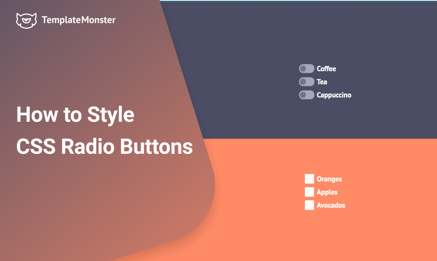
We're all familiar with HTML checkbox and CSS radio button. The most frustrating thing about them is that there's no way for us to change the way they look. They look in a different way depending on your operating system and browser, and we can't style them using CSS.
This can be annoying for most designers, who want to make those elements appealing so that they don't spoil the design. In this tutorial, I'll show you how to make them look really cute with a simple trick. Let's dig in!
Making Your Website Responsive. What Are Your Options? [Free Ebook]
Be Strong. Hide Your Checkboxes
This may sound counterintuitive, but to make our checkboxes and radio buttons look great, we have to hide them and forget about them! Yes, there's no need for them to stick around anymore, so we just apply a simple rule:
.section input[type="radio"],
.section input[type="checkbox"]{
  display: none;
}
But Matthew, you might say, what are we going to do without them? No worries, we'll build our own checkboxes, with blackjack and… well, let's just get into it.
CSS Radio Button
First, there's our markup:
<section id="first" class="section">
    <div class="container">
      <input type="radio" name="group1" id="radio-1">
      <label for="radio-1"><span class="radio">Coffee</span></label>
    </div>
    <div class="container">
      <input type="radio" name="group1" id="radio-2">
      <label for="radio-2"><span class="radio">Tea</span></label>
    </div>
    <div class="container">
      <input type="radio" name="group1" id="radio-3">
      <label for="radio-3"><span class="radio">Cappuccino</span></label>
    </div>
</section>
We have a section, where we're going to contain three radio buttons. We'll cover checkboxes further in this tutorial, the principle is the same. Each input is wrapped into a div with a container class. Also, each input has a label with a span in it.
Important!
Since we've hidden the radio and checkbox inputs, the only way for us to access them would be by using a label tag. To work properly the label tag has to contain the "for" attribute with an ID of corresponding input. If an input has an ID "radio-1", then the "for" attribute should also be "radio-1".
You might be wondering why did I wrap the text inside each label into a span:
<div class="container">
      <input type="radio" name="group1" id="radio-1">
      <label for="radio-1"><span class="radio">Coffee</span></label>
</div>
Since we're going to style radio buttons with "::before and "::after pseudo-elements, we need a parent element, based on which they can be positioned. In this case, it will be our label:
.container label {
  position: relative;
}
Here is a set of styles which is shared among both checkboxes and radio buttons:
.container span::before,
.container span::after {
  content: '';
  position: absolute;
  top: 0;
  bottom: 0;
  margin: auto;
}
Top and bottom properties set to zero and combined with "margin: auto;" allow our elements to have a centred horizontal position.
Here's how the rest of the styles look like:
.container span.radio:hover {
  cursor: pointer;
}
.container span.radio::before {
  left: -52px;
  width: 45px;
  height: 25px;
  background-color: #A8AAC1;
  border-radius: 50px;
}
.container span.radio::after {
  left: -49px;
  width: 17px;
  height: 17px;
  border-radius: 10px;
  background-color: #6C788A;
  transition: left .25s, background-color .25s;
}
input[type="radio"]:checked + label span.radio::after {
  left: -27px;
  background-color: #EBFF43;
}
The most important part is the last set of rules, which basically does the whole trick. The ":checked" pseudo-class allows us to make changes to elements when the input is checked. With a '+' selector we can choose the next sibling element, and target our "span.radio", where we apply new rules to the "::after" pseudo-element. In this case, we change its horizontal position and the colour.
In order to make the switch smooth, we assign the transition of 0.25 seconds to the left property and background-colour. Now when we click on the radio button, the switch is moving smoothly instead of jumping quickly.
Checkboxes
If you need to create custom checkboxes, the method is the same. Take a look at the styles:
.container span.checkbox::before {
  width: 27px;
  height: 27px;
  background-color: #fff;
  left: -35px;
  box-sizing: border-box;
  border: 3px solid transparent;
  transition: border-color .2s;
}
.container span.checkbox:hover::before {
  border: 3px solid #F0FF76;
}
.container span.checkbox::after {
  content: '\f00c';
  font-family: 'FontAwesome';
  left: -31px;
  top: 2px;
  color: transparent;
  transition: color .2s;
}
input[type="checkbox"]:checked + label span.checkbox::after {
  color: #62AFFF;
}
The only difference is that we're using an icon from the FontAwesome family as our "::after" pseudo-element. By default it's transparent, but when the checkbox is checked, the icon becomes blue.
Aside
If you want to use a FontAwesome icon in your pseudo-element, you have to include its code in the content property, and specify the font-family property as "FontAwesome". For example:
{
content: '\f00c';
font-family: 'FontAwesome';
}
The code "f00c" is preceded by a backslash, which is required to escape the Unicode character. The Unicode can be found on the page of your chosen icon:
Final Result
That's it. Now we've created fully-functional and beautiful checkboxes and radio buttons, which you can tweak and use for your own projects. You can view the full source code in the CodePen demo:
See the Pen
Radio buttons and check boxes 2 by Matthew Cain (@matthewcain)
on CodePen.
Video tutorials
It is better to see once than to read multiple times. Some people prefer to look over the professional's shoulder, so I picked 5 best (in my opinion, certainly) video tutorials about creating custom checkboxes and radio buttons. Hope that'll help.
HTML5 Website Templates
If you find this tutorial useful or have any questions, feel free to share your thoughts in the comments below. Thanks!
FAQ
It is a little interactive element that could be toggled by the user to make a choice among two or more variants. Sometimes it is also called a selection box or tick box.
It is an element the user can interact with to make a single choice of several options. Unlike checkbox, it allows choosing only one option among the offered.
Oh, come on, it will be better if the interactive elements fit the other parts of the design, isn’t it? Every tiny detail could be crucial for the general look.
