Clean It Up: 10 Key Distractions on Most WordPress Blogs
What's the primary goal that you pursue while building a blog? Do you want to stun the audience with multiple visuals, widgets, pop-ups, and other elements that fly out here and there? We really doubt that. Blogs should be all about usability and user-friendliness. They don't need to be crammed with multiple fancy things that most of the web users simply do not care about. More often than not people are distracted by the massive pop-ups that appear on the screens of their desktop and handheld devices, which doesn't let them focus on the things that matter the most - your content.
The purpose of sharing this post with you is to highlight the top 10 things that you need to remove from your WordPress blog straight away. Thus, you will be able to captivate a wider audience and deliver your blog's focal point more effectively.
Banners
For many years, display advertising has been one of the core sources of income for site owners. On seeing the effect those have on the users and the income boost, blogs started to look overrun by ads. As a result, this had a negative effect on both the blog design and user experience.
- It's acceptable to place a couple of banner ads on your blog. Provided that they look natural within a design and do not distract the users from scanning through the content, banners will affect your blog's UI.
- Banners should never interfere with your content. Forget about adding expanding ads to your blog.
- Your content is the most important thing on your blog. If an ad overpowers your data, it's high time to rethink things. Instead of putting an ad at the beginning of your content, place it in the end. In that way, it will appear less distracting.
Remove Extra Sign-ups

Recently, site owners started adding several sign-up forms to their sites. Members-only sections, e-teams, and mailing lists co-exist on one and the same web resource, which may look rather misleading and clumsy. Instead of uploading all this to your blog, prioritize mailing sigh-up. With its help, you can notify users about your members-only solutions, exclusive offers, and special rewards for e-team members in separate sections. You can also engage e-teams by means of social media platforms. Ask them to engage with your brand, share content on their profiles, etc.
Social Media Feeds
It's no doubt that social media is one of the most effective user engagement boosters. However, adding several social media widgets to your blog can cause a real mess there. If you want to attract a wider audience to your official Facebook page, you can simply add a Facebook 'like' box to your blog's layout, without the feed. Same goes for Instagram, Twitter, and other popular social media platforms.

Whenever a person lands on your page and sees Facebook, Twitter, and Instagram feeds placed one next to another, he gets confused. He simply doesn't know what to focus attention on, and chances are that he will simply get distracted by the clutter on the page.
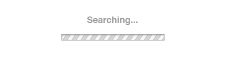
Search Boxes
It's not necessary to add search boxes to all pages of your blog. It takes up space, which could have been better occupied by another valuable piece of data. Leave a search box on the homepage of your blog and remove it from the rest of the pages.
Blogroll
A blogroll can both slow down the loading speeds of your site and take up too much space of your blog layout. Long lists of extra links can drive people nuts and simply draw them away from your objectives. If you want to share other blogs that you follow somewhere on your blog, just remove blogroll from the sidebar and place them on a separate page with recommendations.
Tag Clouds
This is one of the most controversial elements. One of the main reasons why you need to tag clouds removed from your blog's pages is because they look too messy and even overwhelming. On the other hand, tag clouds let you introduce the audience to the most trending topics on your blog.
A possible solution? Instead of placing a huge block of text within your blog layout, choose some of the biggest and most trending sections. This will make your blog cleaner and more user-friendly.
Sidebar
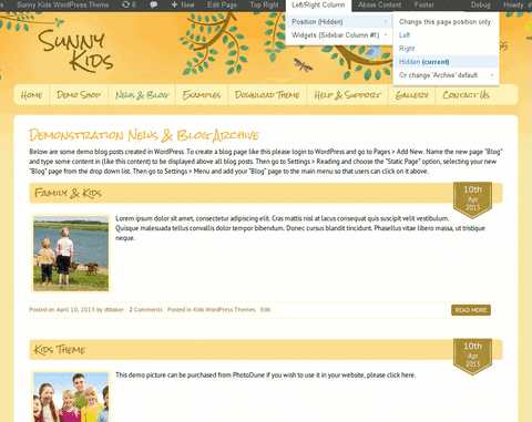
Sidebars are listed among the default WordPress settings. Almost every WordPress theme that you can download from the web supports sidebars. Archives, latest posts, latest comments, and tag clouds commonly populate sidebars. In certain cases, it is appropriate to include sidebars into your blog. However, that is not a one-size-fits-all that for every single project.
While removing a sidebar from your WordPress blog, you get a better control over its look and feel. Stats counters, banners, ads and blogrolls clutter designs, distracting your readers' attention from your content.
Sidebars are easy to remove/manage from your the admin panel of your blog. Simply go to Appearance > Widgets to remove them or drag-and-drop widget areas.
Pop-ups

Google hates pop-ups on mobiles. Neither do desktop versions of websites look user-friendly when a person is interrupted with a nasty pop-up opt-in form over and over again. These ads or opt-in forms are terrible distractions for the web community. If you do not want to remove these from your blog completely, you can delay the execution response for 30 seconds or longer. You can also limit pop-ups to appear only on the first page of your site where a person lands.
Cluttered Header
If a person cannot figure out where is there a logo on your blog and how the navigation panel is structured, then the time for changing your blog's header has come. Remove a flashing header banner. Make the top of the page as simple and minimalist as possible. Get rid of everything that can possibly distract your readers. When it comes to the header structure, less is really more.
Shift for minimalist designs
Minimalist web designs are so easy to browse even for the first-time visitors to your blog. As a rule, they feature spacious layouts with a clever use of whitespace. Simple and readable fonts, clear content hierarchy, and a few images used to the point make it far easier to keep the users' attention on the focal points.
If you are looking for a quick and usable solution to upgrade your blog with minimalist style, you can consider creating a clutter-free environment on your web resource by means of these minimalist WordPress themes.
Follow these 10 simple tips and your visitors will enjoy visiting your clutter-free WordPress blog over and over again. If there are any other elements that you think should be better removed from blogs, feel free to speak up in the comments box.
Don’t miss out these all-time favourites
- The best hosting for a WordPress website. Tap our link to get the best price on the market with 82% off. If HostPapa didn’t impress you check out other alternatives.
- Monthly SEO service and On-Page SEO - to increase your website organic traffic.
- Website Installation service - to get your template up and running within just 6 hours without hassle. No minute is wasted and the work is going.
- ONE Membership - to download unlimited number of WordPress themes, plugins, ppt and other products within one license. Since bigger is always better.

Get more to your email
Subscribe to our newsletter and access exclusive content and offers available only to MonsterPost subscribers.

Leave a Reply
You must be logged in to post a comment.