9 Essentials of the Effective Email UX Design
Companies that use email marketing in their online strategies tend to generate up to 50% more sales-ready leads and at 33% lower cost. If you want to reach the same heights, then keep on reading and discover case studies and live examples of the effective email design UX tricks that the world's known brands put into practice.
How to Create an Effective Newsletter UX
There are multiple tricks that can make your email a success or, on the contrary, break your email marketing strategy. Layout structure, CTA positioning, text readability, and psychological tricks are only a few basic elements that you need to keep in mind in order to make your email trigger the desired action. The way you design your email highly effects the conversion. The following 9 tips are based on the case studies and real examples of emails that were ever sent by the world’s known names.
#1 Make the layout mobile-friendly
One of the fist, and the most important factors that you need to take into consideration while working on the improvement of your emails is making them mobile-friendly. It's a wrong assumption that people do not read emails on their smartphones. With the growing shift from the desktop to handheld devices, more and more users tend to install email apps on their smart gadgets. According to the emailmonday's mobile email stats overview, mobile email counts for 15% to 70% of opens, depending on your niche and the target audience.
At this point it's worth mentioning that most frequently people skim rather than read emails on their smartphones. So, the way you write your email subject is no less important. A powerful headline captures users' attention, makes them get interested in what you are going to share and, as a result, they open it. If your email cannot adapt properly to the screen size of their devices, most likely they will simply close it or even mark as spam.
#2 Design layout based on the email type (branded or newsletter)
Now, as you have optimized your email for mobile devices, let's consider its design. First, think about the specific type of the email that you want to optimize. Is it a personal correspondence, a branded email or a newsletter? Though some might say that there is no difference in the way each of these will be designed, according to Infusionsoft, this factor is of the tremendous importance.
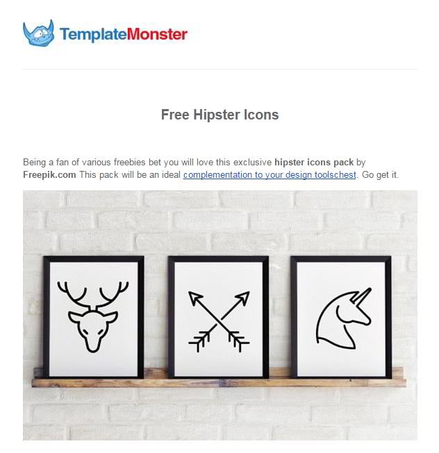
A branded email is commonly created in the official color scheme of the company that it is sent from. In addition, it should contain a company logo and a company name. When it comes to the branded emails sent from TemplateMonster, they feature all the aforementioned elements. Here you will find the company name and the logo. The color scheme is taken from the official page. Light blue and red create a perfect harmony in the email. Just see it for yourself.
A company newsletter features all the attributes of the branded email, with the additional implementation of videos, sidebars, banners, articles, links, etc. This is part of a company's marketing strategy, and the primary goal of such emails is to notify subscribers about a new promo campaign, the launch or update of a certain product or simply provide the users with an overview of the latest blog publications.
The MonsterPost weekly newsletter is sent to our fans each Saturday and includes a brief information about the latest company news, promos or simply inspirational data. A list of the most popular blog posts of the week, editor's pick, and several top-selling TemplateMonster's themes of the week are also included in the email.
#3 Fancy HTML vs. Plain Text Emails
A plain text email looks more personalized and as if sent from a friend. It is easy to follow and is more likely to make the users hit the reply or follow the links that you have added to the text. A long plain text email will work well if you want to tell the audience about your unique or even expensive products, but do not want their attention to be distracted by any fancy design elements. Pure text is all that they should pay attention to in your email.
A highly stylized email creates an opposite effect. It can make the users hesitant to take an action because the email starts to break up. On the other hand, HTML can reinforce your brand identity and show off your professionalism. Stylized email will also work well if you want to present sensitive information in a user-friendly way. Complex data is also easier to perceive when beautifully organized within an email. In a word, everything depends on your intentions and the purpose of sending an email. If you want to build friendly relations with the addressee and motivate him/her for an action, then plain text emails should be your best choice. If you want to look official and make your brand identity stick in the users' mind - go for the stylized HTML emails.
As part of the most recent experiment run by TemplateMonster's team, it turned out that stylized emails show weaker results than plain text emails in terms of CTR. What we did was a shift from a stylized template of our traditional daily newsletter to a more simple one, containing plain text only. With the purpose to compare how these two types of newsletters work, we decided to send out both the stylized and plain text email to our subscribers. What we saw was a significant increase in click-through rates, from 7.96% (CTR of the stylized email) to 22.67% (CTR of the plain text newsletter).
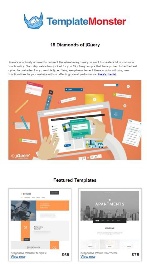
Here is what our stylized newsletter looks like. A couple of lines of text are accompanied by a big bold banner, taking the users to the corresponding article at MonsterPost. What's more, below the banner you can find a visually separated block with our featured templates that were released the day when the email was sent.
View the email in your browser
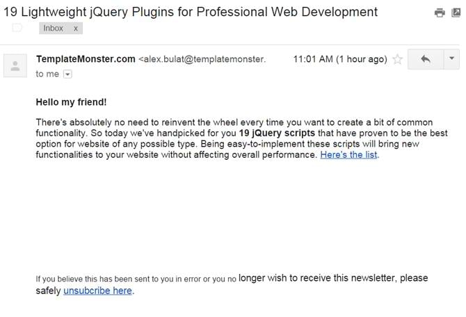
Here is what our simplified newsletter looked like. Here you will find nothing but pure text. The only link that was added to the email in intended to take the users to the newly published article at MonsterPost, and it was placed at the very end of the text. Such an approach lets the readers to look through the message and decide whether the email brings them any value, whether the things that we are talking about will be of interest to them, etc. In case of a plain text newsletter the users' attention is all focused on the primary intention of sending out the email, i.e. to introduce to them to the new piece of content, which resulted in a 3-times bigger CTR.
#4 Make it short and clear
The biggest mistake that marketers do when sending emails to their clients is writing "novels" instead of short texts. This technique could have worked ten years ago, but not in the modern age. A contemporary user doesn't have much time for reading your text from A to Z. An email made short and to the point, with the key information highlighted in bold or italics is much easier to scan, which increases your chances of delivering your writing intentions to the recipient.
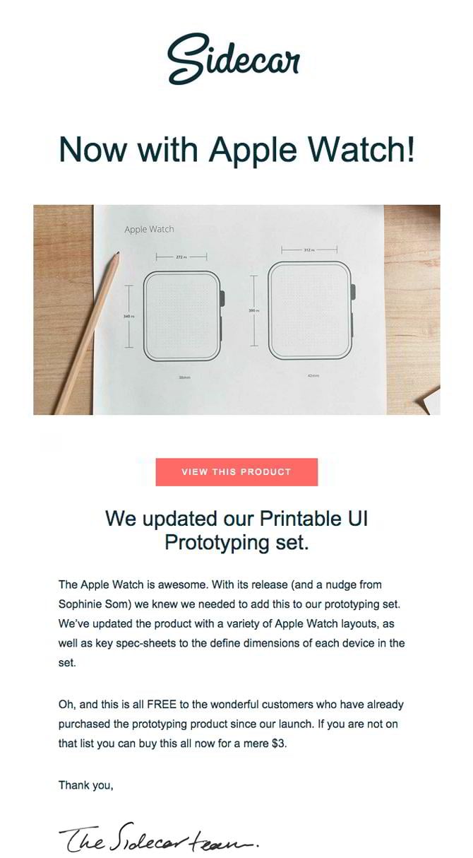
Have you ever heard about the "five sentence email" rule? According to it, the perfect length of a user-friendly email should be 5 sentences or less. Mike Davidson, founder of the Five Sentences movement, says that if you want people to read your email and send you a response afterwards, then the text that you add to the email body shouldn't be longer than a paragraph, otherwise the users will simply put off reading it. According to Davidson, nothing drives people crazier than a long email with thousands words, with the main part telling what exactly you want the user to do hidden somewhere in the mess of words.
Have a look at an newsletter that Sidecar team once sent to its customers. As you can see, it was designed to be clean and simple. The users' attention is not distracted by any heavy elements. White space brings the content to the forefront and makes the readers get focused on the text. The latter, by the way, was made short and concise. Consisting of 3 sentences only, it managed to deliver the senders' writing intentions and motivates to take an action. A signature that was put in the end of the email makes it more personalized.
#5 Use illustrations to tell the story
A picture is worth a thousand words. So, if you want to better deliver the message of your email to the recipient, accompany texts with unique and eye-catching illustrations, and you will find your key to success. As you could have already guessed, stock images are not the best option if you want the email look unique. To achieve the best results, you will need to work with a designer from your team or create something appealing on your own.
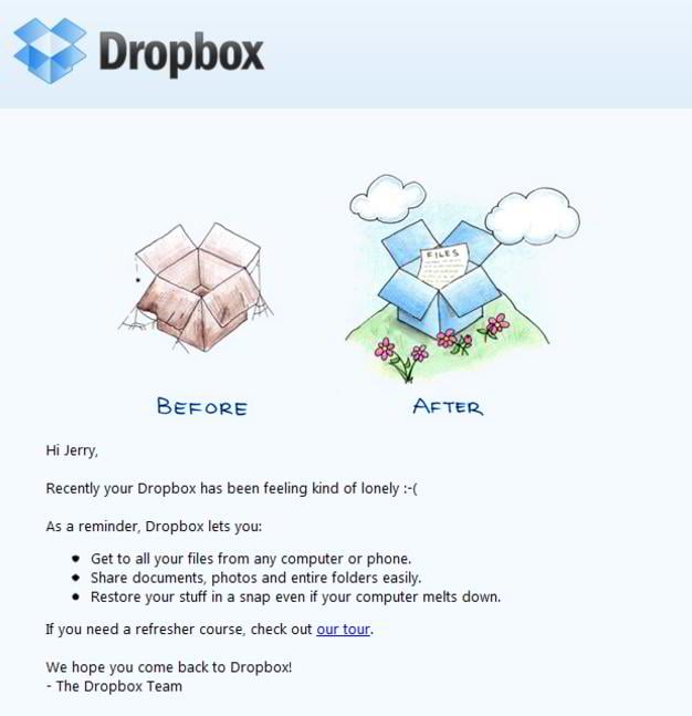
This is what Dropbox makes use of in their email marketing campaign. They make their emails short and clear, like the following example of their "come back to us" email. As you can see, the email was designed in the branded light blue color. A large and catching logo was put at the very top of the email, thus making it clearer for the recipient to understand what company has reached him/her. Next comes the illustration. Since we are dealing with a "come back" email, featuring an old empty box opposed to the new and beautiful one, it helps the sender to convey the message that they are going to introduce later in the email. A couple of lines of text and the key steps that they advice their customers to follow are organized into bullet points. This makes the email well structured and easy to follow.
#6 Integrate GIFs
Have you ever considered adding animation to your email? It goes without saying that when opening the latter the users will have a more long-lasting impression rather than reading a text accompanied by the static images.
A motion effect integrated into an email not only provides for a more pleasant visual appeal. With its help marketers can better introduce their offerings to the clients, showcase their advantages over competitors or simply display a product in action. When getting such an email in their inbox, your subscribers will have a better idea of what your company deals with and have a stronger desire to learn more about you.
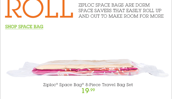
There are many companies that opt for this technique. Amazon, Chanel, Banana Republic, Singer 22, and Mr. Porter are only a few brands on the long list of companies that have once sent animated emails to their subscribers. Here is an example that I enjoyed the most.
In their email promoting Ziploc Space Bag, Bed Bath & Beyond used an animated GIF to demonstrate how easily those bags can roll up and down, leaving plenty of room for other items in your suit case.
View the entire email in your browser
#7 Infographic-inspired layouts
Colorful and easy-to-read infographics have always been one of the preferred types of content on the web. So, why not to style your email as if it was an infographic? Such a solution will be a great option for long and complicated texts, covering many different aspects, none of which can be missed. An inforgraphic can deliver the most complicated message in an easy to understand way.
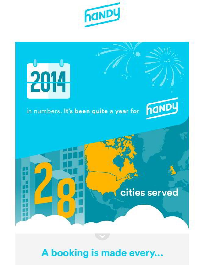
For example, have a look at this newsletter from Handy. Their "year in review" newsletter was created in the infographic style. Rich in bold colors, featuring clear visually defined blocks, readable typography and fun graphics, the infographics presents numbers in an easy-to-understand way.
#8 Design CTA that people can't help but click
A clear call-to-action is an indispensable part of the effective email UX design. It should be bold and visible, motivating the audience for the further engagement with your brand. The rule of using CTAs in emails are pretty much the same as on the websites. The call-to-action should be front and central, designed in the bright colors and contain clear and concise text that can be understood by anyone. However, while working on the email design, many of us underestimate the importance of the clever use of CTA and commit the following mistakes.
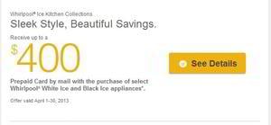
Confusing the recipient with too many calls-to-action. According to the case study run by Whirpool, when reducing the number of CTAs in a single email, the brand has managed to achieve a 42% increase in the number of clicks. Instead of the four call-to-action buttons placed in different part of the email the company left only one and put it next to the product that they were promoting in the email.
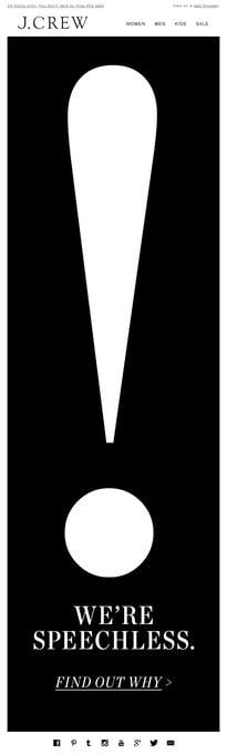
CTA melt into the text. Making CTAs stand out is a rule of a thumb, which marketer neglect sometimes. Just take a look at the following example. Can you differentiate CTA from the rest of the text while scanning this email? Placed on the black and white background, the white call-to-action presented in the form of the text doesn't stick out.
Now take a look at this example. CTA was designed pretty much similar to the previous example. However, the way it was presented within the email is more user-friendly. An oversized exclamation mark placed before the CTA immediately captures the users' attention. As people scroll down, their eye is caught by a large and intriguing call-to-action, which engages and motivates to click it.
Long texts in CTAs. As the name implies, the main purpose of such elements of design is to make the users' get interested and perform a certain action. To achieve this, it's recommended to use short and easy to understand phrases and punchy words that create the sense emergency and stir the recipients into action. Here are some of the most popular examples: Shop Now, See Here, Try for Free, Join Now, Learn More, Save with Us, etc. More examples can be found here.
Wrong CTA placement kills conversion. The place where you put is heavily dependent on how long or short is your email, and what you want the recipient to do. In short copies, a CTA is commonly put in the end of the text. When it comes to a longer copy, the number of CTAs can be increased to two-three buttons maximum (depending on the length of the email). This will provide the readers with several opportunities to engage, even if he/she didn't read the entire message.
In order to convert, CTA should be placed above the fold. As per CampaignMonitor, a CTA button will stand out from the rest of the content in your email and encourage click-through rates when it's surrounded by white space, and thus visually separated from the rest of the content. In addition, the button should be placed at the bottom instead of the top of the email. There is certain logic standing behind such an approach. A CTA placed in the end of the text provides time for the recipient to look through the copy, realize whether or not they are interested in your offerings, and if yes - click the button. A CTA placed at the top of the email is more oriented on the audience that already knows about your offers and is ready to take an action.
#9 Separate text from ads visually
Such an approach will add more transparency to your emails. While separating ads from the main content, online magazines and blogs that include commercials into their newsletters can make it easier for their subscribers to find information that is of the biggest value to them. In addition to creating a more trustworthy brand image in your emails, the technique can give advertisers more visibility to deliver positive ROI on investment.
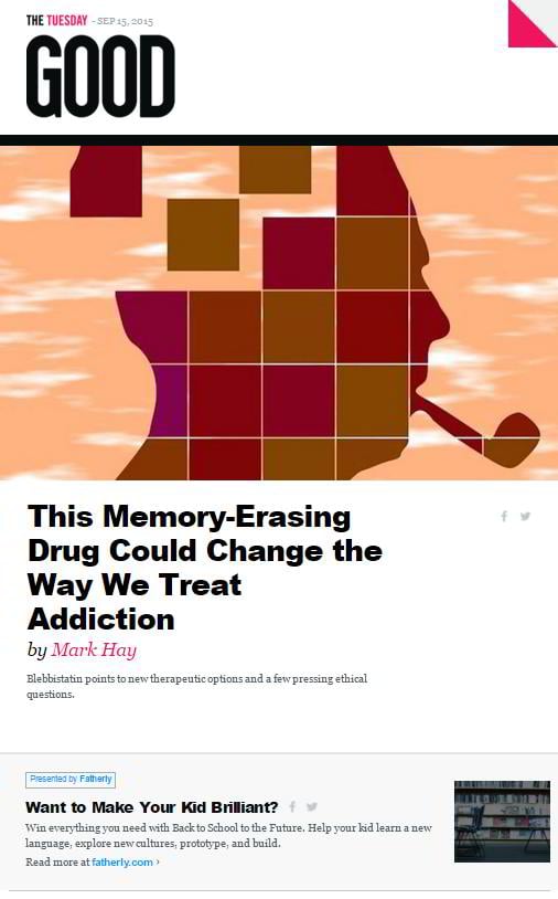
How to use this in practice? Let's consider an example of the GOOD Magazine newsletter. Of course, ads are not placed front and center. The email begins with the branded logo, a large and captivating illustration, a brief introduction to the most recent publication from their site, and only then comes an ads block. It is easy to visually differentiate the latter from the rest of the content. First and foremost, it is highlighted with a different background color. Next comes the content positioning, which is different from the upper part of the email. Images accompanying the ads are minimized and moved to the right side, which is right in terms of Visual Advertising.
These were 9 of the most crucial tips that we consider to be highly effective when working on the improvement of the email design UX. When it comes to creating a plain text email, you do not need to apply too much effort. Use any email agent that comes to your liking and start composing your letter.
As per branded emails, here you will need more time and effort. If you are not a designer, then hiring a professional for the purpose can cost you a pretty penny. However, there is another option available as well. You can opt for the ready-made newsletter templates from TemplateMonster, all of which are fully customizable, responsive and adjusted for all the major email clients. If you use MailChimp or Campaign Monitor - all themes from the inventory support both services and cost some mere $14, regardless of the purpose of use and functional filling.
Below I would like to offer for your consideration some of the most popular newsletter templates from TemplateMonster.
Top-selling newsletter templates for a quick start
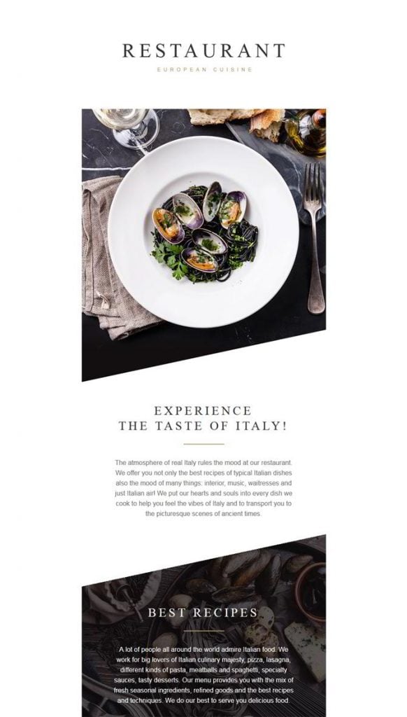
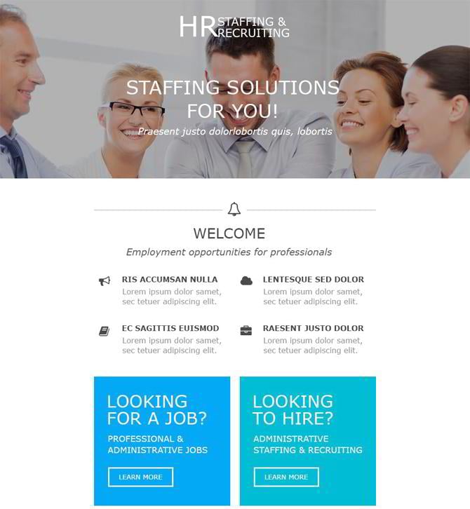
European Restaurant Responsive Newsletter Template is a ready-made solution that will work best for cafe, restaurant, bakery or any other food related business. The clean and simple design of its layout allows the recipients to focus their attention on the content. In order to add visual hierarchy to the layout, the theme's developers made use of fonts of different sizes and photo backgrounds.
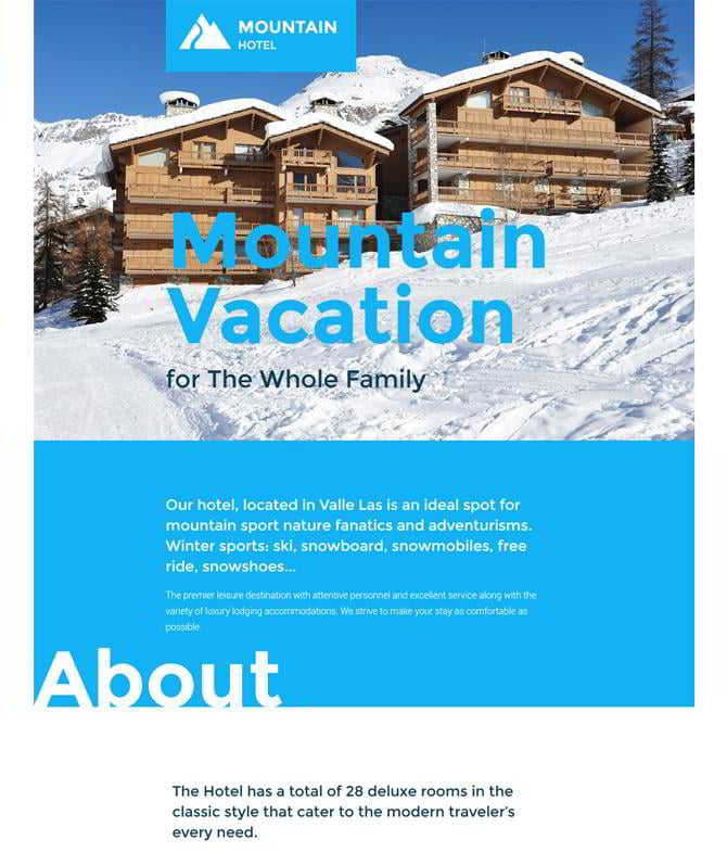
Hotels Responsive Newsletter Template features several clearly defined content blocks, which provide for seamless scanning of the text. A large and vivid CTA button was placed at the very bottom of the email. The template comes with social media support, so there will be no need in managing the latter on your own. Just link the corresponding icons to your profiles on Facebook, Twitter or Google+, and the newsletter is ready to go.
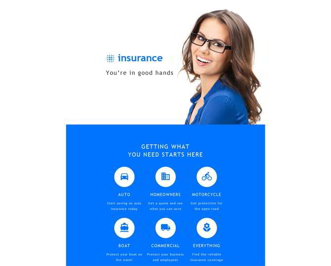
Insurance Responsive Newsletter Template was built in the light blue and white colors, which are known as the best option for business, finance, insurance or accounting projects. The theme's layout was organized in a way that is easy to scan. The designer added plenty of different types of information to the theme, but you can pick the blocks that meet your business objective the most.
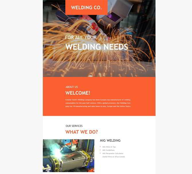
Welding Responsive Newsletter Template features a rather unusual content positioning. The theme's developers decided to add grids and columns into one email newsletter design. The colors are bold and eye-catching, revealing the iron-hot atmosphere of the business that it comes from.
Any business related project can make use of this Consulting Responsive Newsletter Template. The newsletter was designed to be both informative and easy to read. Fonts of different sizes and such visual elements as lines and icons were added to add some visual hierarchy to the template.
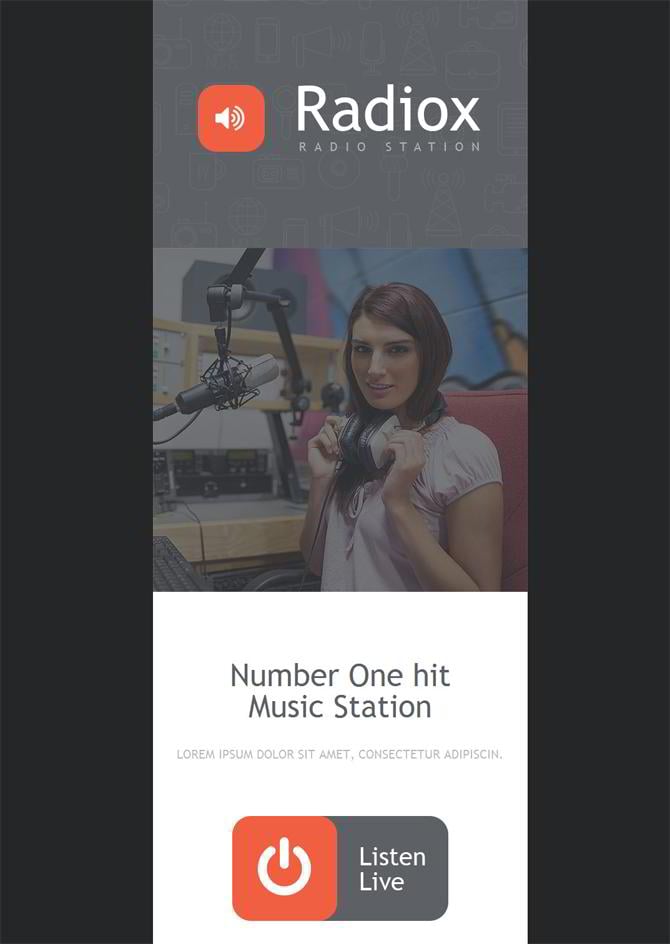
Radio Website Responsive Newsletter Template is a good example of how a branded newsletter should look like. The company logo was put front and center. Enhanced with a photo of the radio DJ, the theme created a feeling of trust. A large CTA button welcoming the recipient to listen live radio occupies the central place of the theme. The list of staff, social icons, contact details and all the other elements of the template can be customized effortlessly.
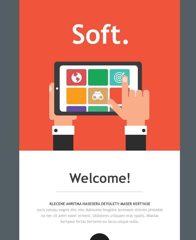
Soft Responsive Email Template was designed in metro style. With the purpose to entertain the reader, the theme features icons and buttons of different shapes. In order to organize content in a well-balanced way, the layout features a grid-based structure.
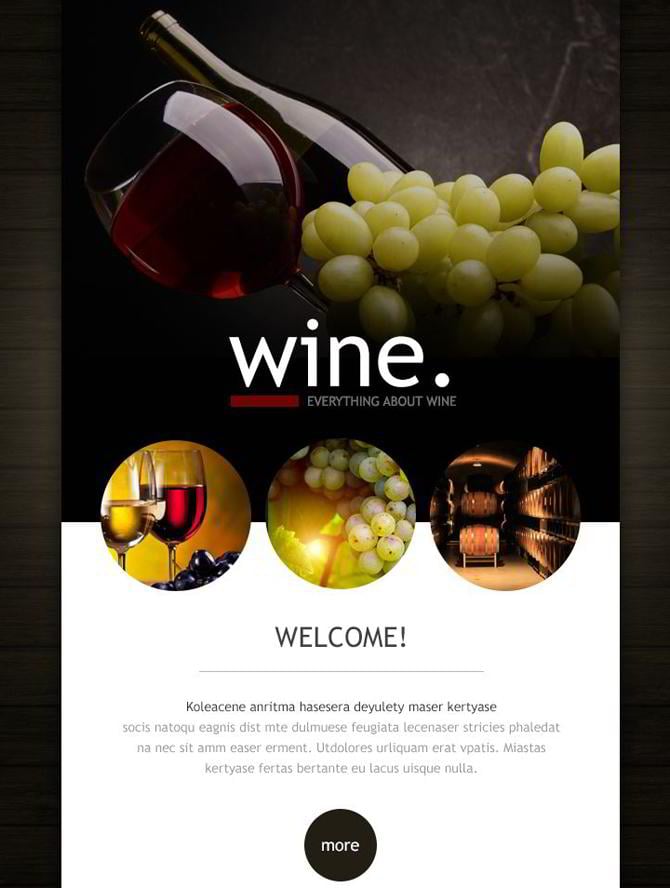
Wine Responsive Website Template is intended to introduce subscribers to the explicit information about a winery or any other food and drink related business. The template was designed in dark tones, with the main attention paid to visuals. Circular design elements make up a perfect harmony with the sharp-edged banners, making the layout so diverse and captivating.
Final Thoughts
When dealing with email marketing, don't forget to create real value for the recipient. No matter what you create, it should bring some value to the audience. This can be literally anything - from information to digital or physical goods. Any value stands in the close relation to return on investment. In our case, the latter is all about the time and effort the recipient needs to spend in order to read your email and realize its intention.
The amount of effort that users put into getting the value should be always less than the thing they get in the end. If you offer a free ebook, the efforts that they make to get it should equate to zero. In case you are offering something that costs $100 or more for free, then the users will put a lot more effort into getting it. No matter how expensive that value is, the primary goal is to make the process of getting it effortless.
Basically, that's all that I wanted to highlight in this post. Now it's your turn to speak up. What tricks of trigger based email marketing do you implement in your work? Which of the aforementioned tips do you consider the most useful in terms of enhancing email design UX? What do you think about using ready-made newsletter templates in marketing? You are welcome to share your thoughts below this post.
Email Listing Done Right: an Ultimate Guide from Template Monster

Get more to your email
Subscribe to our newsletter and access exclusive content and offers available only to MonsterPost subscribers.

Leave a Reply
You must be logged in to post a comment.