Ucraft vs. MotoCMS: Which Website Builder to Choose?
We continue our series of website builder battles. This time we’re going to compare MotoCMS and Ucraft, a relatively new but promising tool for creating websites without any programming skills.
Website builders are a great choice if you want to create a website, but don’t know from where to start. They eliminate the necessity to deal with coding, HTML markup, and other geeky stuff. It takes time for an unskilled person to learn it, but why bother if you have a tool that takes you by the hand and guides you through all the pitfalls of the web development process. Web builders are enhanced with drag-and-drop editors making the site creation process accessible to the average person who doesn’t have a computer science degree.
Although there are many website building solutions, today we concentrate on two popular platforms, MotoCMS and Ucraft. Let’s start with the latter.
Ucraft
Ucraft is a website creation platform that eliminates the pain of building a website. With their drag-and-drop interface, anyone can build a simple site.
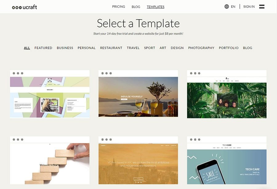
You start creating a website with Ucraft by picking your design from a collection of 37 templates. It is versatile and covers such topics as business, personal, restaurant, travel, sport, art, design, photography, portfolio, and blog.
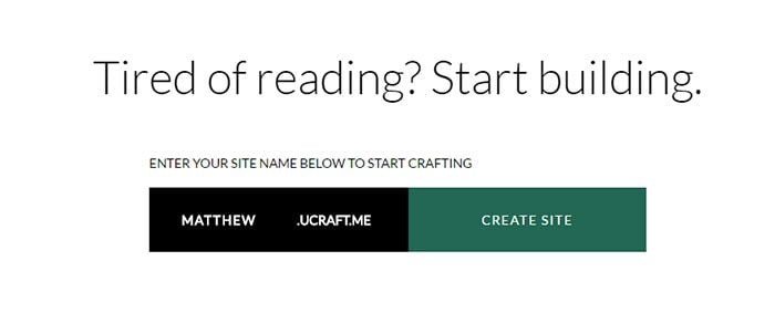
After selecting a template, the next step would be to choose your website domain name.
Ucraft gives you a free website address that ends with ucraft.me. You can replace it later with a custom domain name.
Once you’ve chosen a domain name and a template, you’re free to customize your site.
Crafting Your Site With Ucraft
Ucraft provides a comfortable editing experience and implements some interesting features that simplify the website building process. In order to understand better how the builder works, let’s take a look at its main components.
Blocks
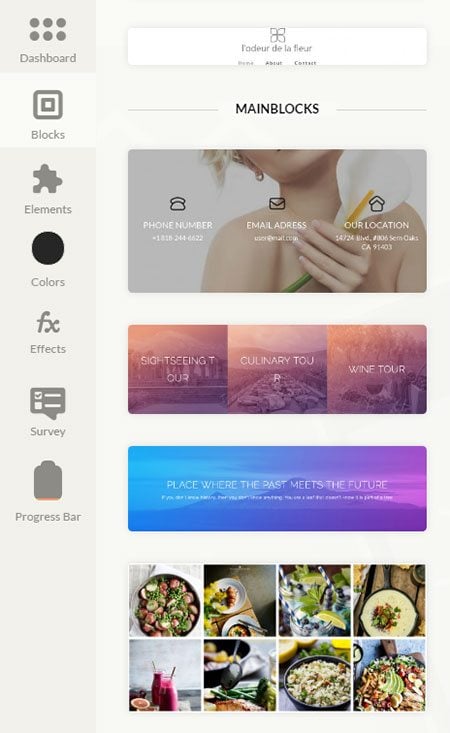
Blocks are pre-designed elements in the Ucraft’s builder that can be placed into your page as is. The main advantage of blocks is that they already look beautiful and you don’t have to spend time designing the required sections from scratch. The blocks cover most of the common needs including header, gallery, contact sections, and more.
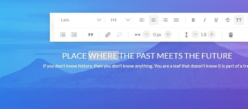
You can customize each block by changing text and images. Edit text just by clicking on it and choosing the proper formatting, and change images by uploading your own or selecting them from a default image gallery.
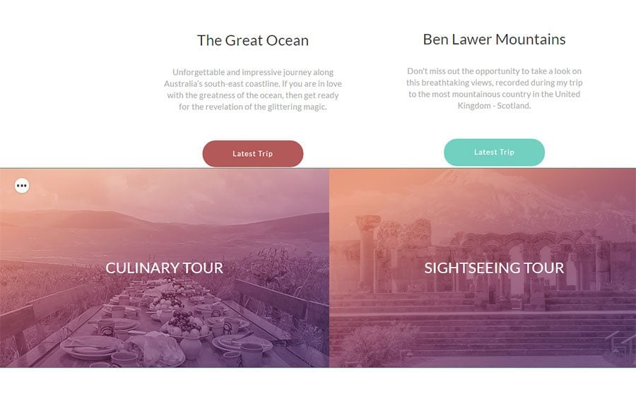
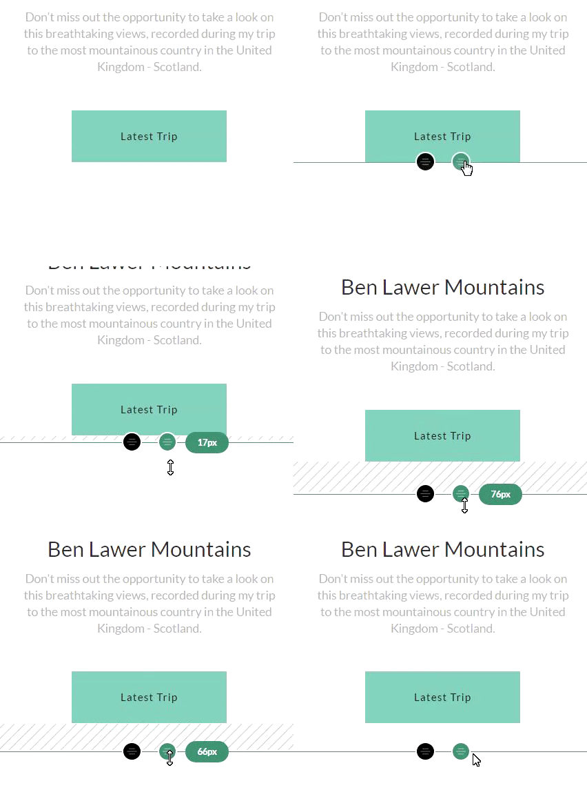
The only thing that struck me as a bit of an odd move is that you cannot really change the spacing between the blocks. If you place one block after another they become smashed together like this:
Not all blocks behave like that, but in my case, I couldn’t do anything to add spacing between the image section and the buttons.
After further exploration of Ucraft, it turned out that you can actually change this behavior and exercise more detailed control over your layout and design. You do this by enabling the Designer Tool premium extension, which I’ll cover shortly in this article.
Elements
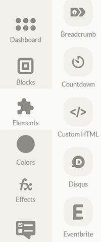
Elements in Ucraft are the basic components of which your web page consists. They include both common and more elaborate building blocks. For example, you can get along by using images, paragraphs, headings, buttons, etc., or add something cooler such as a Twitter feed, or a Typeform. In total there are 34 elements and many of them can be quite helpful.
Also, elements do not include any layout components such as rows and columns meaning you can create layouts by using only pre-designed blocks as your foundation. In other words, elements are great for customizing existing layouts, not for creating them from scratch.
Colors
Ucraft has a neat feature I’ve never seen anywhere before and that is Colors.
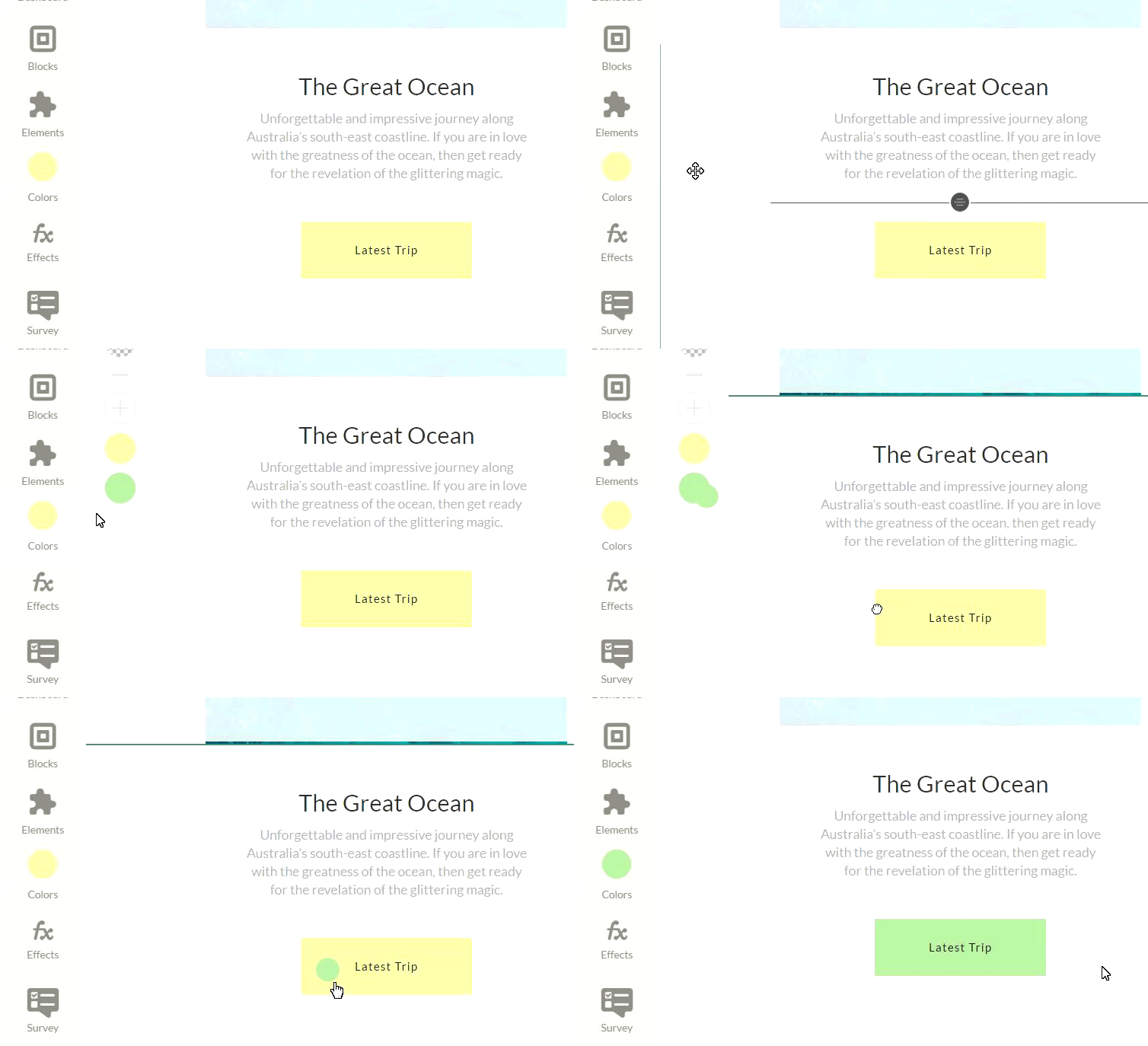
With Colors, you can change the appearance of any of your elements simply by dragging a color circle and dropping it on the desired element. You can do this not only with buttons but with text and background as well.
At first, it’s really fun to use, however after some time changing colors becomes tedious. The point here is that you affect only one single element, the rest of the buttons (or headings, or whatever you chose) remain intact. If you want to play around and paint that specific button red, that’s fine. But if you want to change the entire color scheme of your site, Colors is really pointless. Fortunately, Ucraft does provide a better color management solution with Designer Tool.
Designer Tool
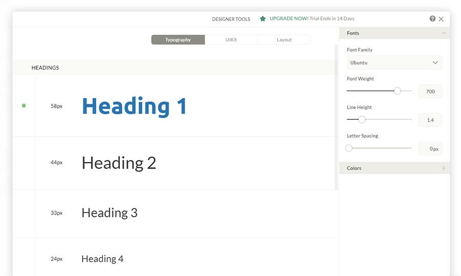
Designer Tool, finally. It’s a premium Ucraft extension that helps you customize your fonts, buttons, input elements and layout spacing. You can purchase it for a nominal fee of $2.99, and I’m not really sure why it’s not included in the main package by default.
With this tool, you can edit most of your settings in one place without having to go through each element manually.
In the typography section you can set up font properties for headings and body text, including their color, color of links and link hover states. Overall you can choose from 18 different font families, which is rather limiting. The good part is that all fonts are high-quality and include a lot of styles.
You can also create multiple button styles and use them in different places on your site. Although the configuration settings are flexible, there are still some limitations. For example, there is no option for selecting a font family for a button text. It is determined by the current font of your headings.
After enabling the Designer Tool you’ll also see black and green spots when you hover over the edge of a section. You can use them to manage the distance between sections, making sure each one has enough white space.
Effects
I have mixed feelings about animation in web templates. Mostly because it’s so easy to overdo it. It’s a fine line that separates a good animation from an obtrusive one that only distracts you from the content.
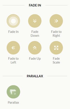
Ucraft provides you with the capability to add animation effects to your web elements. You can fade them in, up, down, etc., or add a parallax effect to your background. It’s up to you whether you use these effects sparingly, but in general, it’s a neat feature that can spice up your design a bit.
Ucraft Dashboard
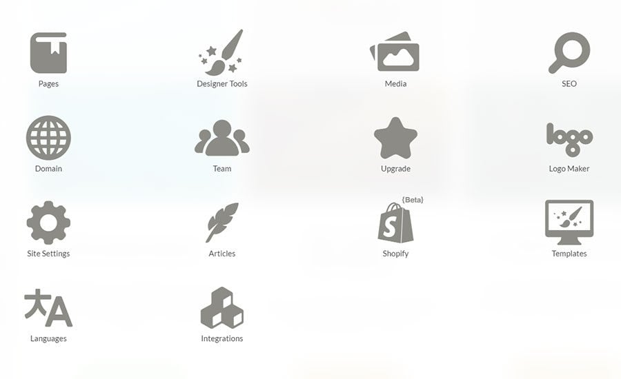
In the Ucraft dashboard, you can find different sections also referred to as ‘apps’. Each app takes care of a certain piece of functionality and helps you customize non-design aspects of your site. Let’s provide a short overview of the most important apps in the dashboard.
SEO
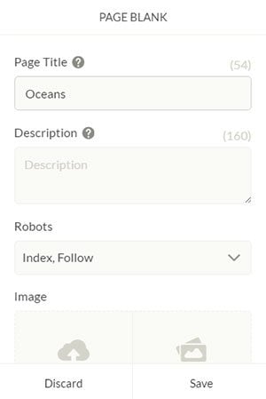
The SEO app lists all of your pages on your website and lets you adjust some of the SEO settings such as page title, meta description, and content for the meta robots tag.
You can also choose a page image, which would appear when you share your site on social media.
Pages
In the Pages app you can manage the page structure of your site. Add, delete pages, and specify page settings, such as a URL slug and a page title.
The pages are organized in a tree-like format, which helps you visualize the website structure better.
Articles
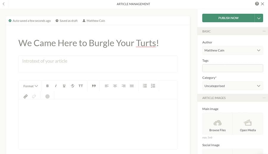
Yes, you can write blogs with Ucraft. There’s nothing fancy about them; for example, you cannot insert images or videos into posts, but it will do for short articles or essays. You can categorize your posts though, add tags, URL slug, and meta description.
Ucraft’s blog is certainly not WordPress, but if you want to post an occasional write-up or two, it would be enough.
Integrations
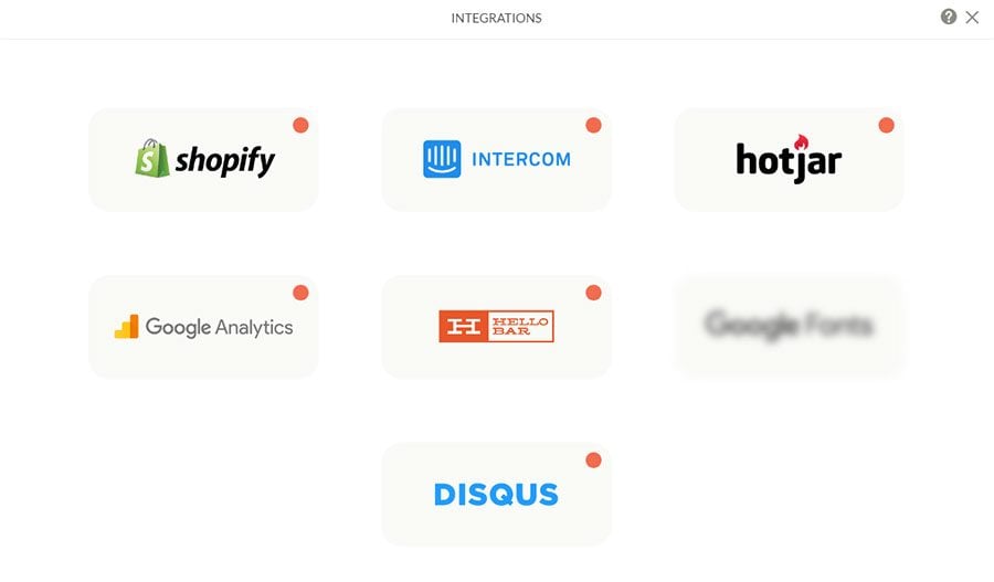
Integrate your Ucraft site with popular tools such as Shopify, Google Analytics, Disqus, Hotjar, and more.
These integrations help make your Ucraft site much better. It seems like the blurred icon spells ‘Google Fonts’. If the developers integrate the Google fonts collection into Ucraft, it would be a really nice addition to the current font selection.
Pricing
Ucraft decided to make their pricing policy as simple as possible. You can select either a free plan with a single page website and a maximum of five blog articles, or pick a premium plan with all the nitty-gritty stuff that comes with Ucraft for $8 per month. Certainly, the latter is more desirable.
Also, don’t forget the Designer Tool for $2.99. It’s a one-time fee that can save your day when building layouts.
Summary
Ucraft is a website builder that has the potential to become a good solution for creating websites without any coding knowledge. It offers tools for personalizing your design, has a nice selection of templates and a generous pricing policy. If you’ve never built a website before, playing around with Ucraft can be fun.
However creating a really solid and user-friendly website builder is difficult. Finding that golden balance between too few and too many options is not that easy either. Although it seems that Ucraft tried their best at making their tool convenient, they’re not there yet.
It takes time to get a firm grip on Ucraft’s builder. Some of the settings are scattered across different interfaces making it time-consuming to customize each element properly. It seems like Ucraft tried to give their users freedom to customize their site in detail, but became stuck somewhere in the middle because otherwise, they would make it too difficult. That middle ground is what makes Ucraft a tool that needs more improvement.
In its current state Ucraft would be a great choice if you need a super simple site for free. You don’t really care about the site’s loading speed, and just want to have a page somewhere on the Internet. It would also be adequate for a simple personal website if you pick a premium plan for $8 per month.
However, if you need a solid site for your business and are serious about your intentions, you’d be better off with a different builder.
MotoCMS
MotoCMS is a professional website building tool with a drag-and-drop editor, multiple customization settings, and beautiful template designs. MotoCMS is preferred among small and medium businesses, as well as personal website owners.
Templates
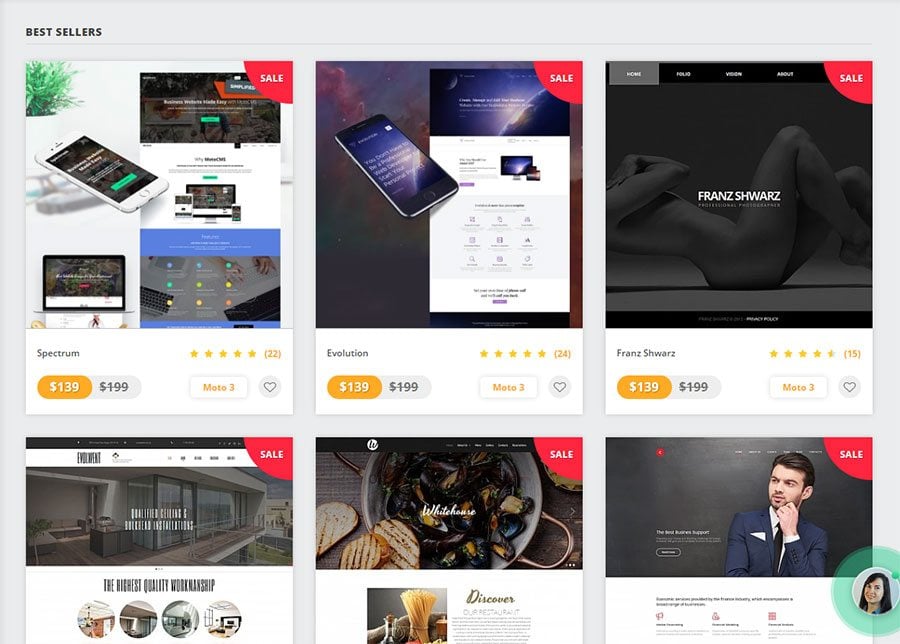
Probably one of the most distinctive features of MotoCMS is the versatility of their designs. They are beautiful and can cater to multiple niches. If you have a business in a relatively narrow niche, like a flower shop or jewelry business, MotoCMS can provide you with some really suitable choices.
The MotoCMS template collection numbers more than 400+ items. Just think about that.
When you find a suitable template, go to its page and click the ‘Try Demo’ button. This will give you a full access to MotoCMS for 14 days so you can explore it and decide whether it fits your needs.
Now that we’ve chosen a template, let’s explore MotoCMS under the hood.
Layout and Components
Blocks
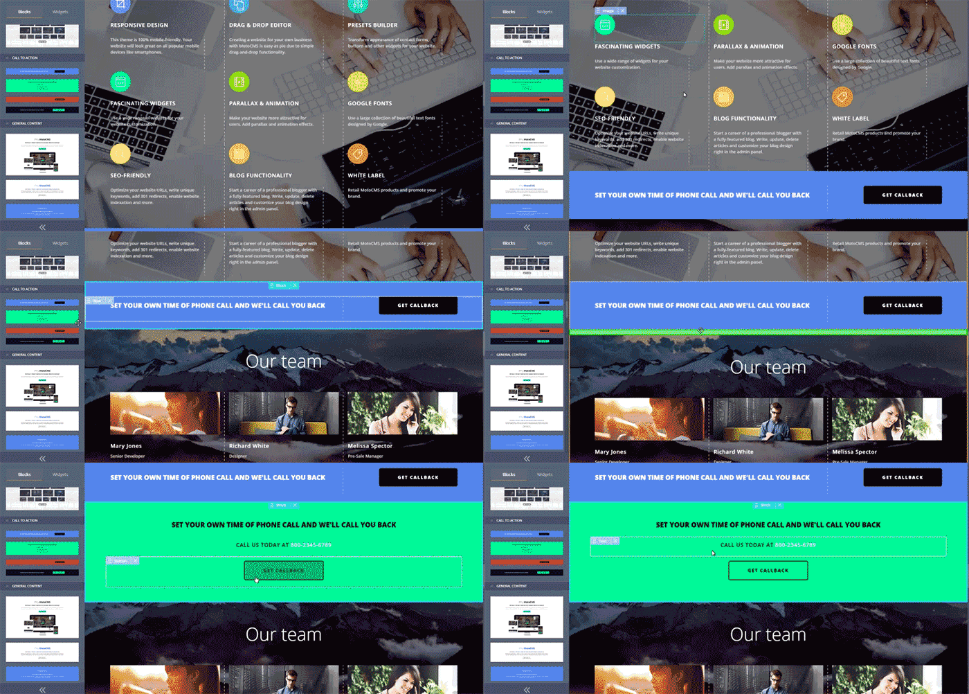
Blocks in MotoCMS are similar to those in Ucraft meaning you can use them as pre-designed sections of your site. The difference, however, is that in each MotoCMS template you have different blocks depending on your design.
In the Spectrum template, which I’m currently editing, you can find more than 70 pre-built blocks. That means you can choose from several headers, galleries, testimonials, contact forms, footers, etc. It’s a very impressive collection that lets you build dozens of layout variations.
Blocks are very important when building a MotoCMS website. They provide you with a backbone and save you time you would otherwise spend on creating layouts from scratch.
Widgets
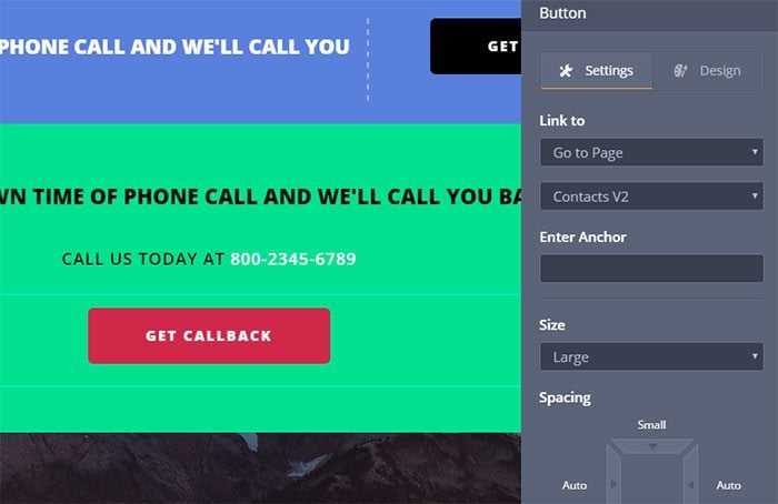
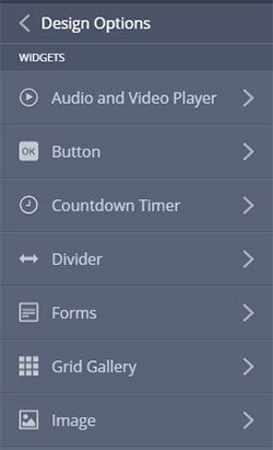
Think about widgets as child elements of blocks. Your blocks consist of widgets that you can add, delete and customize. Do you see that catchy red button? That’s a button widget. What about that bold heading? Yep, that heading is a widget as well. The same applies to more complex elements such as a Pinterest board, Facebook feed, Google maps, etc. There are 31 widgets in total.
When you click on a widget you can find all kinds of settings in the right panel. If we take a button widget as an example, we’d be able to:
- Specify the button’s link or pick an internal page on the site
- Enter anchor text
- Choose size (large, small, medium)
- Adjust spacing and alignment
- Select animation (from 40+ variations)
- Select a preset (Basically, the button’s design. I’ll explain how to customize presets later in the article)
Depending on your widget, the settings would be different, but most of them are enough to satisfy even the most nitpicky user.
Design
MotoCMS features a consistent and extremely detailed design system that enables you to modify all of your styles in one single place. When you first see it, the number of settings can seem overwhelming, but the moment you start customizing your site, everything falls into place. It takes some time to explore fully the design settings, so don’t worry if you cannot find how to increase the letter spacing of an H3 heading on a table screen by 1,5 pixels immediately.
Typography
Your typography consists of multiple text styles, which you can assign to your text widgets. The system of styles is very convenient because you make changes only in one place. No need to search through the whole website and check whether all of your H4s are now 15 pixels instead of 14.
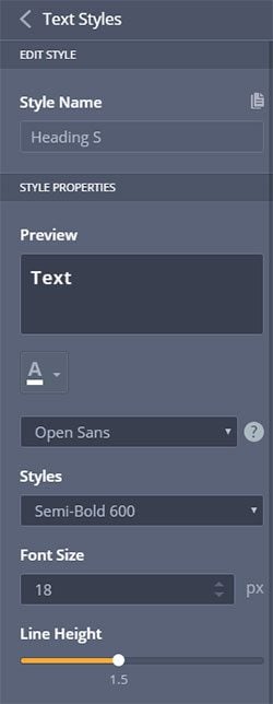
Since, in a ready-made template, there can be a lot of different text styles, the easiest way to customize a specific text element is to click on it. A panel with style properties will open and you’ll be able to make your adjustments.
You can tweak such properties as font size, font family, font weight, line height, letter spacing, link properties, and more. For true control freaks like me, you can even specify the font dimensions on tablets and mobiles.
I cannot think of any font property not included in there. Probably it’s word spacing. But who needs word spacing anyway?
Colors
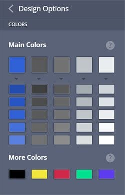
The same principle of consistency we saw in the typography section applies to colors. Each template has a pre-defined color scheme with primary and secondary colors. For example, if you think that red is too quirky for you, pick that red color and change it to something more neutral, say blue. All the red elements will become blue automatically. That’s convenient and makes your design harmonious.
Widget Presets
As mentioned earlier in my example with button settings, you can change the design of your widgets by selecting a design preset. A preset is a series of design rules applied to an element. In the widget design panel, you can modify those rules as you see fit.
The main advantage of presets is you need to customize your design only once. Later when you want to change a style of a particular element there’s no need to redefine it all over again, just pick a corresponding preset.
Spacing & Grid System
A true design customization wouldn’t be complete without adjusting the spacing and grid system of your layout.
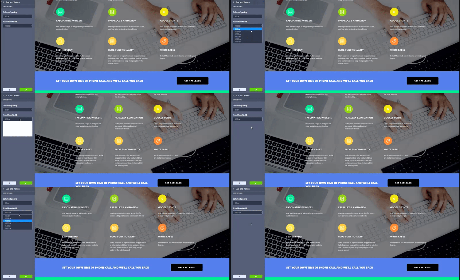
The grid defines the edges of your content area. You can choose how wide or narrow your main content section should be by picking a width value ranging from 980px to 1920px.
If you think that you need to correct some vertical spacing, you can tweak it by using the Size and Values panel. Set values for desktop, tablet, and mobile screens.
SEO
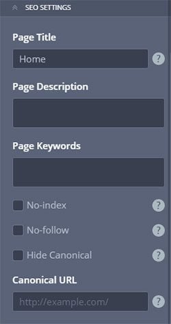
MotoCMS provides you with a sufficient number of SEO settings that can help you set up all the necessary information for your pages and articles.
By comparison with Ucraft, the SEO settings in MotoCMS are more mature. You probably won’t use all of them if you have a one-page personal website, but for a business that needs search engine exposure they can definitely come in handy.
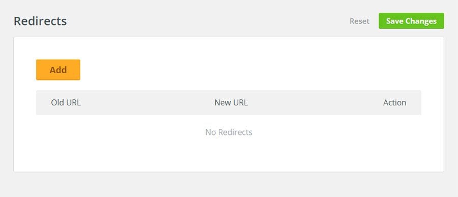
The Moto team also enables you to set up redirects for your pages.
Imagine you created a page but then later needed to change its URL. In order not to lose the page weight and traffic, you set up a 301 redirect which points people to your new page. The result is a win-win situation; you keep your visitors coming, and the visitors get what they’re looking for.
Blog
MotoCMS wouldn’t be called a CMS if it didn't have a blog. Running a blog is crucial for every business because it helps you add more relevant content to your site, gain exposure, traffic… well, you know the picture.
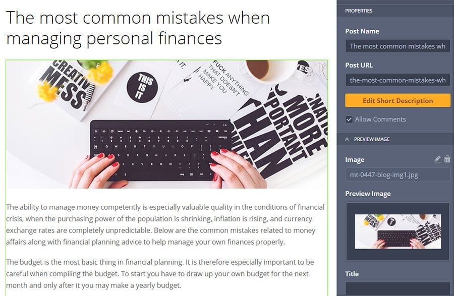
In MotoCMS you create a blog post directly on the front end. You can see exactly how your page will look before you hit the publish button. If you are used to working with admin panels such as in WordPress, the editing experience may seem unfamiliar. Once you get the hang of it, however, you’ll see that working this way can be much better.
Pricing
A regular MotoCMS template comes at a price of $199. This includes 24/7 support and template updates. It is a one-time payment without any recurring fees.
With MotoCMS you are free to pick your own hosting service depending on your business needs.
Conclusion
MotoCMS is a website builder with an elaborate design system, set of detailed options and freedom to build websites of any complexity. It takes time to get a grasp of all the intricacies of this builder, but this can be said about any advanced tool.
Another advantage of MotoCMS is their large collection of templates. You can choose a template for practically any niche from finance to agriculture.
MotoCMS is great for businesses and individuals that want to have full control over their site, but don’t want it to be too simplistic or lacking in important features. With MotoCMS you can build a professional website with a solid SEO and personalized design without the need to hire a third party developer or learn how to code.
Over to You
We could discuss each page builder in more detail, but the best option would be for you to try them out for yourself. Just go to the corresponding page for each builder and see what they offer. Create a site at Ucraft, or pick a 14-day trial for any of the MotoCMS templates.
Once you check them out make sure to come back to this article and share with us your experience. Perhaps you’ve used some of them already? In any case, share with us your thoughts in the comments below!
Get more to your email
Subscribe to our newsletter and access exclusive content and offers available only to MonsterPost subscribers.


Leave a Reply
You must be logged in to post a comment.