UI Web Design for Real Estate Websites
Houses, offices, apartments, condos, you name them. People are always looking for places to live. Where is the first place they go? Online.
One of the greatest aspects of searching for a new home or office online is a visual appeal. Future home buyers not only look for their 4 bedroom/3 bath must-have on their list. They’re also looking to see if their home appeals to their eyes.
Your real estate website creates that visual appeal they need to help them buy their next home, rent their future apartment, or find a new office space.
Types of real estate
When thinking about the different types of real estate, four main types are important to list on your website if you offer those services. When users are looking for specific types of real estate, listing the services you offer will narrow down your website visitor's main purpose.Residential
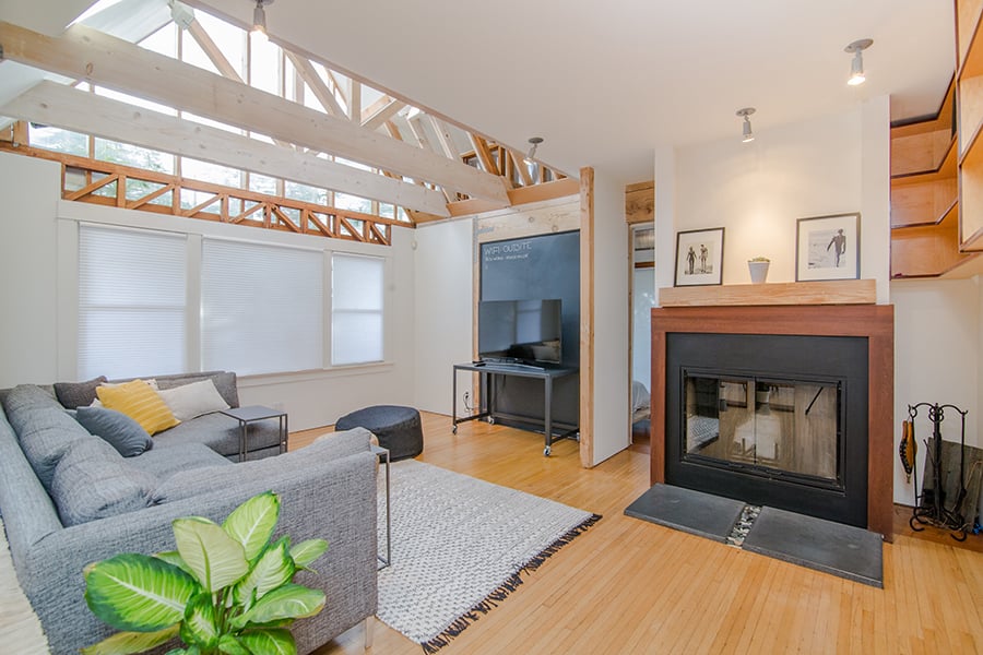
Every day people are looking for places to live and their housing search will yield better results if you pay attention to their needs, especially UI on your website. Properties listed under residential can fill up a page as they consist of single family homes, duplexes, townhomes, apartments, condominiums, etc.
Commercial
Offices, hotels, malls, and shopping centers fall under commercial real estate. UI is different from residential because you are serving a large building, thus more is involved in developing a website.

Vacant Land
This undeveloped land has very little components to its property. With actual ground to sell, photos are best when trying to sell through a website.

Industrial
Warehouses, production buildings, and distribution centers are the cornerstones of industrial real estate. This means big business, thus creating a more robust web page.

To help your website stand out, colors and position of your features is the key. Important features of a real estate website help maximize leads.
Features of a real estate website
Many of the features of a real estate website depend on the business itself. Real estate agencies websites may differ from property management websites. Depending on what services and properties served, all real estate websites have some features in common. Some of those important functions are listed below.Search
One of the most important features of a real estate website is the search feature. Most real estate websites use it.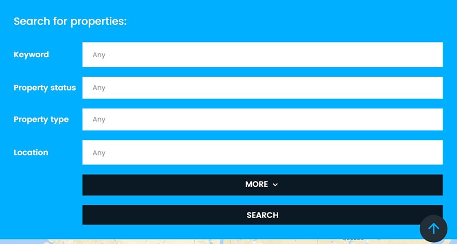
Narrowing down a prospects dream home will allow them to focus on what’s important. When the position of the search feature is at the top of the website and above the fold, the user can jump right into the search.
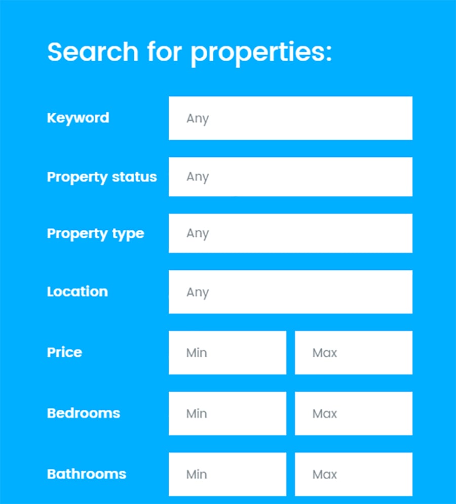
Search features allow users to focus on what’s important to them and narrow down their must haves. Price is one of the most used features followed by the number of beds, type of real estate, and city or neighborhood.
Photos
What’s a website without photos? A photo is crucial to a real estate website. Without it, what will the visitor think if they don’t know what it looks like? A photo shows them what the property looks like both inside and out without worrying about buying or considering anything site unseen.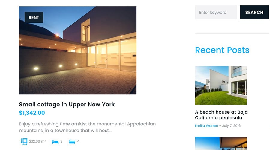
Text
Words used to describe a property can make or break a future sale. You’re selling a property for its value. Too much text will steer the user away and too little won’t allow for the best representation of the property.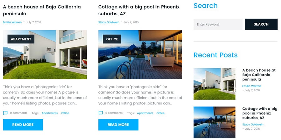
Focus on details such as beds, price, city, square foot, baths, type of home, year built, and neighborhood.
Maps
On your search landing page, maps tell the user where their future home may be. Embed a reliable map that works well with the functionality of your website. This allows them to see where things are in conjunction to popular areas such as shopping malls, schools, parks, grocery stores, etc.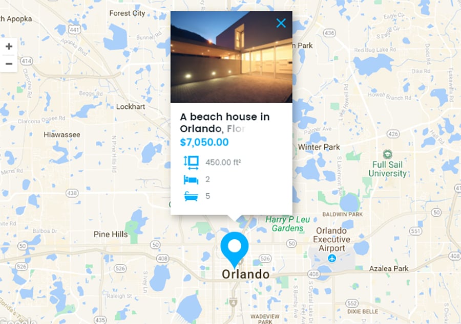
Featured Properties
On your front page, having feature properties is a popular common feature many real estate businesses have. These properties are a marketing technique used to sell homes that are of value. They are worth putting on the front page or having a stand-alone page so more visitors see the types of homes you offer.Special offers
Oftentimes, price-reduced homes can impact a future sell. Focus these on your front page as a photo slider so people see that those homes will give them a good deal on price.Homepage
Crucial to a website as a whole, the home page is where most of the information will be in a condensed form. Your featured homes can be in a small section on the homepage (image slider) along with special offers.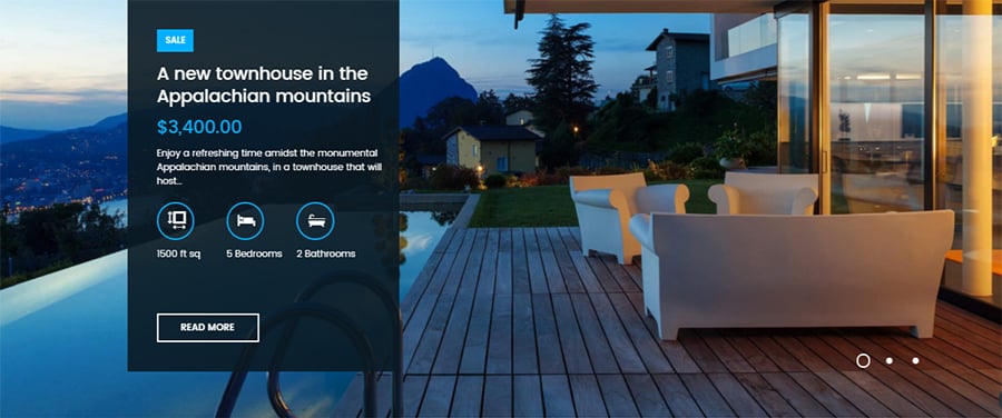
Services
What type of service do you offer? Listing this is another important feature that can also be on your home page. Do you offer rental properties, commercial real estate, or residential home buying? You wouldn’t want a visitor online searching your website for properties and you don’t offer what they’re looking for.If you’re offering many services such as renting and selling or real estate investments, a separate page can help your online visitors figure out what you do and what you offer.
About
Your About page lets people in on who you are. With a face to a name, you create a formality that puts the future customer into trustworthy hands. Your photo or a picture of your team is a great way to introduce yourself, or your team, to a future buyer.
This page won’t take up a lot of the user's time as it’s to introduce who you are, what you do and how you can help them. Putting your contact information for easy access is a step higher in customer service.
Properties Page
This is the reason why visitors come to your website. They’d like to see some properties they could buy or rent soon.A great way for UI is to have a map embedded with properties listed on the side. That way, they can see where each site is if they’d like to plan a housing tour.
As stated above, keep in mind the details listed on your properties.
Contact
If future property buyers have questions about something that isn’t listed on the website, they can contact you about it. Having a pop-up box at the bottom or top of your page can make it easier and provide better UX.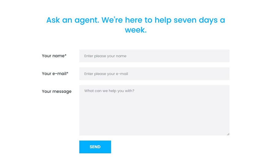
A contact form with no more than three form fields gives the best results. Name, email, and phone are commonly used fields. Make sure all your information including name address, phone, email, and hours are on the contact form page.
Build Your Real Estate Website Today
Building a home is like building a website. It takes time but with sites already built, it’s easier to move on in. Take a look at some of Template Monster’s real estate templates and get building on your new “site”.Related Posts:
What Are The Most Promising Mobile UI Design Trends for 2017?10 Best Design Tools for UI/UX Designers
Interview with Arturo Toledo, Experience Architect and UI Designer
The DIY Post: Flat UI Design Tutorials

Get more to your email
Subscribe to our newsletter and access exclusive content and offers available only to MonsterPost subscribers.

Leave a Reply
You must be logged in to post a comment.