The Ultimate Guide to Designing a Website for iPhone X
We remember vividly how the first iPhone was presented. Some of us considered it as a weird device with an unreasonably high price. Some of us called it the ‘reinvention of the phone.’ But what we have in common today is that many of us own an iPhone.
Apple continues to present new models every year, and their latest release had a bit of a different approach. They decided to create a borderless phone, and if you google for some unofficial concepts arts of the iPhone, you’ll see that the borderless screen was predicted a long time before Apple got enough guts to release it.
But is the new iPhone X so borderless? Unfortunately, not. And while someone can say that the phone’s ‘notch’ makes this phone stand out from the crowd, we as website developers and web-designers should think of how to work with it. We are the ones who will create this pseudo-borderless experience, and if you want to make your website look great on the iPhone X screen, you’ve got to dive a bit into this topic.
What is the ‘Notch’?
As we’ve already mentioned, the new iPhone got this ‘notch,’ but what exactly did we mean? Let us show you.
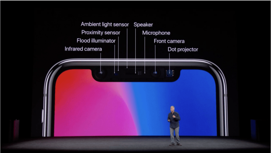
While designing the tenth model of their phone Apple designers couldn’t make the screen completely borderless. Some technical reasons make it clear that it was a necessity.
Even though all our phones didn’t need those huge borders, there are some things that the phone needs and they cannot be removed so easily:
- Speaker
- Microphone
- Front Camera
- Proximity Sensor
- etc.
These sensors, speakers, front camera and other things are crucial and cannot be moved somewhere else. So, Apple engineers couldn’t find another solution rather than create this black area on the top of the phone.
Yes, in some way it sucks, but sitting and complaining about the notch is not an option. As a developer or a designer, there is a strong chance that you have to make your website templates compatible with this notch. We created an ultimate guide with tips and advice so that you could make the best iPhone X ‘borderless’ experience for your users.
Especially, considering the fact that this notch will not disappear in the next model. Want to know why?
As we’ve already seen on the recent technological conferences, Android devices with the borderless screens do not have the notch. Guys from China fixed this issue soon and created the notch-free experience for their users. But the problem is, all these devices look the same now.
And as we all know, Apple loves to stand out. So, it looks like we’ll have to deal with the notch for a long time now.
Considering this fact, let’s review some tips on how to fit your website design into the iPhone X screen.
Embrace the notch, don’t hide it
Trying to avoid using the notch in your design is a dead end. There is no way a self-respecting designer won’t take it as an advantage. Yes, it’s a weird-looking thing that you’ve got to deal with now, but at least now you’ve got a bigger space to work with. I bet that’s something you dreamed of while developing your designs for the previous model of the iPhone, so stop crying about it and take advantage of it!
Because of the sensors on top of the display, the new status bar is split into two parts. If your UI is doing something special with that space (previously 20pt high, now 44pt), you will need to update your interface because it will be taller on the iPhone X. Make sure that it can be dynamically changed in height. The great thing is that the height won’t be changed if a user makes a phone call or is using a navigation app, which was previously the case on other iPhones.

If you currently hide the status bar in your design, Apple asks you to reconsider this decision. Since the screen is taller and you have more estate to display your content, it might be useful to unhide the status bar. Users can find useful information up there, and most of the time, other UI elements will not use the space.
Think through the landscape mode of your website
Let’s say you’ve worked on your design and made all the necessary changes to make the notch interact with your user correctly. Are you sure that you didn’t forget something? That’s right, that damn landscape mode.
I don’t use the landscape mode. The only situation where I adore it is when I watch YouTube or any other video. But that’s not the reason to neglect the landscape-friendliness in your design. Otherwise, some random user will flip his phone and see this notch hiding a part of your content, that’s not good.
When the phone is turned to landscape mode, the status bar is hidden to give the maximum space for the content. Besides, other bars are getting smaller. So, the navigation bar in landscape takes 32pt instead of 44pt, while the tab bar size reduces from 49pt to 30pt.
Even though not all apps need and will take advantage of the iPhone X landscape mode, there are still a bunch of scenarios for its usage. For instance, it's a good fit for viewing different sort of content like photos, videos, texts in full-screen. Remember that after users finished interacting with iPhone X turned to landscape, they should be able to switch to the portrait mode easily.
Place the most important content in the center
In general, content should be centered and symmetrically inset so that it looks great in any orientation and isn't clipped by corners or the device's sensor housing, or obscured by the indicator for accessing the Home screen. For best results, use standard, system-provided interface elements, and Auto Layout to construct your interface.
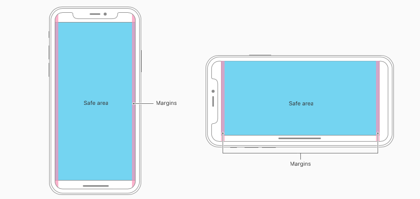
Apps and websites should adhere to the safe area and layout margins defined by UIKit, which ensure appropriate insetting based on the device and context. The safe area also prevents content from underlapping the status bar, navigation bar, toolbar, and tab bar.

Use P3 instead of sRGB
Apple wants you to use the P3 color profile instead of sRGB for all your artworks. This is a step towards using a broader palette of colors. However, exporting your assets in P3 is currently available in Photoshop only, Sketch doesn’t support it as of right now.
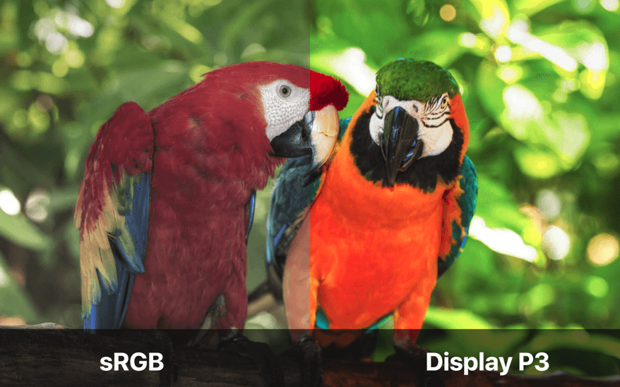
All Apple devices currently support P3, and iPhone X is P3 compatible as well.
Review the pictures and artwork on your website
Your artwork and pictures from previous model designs may not look so cool on iPhone X due to the changed sizing. It would be a great idea to review all your image resources from the previous website versions and make sure that all the images are displayed correctly on the new phone.
Don’t place interactive controls at the bottom of the screen
Because the new iPhone got rid of the ‘Home’ button, the new Apple device relies on a set of gestures.
While designing your website, you should avoid placing the interactive controls, buttons, CTA elements, etc. on the bottom of the screen. Otherwise, users can accidentally interact with them while trying to use one of the default gestures. This could be a very annoying experience, so under any circumstances, avoid using this kind of controls placing.
What about coding?
Viewport meta content
To start, find your viewport meta tag in your site’s <head>, and add the following property to the end of the content attribute: viewport-fit=cover.
<meta name="viewport" content="width=device-width, initial-scale=1.0, viewport-fit=cover">
This will tell Safari to ditch the pillarbox and allow your site’s content to run to the edges of the display. It’s at this point it becomes apparent why Safari squashes the content by default; part of the page is now hidden beneath the sensor housing notch. We need to add some smart padding in CSS to make sure that our content stays visible.
The CSS
To achieve this, WebKit in iOS 11 includes a new CSS function, env(), and a set of four pre-defined environment variables, safe-area-inset-left, safe-area-inset-right, safe-area-inset-top, and safe-area-inset-bottom. When combined, these allow style declarations to reference the current size of the safe area insets on each side.
env() works anywhere var() does — for example, inside the padding properties:

.post {
padding: 12px;
padding-left: env(safe-area-inset-left);
padding-right: env(safe-area-inset-right);
}
Where can I test my website?
There is an excellent service to test out your website and see whether it’s ‘notch-friendly’ or not.
Test your website design
Just put in the website address, and you’ll see how it will look in the landscape mode on the iPhone X. It’s a handy tool that will help those designers who do not own an iPhone X or do not have it on hand at the moment. There is no need to test it out on your gadget anymore; simply use this testing tool.
You can also use the Simulator option (included with Xcode) to preview your website and check for clipping and other layout issues.
Wrapping things up
We’ve reviewed a lot of tips here, but let me sum the things up for you and form some short version of this e-book:
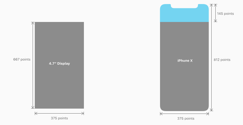
- The iPhone X is 145pt taller, so design for 375×812pt instead of 375x667pt.
- Create a fullscreen experience, don’t hide the device’s unique features.
- Center the most important content in the safe zone.
- A new taller split-in-two status bar, previously 22pt, now 44pt high.
- Fullscreen images might/should be updated to be fully displayed.
- Don’t add buttons at the bottom of the screen, near the home indicator.
- Don’t hide the home indicator, only when necessary.
- Richer and more saturated colors thanks to the P3 color spectrum.
- Be aware of custom gestures near the home indicator and status bar. Don’t mess with the user’s expected native gestures.
- Face ID replaces Touch ID. Update your UI and replace textual references to Touch ID.
- Custom keyboards don’t need to add the Emoji and dictation buttons.
- Larger navigation bars will look and animate great on this tall display.

Read Also
The iPhone 8 Launch on 12th of September 2017
Easy Steps to Create Cool Vector Art on Your iPhone
5 Mistakes That iPhone App Developers Should Avoid at All Cost

Creative writer passionate about WordPress and all that technical stuff. Meet Alex in person on LinkedIn.
Get more to your email
Subscribe to our newsletter and access exclusive content and offers available only to MonsterPost subscribers.

Leave a Reply
You must be logged in to post a comment.