Design Concepts for Building a Usable Website Footer
When putting together a solid website layout there are a number of factors you need to consider. The header section above-the-fold is always a key portion of the webpage. Along with the common user navigation and basic typography styles. But the footer is an often overlooked area of your website which can add tremendous value to the user experience.
I want to present a few examples and ideas for building a usable footer interface. The modern day website layout is constantly changing and adapting to new trends in the market. This also means generating feedback from visitors and putting together an idea of what works, and also what doesn't work. I cannot say that I have all the answers but I do hope to address many common ideas for laying a foundation of design precedents.
Easily Readable Links
A big concept in user experience is readability and obviously within hyperlinks. This idea should become an ingrained asset for all areas on the page. But obviously in the footer it will greatly affect how users traverse your link structure - regardless of how many links you have listed.
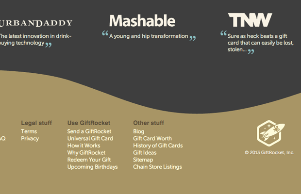
The footer design of GiftRocket has a clever swing to colors and design influence. Above the links you can find a list of companies which have written articles on GiftRocket. Then a follow-up section of related website links and popular cities. But even more interesting is how the links are split up by headline titles. You should notice a myriad of topics from user information to legal jargon. But the important piece is that all the text is legible.
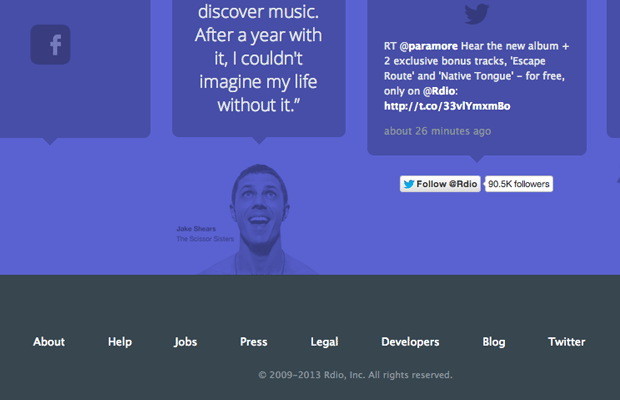
Similarly the website for Rdio has been online a few years, and the service performs very well among users. This footer is split into sections much like GiftRocket where you have a chunk of reviews and article quotes discussing their service. At the very bottom is a long horizontal list of links about the company, blog, and social networks.
Placement and organization of links in your footer will greatly impact clickthrough rates. Ensure that you have optimized the text colors and font choices so they are readable to the majority of users. Not everybody will have an interest to click links so far down in the page. But you would be surprised how many visitors will, and it helps if the links can stand apart from regular text.
Space and Structure
Think about scaling your footer design to include plenty of space for new resources. There is obviously a limit to this task, since you do not want to cram everything back into the footer. But you also don't want a small 30px bar of links which visitors are straining their eyes to read. Additional whitespace and a proper structure for your content will be of the greatest design traits for a usable footer.
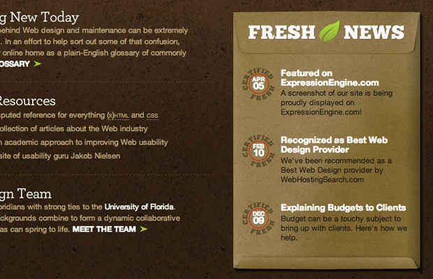
The website design agency Florida Flourish has a great example footer. Many of the very bottom links have been sized and fitted into a smaller section for convenience. The links have been repeated elsewhere on the page so the content isn't anything new. Plus the design holds direct links out to resources for designers and web developers.
You can tell how the categories and sections have been organized based on their inherent design qualities. The manilla envelope carries a list of the latest blog posts with news on the company. Then similarly you will find a brief content section with some icons for differentiating the list ideas. Their link styles and color palette blends so nicely together that the footer adds more benefit and structure to the webpage, rather than becoming an annoyance to the reader.
Including Related Content
If your layout does not have enough room to include related code snippets then you can always squeeze this content into your footer. These types of link lists may include a blog RSS feed, recent Twitter posts, user comments, or even just links to other similar websites. These types of links may garner more attention compared with standard company information.
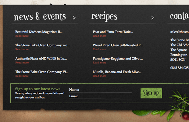
The overall design influence of Stone Bake Oven Company is beautiful. There are lots of unique textures and gradients among the navigation, page headings, and other small elements. The footer is just as equally dynamic with plenty of great information for typical users. They have a list of news updates along with latest recipes and direct contact information. All the important details can still be found with more relatable content positioned in its place.
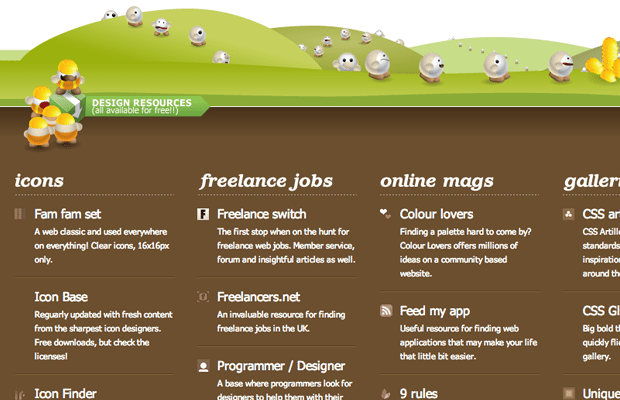
The footer design on YoDiv contains more illustrations and branding for the website. I enjoy seeing designers include some branding and connected artwork as it joins all aspects of the website together. The YoDiv lists are more focused on designer-friendly resources. All the links point towards external websites related to free icon sets, web design magazines, inspiration galleries, and freelance job listings.
You can tell this is a bit more complicated than any run-of-the-mill website layout. But I want to show how creative you can be with the footer area to still draw lots of attention. And most(or all) of the content does not even have to be your own! Understand what your visitors would be interested in reading, then craft a structure for links and be willing to change the stuff that doesn't work.
Responsive Designs
Mobile responsive website layouts have become increasingly popular with the rise of smartphones and tablet PCs. And as more people start using these devices around the world it will make Internet access that much more commonplace. So why not build your footer to scale properly along with the entire layout?
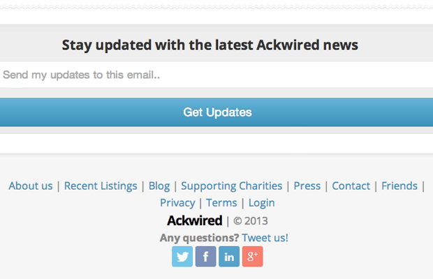
The website marketplace Ackwired has a brilliant responsive design for containing so many page elements. The footer area initially holds a series of links and social icons. As you resize these will restructure themselves one on top of the other. This technique is common when using CSS3 media queries and it allows mobile users more space for tapping links. The responsive setup works well because you do not need to redirect users onto a mobile site, or force them to pinch and zoom into your layout.
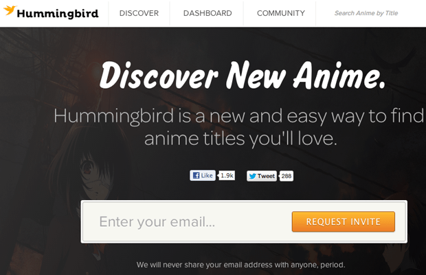
One other tight responsive example can be found on Hummingbird which is a startup for discovering new anime TV shows. Their design is a bit minimalist, so it is a good display of how designers may still craft usable footers with a small bit of content. It can be interesting to watch how all the areas on the page transform into responsive position. Their footer section merely drops links below the logo icon. Certainly nothing mind-blowing, however it goes to show that any typical layout - complex or minimalist - can often be crafted around a mobile responsive design.
Final Thoughts
Footer design is no easier than imagining an entire website interface. All of your typical design senses will be required as with most web projects. Keeping these tips in mind will forge a path towards more sensible footer and website navigation. But the trends are always changing with new ideas coming to fruition and growing in popularity. I would love to check out related ideas and suggestions on footer designs within the comments discussion area.
Don’t miss out these all-time favourites
- The best hosting for a WordPress website. Tap our link to get the best price on the market with 82% off. If HostPapa didn’t impress you check out other alternatives.
- Monthly SEO service and On-Page SEO - to increase your website organic traffic.
- Website Installation service - to get your template up and running within just 6 hours without hassle. No minute is wasted and the work is going.
- ONE Membership - to download unlimited number of WordPress themes, plugins, ppt and other products within one license. Since bigger is always better.

First it was design, then writing, and now affiliate marketing. Over a period of 6-7 years he wrote a lot of content for many websites. You can reach Jake on Twitter.
Get more to your email
Subscribe to our newsletter and access exclusive content and offers available only to MonsterPost subscribers.

Leave a Reply
You must be logged in to post a comment.