Top 20 Vintage PowerPoint Templates 2020: Bring Creative Style to Your Presentations [Going Retro]
- What's Vintage?
- What's PowerPoint?
- Find Inspiration in Examples of Vintage PowerPoint Presentations
- Top 20 Vintage PowerPoint Templates 2020
Vintage PowerPoint Templates. Do you think that PowerPoint presentations should be only built in a clean and minimalist style? Everything depends on the content you want to present and the kind of message you'd like to deliver to your audience. Your PowerPoint presentation will have a truly sleek and refined presentation if you give preference to vintage style.
Vintage and retro styles are the sure-fire ways to make your data stand out. Design trends that are borrowed from decades ago are making an impact in the present-day digital world. We've got used to seeing clean and well-polished designs, so when we are presented with something with a vintage vibe we take more time to examine it in more details. What makes retro-styled designs work is a sense of nostalgia. When paired with a modern interface and user patterns, such visually stunning presentations represent combinations that are hard not to interact with.
We are here for you with cool examples of vintage PowerPoint presentations and ready-made vintage PowerPoint templates that will turn your presentation into something cool and impressive.
What's Vintage?
The vintage or retro style is gaining wider popularity in today's digital world. The use of elements of vintage style in web design is one of the most effective and pervasive trends. All the things that surround us have gone completely digital. Sometimes you simply want your eyes to relax and watch something built in soft hues.
For those who are older, retro-styled presentations recall the improvised digital designs of their youth, before mobile-optimized interfaces gained the major positions in modern web designs.
What are the first associations that come to your mind as we mention vintage web design? I guess these are neutral brownish colors and rounded elements that deliver a sense of retro style to a web page. This is absolutely correct. Still, there are plenty of other elements that make up retro web designs. Let's enumerate them.
Simple shapes. Circles are the most common elements that you can meet in retro-styled projects. These are the most common elements being used for branding purposes.

Limited use of colors is another popular feature of the retro design. Full-color printing was very expensive in the past. This limited designed in the number of colors they used in their works. As a rule, vintage-styled web designs include just a few elected colors, thus presenting a unique color scheme in your design.
Modern retro style gives major preference to muted color hues and color overlays. Reds, yellows, and oranges are especially popular in such designs. Instead of being used with actual photographs, these are commonly paired with illustrated imagery that emphasizes the effect and visual appeal of vintage-styled projects.

Typography of vintage web designs looks different from the rest of artworks that we can find on the web. Designers use simple techniques like the repositioning of fonts, duplicating, and adding pixel strokes in order to bring a unique flavor to web design.
There are two major techniques being used in retro-styled projects. For example, you can find digital projects that make use of big, block-style lettering with elaborate strokes and coloring that takes you back in the old times. Also, you can come across works that make use of cursive styles with heavier lines and roughed up edges.
In order to make such vintage-styled typefaces stand out from other data that you add to your presentation, keep the rest of the typefaces simple. Opt for one vintage-styled typeface for display purposes, and use simple serifs or sans-serifs for the main body copy.
Use of borders is a special peculiarity of vintage web design. Borders can be used for framing purposes, for highlighting specific areas of content or just to create focus areas.
Vintage style is always used to serve a particular purpose in web design. When a designer makes use of some retro-styled elements and blends then which modern and innovative approaches of data presentation, they want us to stop and reconsider the message that he wants to deliver by means of his work.
What's PowerPoint?
It seems there isn't a person on earth who has never created a PowerPoint presentation. This is the most popular tool that's being widely used for educational and business purposes. This is the best way to present even the most complicated pieces of data in a simple and easy-to-follow style.
When you launch PowerPoint on your computer, you are provided with a selection of default styles and elements that can be used in your presentation. The same deals with animation and transition effects. However, if you want more and create a unique and outstanding PowerPoint presentation that will get your audience immersed in your interactive storytelling, then you need to opt for something custom-made and unique. This is when ready-made PowerPoint templates come into play.
Find Inspiration in Examples of Vintage PowerPoint Presentations
In fact, vintage or retro styles can refer to many things. In the modern retro-styled graphic designs, you can come across elements that are most reminiscent of the 1980s and 1990s. When it comes to the choice of the text color, many designers borrow some influences from the 1970s. One of the most impressive things about vintage designs is that it pulls from early computer influences, print, fashion, and events of the past times:
- In the 1970s, muted colors and bold typefaces were in the greatest demand. These were commonly used in print media, aside from TV screens.
- It was just fine to use pixels and bright neon-styled elements in graphic designs back in the 1980s.
- In the 1990s, designers were experimenting with different forms and shapes of the data presentation. The era was notable for the heavy use of animation effects and different moving parts that provide pure information.
In order to make any of these retro-styled design approaches work, you need to adjust your presentation to meet the contemporary usability standards. In the examples of presentations vintage powerPoint presentation that we've handpicked for this post, you can see how muted color palettes with old-fashioned typography styles are used with modern elements.
Top 20 Vintage PowerPoint Templates 2020
If you want to add a unique presentation to your presentation, use premade vintage PowerPoint templates for this purpose. TemplateMonster collection of templates lets you select from a range of ready-made designs suited for multiple purposes. Simply browse the showcase and pick templates that can match your own project. Mind that all of them include hundreds of pre-designed slides that can be customized according to your preferences and business purposes. Take a look.
Letteroad | PowerPoint Template
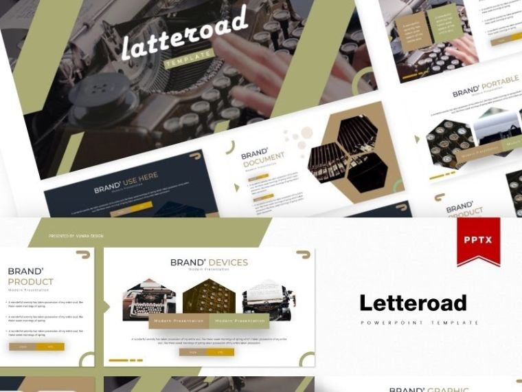
Letteroad is one of those vintage PowerPoint templates that combine discreet elegance of old times and awesome modern functionality with complex, multi-functional layouts, handcrafted infographics, and pixel-perfect illustrations.
Key features:
- 150 Slides + 30 Slides for each template
- Gallery and Portfolio Slides
- 5 Premade Color Variations
- Section Break Slides
- Drag & Drop Picture Placeholder
- Based on Master Slides
- All Graphic Resizable and Editable
- 5 PPTX Files (Widescreen)
- Readme First (Font & Photo Information)
Radiowate | PowerPoint Template
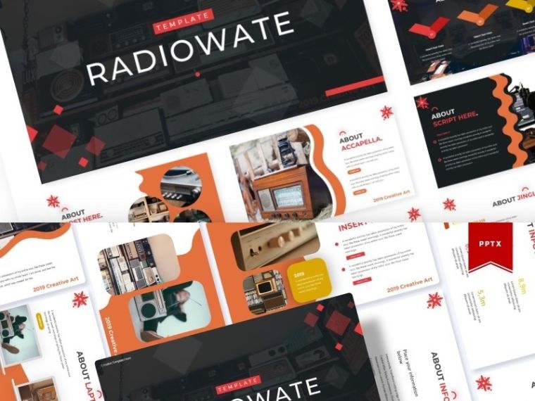
Radiowate creates a flair of the 1970s with its rounded streamlined shapes, limited color scheme, typical for that period (e.g. dignified ochre), and minimalistic but high-quality typography. If you are looking for vintage PowerPoint templates, Radiowate is the right choice!
Key features:
- 150+ Total Slides
- 5 Color Schemes
- 30 Additional Slides in each Template
- Multipurpose Handcrafted Infographics
- Section Break Slides
- Pixel-Perfect Resizable Illustrations
- Editable Gallery and Portfolio Slides
- 5 PPTX Widescreen Files
Circus | PowerPoint Template
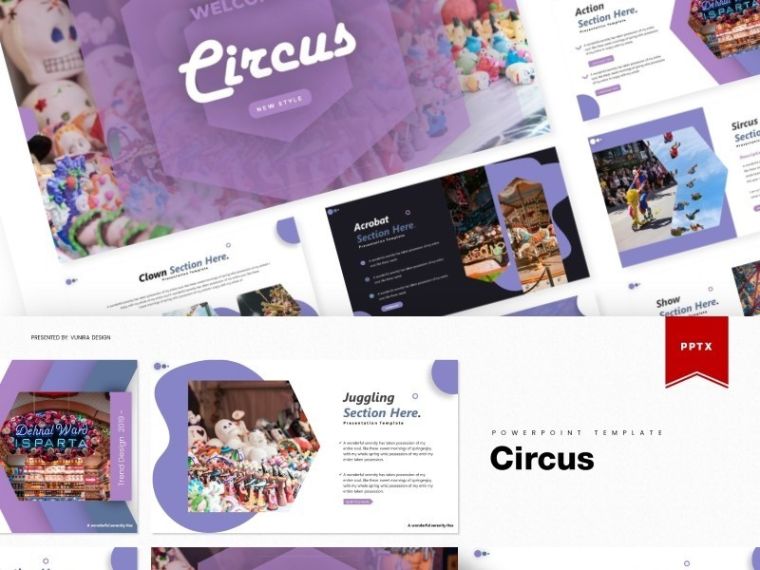
Circus is what you need if you are in a search for colors and a vivid manner of expression! A purple color scheme (and 4 more color schemes) is used to draw the audience’s attention to important information. For the same purpose, you can use unusual complex layouts and infographics.
Key features:
- 140+ Slides + 30 Unique Slides in each Template
- Section Break Slides
- Gallery and Portfolio Templates
- Resizable and Editable Illustrations
- High-Quality Typography
- Drag & Drop Picture Placeholder
- Based on Master Slides
- 5 PPTX Widescreen Files
Retrorik - Retro PowerPoint Template
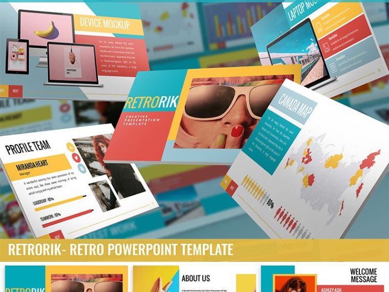
Retrorik is one of those vintage PowerPoint templates suitable for fashion stores and lookbooks, creative agencies, art galleries, photographer, artist, or designer portfolios. Its bright colors, unusual shapes & mockups, and PopArt style create a retro atmosphere but don’t deflect the attention from the main goal – conveying and perceiving information.
Key features:
- 4 PPTX + 4 PPT files
- 10 Premade Color Schemes
- Based on Themes Color
- Dark & Light Background
- Widescreen & Standard Resolution
- Rich Content List (Mockup, Chart, Image Layout, Cover, Section Break, and more)
- Drag & Drop Picture Placeholder
Retros | PowerPoint Template
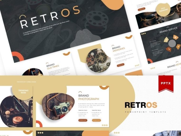
Retros is another sample of the vintage PowerPoint templates with a restrained color scheme that has 5 color variations. Despite the complex layouts, the slides look nice and neat. All slide elements perform certain functions – organize information in blocks and draw the audience’s attention from the most to the least important data.
Key features:
- 150 Total Slides
- 30 Unique Slides for each Template
- Editable Infographics & Illustrations
- Portfolio and Gallery Layouts
- Resizable Graphics
- Section Break Slides
- 5 PPTX Widescreen Slides
Barebo | PowerPoint Template
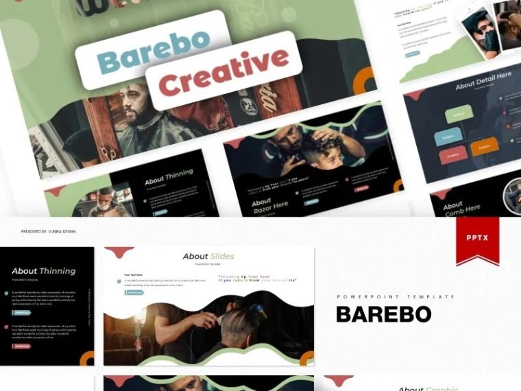
Barebo combines a diversity of colors in a calm and restrained color scheme. Apart from that, it has a complex design with unusual layouts, high-quality typography, and various elements for presenting content and visuals.
Key features:
- 145+ Slides & 30 Unique Template Slides
- 5 Premade Color Schemes
- Section Break Slides
- Gallery & Portfolio Slides
- Customizable Infographics and Illustrations
- 5 PPTX Files
- Drag & Drop Picture Placeholder
- Based on Master Slides
Libraro | PowerPoint Template
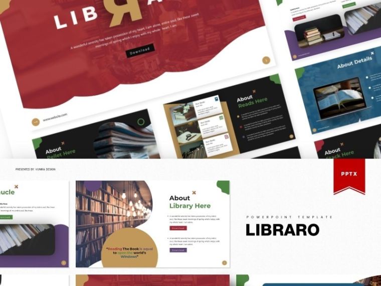
Here is another retro PowerPoint template with an awesome color scheme that has 4 more color variations. It’s pretty similar to Barebo but is more classy.
Key features:
- 140+ Slides
- Portfolio and Gallery Slides
- Section Break Slides
- 30 Slides for each Template
- Editable Infographics & Illustrations
- Resizable Graphics
- Made with Master Slides
- 5 PPTX Files
- Drag and Drop Picture Placeholder
Justifo - Firm PowerPoint Template
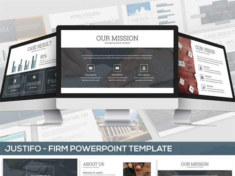
Justifo is a simple and minimalistic template suitable for any kind of business, especially law, financial, and consulting. It has a variety of neat layouts with charts, tables, lists, boxes to present information in a user-friendly structured way.
Key features:
- 12 PPTX and 12 PPT Files
- 30 Unique Files for each Template
- 6 Premade Color Schemes
- Based on Theme Color
- Widescreen & Standard Resolution
- Drag and Drop Picture Placeholder
- Diverse Content List (Chart, Mockup, Cover, Section Break, Process/Flowchart, and more)
Elegancy | PowerPoint Template
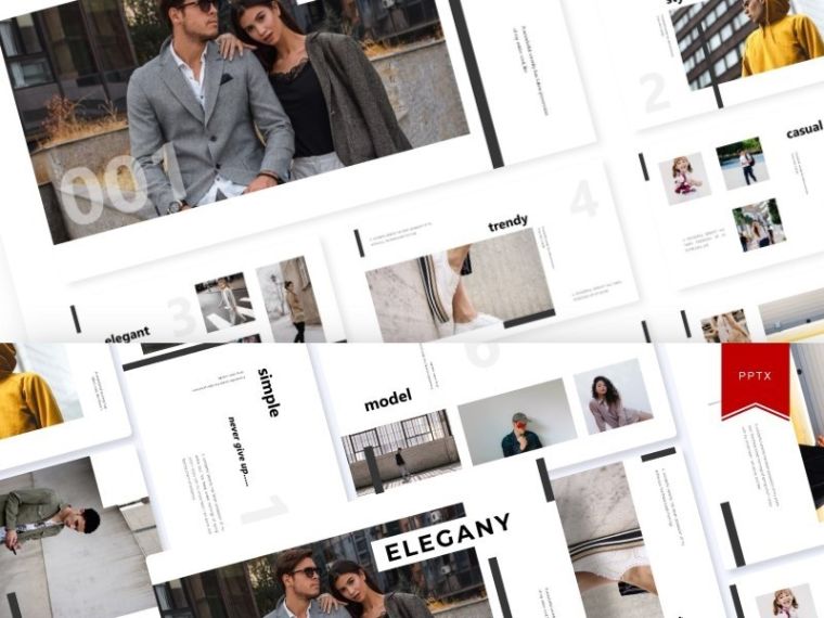
Elegany is one of those vintage PowerPoint templates that stand out with simplicity. Although it comes with 5 color scheme variations, its key feature lies in a simple, minimalistic design. It has neat layouts to structure information and add high-quality illustrations.
Key features:
- 150+ Total Slides & 30 Unique Template Slides
- Section Break Slides
- Gallery & Portfolio Layouts
- Editable Infographics & Graphics
- 5 PPTX Files
- Based on Master Slides
- Picture Placeholder (Drag and Drop)
Arthe | PowerPoint Template
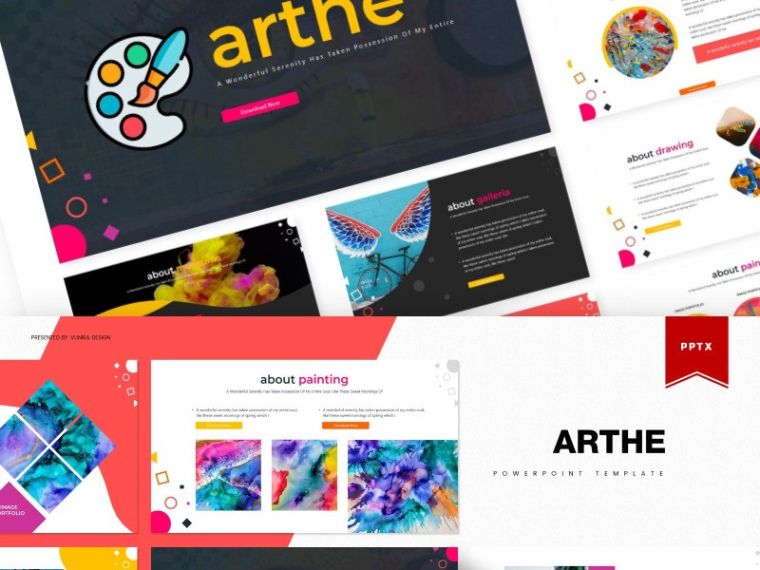
Bright and colorful – this is Arthe. Despite a defiant color scheme, the layouts allow organizing information in the most convenient and user-friendly way. You will find editable boxes, grids, lists, tables, infographics, and other content elements.
Key features:
- 150 Total Slides + 30 Template Slides
- 5 Color Variations
- Section Break Slides
- Portfolio and Gallery Layouts
- Editable Illustrations & Graphics
- Drag and Drop Picture Placeholder
- 5 PPTX Files
Pop & Retro Presentation PowerPoint Template
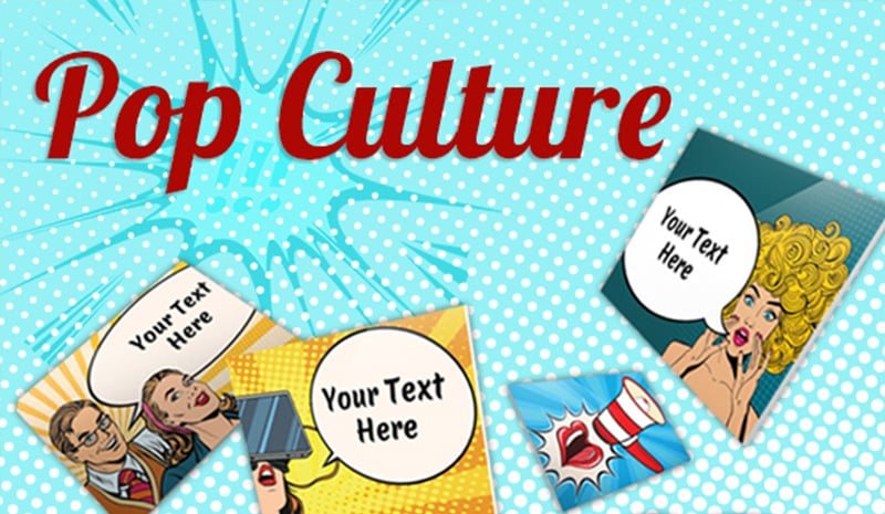
Key features:
- Multi-Purpose vintage powerpoint template
- 40+ slides
- Wide angle 16:9 template
- Flat colors
- Fully editable
- Easily customizable
- Pop design style
Entorum - Business PowerPoint template with customizable infographics
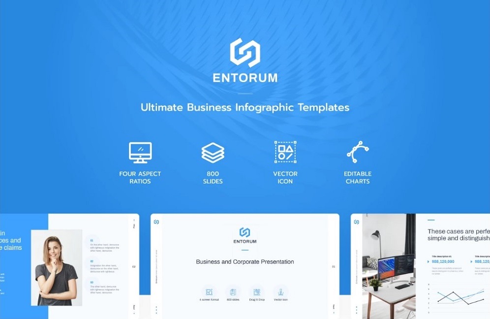
Crafting a fully-fledged PowerPoint presentation make take up to a few days. To simplify your task, you can choose ready-made PowerPoint templates that you can download right this very moment. The best business and infographics option is Entorum. The template is built with care and detail-orientation to every design element. Every chart and diagram can be customized in the presentation to your needs and business requirements. Moreover, Entorum business template allows you to choose between dark and light stylization of the slide.
More features:
- 100 unique and classy slides
- 4 different aspect ratio settings
- Easy editing points of each vector object
- Dynamic diagrams
- Detailed documentation
- 24/7 support
Retrospective PowerPoint Template
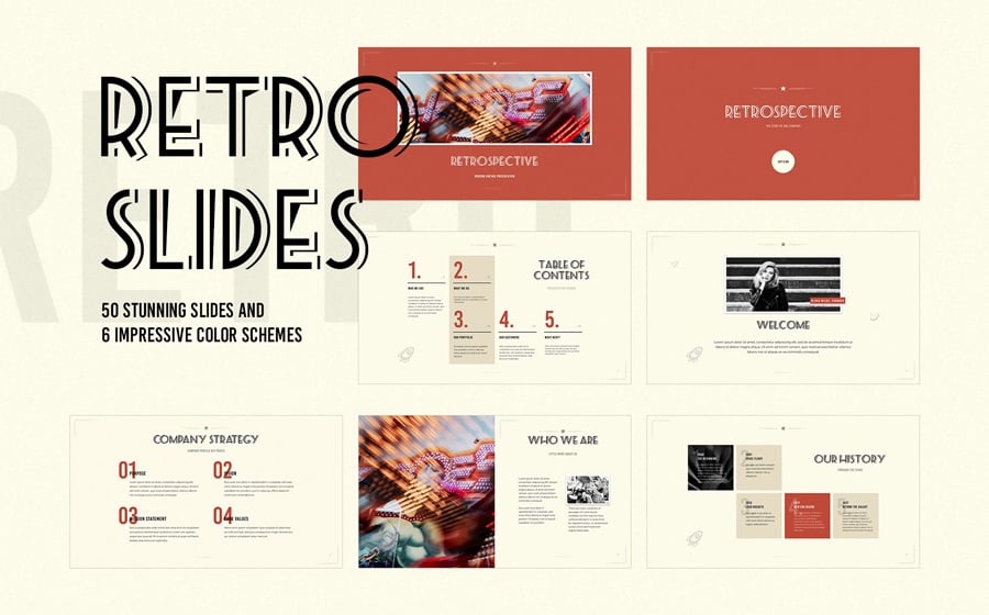
Key features:
- 50 creative slides with unique vintage design
- 6 predefined color schemes
- Based on Master Slides
- Media placeholders for images (Drag n Drop media placeholders)
- Styled Tables and Charts
- Full HD Resolution (16:9)
- Set of hand-drawn icons
Food Vintage PowerPoint Template
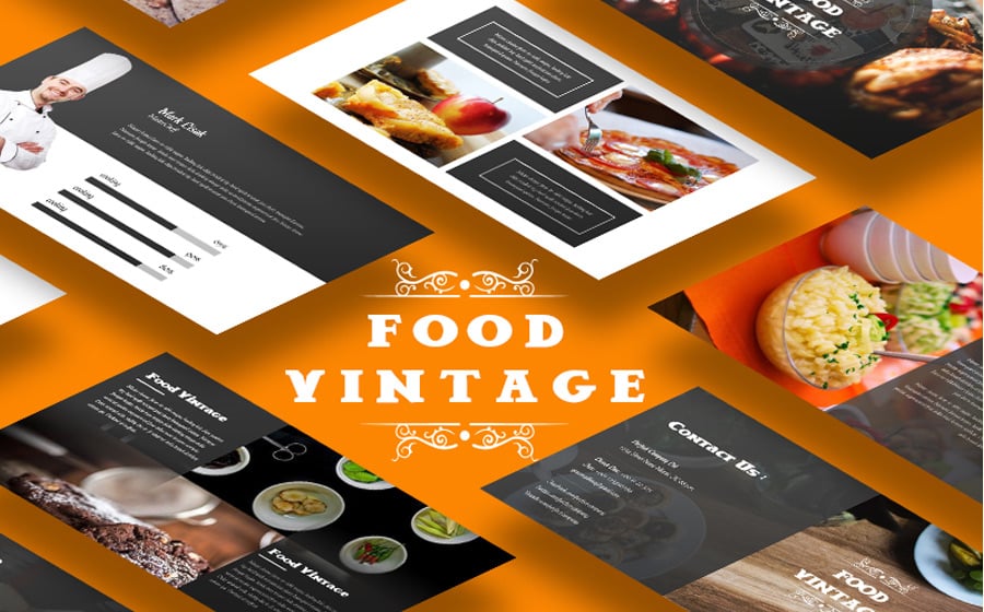
Key features:
- 40 Unique Slides
- 4000+ Vector Icon Include
- 16:9 HD Widescreen
- PPT, PPTX
- Fully Animated Version
- Easy to drop your screen image into Mockup
- Mocup & Images are not included
- All Shape Are Vector
Project Alpha - Business PowerPoint Template
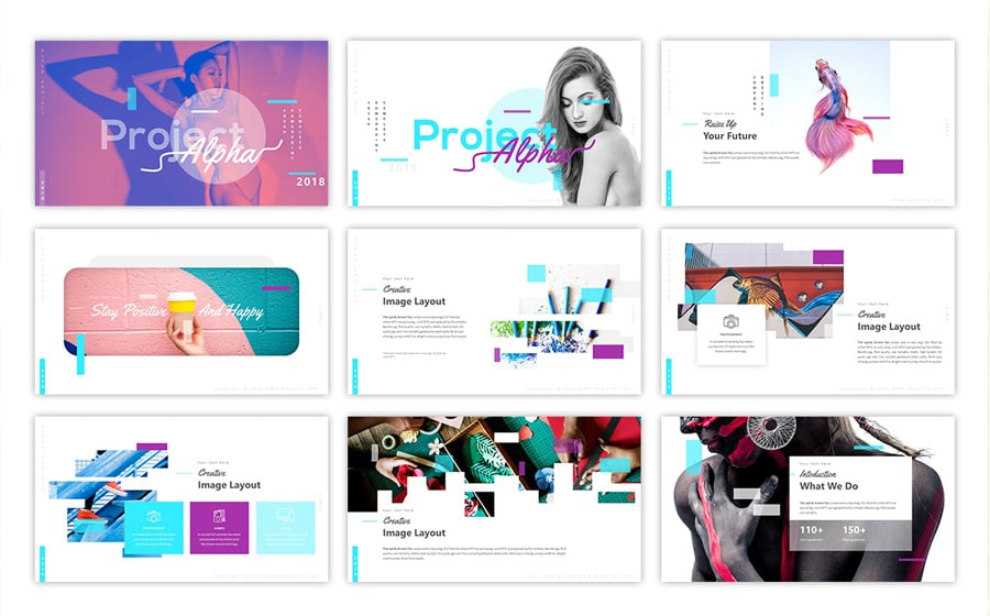
Key features:
- 58 Unique Slides
- 20 XML Files MS Office Theme Colors
- Modern Icon Pack
- 50+ Master Slide Layouts (Light and Dark Version)
- 16:9 Aspect Ratio
- Handmade Infographic
- Section Breaks Slides
- Light & Dark Version
Crooz PowerPoint Template

Key features:
- 70+ Unique Slide
- Clean and Minimal Template
- 16:9 Screen Ratio
- 1920×1080 Full HD
- Device Mockups Included
- Fully Editable and Customization
- Editable Icons
- Maps & Infographic Shapes
Rites - Creative PowerPoint Template
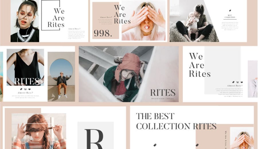
Key features:
- Minimal Presentation
- Ready 4 Color
- Color Combine Monochrome
- Images Placeholder
- Combine Text
- Unique portfolio slides
- Vector-based icons
- Full HD
Minimal Clean Creative PowerPoint Template
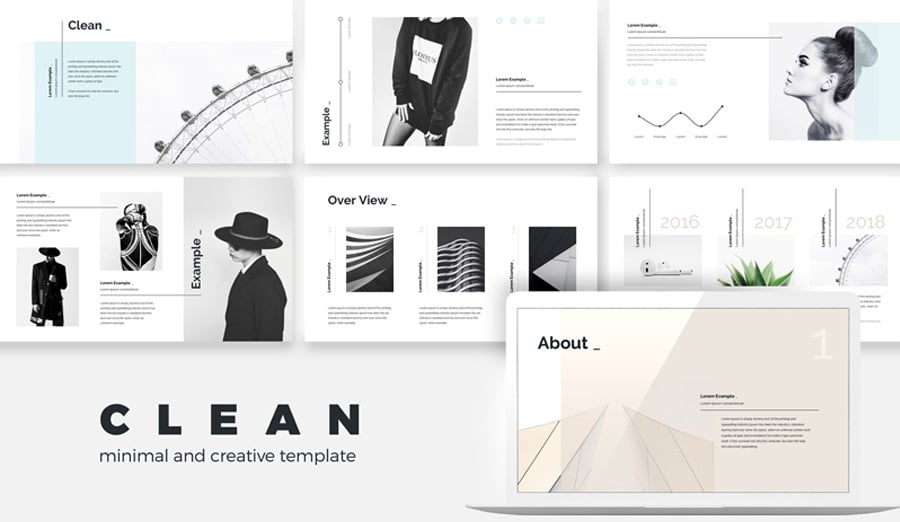
Key features:
- 54 Unique creative slides
- Dimensions 1920 x 1080 px
- PPTX files for (16:9 + 4:3) Ratio
- Drag & Drop image placeholders
- No animated files
- Vector Icons and elements in Files
- Theme colors option, Easy to change colors, Fully editable text, photos, music & other elements.
The Elegant PowerPoint Template
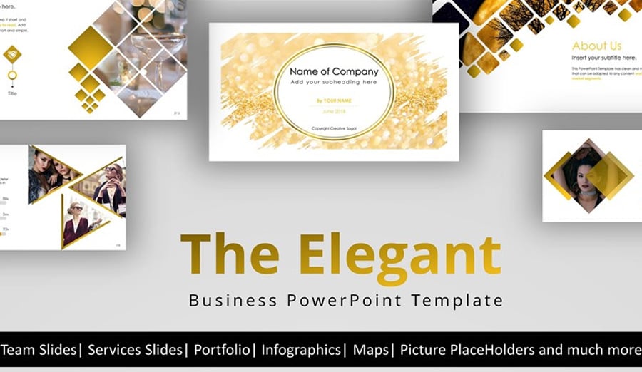
Key features:
- 210+ Modern & Unique Slides
- 16:9 Screen Ratio
- Dark & Light Template
- Fully Editable and Customization
- 24 Categorized 4900+ Icon-Fonts
- Maps of over 220 Countries
- Extra 210+ Picture Placeholders for Alphabet, Numbers, Faces, and Animals
- 14 Pre-Made Color Templates
Simplicity - PowerPoint Template
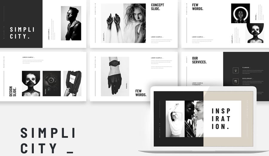
Key features:
- Works on both Apple and Windows
- 55+ Unique creative slides
- PPTX files and 16x9 FULL HD Ratio
- Bonus Included: 3000+ Vector Icons as shapes
- Based on Master Slides
- Easy and Fully Editable in Powerpoint Presentation
- Easy Drag and Drop to change pictures
Don't spend hours on the development of the vintage PowerPoint presentation. Find your inspiration in the works of professional web designers and use PowerPoint vintage templates to bring an outstanding presentation of your own project.
Are you ready to create your perfect PowerPoint presentation? Can't wait to see the final results!
Read Also
PowerPoint Templates to Present Your Sports Project
25 Business PowerPoint Presentation Templates for 2019
How to Make the Audience React? 10 Rules of a Successful PowerPoint Presentation
How to Insert a YouTube Video into a PowerPoint Presentation (Using Different PowerPoint Versions)
Design in PowerPoint: Step-by-Step Instructions on How to Create Awesome Slides
Vintage PowerPoint Templates FAQ
There are plenty of elements that make up retro or vintage web design. The list encompasses simple shapes, including circles, limited use of colors, red, yellow, and orange hues, use of big, block-style lettering with elaborate strokes and coloring, and use of cursive styles with heavier lines and roughed up edges. Vintage web design is also special for its use of borders and other specific elements.
Vintage is a new trend these days. Not only is it back in fashion, but it is also becoming popular in web design and actively used in advertising, corporate and blog design, etc. Applying an old-fashioned style to the projects makes them stand out and look different. This kind of design never looks boring and always draws attention. Presentation is no exception, so, when building your next slideshow, feel free to use a vintage PPT template to impress your audience.
Vintage design highlights art deco, art nouveau, vintage badges, letterpress, mid-century modern, punk, steampunk, atomic age, Swiss-style, and vaporwave types.
If you strive for a certain look of your presentation, you have to stick to that look’s design rules. When building a slideshow with a PPT template, pay attention to color palettes, fonts, and construction. Don’t get stuck at recreating color palettes specific to vintage epoch, better get into color psychology to select the color supporting your branding goal and think how you can fit it to vintage design. Do some research on the technology in use during the epoch you are going back to before picking the right font for your presentation. Make sure the construction of your design is consistent, and there are no 3D graphics or high res photography across the slides in vintage style.
Get more to your email
Subscribe to our newsletter and access exclusive content and offers available only to MonsterPost subscribers.

Leave a Reply
You must be logged in to post a comment.