PPI
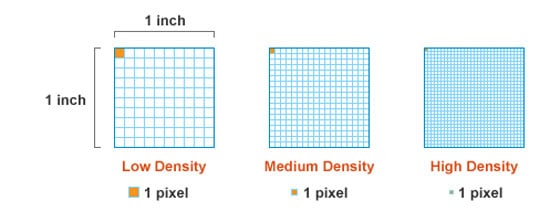
PPI stands for Pixels per Inch and is the most common measure of pixel density that determines screen resolution of a device. An alternative of PPI is PPCM (Pixels per Centimeter), although this measure is less common.
PPI determines the sharpness (resolution) of such devices as PC monitors, TV displays, smartphone and tablet screens, photo cameras and scanners. PPI may also refer to images. In this case, it shows how many pixels a square image of 1 inch has. As a rule, it’s the case that horizontal pixel density equals the vertical one as pixels are typically square.
How is PPI of a device calculated?
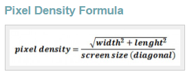
A screen of a device is a grid of pixels. For instance, let’s say a device screen contains 720 pixels horizontally and 1280 pixels vertically (e.g. Samsung Galaxy S3). In this case, the PPI of it is 305 pixels per inch, and this value depends not only on horizontal and vertical screen resolutions but also on the screen diagonal size in inches. Here is the formula, using which PPI is calculated:
If you’re not after doing a bit of math to find out your device PPI, there is a number of PPI calculators that do the job for you. To see them, check out the references section below.
As mentioned above, PPI depends not only on screen resolution but on the size of the screen as well. As a rule, the larger the screen, the lower its PPI. If two devices have the same screen resolution of 720x1280 pixels, the device with a smaller screen has a higher pixel density.
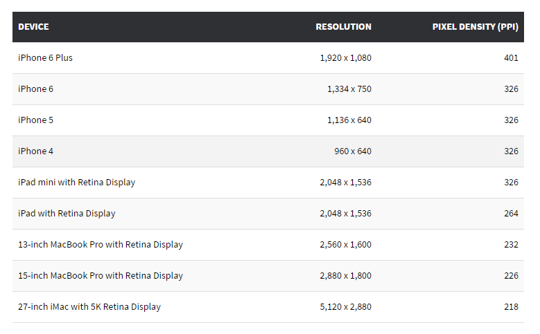
This fact is well illustrated if we compare PPI of Apple devices. iPad mini has a higher PPI than iPad (326 vs 264 ppi), although both have the resolution of 2,048 x 1,536 pixels. The reason for this is iPad has 9.7-inch screen and iPad mini has 7.7-inch screen. From the table below, you can also see that 4K and 5K screens with ultra high pixel density and large screen resolutions have the smallest PPIs.
Does PPI matter?
There are cases when chasing higher PPI doesn’t make sense. A human eye is not able to perceive the difference between pixel densities higher than 399 ppi on small (smartphone) screens at a normal viewing distance. So, whether your device has the PPI of 410 or 450 makes difference only for the screens with the diagonal larger than 5.7 inches.
To learn, how to create a website that looks equally great on devices with different PPIs and screen resolutions, check out this article. You can also learn how to create responsive images here.
Related terms: CMYK, accent colors, color wheel, DPI.
References and further reading:
- Pixel Density - Wikipedia.
- Pixels per Inch (ppi). Definition and examples.
- Pixels per inch (ppi): What it means and how it’s calculated.
- How To Calculate A Display's Pixel Density (ppi / Pixels Per Inch) By Yourself And What Is Pixel Density.
- A Resolution and Pixel Density Comparison of Apple’s Retina Displays to Date.
- DPI Calculator / PPI Calculator. PPI Calculator for devices with square pixels.
- Pixel density calculator - King's Calculator.


