How to Keep Audience Engaged? 10 Successful PowerPoint Presentation Rules
We live in a fantastic time. The world is changing rapidly and the digital universe will have changed significantly. To cope with such a rapid information flow, you must learn how to structure and present data to your potential audience properly. While you address the audience, it’s vital to not only convey the necessary information but also create a fascinating and inspiring presentation. Such ones will remain in people’s memories for long. To make your audience react to your PowerPoint presentation instead of seeing indifferent yawning faces during your speech, see the following PowerPoint presentation rules.
Rule #1. Get the Audience involved with Your Content
What is the number 1 secret of any successful presentation? You will not believe how transparent it sounds. The secret is to deliver compelling, well-structured and well-presented content.
You know, that kind of content when all the listeners would take out the phones for only one purpose - snapping the presentation slides, and not checking their Facebook or Instagram feed.
They say, “Content is King!”
You want to see the fire in people’s eyes, which shows their desire to create.
But how can you understand if the audience is ready or whether your content is interesting? How would see if the audience is involved enough?
First, keep in mind one truth of life - people are not willing to think and put efforts to do something. And, most likely, they don’t care about your presentation. However, your content and the way of presenting one can change their opinion.
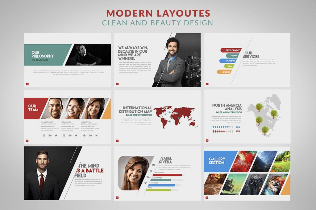
Take advantage of professional design with attractive layouts for images and graphics to help the audience perceive your content more effectively. Have a look at PowerPoint templates from TemplateMonster.
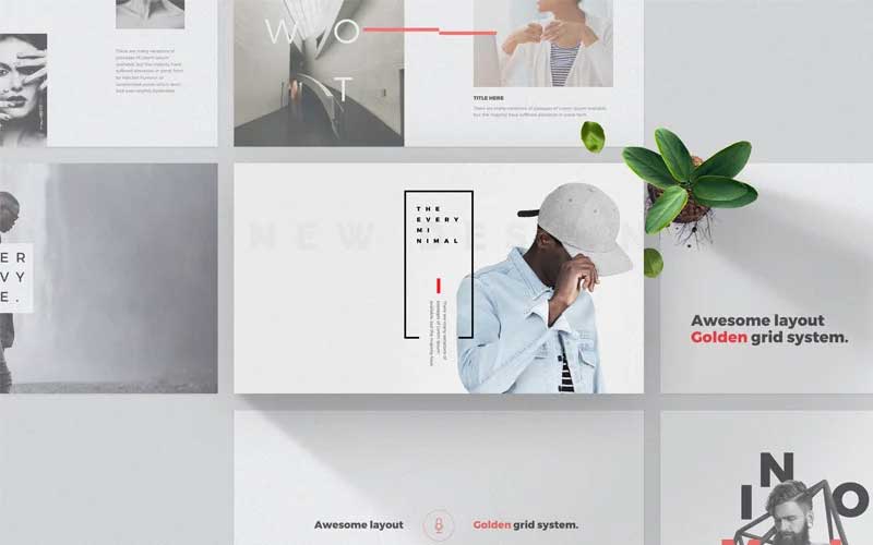
Here is one of many examples - Minimal PowerPoint Template.
Every - Minimal PowerPoint Template
Rule #2. Engage With them!
The more actively your audience participates in the process, the more effectively you’ll be able to deliver the necessary message.
Add as many interactions as possible - games, tests, tricky questions. When people interact with the content (at least somehow), there grows an involvement level. For a perfect ending, ask the audience a question so that they have something to consider about. It doesn’t matter if they respond immediately or leave it for later. They’ll reflect on the topic in any case.
Rule #3. Tell a Story
The human brain reacts automatically to stories. Somehow, this is a part of our survival mechanism (Stay in the cave! Huge mammoths are out!). Also, stories are a great way to entertain yourself (the reason why kids love fairy tales and why people watch movies). Storytelling made narration to be one of the most critical communication means between people.
We pay more attention when we hear stories rather than when someone lists facts. Storytelling during your PowerPoint presentation helps the audience to understand and memorize the information for a longer time, even after the story’s end.
Instead of concluding a chain of facts (figures, breakdown), which can drive even the most positively-minded person crazy, make a story out of those facts.
I guess, the recently-added Marakesh PowerPoint Template will be perfect as a storytelling base for your PowerPoint.
Infographic Pack
Rule #4. Stop Reading Text from Slides
So, 69% of respondents answered that they couldn’t stand a speaker reading text from the presentation slides. You must convey the information in your own words without even looking at the slide.
Yes, I mean you have to memorize it. Otherwise, you risk having your audience fall asleep.
Rule #5. Keep the Reasonable Font Size
48% of people hate when the font size is too small. Like who cares about your genius text in each slide when people are not able to read a single thing? Goodbye to all your creative text, useful statistics, meaningful remarks, etc.
The More Bundle Presentation PowerPoint Template
Rule #6. Do Not Be Afraid to Joke
Even during the most serious TED talks, Will Stephen does not forget to laugh at himself. He knows - humor rules the world. Even in the business world.
If you are getting ready for a serious presentation in front of your client or investor, don’t think that using humor for the presentation will be inappropriate. You do not need to joke around all the time. This instead means staying cheerful and appealing. The audience will appreciate your ease of communication and simplicity of speech.
Although it might be tough to find the right humor vibe, I still recommend you take a risk. The effect is amazing! People get more open to the ideas you want to share during your presentation.

Rule #7. Choose the Right Fonts
In 2012, The New York Times had an experiment called "Are you an optimist or a pessimist?". The participants had to read a piece from a book and answer "yes" or "no" to several questions. The purpose of the experiment was to determine whether different fonts can influence the reader's confidence in that text.
40K of participated ones were shown the same paragraph typed in different fonts: Comic Sans, Computer Modern, Georgia, Trebuchet, Baskerville, Helvetica.
The results state: text written in Comic Sans and Helvetica are least “trustworthy” among readers, while Baskerville font, on the contrary, gained the most of trust. According to psychologists, it has to do with the more formal outer look of the font.
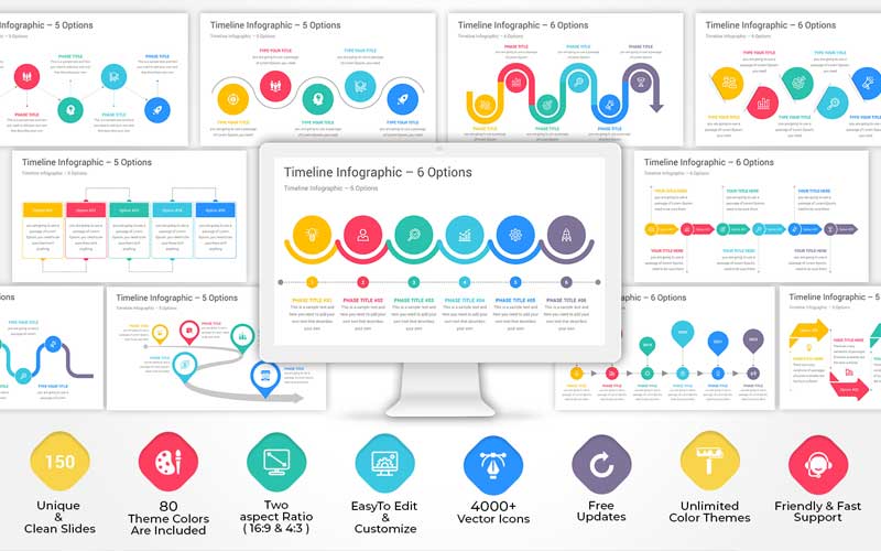
Timeline Infographics PowerPoint Template
Rule #8. Visualize
People perceive information differently. So, you tell somebody: make a beautiful presentation. In your head, you are drawing a particular picture of how a beautiful presentation should look. But you don’t even think that the other person’s thoughts about a beautiful presentation are far more different from yours.
Thus, it is better to show five images than to explain everything in words. You need more visuals. Graphics, charts and visual metaphors - everything that supports and demonstrates your argument. Speaking of visual metaphors, it’s the way of using images to illustrate your ideas or separate important statements. Such visual metaphors are likely to stay in people’s minds longer.
And don’t stop on traditional visuals because 1998 has gone for 20 years already. Stylish and modern PowerPoint presentation ideas look far different from what we used to see 10 or 15 years ago. Make sure you keep up with the latest trends, including moving graphics, videos, emojis and gif animations.
For example, Inertia Template has an incredible set of layouts with modern-looking infographics and charts. I haven’t seen anything better so far!
Inertia PowerPoint Template

Rule #9. Simplify the Design
Once PowerPoint let us experiment with colors and slide designs, people started to believe that leaving plain white background is dull and unprofessional. It’s like if you change the background color, some magic will make your client accept the order.
Who still believes in this kind of a delusion? Why do we keep embellishing slides with many objects when you can explain your thought in 1 word or picture?
Unnecessarily details, elaborate design, and unreadable fonts only distract the audience from the idea you intend to convey. Using illustrations and a minimum of text is enough to deliver your thoughts to listeners and grab their attention.
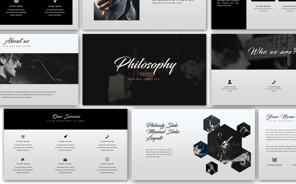
Remember that less is not boring. Look at this minimal PowerPoint template, and you’ll make sure!
Philosophy - Minimal PowerPoint Template

Rule #10. Use Personal Examples
One more way to reach your audience is giving examples and reflect the issue of the listeners. It doesn’t necessarily mean providing examples from your own life. Once you know your target audience, whether it’s a speech at a conference or in front of your potential investor, think of how your topics can relate to them directly.
Use examples to help support your solutions to the presented issue. People might not care how your solution can be useful to someone else, but once you show how it might affect them, people will start listening attentively. Psychology is so basic.
Remember those listing facts out loud is not a presentation. If you want to make an impression, convince the audience and urge them to act. You got to work on your presentation structure and add some enthusiasm.
All the above-described rules work. Use and implement them in your presentation.
Get better every day!

Read Also
How to Insert a YouTube Video into a PowerPoint Presentation (Using Different PowerPoint Versions)
Design in PowerPoint: Step-by-Step Instructions on How to Create Awesome Slides
Get Pitch Pro – A Free PowerPoint Template for Business
Get more to your email
Subscribe to our newsletter and access exclusive content and offers available only to MonsterPost subscribers.


Leave a Reply
You must be logged in to post a comment.