10 Tips for Creating a Brilliant Visual Content
We are all little children inside… And how does a child from the first days of his life understand that this is his mother? What does she want from you? What does baby pay attention to? - Visualization! Illustrations. Colors. Paints. It’s the visual language of communication! In our case, it’s called visual content. Plus, according to the Social Science Research Network - 65 percent of human beings are visual learners. Yes, obviously everyone has their own tastes and preferences. But visual language is not aimed at making everyone be like you. It aims to ensure that you are comprehensible, to pay attention to you, to be remembered and unconsciously identified among others. And your target audience will like you!
No matter what kind of visual content you create, it is important to follow the principles of excellent projecting. From color and typography to design and data proportion, simple tweaks can considerably improve your work. Creating powerful visual language takes time, great lengths, and resources. So if you are ready to enhance your visual content, here are 10 tips for creating a brilliant visual language. Keep these in mind as you improve your designs!
1. Color!
Color is a powerful tool to leverage the human psyche. The power of color lies in the fact that it is able to “circumvent” the defense mechanisms of our consciousness and influence at an unconscious level. Use no more than five colors in a single layout. Color should be used sparingly to highlight important information. Typically, light colors such as white, green, pink, and blue express virginity, wealth, and purity. As well, dark colors such as black, brown, and grey depict calm and elegance. A specific color palette is a perfect identification tool for users. For example, everyone knows that when you think of YouTube, you know their color is red. Maybe you even remember YouTube Red.
As Charles Baudelaire once said, “I want the grasses to be red, and the trees to be blue. Nature has no imagination.” And what about you? Do you have imagination?

2. Increase the “white” space
To make your interface look beautiful, let it breathe. Do not press on people with a bunch of icons, colors, links, menus, texts, and animations.
- Add space between the lines.
- Add space between elements.
- Add space between groups of elements.
Analyze what works and what does not!
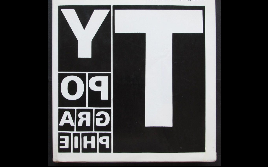
3. Use good fonts
Every day we see hundreds of fonts: on signboards, road signs, in shopping malls, on advertising banners, packages of goods, and websites.
The effectiveness of the message you want to convey to people often depends on the choice of font. A well-chosen font helps the viewer revel in reading. It is very important that typography attracts viewers and remains their attention, so the font should be easy to read, be nice and neat. After all, remember what you noticed among the hundreds of these advertising banners?
Each font has its own mood, rhythm, and dynamics. It can be playful, strict, friendly, or conversely cold. To choose a font for a logo or website, determine which mood you want to convey.


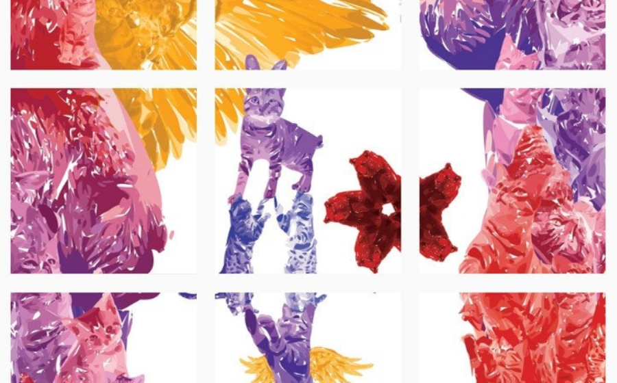
4. Grid banners
One of the last original features in the posting of photos - grid banners allow users to divide a large photo into small parts and present them in the form of a single composite banner. Such grid banners or collages are now very popular among online users and in small business accounts and brands. This kind of visual content is great for promoting and advertising products and services.
5. Build rules for animation
Animation is not the art of drawings-that-move, but rather the art of movements-that-are-drawn.
Norman McLaren
But all animated elements must follow the basic set of rules, and on any page of your site be in the same style. Therefore, determine the principle of movement, speed, number of elements, etc. Animation can set the tone for the project. Whether using or not using animation, they can talk a lot about who you are and who you want to be. Most importantly, enjoy the process of creating your animation.
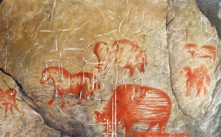
6. Infographics
Infographics is a marketing tool that combines a lot of different information and may contain drawings, text, graphics, etc. It accompanies the text and gives readers a clearer idea of what is being said. Infographics is a great tool for drawing all your complex data and statistics and comparing them with an attractive, easily understandable visual display.
After all, it can be assumed that this kind of visual language was the first one that people began using to send messages to their descendants about their way of life, about hunting. Cave painting may be called the ancestor of the modern concept of “infographics.” And it worked!
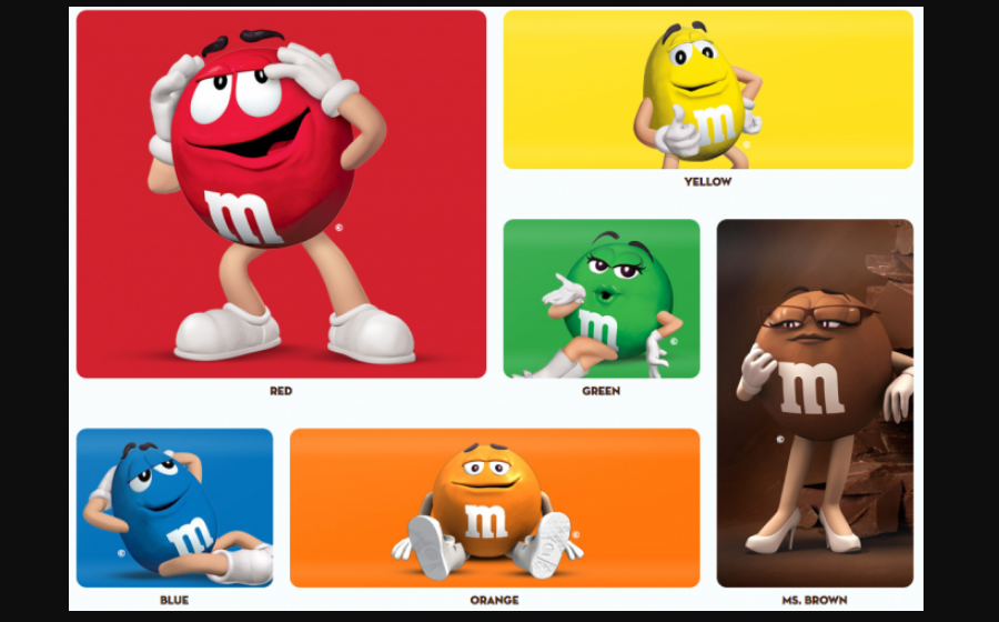
7. Designing your own character (my favorite!)
Great things stand out because they have unique brands behind them. And a character is the most common and effective way to engage a person in your brand concept. Cool characters we remember for life: in our childhood, such were the characters of cartoons and books for example. Your character design needs to be strong and interesting in a visual sense to grab people’s attention. And a character's personality can be revealed through comic strips and animations, where we see how it reacts to certain situations. If it is appropriate - come up with your character, put in it the main idea of your product and success is guaranteed! It will be your personal visual language! Because who in the world does not know these guys?
8. Keep it real
To create your own visual language, you first need to figure out what type of creator you want to be. What style do you like? What colors and shades? Aggressively or softly? And how will all this be combined in the presentation of your brand? Moreover, this is the only way to show the world how unique you are. And if you believe in what you do, then others will believe.
9. Keep it consistent (even if the inconsistency is your consistent theme!)
Once you have determined all the points of your visual language, stick to them. The biggest mistake when working on the creation of a visual language is inconsistency. As an example, Jeweler Laura Bezant offers an excellent visual style on her brand website. Visit their Instagram.

Soft, gentle, nice style. On all visual platforms they use the same filter, the same image size, the same font. This is the consistency. This creates cohesion, so if a client follows Facebook instead of Instagram, they will still get the same story.
What color palette are you using?
How do you create an animation?
Where is the logo?
What are the font styles?
Stick to your unique style everywhere!
10. Experiment!
Do not be afraid to experiment and ignore all the rules and tips about planning and developing your visual language. Do not just take a look at the examples that are being created: look back at the history and look at the real world around you–your surroundings, people on the street, bookstores, photos, car booties, food, grandmother's attic, whatever! Going against what is supposed to be the right way of doing something could create unexpected and exciting results. Resist the urge to just look online for inspiration and influence. After all, who knows what can inspire you?
You have to admit that text without visual accompaniment will be interesting to very few people. I remember when I studied at a driving school; our teacher told us at the first lesson, “I have 2 rules to follow in this office: – 1) Do not be late, and 2) When we write notes, if I say something to highlight, highlight these in color and make sketches!”
After all, our brain works in such way that it will immediately pay special attention to color when you repeat the material. It is obvious: the original images and videos in the materials attract us much more than the text, no matter how brilliantly it was written. For example, look at the stats for the popularity of Pinterest and Instagram. And what is their main feature?


Read Also
65 Web Design Trends of 2019 – Complete Edition
10+ Design Tips For The Success of WordPress Website
The Ultimate Guide to Content Marketing for Ecommerce Websites
How to Plan Your Visual Content Marketing Strategy
Choosing Graphics for Your Website: Trends and Tips From Crello

Get more to your email
Subscribe to our newsletter and access exclusive content and offers available only to MonsterPost subscribers.

Leave a Reply
You must be logged in to post a comment.