- What are Popups?
- Some Tips When Using Popups
- What Are the Main Types of Popups?
- 20 Best Popup Design Examples of 2020
- Sweet Bonus: Cool Popup Maker
- Wrapping Up
Have you ever visited a website and seen a tiny window appear as soon as the web page finishes loading? If yes, it was a popup, the thing we’re going to talk about today. So, you’ll know what popups are, why are they used today, what are the purposes, how to use them properly on your website, what you shouldn’t do with these little additional windows, and so on and so forth. You’ll receive some theory about these things, and what’s more important, you’ll get some magnificent popup examples of 2020 so far for inspiration, and I hope you’ll really be inspired by them. Moreover, you’ll get a great plugin where you can create your own cool popup design and use it on your website. So, here we go! Enjoy!
What are Popups?
Popups are forms of advertising on the net. A popup is a graphical user interface (GUI) display area appearing most often in a separate little window at the front of the visual interface. A popup is called a popup because it pops up while you surf a website. Popups show up for advertising and catching the attention of a visitor. They can also appear when you’re close to leaving the website you’ve been surfing.
Some Tips When Using Popups
If you want to use popups on your website, don’t be irritative and boring, and remember the following basic principles:
- Your popups must be informative and relevant. It means they must contain useful information for your user at a particular moment.
- One popup should contain one message. Don’t confuse your visitor with one popup containing few messages, it should be for one purpose only.
- Your popups should be funny and delightful. Adding some funny pictures or animation to your popup would make your visitor interested in the info contained in the popup.
- Make your popups responsive. It would be better if your popups are responsive; i. e., they can adjust to any screen—PC, smartphone or tablet.
If you want to know about popups more and check out the examples, watch the video Web Design Inspiration: Creative Popup Design | TemplateMonster. So, now you know what popups are, how to use them properly, what they should contain and in what way it’s better to use them.
What Are the Main Types of Popups?
As lots of terms and conceptions, popups have a classification as well. What are the main types of popups? Check out the following ones:
- Entry popups: these appear right away when a visitor goes on the website. They’re used for drawing their attention to some sales, or for them to subscribe to the newsletter, etc. They’re good because they show that the website cares about its visitors and wants them to stay with it. However, such popups can be irritating oftentimes because they appear right away when a visitor goes on the website and can confuse them.
- Exit popups: these popups are opposite to the previous ones; they appear when a visitor is close to leaving the webpage and the website wants them to stay. That’s why these popups appear offering to subscribe or any other suggestion. They’re good because when a person wants to leave a webpage, these popups are the last hope to make a visitor leave with the website. However, it does not always work well.
- Timed popups: these appear when a visitor goes on a website and stays there for some time. For example, for 15 up to 60 seconds. Some experts say that 1 minute is the ideal time for giving such popups to visitors. When a visitor stays on a website for 1 minute, it means that they’re interested in this site. That’s why the chances that they would subscribe or buy something are higher. But these popups can also be irritating sometimes.
- Scroll popups: such popups appear when a visitor has come to a particular place of a website, for example, they have reached 50% of the webpage. When a visitor has read half of the webpage, they’re probably interested in the website. That’s why such pop-ups are used. But it doesn’t 100% work.
- Click popups: these are popups appearing as small windows and a visitor can fill in the blanks and simply click on a button below. The visitor doesn’t need to redirect to another subscription page; they simply need to click on one button.
So, as you can see, there are a lot of popup types and it’s up to you which one to choose and use on your website. Look through these types and decide which one would work out depending on your purpose.
20 Best Popup Design Examples of 2020
Now, you already know what popups are, how to use popups, what are kinds of popups, what are the pros and cons of different kinds of popups. Check out the following 20 best popups design examples of 2020 so far. Of course, each of them has its pros and cons as well. Look through the list and think about which one would really catch your attention and which one you would choose and try using on your website. Enjoy!
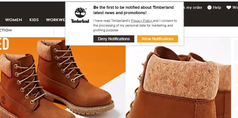
Timberland
As you can see, this popup on the Timberland website informs a user about the possibility to get notifications about the news and promotions from the website.
What’s really good:
- The color scheme of the popup and the website are similar.
- The message is simple and allows a visitor to understand the message and choose between two offers.
- The visitor doesn’t need to search for such an option to get notifications.
What could be changed:
There are too many words in the heading.
Yoins
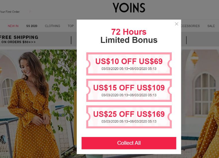
The popup on the Yoins website allows a visitor to choose from a number of coupons. This means the visitor doesn’t need to search for it themselves.
What’s really good:
- As this online shop is for women, the pinkish design really fits its purpose.
- It’s clear that a visitor has only 72 hours left, so it creates an additional feeling of urgency.
- Interesting CTA button, not a boring “Subscribe” but lively “Collect All”.
What could be changed:
- There are no clear instructions for a user; it’s not clear what they have to do.
- There are a lot of numbers under a lot of numbers. It could be reduced a little bit.
The Dog Bakery
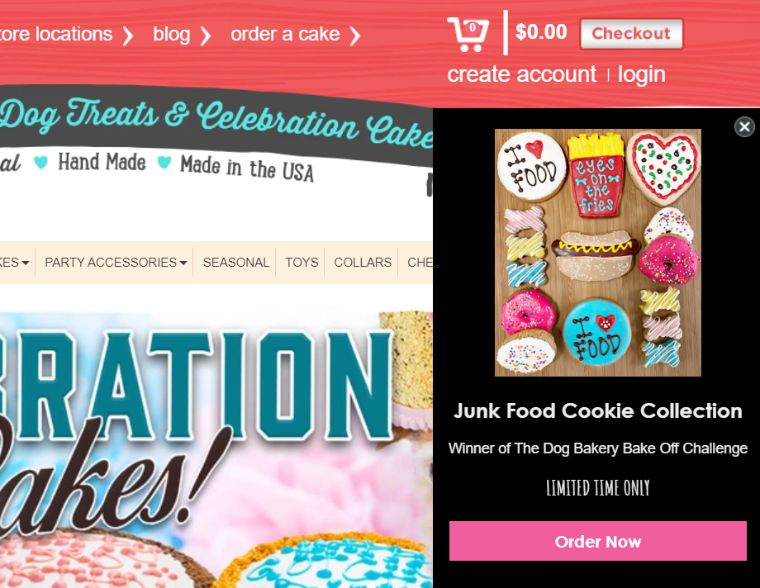
The popup on The Dog Bareky website informs a visitor about the possibility to order such a particular collection of cookies. The offer seems to be limited in time.
What’s good:
- Attractive and bright design that immediately catches the attention of the user.
- The visitor sees that the offer is limited in time.
- The presence of a picture makes it clear to understand what the website offers.
- The short description allows a user to get the instructions quickly and without wasting time on reading long instructions.
What could be changed:
The second line could be a little shortened or fully deleted. It contains not so necessary information.
OptinMonster
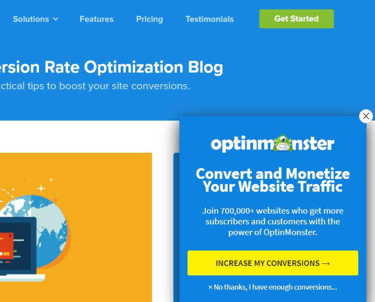
OptinMonster uses a popup when a visitor spends a little time on the website. It appears in the bottom right corner as a small additional window offering some particular services.
What’s really good:
- The CTA button has another color and a visitor can clearly see what they can get.
- The popup is small and doesn’t irritate the visitor with its huge sizes and doesn’t punch a visitor in their face.
- It also contains a little monster that will definitely be remembered and memorized.
What could be changed:
- The colors of the popup and the website interface are similar and it’s difficult to distinguish them.
- Too much information and many words. It could be reduced.
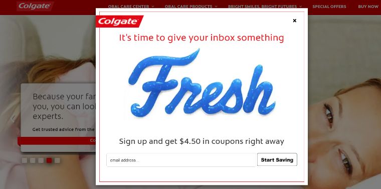
Colgate
The Colgate website offers a popup right after a visitor goes to its website. It helps them to grab the visitor’s attention right away.
What’s really good:
- The design is simple and exquisite; it contains the word “Fresh” as it’s done with the help of toothpaste.
- The popup design accurately matches the design of the website.
- Short, simple and clear instructions don’t make a visitor waste their time and they can simply do the action asked by the popup.
- Presence of a unique CTA button “Start Saving” instead of a boring “Subscribe”.
What could be changed:
A blank with a visitor’s name could be added.
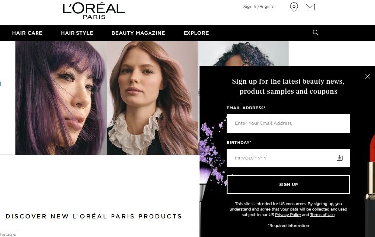
L’Oreal Paris
The L’Oreal Paris website uses a popup appearing in the bottom right corner offering to sign up for getting the latest news in the beauty industry.
What’s really good:
- The popup offers to input the visitor’s date of birthday which could make the visitor and the website closer.
- The darkish design of the popup greatly fits the color scheme of the site.
- Clear and simple instructions.
- The CTA button also gives clear instructions.
What could be changed:
- The heading contains too much information, which could be reduced a little bit.
- The last line isn’t so necessary.
- The CTA button can be expressed in different, more bright words.
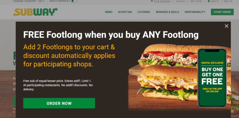
Subway
When a visitor’s entering the subway website, a huge pop-up appears offering free footlong when you buy any footlong.
What’s really good:
- The greenish and yellowish design perfectly matches the design of the main website and it creates the feeling of unity of the two items mentioned above.
- The popup appears when a visitor’s just come on the website, so the chances that the visitor would make an order are higher.
- The presence of a pleasant and nice-looking hotdog doubles the chances of visitor’s ordering.
What could be changed:
There’s a lot of words that could be decreased in the heading, and other instructions.
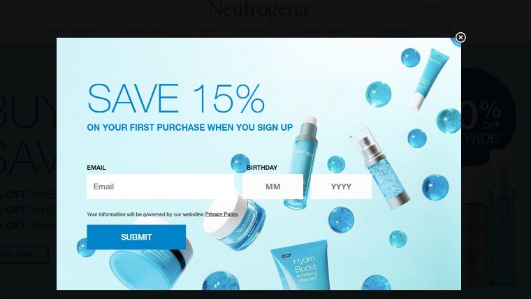
Neutrogena
The Neutrogena website gives a popup offering to save 15% on the first purchase when you sign in. Quite a great idea, isn’t it?
What’s really good:
- The bluish design of the popup perfectly corresponds to the bluish color scheme of the website.
- It’s not just a bare blue popup but it contains blue balls, tubes, sprays, jars connected to the beauty sphere which catches the attention of any interested visitor.
- The instructions are quite simple to follow and don’t take much time to do them.
- There are no unnecessary blanks—just the ones that are needed.
What could be changed:
The CTA button could be expressed in another interesting way.
Budweiser
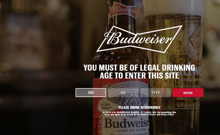
Before a visitor goes to the Budweiser website, they must confirm that they’re of legal drinking age. Such popup won’t let them go on the website if they don’t verify the age. Here a visitor should enter their month, day, and year of birth. Only after this kind of confirmation, they could enter the website.
What’s really good:
- It’s an unusual kind of popup that helps to verify the age of a person that wants to enter the website.
- Simple and easy instructions that can be followed by any visitor.
- The instructions don’t take much time and a visitor can easily pass the confirmation spending a few minutes on it.
- The exquisite and transparent design could catch the attention of any interested visitor.
What could be changed:
The background could be less transparent to see the info clearly.
Estee Lauder
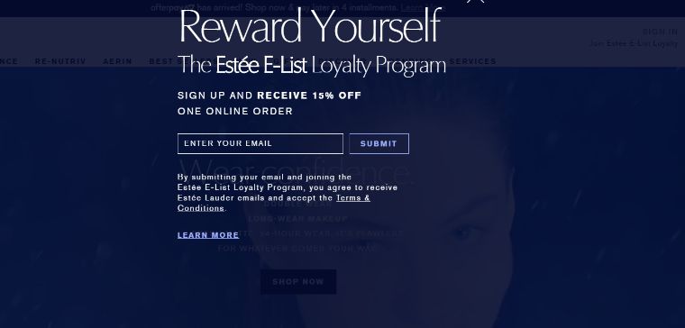
When a visitor enters the Estee Lauder website, they’re welcomed by an entry popup appearing just at the front of their eyes. This popup is really huge and takes the whole webpage.
What’s really good:
- The popup takes the whole page, so you can be 100% sure that a visitor would take the offer or refuse.
- The heading is catchy and written using a bigger font, so the visitor would read the heading first, and then other instructions.
- Only an email address is required, so it won’t take much time to do these simple instructions, thus the chances of a visitor to sign up are higher.
What could be changed:
- The words in the second line seem to merge because the letters stand too close.
- The huge, blue background spikes the universe terror and fear, so it could be made in more positive colors and sizes.
- To use one font is required for this popup.
Lindsay Letters
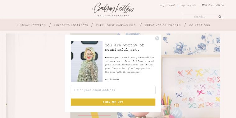
When a customer goes on the Lindsay Letters website, they’re welcomed with an entry popup.
What’s really good:
- This popup meets new visitors with warm words, so it gives them a feeling of being special and unique.
- The light design of the popup matches the main color scheme of the website.
- The unusual CTA button immediately draws the attention of a new member, it’s not just ordinary “Submit”.
- The picture of the author and signature below make a feeling of a real letter sent to the visitor.
What could be changed:
- The font of the main text is too small; I can barely see this with my poor eyesight.
- The font of the heading and the content text could be some different.
Elvie and Leo
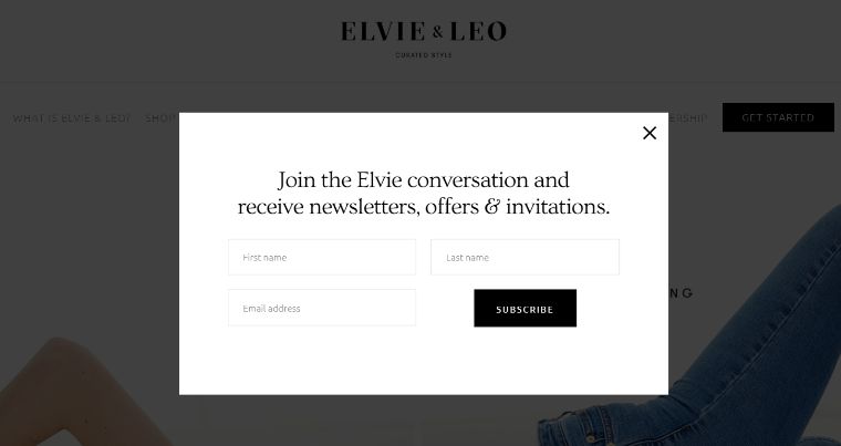
The Elvie and Leo website uses an entry popup offering subscription when a visitor just enters the website.
What’s good:
- The black and white color scheme is perfect for minimalism lovers and well matches the design of the main website.
- Simple and clear instructions take not so much time to follow and do them for an average person.
- A clear and simple heading.
- The fonts are great and quite readable.
What could be changed:
- The Last name line could be removed because this information isn’t so necessary.
- The CTA button could be expressed in another more interesting way.
Grab Green House
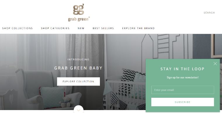
When a visitor goes on the Grab Green House website, they see a little popup showing in the bottom right corner offering to subscribe.
What’s really good:
- The color of the popup is quite different from the main website and it helps a visitor to catch sight of it.
- Catchy heading containing interesting words as “Stay in the loop”.
- Short and easy to follow instructions that don’t take much time to follow.
- The visitor doesn’t need to fill in a lot of unnecessary fields.
What could be changed:
There could be one extra field to fill for a visitor’s name.
Cygnett
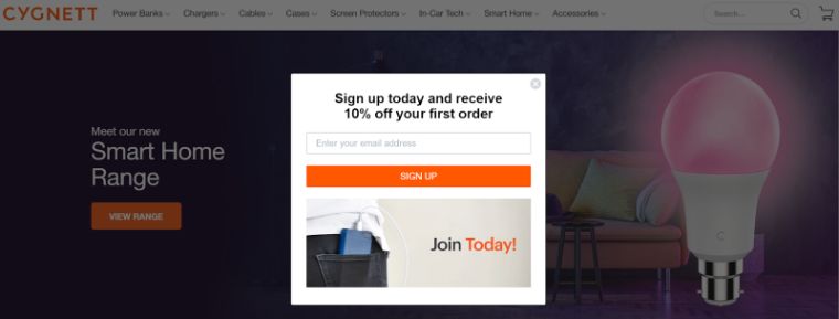
The Cygnett website has an entry popup offering to sign up and receive a 10% discount on the first order.
What’s really good:
- The color scheme of the popup is similar to the color scheme of the main website, so it gives a feeling of unity.
- Simple instructions and readable content. The visitor doesn’t need a lot of time to fill in different unnecessary forms.
- The presence of a catchy picture immediately draws the visitor’s attention and tells what products are sold by this online shop.
- No unnecessary extra texts.
What could be changed:
The “Join Today” words could be placed instead of the CTA “Sign Up” words.
Soggy Doggy
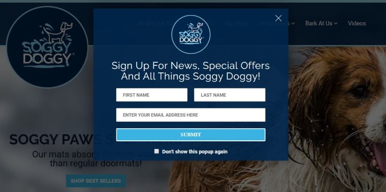
When a visitor goes on the Soggy Doggy website, they’re met with such an interesting bluish popup offering them to sign up for the latest news.
What’s really good:
- The bluish color scheme has similar colors with the website, so these two items are in unity.
- The presence of the company’s logo makes the popup remembered and unique.
- The catchy heading grabs the visitor’s attention right away.
- The presence of the option “Don’t show this popup again” reduces the future probable visitors’ irritation.
What could be changed:
The Last name line isn’t so necessary and could be deleted.
My Deal
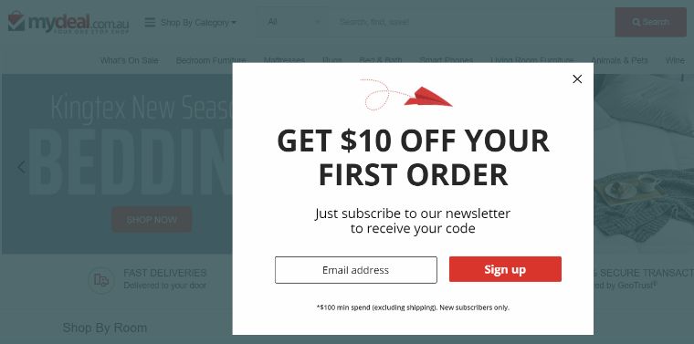
The My Deal website uses an entry popup offering to get a 10% discount on the first order using a promo code.
What’s really good:
- The red and black design perfectly matches the design of the main website, so these two items are united.
- Bigger fonts and uppercase letters are used in the heading to catch the visitor’s attention.
- The presence of the picture of a little red airplane catches the visitor’s attention right away.
- Simple and easy instructions to follow.
What could be changed:
A name line could probably be added.
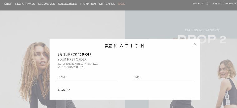
P.E. Nation
When a visitor goes to the P. E. Nation website, they are welcomed with an entry popup offering them to sign up to get a 10% discount on the first order.
What’s good:
- The greyish design that doesn’t have any unnecessary details, perfect for minimalist lovers.
- The presence of the logo above makes a visitor know that the company is serious and prestigious enough.
- Clear and simple instructions that are easy to follow and don’t need extra time to complete.
What could be changed:
- The design is poor and needs to be refreshed with more colors and various fonts.
- The fourth and fifth lines are completely unnecessary and could be removed.
- The main text font could be a little bigger.
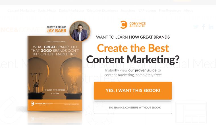
Convince and Convert
The Convince and Convert website has such a unique popup offering to buy an eBook or refuse.
What’s good:
- The orange and black color scheme greatly matches the design of the main website, so these two units are completely united.
- Here the visitor can’t close this additional window, they can only choose between two options: to buy or not to buy, so you can be sure that they would make a choice.
- The neat design has different fonts, colors, a picture of the book, a logo and a photo of the person reading books.
What could be changed:
There are too many readings.
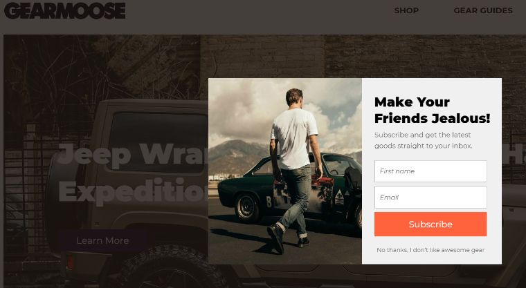
GearMoose
The GearMoose website has an exit popup offering a visitor to subscribe to the newsletter when the visitor is close to leaving the webpage.
What’s good:
- The neat design has a similar color scheme as the main website, so they’re in unity.
- The CTA button has different colors than the whole popup, so it helps the visitor to distinguish this button from other fields.
- The presence of a catchy picture makes the visitor stay on the website.
- The last line below doubles the chances of visitors subscribing because of power words.
- The use of different fonts highlights every important detail.
What could be changed:
The CTA button could be expressed in another interesting way.
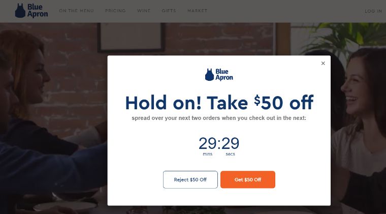
Blue Apron
The popup of the Blue Apron website is one of the best I’ve ever seen. This one is timed and contains a timer offering a $50 discount on the next two orders in case of checking out in the next 30 minutes.
What’s good:
- The presence of the timer creates an additional feeling of urgency and makes the visitor make the choice quicker.
- Here you can also see the company’s logo.
- Not all popups use a timer like this one.
- The CTA button “Get $50 off” is brighter than another one, so the chances that the visitor will grab the offer are higher.
What could be changed:
Some additional elements could be added as “Sign Up” or “Subscribe”.
Sweet Bonus: Cool Popup Maker
Now, you know what popups are and I hope you’ve checked most of the cool examples mentioned above. There you could see the pros and cons of every popup and you could draw some conclusions. And I hope you can make an ideal popup for your website. Make it with the help of JetPopup - Popup Addon for Elementor WordPress Plugin. With the help of this plugin, you can create your own cool popups! Pretty cool, isn’t it?
Check out the main features of this plugin:
- The possibility of building popups in drag and drop way having no special skills.
- The ability to customize popup designs makes you a king of popup design.
- You can set trigger events for important notices on your website as well.
- The presence of stylish templates allows you to choose from a great variety of different templates.
- Your popups can be placed in the center of the screen or on any place of it.
- Your future popups can slide from one side to another what adds vitality to your website interface.
- The visitor could allow the full screen for a popup.
- Animation effects that are available include fade, zoom in/out, move up, bounce in/out, slide up/down, slide left/right, horizontal/vertical flip, rotate.
- Your popups can be used for such popups like subscribe, countdown, contact us, discount, yes/no choice, info card, GDPR, cookie policy.
- You also get 24/7 support and can ask us any questions concerning this popup plugin.
- Any information you need for popup design, you can get from the documentation that comes within the plugin.
Wrapping Up
So, today we spoke about popups, what are these little things popping up when we’re visiting any website, you know what are their main types, how you should use them on your website, what you shouldn’t do placing them there, etc. Moreover, you got some examples of 20 cool popup design examples with their pros and cons explained, so now you can analyze any popups by yourself. And the greatest thing is the plugin you got with the help of which you can create popups of various types, sizes, colors, for different purposes. I wish you luck with creating popups and using them on your website. Have a great day or a good night!
Read Also
A Highly Converted Elementor Popup - Step-by-Step Guide and Tips
10+ Best WordPress Popup Plugins 2020
How to Win at Popups: The Top Plugins, JetPopup and Popup Builder, Compared
JetPopup or Popup Builder: Which One do you Choose?
Don’t miss out these all-time favourites
- The best hosting for a WordPress website. Tap our link to get the best price on the market with 82% off. If HostPapa didn’t impress you check out other alternatives.
- Monthly SEO service and On-Page SEO - to increase your website organic traffic.
- Website Installation service - to get your template up and running within just 6 hours without hassle. No minute is wasted and the work is going.
- ONE Membership - to download unlimited number of WordPress themes, plugins, ppt and other products within one license. Since bigger is always better.
Get more to your email
Subscribe to our newsletter and access exclusive content and offers available only to MonsterPost subscribers.


Leave a Reply
You must be logged in to post a comment.