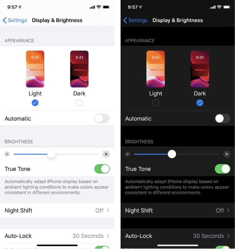
DARK MODE UI DESIGN – Should You Use It For Your Website?
- Why Are Users Switching To Dark Mode?
- When Does Dark Mode UI Design Work Well?
- When Is Using Dark Mode UI Design a Bad Idea?
- How To Make Dark Mode Work For Your Website?
- So is a dark theme the right choice for your website or mobile application?
Using dark color schemes in UI design is nothing new. For instance, Adobe Creative Suite has been using a dark interface for years. However, it was in 2019 when the dark mode UI became one of the HOTTEST design trends. It seems like users have gone crazy over the dark theme after getting dark mode options in MacOS, Apple iOS, and Android, as well as across popular apps and platforms.
But don’t rush to switch to the dark mode if you still haven’t. Research suggests that while dark mode may present some advantages for low-vision users, in users with normal vision, light mode leads to better performance most of the time.
Why Are Users Switching To Dark Mode?
The popular pros of using dark mode are:
- Reduces eye strain and improves readability in the nighttime hours
- Prolongs the battery life of your smartphone
- Emphasizes visual content and the overall emotional appeal
The popular cons of using dark mode are:
- Puts strain on user’s eyes when used in high-light conditions
- Bad for text-heavy and content-heavy applications
When Does Dark Mode UI Design Work Well?
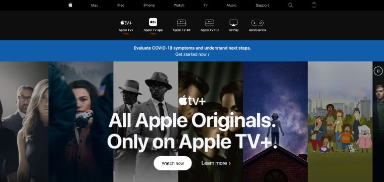
You might’ve noticed that many streaming services websites (Smart TVs, Game Consoles, and TV and Movie Apps) have dark-themed UI designs. There’s a simple explanation to that - as people mostly use these websites in the evening, and they are viewed from a distance of 6-10 feet, in dimly lit rooms. Plus, colorful content stands out better on dark-themed UIs.
Design experts emphasize that dark mode UI works well in the right context, environment, application, and use. So, in general it’s a good idea to use dark mode when you need to:
- Emphasize a strong, dramatic look of your visuals
- Focus the user’s attention with minimal distractions
- Support visual hierarchy and information architecture
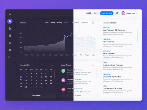
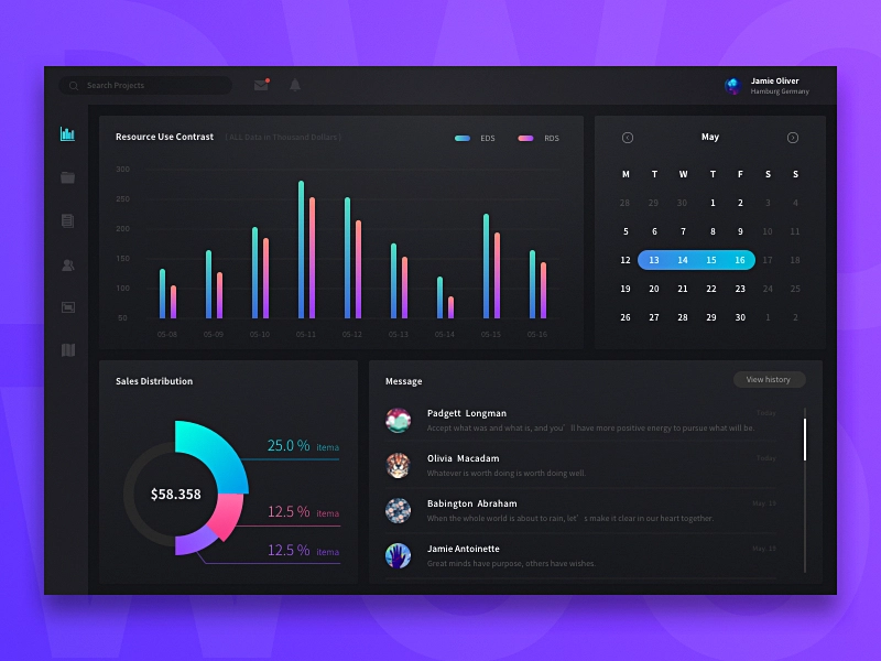
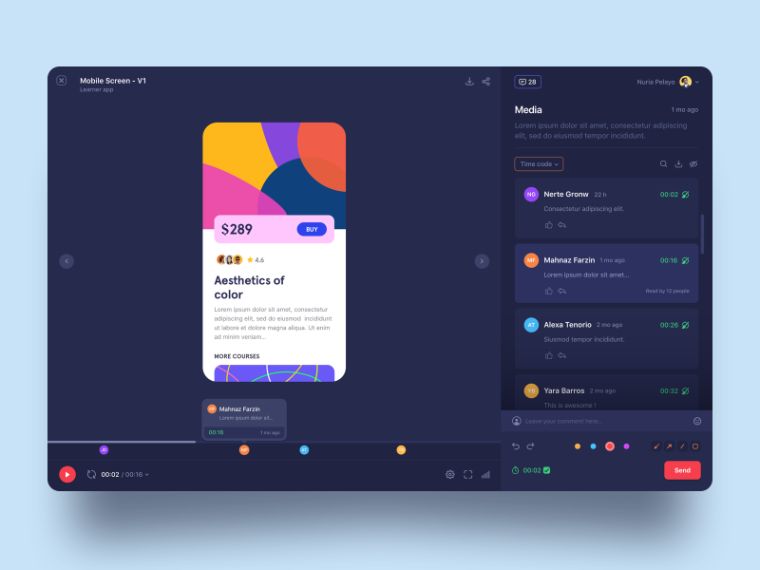
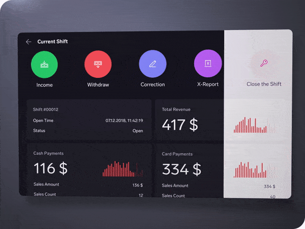
Examples:

When Is Using Dark Mode UI Design a Bad Idea?
Typically, using dark mode is a bad idea for text-heavy and data-heavy projects. It’s also a bad choice when using a variety of content types (text, images, video, data tables, dropdowns, fields, etc.). According to design experts, dark UIs mostly work well for simple content with bits of text here and there.
Why? Dark mode makes it challenging to maintain enough contrast and readability. It’s quite easy to pick colors that work on a white background, while the color palette that works against the dark background is limited.
Bad Example (poor contrast):
How To Make Dark Mode Work For Your Website?
If you’re still adamant about using dark theme on your website or app, make sure to follow these simple rules to avoid common design mistakes.
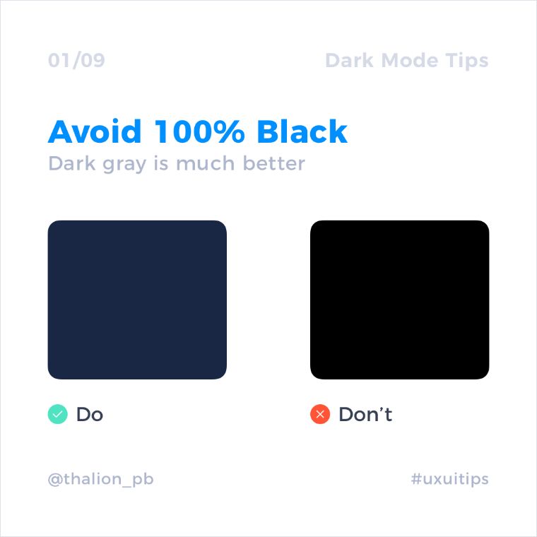
Say “no” to 100% black
Google’s Material Design guideline suggests using dark grey is much better than black. Dark grey provides a “broader range of depth”. According to the guide, “dark gray surfaces also reduce eye strain, as light text on a dark gray surface has less contrast than light text on a black surface.” The recommended dark theme surface color in Material Design is #121212.

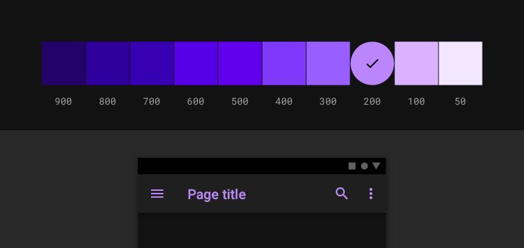
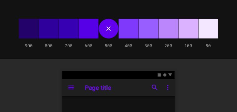
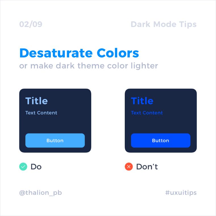
Don’t use saturated colors
Saturated colors can cause accessibility issues as they don’t pass WCAG’s accessibility standard of at least 4.5:1 for body text against dark surfaces. Also, they can induce eye strain.
Right:
Less saturated colors improve legibility and reduce visual vibration.
Wrong:
Saturated colors that visually vibrate against a dark background.
Example:
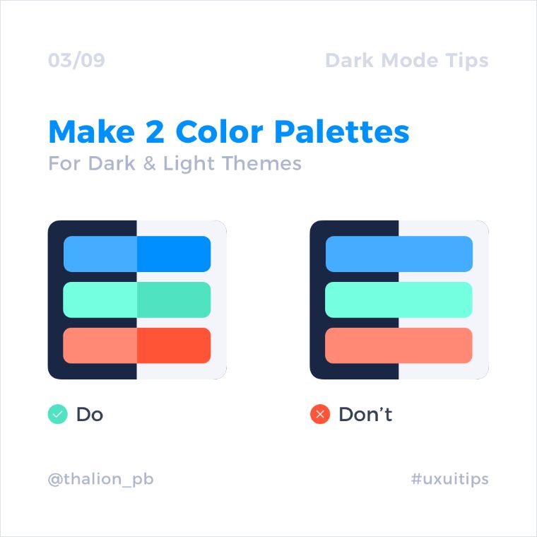
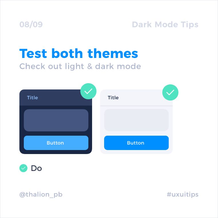
Use two color palettes – for light and dark mode
If you’re using light and dark modes in your project, creating complementary color palettes for both themes could be a good idea.
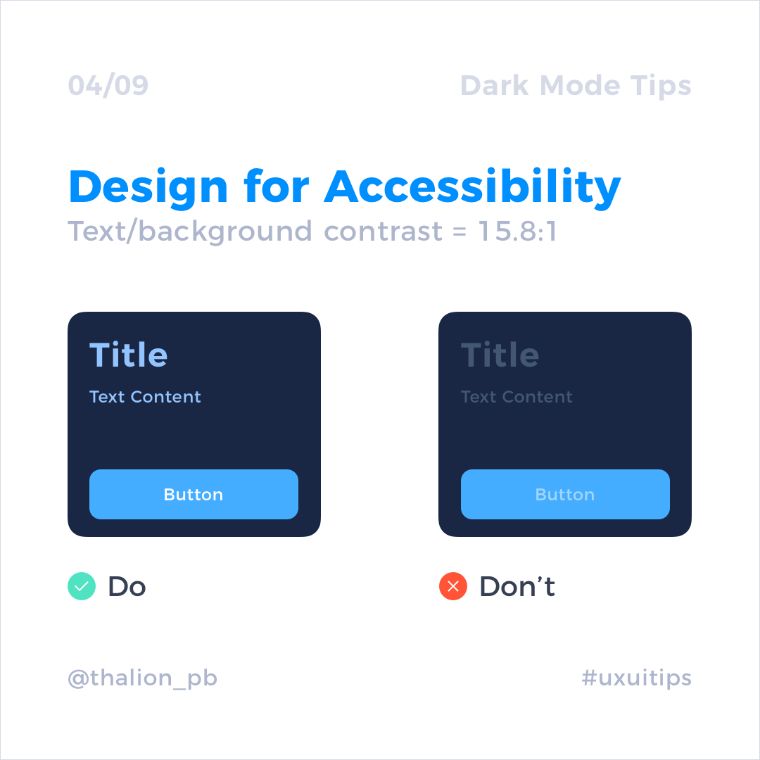
Keep in mind contrast levels to ensure better readability
The contrast level between body text and the background should be at least 15.8:1. This ensures better readability even if the higher surfaces will be lighter.
Tools to check the contrast ratios:
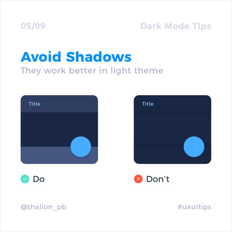
Avoid shadows
Shadows are poorly visible on the majority of dark mode elements. This is why they should be used less frequently. There is another way to communicate hierarchy.
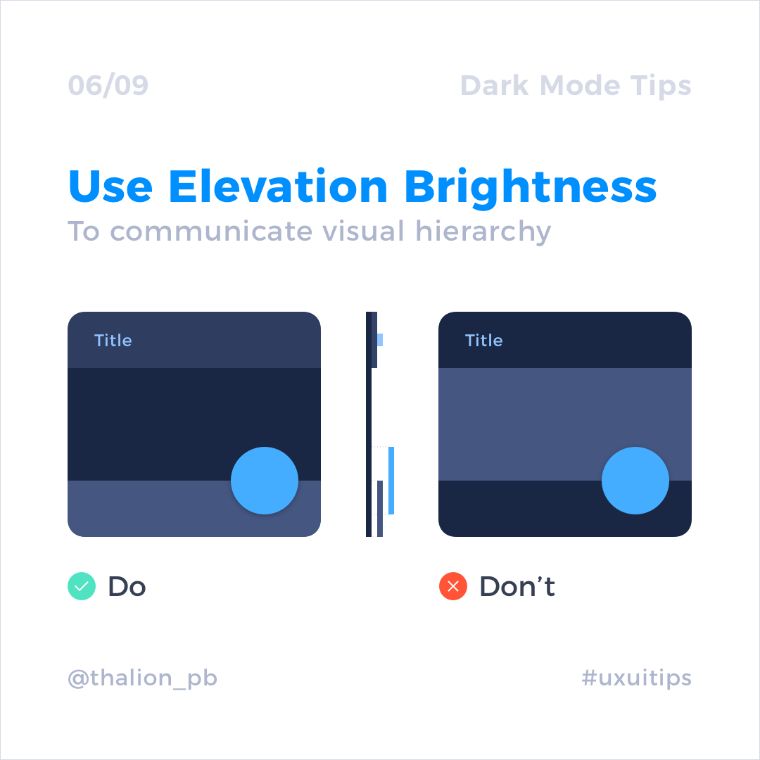
Use elevation to create hierarchy
Playing with elevation is the way to create hierarchy. Background surface should be the darkest of all, while UI elements that lay on top of it should be slightly lighter.
So is a dark theme the right choice for your website or mobile application?
Well, you can’t know until you try. Unfortunately, there’s no universal secret to using the dark mode. What you can do is follow the Material Design guidelines and perform tests in light & dark themes.
It’s a good idea to provide viewers with an option of switching between both themes. Switching UI theme should always be in the user's control. That being said, researchers from the Nielsen-Norman Group strongly recommend that designers allow users to switch to dark mode if they want to — for three reasons: (1) there may be long-term effects associated with light mode; (2) some people with visual impairments will do better with dark mode; and (3) some users simply like dark mode better.
That’s all for this video. Have you used the dark theme in your projects? Share your experiences in the comment section below!
If you liked this video - give it a thumbs up. Subscribe to our YouTube channel for more web design inspiration videos and Elementor tutorials! See you in the next video.
Read Also
Neomorphism Elementor Pro Tutorial
Elementor Tutorial: How to Create Video Masks in Elementor Free?
3 Easy Ways To Create Blob Shapes In Elementor
Create Elementor Slider with Custom CSS
Don’t miss out these all-time favourites
- The best hosting for a WordPress website. Tap our link to get the best price on the market with 82% off. If HostPapa didn’t impress you check out other alternatives.
- Monthly SEO service and On-Page SEO - to increase your website organic traffic.
- Website Installation service - to get your template up and running within just 6 hours without hassle. No minute is wasted and the work is going.
- ONE Membership - to download unlimited number of WordPress themes, plugins, ppt and other products within one license. Since bigger is always better.

Posting contributed articles about the major web design highlights and novelties. Come across a handful of useful tutorials and guides shared by experts in the web design and online marketing fields.
Get more to your email
Subscribe to our newsletter and access exclusive content and offers available only to MonsterPost subscribers.

Leave a Reply
You must be logged in to post a comment.