Top 10 Delicious Food PowerPoint Templates 2020 | The Yummy in the Presentation
- How to Choose a Food Theme Template
- What mistakes to avoid when creating a restaurant PowerPoint presentation
- How to Create a Restaurant Business Plan PowerPoint Presentation
- Food PPT Templates Must-haves
- Free vs. Premium Food PPT Templates
- Showcase of Freebies in PowerPoint
- Showcase of Food PPT Templates
Food Powerpoint template. All of us are well aware that food remains one of the main priorities of mankind; therefore, it is quite important to have restaurants. Even though people will probably be able to find you in their search for food sources, for your restaurant to do well, it still needs to be promoted through marketing. This is where a food PowerPoint template theme will help. Here you will learn how to create a restaurant business plan in the form of a PowerPoint presentation, which food PPT templates are must-haves, and how to get a showcase of freebies.
Opening a restaurant is a good idea if you can simultaneously make an attractive presentation of your restaurant on the internet. Take-away food with delivery can pay off in a matter of months; it is an excellent business idea requiring a minimum amount of investment. But for everything to work as it should, you should use one of these suggested templates.
Showcase of Food PowerPoint Template
It seems that the restaurant business is too complicated and impossible to translate online, but with TemplateMonster, this task will be easy. Perhaps free food PowerPoint templates are good, but here you get the maximum content, icons, themes, and additional options. What kind? Read about it in the descriptions below.
DESSERT PowerPoint Template

Appetizing simple design in white and purple tones does not distract attention from the main thing — food. This is the most important thing, because the user must literally be drowning in saliva and immediately need to place an order. Suitable for reports related to cooking, cafe activities, small business, etc.
This is a great template with a nice design for the site of a small cafe or coffee shop. The world of sweet pleasure will attract customers with its diverse assortment. Delicious desserts and pastry icons seduce clients. With this template, the customer will place an order without any problems. Colorful pages of the template will give a sweet mood with their delicious cakes. Menu cards can be developed with this flexible and responsive template. Users will be satisfied and will definitely come to you for a cup of coffee.
Aldente Food Presentation PowerPoint Template
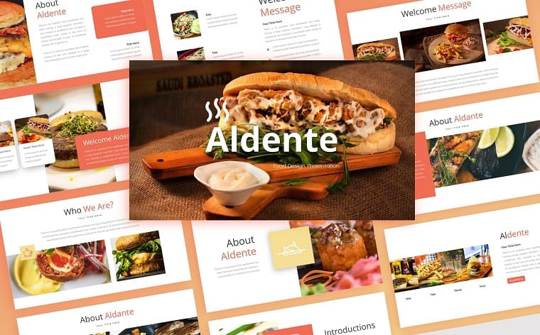
Simple, powerful, and beautiful — this is all that can be said about the template, which is suitable not only for small establishments, but also for large chain burger or sushi restaurants. You can make a pizza PPT template from this presentation. Presenting burgers and other fast food at the same time could earn more. The chic design simply does not allow users to stop watching the presentation; the template is so delicious and appetizing. Working 24/7? Indicate this as one of your advantages — and this is already provided for in the finished developed site. Just replace it with your recipes and collect orders during the presentation with 50 slides available to you.
The options for customizing the template are truly amazing. Here you can make vivid pages where you can explain to customers what options you have for orders in one or another quantity, consultations to increase customer loyalty.
Tomatoes | PowerPoint Template
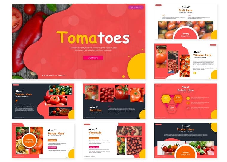
Many presentations of food present many dishes, but these slides are significantly different from what you saw earlier. There are tomatoes everywhere: yellow, green, and traditionally red. Suitable for creating presentations related to reports on a healthy diet.
The topic of healthy eating is now very relevant. Inside you will find 150 slides. Pixel-perfect illustrations allow you to expand on the theme. You are also given 5 color variations. Change the default text, upload your pictures — and the creative presentation is ready!
Honibe | PowerPoint Template
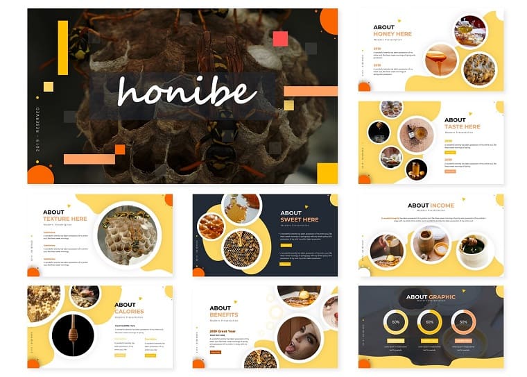
Beehive, honey, and bees — a unique template for creating a presentation. Beekeeping is gaining new momentum for development. Now the trend is not just honey, but all the products produced by bees: royal jelly, pollen, polka, etc. All of them are useful to humans. Do not forget to mention this in your report.
Features:
- background colors — white, gray, yellow
- graphic elements used in the template — honeycombs, beehive, bees
- consists of several demonstration slides
To create what you can use:
- presentations on ecology, biology
- reports on honey, bees, beehives, and the production and benefits of honey, and honey products
You will get 150 slides with the ability to choose one of five colors for design. All of them are in PPTX format. Each template ultimately contains 30 slides with manual infographics.
The gallery is filled with pictures.
Edith Food PowerPoint Template

Templates in the category “Food and Drinks” contain 50 slides in which drinks are used as background images, kitchens represented by various nations of the world, fruits, vegetables, berries, etc. Everything that a person eats is represented. Themes for presentations of this category can be used by people of various professions, one way or another related to food. These are culinary specialists, grocery store specialists, food producers, farmers, etc. They will find the necessary widescreen presentations of food in this category for students and teachers. At school, these are biology lessons. In secondary and higher educational institutions — teachers and students in areas related to culinary, food, food production, services, and food trade. Believe me, children will immediately see pineapple on the first page and will understand that this cooking PowerPoint video will be interesting and exciting.
In addition, there are pictures with ice cream, hamburgers, and French fries.
You can fully reveal their content in the food PowerPoint presentation, explaining to schoolchildren how to run a restaurant business. Do not forget to explain the economic nature of the cost of finished products, illustrating what is the main goal of any enterprise, including a restaurant. The secret: it consists of making a profit.
You can choose as a target audience for viewing slides not only schoolchildren and students, but also potential investors and future or existing customers.
Vegeta - Food PowerPoint Template
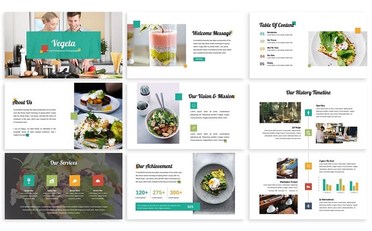
This site template was originally ‘tailored’ for vegetarian food. It is supposed as a business card site with a simple expressive design, with the help of which you will be able to perfectly demonstrate the menu, indicate prices, calories, and other details that can be important for people. Introduce your restaurant business plan on PowerPoint using 12 files in PPT format, and the same in PPTX. Each slide pack is presented in three color schemes.
You will receive the following pages:
- Slide content
- Cover
- Gap Section
- About us (i.e. about you)
- Layout
- Image Layout
- Infographics
- Contact us (indicate your contacts)
- Thank you page
Create different types of charts (circular, vertical histograms) to visually display statistics and visualize data.
Acaman PowerPoint Template

The design of this template is adapted to the theme of nutrition. In the set you will find 30 slides in five color schemes. Unlike free food PowerPoint templates, there is professional content filling, both text and vector. All infographics are fully editable, and fonts are included. Acaman is based on Masterslide.
This is an extremely simple and universal template. The whole setup is built on the principle of Drag and Drop — that is, you only need to pick up the pictures in advance and insert them into the already prepared design. No time to do these things?
Take this layout and you will get:
- Attractive traditional style blocks with mouth-watering food close-up photos.
- The ability to fine-tune — for example, the client will be able not only to choose a dish from the proposed menu, but to get acquainted with the full portfolio of the cook.
- Instructions are provided if you are having difficulty setting it up.
You can attach your personal photos showing you prepare the dish: cut zucchini into thin slices, stick dumplings, decorated beautifully with spices and herbs. Cook in a chef's hat and do not forget the apron, then the photos will look professional, as in this template!
Farm - Agriculture PowerPoint Template
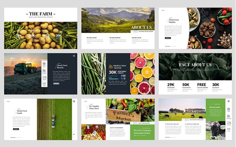
The theme of this site template is the delivery of organic products from farms (and related topics). Create your digital business card or online store and accept orders online. This is all available to you will the help of this food PowerPoint template which includes 36 slides.
Here you will get bright colorful pictures with a slide of potatoes, another with citrus fruits, nuts, asparagus beans, artichokes, and many other tasty and healthy products. Along with this, combines and tractors in a large field show that all products are of organic origin.
In addition, you will find slides with graphs, charts, and a map. All these tools allow you to visualize statistics and present your presentation in the best way and it will certainly benefit the person who watches it. Use the drag-and-drop function for each element with a simple movement of the hand on the touchpad or mouse on your PC.
Promote your offline business using all the modern digital capabilities and innovations in web design.
Brogy - Food & Beverages Presentation PowerPoint Template

A nice template for the restaurant business with an interesting and “tasty” idea for decoration, implemented using the header image with a table and food on it. Further, the stylization is preserved, which gives the piece a single style, at the same time simple and pleasing to the eye, causing the necessary associations with mouth-watering dishes and drinks.
You will find them on 36 slides of the template.
It is suitable for restaurants, bars, and fast food. There are ready-made cards for the menu. You can create various events that can take place in the restaurant — performances with live music, promotions, etc. Present this data with Brogy-Food & Beverages.
Mango slices decorated with nuts look so appetizing on a plate. Each dish is tastefully decorated.
Restaurant - Creative PowerPoint Template

Create professional cooking PowerPoint designed presentations for your service business with this versatile template. Restaurants that invest heavily in their presentations work better than those that do not. Such a marketing move is important to convince customers to order certain things. He makes them come back to try something that they could not try for the first time. Choosing the right menu templates can make a big difference to restaurant sales.
With the help of 21 slides, it is quite realistic to present your company in the best possible light. Make pancakes and pile them high on a plate, decorating with a raspberry and blackberry on top. Take pictures of juicy moments, cooking by the stove, and how he claps flour in his hands.
How to Choose a Food PowerPoint Template
Go with positive emotions. A person will arrive to your site with a desire to order some delicious food, and you can help him with this by using high quality, bright attractive graphics, or “tasty” photos.

The Food PowerPoint Template should definitely have bright elements and colors, not boring, overly serious, and plain pastel colors. Photos of the food come first. The remaining elements should emphasize your menu, location, and other offerings, not vice versa. For this purpose, you might select a template with a dark (blue or black) background.
Easy ordering. The visitor should be able to place an order easily, without unnecessary difficulties. Suggest a choice: phone call, order app, and maybe a callback widget. Correctly made templates do not require special knowledge in the field of web programming. You can just buy a ready-made website with the whole design ready to edit the text and pictures for yourself.
What mistakes to avoid when creating a restaurant PowerPoint presentation

One of the most common mistakes made by people unfamiliar with modern web design trends is that they choose an extremely unfortunate combination of colors: brown, navy, burgundy, and mustard. If you use these colors with each other, and with a poorly selected font, it seems that the image came to us from the 90s.
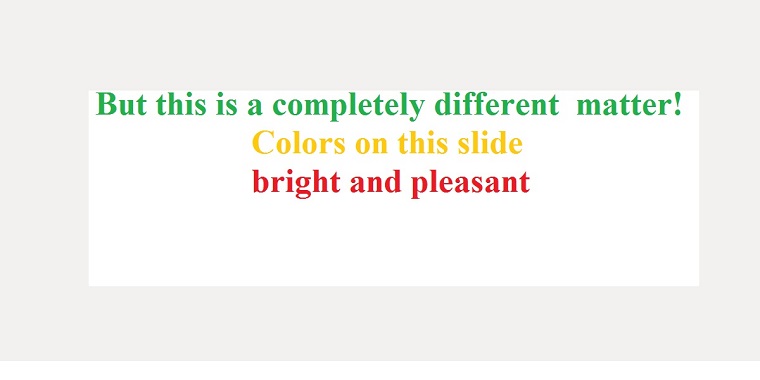
Now, these colors are not typically used in web design. More precisely, they are used, but in combination with other, more pleasant, and “pure” shades (the so-called flat colors).
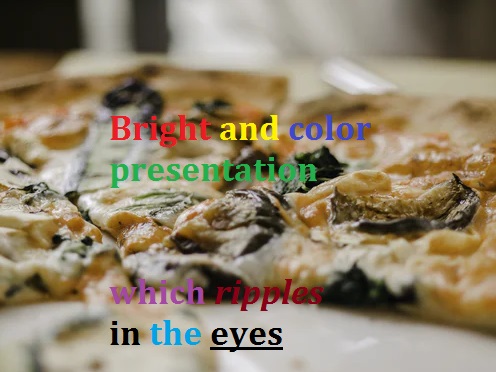
Do not turn your presentation into a rainbow, even if your talk is about a child’s topic. A large number of colors will interfere with the reading and comprehension of the slides.
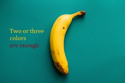
On one slide, it is best to use no more than 2-3 colors, taking into account the main background color. In the entire presentation — try to use no more than five.
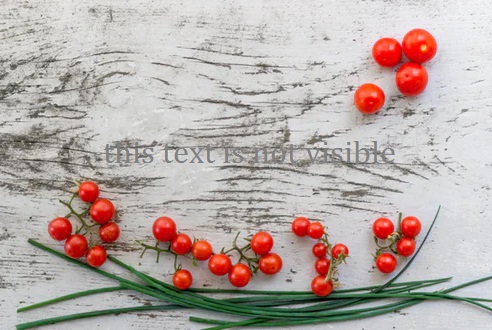
Observe the contrast between text and background. Everything is simple here: if the background is dark, use a light font. If light, then dark.
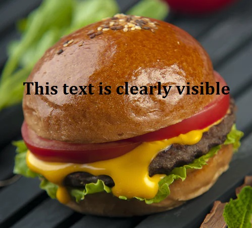
The text should be clearly visible on your slide, otherwise, your audience will be uncomfortable, and instead of listening to you, they will spend their attention on sorting out what is written there.
Give up the idea of using shadows, gradients, and other old-fashioned effects. Try to keep everything up to date and arrange your slides so that they are not perceived as a relic of the past. After all, the level of confidence of the audience in you as a specialist will depend on how well you design your presentation. A good specialist is always developing and following new trends. A bad one does not want to perceive anything new and believes that it has already fully taken place. Do you agree? You should strive for minimalism.

Refuse low-quality stock images. Poor stock images will ruin the impression of your presentation, even if smart thoughts are written on the slides. Please do not use them. It’s better to spend more time finding images that will be pleasant to look at.

Use modern fonts. Calibri, Comic Sans, Times New Roman — you could use these fonts, but I would not recommend this to you, because they are quite boring and do not produce the desired result from the audience.
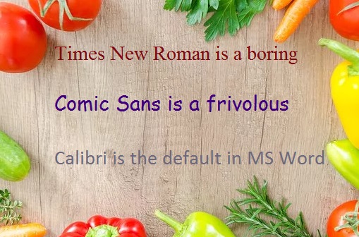
It’s better to opt for more modern fonts. For example, Helvetica, Open Sans, or Roboto will be good choices. These fonts are quite simple but suitable for almost any project. When you choose a font, be sure to pay attention to how well it reads. Unusual ornate serif fonts look interesting, but sometimes they are so difficult to read that it’s better to completely abandon them. The entire presentation should have no more than three fonts: the heading font, the body text font, and the font for the frames (if necessary). If you use more fonts, your slide will look sloppy and frivolous.
Follow the basic layout rules. Do not align the text in width. Because of this, large gaps form between the words, the text becomes untidy, and its reading causes difficulties. Do not make lines too wide as it will be difficult for users to keep their attention on them. The ideal line width is approximately 70-100 characters. Use normal line spacing: not too big, but not too small. Put spacing between paragraphs that is slightly more than the spacing between lines. Use different formatting to facilitate the perception of information: bulleted and numbered lists, bold, etc.
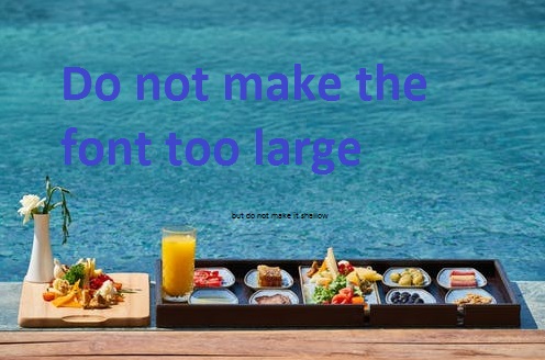
The text on the slide should not be too large or too small. Try to find a middle ground. In the event that you will show your presentation offline, make sure that the text is visible even to those people who are sitting in the very last rows.
The more accurate your presentation looks, the more users will trust you as a specialist.
The slide should not contain a lot of text. Some speakers try to fit almost their entire speech into the presentation and, instead of speaking on their own and improvising, they type out all the text on the slides shown to the participants and proceed to read it aloud. The audience does not like this! They begin to get bored and lose their emotional connection with the speaker. To prevent this from happening, add a minimum amount of text to your slides and remember that the goal of your pages is not to help the speaker remember the text, but to strengthen the emotions of what you say to the audience.
Devote a separate slide to each item. If your presentation has bulleted or numbered lists, it is best to break them into separate slides. The information is better absorbed because each item will be supported by a relevant image and a separate story.
Highlight important text with a different color. To focus your audience on a particular phrase, highlight it with a different color, italics, boldness, or underline.
Use the icons to speed up the perception of information. Icons and various graphics accelerate the understanding of your message. Use them in your presentation, but make sure that they are made in the same style; otherwise, the slides will look messy. If you take the icons that are filled with color, they should all be like that. If contour, then everything should be contour. And of course, they should also be the same size.
There should be a lot of “air” or white space on the slide. Do not sculpt icons and text close to each other. Your presentation should be able to “breathe.” Then it will be perceived as much faster and more efficiently.
Do not add unnecessary fields and logos to the slides. Very often, presentations include footers with a logo, company name, phone, address, groups in social networks, and other business information. I believe that in most cases this is unnecessary. These elements “eat up” space and add unnecessary noise to the slide. In addition, all this information can be placed on the final slide, and if the audience likes the presentation, be sure that they will remember the name of your company and logo, and will be able to find you on social networks.

How to Create a Restaurant Business Plan PowerPoint Presentation
A restaurant business has many competitors, so you need to make a lot of effort to make it work, both online and offline. To do this, it’s useful to make a presentation of superpowers to better present your kitchen to visitors and create a positive brand image.

The main steps to create:
Step 1: Open Microsoft PowerPoint.
Step 2: Go to File at the top of the screen and click New.
A box that says “New Presentation” should appear on the right side of your screen.
Step 3: In the “New Presentation” dialog box, click on “From Design Template.”
You may then scan through design templates and choose one that you like.
Step 4: Slide Design.
Select a design template by clicking on the template you like. You may choose a different color for your template by clicking on “Color Schemes” in the “New Presentation” dialog box.
Step 5: Change the Slide Layout.
You may change the slide layout (how information is presented in the slide) by going to the top of the screen and clicking on “Format” – “Slide Layout.” A box will appear on the right side of your screen (where “New Presentation” appeared) labeled “Slide Layout.”
You may select a design by clicking on it.
Step 6: Adding Text. Enter your text by clicking and then typing in the box titled “Click to Add Text” or “Click to Add Title.”
Step 7: Adding Pictures.
You may add pictures by clicking on the box that says “Click to add content.” Inside that box, there will be a smaller box with six icons. Click on the icon that looks like a photograph of a mountain. A new window will open, allowing you to browse for a picture on your computer or a CD. Once you find your picture, click on it and then click “Insert.”
Step 8: Resizing Pictures.
You may change the size of your picture by clicking on the picture. The picture will then have black lines around it with small bubbles or boxes in the corners. Place your mouse over the bubbles or boxes and click. Holding the mouse pointer down, drag the picture to the size you want.
Step 9: You’re done! Wasn’t that easy? Now you can do it again to make more.
Food PowerPoint Template Must-haves
There are some free food PPT templates that everyone should have, or the so-called - “must-haves.” They are simply amazing designs and I’ve brought you the current best free food templates that if you begin to take the same food route as the template design, you should definitely use them in order to reach the maximum success possible while saving the most money by using free templates.
Bananas Whole and Sliced on White Background template
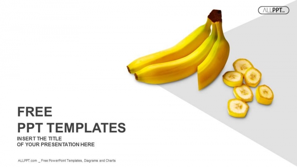
Everyone loves bananas… right? If you’re going into the banana or fruit business, this is definitely the template that you need to choose.
Burger with French Fries PowerPoint template
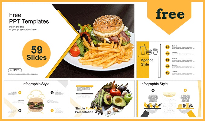
Again, here’s an amazing free must-have template that you definitely need to use. It’s simply an amazing free template - plus, burgers and French fries always attract people!
Motion Chefs at a restaurant

This is a really generic, restaurant pitch presentation that you can use for a wide variety of things, as the template is really neutral and suitable to include content from all food topics.
Free vs. Premium Food PowerPoint Template
It’s important to know the difference between free and premium PPT templates. The key factor here is the design that you’re about to choose and even more importantly — the fact that many other people might have selected the same template. Your main goal here should be to have the most unique and advanced design from the template. Once a client sees it, they will be left in awe.
Sadly, this usually doesn’t happen with free Food PowerPoint Templates. The fact that they are free usually means that a lot of other people might have possibly used the same template which could cause issues such as your clients or visitors have already seen the same template in another place. This leaves you in a really bad position and people do not get impressed by that.
Your bonus here will be to purchase a premium food PPT template in order to minimize the chances of other people using the same pattern. Premium food restaurant PPT templates usually are also much better designed with more complex shapes and curves, the correct use of colors, and other factors that impress your visitors and future clients.
Your last option here will be to purchase a totally unique and custom design that only you can use. The work to create it will have to be done by someone who takes such requests. The price here will, obviously, be higher than buying a premium use template, due to the fact that the specific creator will have to create the design specifically for your individual use. However, this does have its bonuses — you will be able to get a template custom made for your own liking and preferences. This route usually interests people who are really looking for that extra shine to their food PowerPoint presentation, with unique food PowerPoint backgrounds and attention-getting texts and images, as well as people who do not like any of the templates available from other sources.
We should not forget the biggest factor here — the freebies. Even if premium and custom Food PowerPoint Templates have the benefit of being unique, the fact that other templates are free is why they have the most followers online. People love free things and if a person has a way to obtain something without paying for it, they will definitely go for it.
Showcase of Freebies in Food PowerPoint Template
Of course, there are some really good free food PPT presentations as well. I’ll be giving you some basic information for them and talking about the pros and cons that each of them has.
Pizza PowerPoint Template

Starting off with the Pizza PowerPoint Template. It’s a simple yet sleek pizza design that by modern standards is pretty well accepted by the public. We’ve moved into years where simple things really begin to shine and impress the most. Fewer special effects are being used and basic forms and shapes attract everyone’s eye, which is where this free food PPT template impresses with its simple design - squares and triangles form most of the design and give that unique new-age look.
Stylish Food Presentation Template

Continuing with the Stylish Food Presentation Template. This free cooking PowerPoint template is great for presentations of food. It has places for an Ingredients List, Preparation Steps, Nutrition Facts, and any other details that you may need. The design is modern while keeping the same simple style in which you can impressively showcase your modern food art.
Freshly Baked Bread PowerPoint Templates
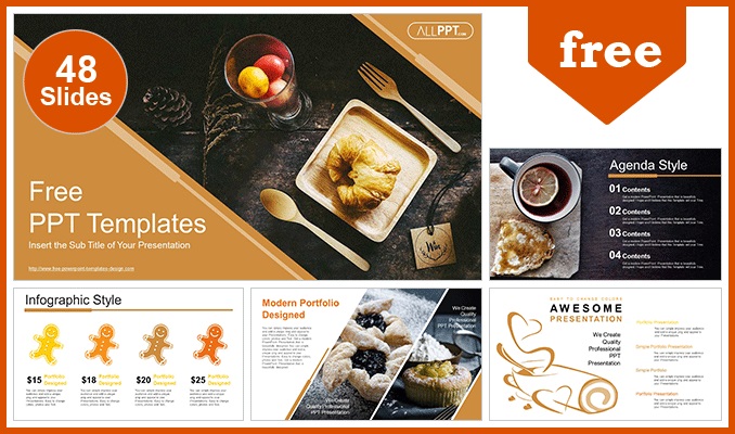
Moving to the Freshly Baked Bread PowerPoint template. This PowerPoint template is perfect to use if you plan to open a bakery or another food restaurant where you wish to offer bread and other wheat products. This specific template includes 48 slides with a unique design. And the best part–It’s free.
Coffee PowerPoint Templates
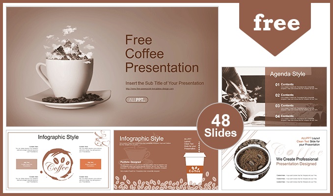
The Coffee PPT Templates also includes 48 unique slides and it’s free of charge as well. The idea behind this template is to showcase and make the viewer ‘feel’ the aroma of the coffee you’re about to serve him.
Organic Food PowerPoint Templates

Are you into organic food? If so, the Organic Food PPT Template should be your number one choice on the internet. The design is very well made and fresh with a perfect color choice for the topic.
Now you can easily present your restaurant business and you will surely find investors and clients by using the proposed templates. Choose the pizza PPT template or any other depending on your preference.
The article turned out to be very large and hopefully useful for you. If you liked it, I will be grateful if you share it on social networks. If not, write your comments, questions, and suggestions in the comments. I will be glad to get feedback.
Read Also
The Magnificent 50 Free PowerPoint Templates
Top 10 Cool PowerPoint Templates 2020
Get more to your email
Subscribe to our newsletter and access exclusive content and offers available only to MonsterPost subscribers.

Leave a Reply
You must be logged in to post a comment.