How to Build a jQuery Slide Out Menu with CSS
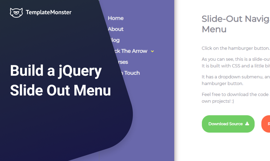
In this tutorial we’ll show you how to build a slide-out navigation menu. jQuery slide out menu is a common trend in modern web design, and you can see that many websites prefer that type of menu. It removes clutter from the page, and makes it more readable, allowing you to put all the emphasis on the content.

It's a great way to achieve minimalist layout for your site that would be free from distractions. Today I’ll show you how to build such a menu on your own by using:
- CSS & jQuery - requires at least basic knowledge of coding;
- JetMenu - a WordPress plugin for visual drag-and-drop customization.
Building a jQuery Slide Out Menu Using CSS
In order to build the navigation menu, let's take a look at the document set-up first:
<!DOCTYPE html>
<html lang="en">
<head>
    <meta charset="UTF-8">
    <title>Animation Menu Demo</title>
    <link rel="stylesheet" href="https://cdnjs.cloudflare.com/ajax/libs/normalize/3.0.3/normalize.css">
    <link href='https://fonts.googleapis.com/css?family=Montserrat' rel='stylesheet' type='text/css'>
    <link rel="stylesheet" href="https://maxcdn.bootstrapcdn.com/font-awesome/4.3.0/css/font-awesome.min.css">
    <script src="https://cdnjs.cloudflare.com/ajax/libs/jquery/3.0.0-beta1/jquery.js"></script>
    <script src="script.js"></script>
    <link rel="stylesheet" href="style.css">
</head>
<body>
    <!-- Content goes here -->
</body>
</html>
First off, we’re loading Normalize.css in order to change the default browser styles, and make sure that our menu looks the same in every browser. We’re using FontAwesome to display an arrow in front of the menu item with sub-items. We also load jQuery to toggle the classes in the menu, and move all the custom jQuery code to script.js. The last link is the main stylesheet for our project.
Hamburger Button
A hamburger button is a common attribute of a website’s navigation. Quite often it is made with an icon font, such as FontAwesome, but in this tutorial I’d like to add some animation to it, so we’ll be building it from a scratch. Basically, our button is a span, containing three divs displayed as horizontal bars.
<span class="toggle-button">
     <div class="menu-bar menu-bar-top"></div>
     <div class="menu-bar menu-bar-middle"></div>
     <div class="menu-bar menu-bar-bottom"></div>
</span>
The styles look as follows:
.toggle-button {
  position: fixed;
  width: 44px;
  height: 40px;
  padding: 4px;
  transition: .25s;
  z-index: 15;
}
.toggle-button:hover {
  cursor: pointer;
}
.toggle-button .menu-bar {
  position: absolute;
  border-radius: 2px;
  width: 80%;
  transition: .5s;
}
.toggle-button .menu-bar-top {
  border: 4px solid #555;
  border-bottom: none;
  top: 0;
}
.toggle-button .menu-bar-middle {
  height: 4px;
  background-color: #555;
  margin-top: 7px;
  margin-bottom: 7px;
  top: 4px;
}
.toggle-button .menu-bar-bottom {
  border: 4px solid #555;
  border-top: none;
  top: 22px;
}
.button-open .menu-bar-top {
  transform: rotate(45deg) translate(8px, 8px);
  transition: .5s;
}
.button-open .menu-bar-middle {
  transform: translate(230px);
  transition: .1s ease-in;
  opacity: 0;
}
.button-open .menu-bar-bottom {
  transform: rotate(-45deg) translate(8px, -7px);
  transition: .5s;
}
The button has a fixed position, and doesn’t move when you scroll the page. It also has a z-index of 15, so that it always remains on top of other elements and overlaps them. The button consists of three bars. Each bar shares some styles with each other, so I moved them into the .menu-bar class. The rest of the styles are moved into separate classes. The “magic” happens when we add another class to the containing span, which is .button-open. We add it with the help of jQuery like this:
$(document).ready(function() {
  var $toggleButton = $('.toggle-button');
  $toggleButton.on('click', function() {
    $(this).toggleClass('button-open');
  });
});
For those of you unfamiliar with jQuery, let me explain what is going on here. First, we initialize a variable called $toggleButton, which contains our button. We store it in a variable, so that JavaScript doesn’t need to search through our document and look for the button each time we click on it. Then we create an event listener that listens to the clicks being made on the button. Each time the button is clicked, the event listener fires the function toggleClass() that toggles the .button-open class.
When the .button-open class is added we can use it to change the way of how the elements are displayed. We’re using the CSS3 translate() and rotate() functions to make the top and bottom bars rotate to 45 degrees, and the middle bar drift to the right and disappear. You can play around with the button and change its properties in the Codepen demo:
jQuery Slide Out Navigation Menu
Now that we have our button created, let’s actually make it useful and create the menu that slides in and out when we click the button. Here’s how the markup of the menu looks like:
<div class="menu-wrap">
    <div class="menu-sidebar">
        <ul class="menu">
            <li><a href="#">Home</a></li>
            <li><a href="#">About</a></li>
            <li><a href="#">Blog</a></li>
            <li class="menu-item-has-children"><a href="#">Click The Arrow</a>
                <span class="sidebar-menu-arrow"></span>
                <ul class="sub-menu">
                    <li><a href="#">Alignment</a></li>
                    <li><a href="#">Markup</a></li>
                    <li><a href="#">Comments</a></li>
                </ul>
            </li>
            <li><a href="#">Courses</a></li>
            <li><a href="#">Get In Touch</a></li>
        </ul>
    </div>
</div>
I won’t go in detail about each style for this menu, instead I’ll just focus on a few important points here. First of all it’s the div with .menu-wrap class. Look at its styles:
.menu-wrap {
    background-color: #6968AB;
    position: fixed;
    top: 0;
    height: 100%;
    width: 280px;
    margin-left: -280px;
    font-size: 1em;
    font-weight: 700;
    overflow: auto;
    transition: .25s;
    z-index: 10;
}
The position is fixed, so the menu stays always at the same place when the page is scrolled. The height 100% allows the menu to take up all the vertical space on the page. Notice that the margin-left is set to a negative number, which equals to the menu width. This makes the menu disappear from the viewport. In order to make it visible again, we create another class toggler with jQuery. Our JavaScript file would look like this:
$(document).ready(function() {
    var $toggleButton = $('.toggle-button'),
        $menuWrap = $('.menu-wrap');

    $toggleButton.on('click', function() {
        $(this).toggleClass('button-open');
        $menuWrap.toggleClass('menu-show');
    });
});
We add another variable $menuWrap which contains the menu wrapper, and use the same event handler for the button we created earlier. Only this time we toggle two classes, one for the button, and one for the menu wrapper. The .menu-show class sets the left margin to 0, and adds some box shadow effect.
.menu-show {
    margin-left: 0;
    box-shadow: 4px 2px 15px 1px #B9ADAD;
}
Sub-Menu and Links
You might notice that one of the list items has the class .menu-item-has-children and contains a sub-menu. Also, right after the link, there’s a span with the class .sidebar-menu-arrow.
<li class="menu-item-has-children"><a href="#">Click The Arrow</a>
<span class="sidebar-menu-arrow"></span>
    <ul class="sub-menu">
    <!-- List items -->
    </ul>
</li>
The span has an ::after pseudo-element that contains a FontAwesome arrow. By default the sub-menu is hidden, and would be visible only if you click the arrow. Here’s how we do it with jQuery:
$(document).ready(function() {
    var $sidebarArrow = $('.sidebar-menu-arrow');
    $sidebarArrow.click(function() {
        $(this).next().slideToggle(300);
    });
});
When we click the arrow, a function is called, which targets the next element right after the span (in our case it’s the sub-menu), and makes it visible. The function we’re using is slideToggle. It makes an element appear and disappear using a sliding motion. The function in our example has one parameter, which is the animation duration.
Lastly, the menu items in our demo have a hover effect. It is created using an ::after pseudo-element. The code looks as follows:
.menu-sidebar li > a::after {
    content: "";
    display: block;
    height: 0.15em;
    position: absolute;
    top: 100%;
    width: 102%;
    left: 50%;
    transform: translate(-50%);
    background-image: linear-gradient(to right, transparent 50.3%, #FFFA3B 50.3%);
    transition: background-position .2s .1s ease-out;
    background-size: 200% auto;
}
.menu-sidebar li > a:hover::after {
    background-position: -100% 0;
}
The ::after pseudo-element contains an absolutely positioned block level element at the bottom of each link, with the height of 0.15em and a full width. In other words it’s our underline. What is special here is that we don’t just apply the background color to the line, we’re using the linear-gradient() function on the background image. Although this function is intended for making color gradients, we can make an abrupt color change by specifying the percentages.
.menu-sidebar li > a::after {
  background-image: linear-gradient(to right, transparent 50.3%, #FFFA3B 50.3%);
}
Here a half of the line is transparent, and another half is yellow. By making the background size 200% we double the width of our block, so that the transparent part takes up all the width of the link, and the other, yellow part, is moved to the left and we don’t see it. On hover we change the background position to -100%, which moves our double-sized line. The yellow part becomes visible, and the transparent part is now hidden.
Instead of the transparent part you can use any other color. This would create an illusion of the line filled up by another color, but in reality it’s just a two-colored line. You can also experiment with gradients, instead of making an abrupt color change like we did here.
Go ahead and take a look at what we’ve built. Each of the elements we examined separately act together as a whole. Also, feel free to download the source code for this tutorial and use it for your own projects.
Building a jQuery Slide Out Menu Using JetMenu
For those who skipped the entire CSS & jQuery part because coding is way more complicated than you thought it would be, I have some great news. WordPress took care of non-professional users by creating multiple plugins for a more convenient drag-and-drop customization.
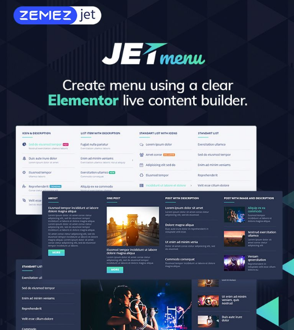
What you’ll need is a JetMenu plugin to create a convenient slide-out menu using Elementor live content builder. This means you can easily add Elementor models to menu items by just moving them with your mouse cursor.

For regular users, this plugin is everything. Not only is its drag-and-drop customization easy and fast, but also diverse in menu designs. And don’t worry about the responsiveness of your slide-out menu - it will look awesome on all types of screens.
Take a look at this video and you’ll understand why JetMenu plugin is so easy to work with (not to say it’s not as confusing as messing with CSS & jQuery code):
Finally, JetMenu is fully compatible with Avada, BeTheme, and Enfold WordPress themes, and other WordPress Elementor themes. It comes with a set of documentation and 24/7 support for you to contact the developers in case of any issue or questions.
If you have any questions let me know in the comments below.
Zemez Responsive Navbar JavaScript

If you already have a working web resource or blog, sometimes its functionality needs to be updated with new features. In such a situation, it is rational to re-create an html website. But, it is much faster and more efficient to implement a ready-made block of program code - a script. Here when a JavaScript comes in.
Take advantage of a fully responsive Navbar JavaScript to enhance your website navigation. The vendor provides 8 beautiful layouts for you to select the most suitable option for your web resource. You will discover a number of megamenus and drop-down elements to choose from. The highly customizable interface will allow you to create a unique design.
More features:
- Flexbox-based
- Sticky navbar
- SASS
- Single code for all devices
- Compatible with Bootstrap 4
jQuery Slide Out Menu FAQ
It is a navigation element that has an animation effect. It looks like a menu that smoothly slides out when the user hovers over it with a pointer.
If the menu is hidden and shows off only when the user needs it – it makes the whole website space clearer. Massy websites reduce the user experience, so it is better to keep everything in an understandable order.
Animation effects make the website look more dynamic and modern users love it. The animated menu will make your pages more visually appealing.
Read Also
- The Ten Best WordPress Navigation Menu Plugins for Your Website
- How to Add More Navigation Menus to Your WordPress Theme
- How to Build WordPress Navigation Using wp_nav_menu
- How to Code a Hidden Sliding Navigation for Responsive Websites
- Coding a Mobile-Responsive Website Layout Using Footer Navigation
Get more to your email
Subscribe to our newsletter and access exclusive content and offers available only to MonsterPost subscribers.

Leave a Reply
You must be logged in to post a comment.