Email Marketing Usability: How to Optimize and Why You Should
When it comes to modern technology, it is often short-lived, mainly due to the new technology popping out every other month and stealing the spotlight from the older versions. You know, like iPhone 4 that was all new and shiny in 2010 but had no OS updates after 2014? Sure, it is still used, but the new features are not supported and some people regard it with the same disdain as flip phones.
Compared to iPhone 4, email technology is a dinosaur and dinosaurs are extinct.
However, emails are more than alive and kicking; they are thriving according to some studies. This is especially true when it comes to communication between a brand and the consumer.
As it is common knowledge that email campaigns are among the most successful when it comes to brand promotion and retaining customers, it is of little surprise that everyone uses it for these very purposes. This makes it quite challenging to get noticed in all that crowded space.
To really be noticed in the pile of newsletters your customers receive every day, besides the strategy and content, the usability of your emails should never be overlooked.

What Is Usability?
In a nutshell, usability is how easy it is to use the product. This is true for physical products but it is also applicable to email campaigns. The design of the emails you send as well as the content can be an instant hit or miss for your brand’s recognition. Try asking yourself these questions when you design the emails your brand sends:
- How easy is it to find what one is looking for in the email?
- How long does it take to get a grasp of the email design, and to start navigating it?
- Will the customer recognize this as your brand’s email the next time they receive one?
If the answers to those questions are not very flattering, you need to reconsider the design.
Does It Really Matter?
Yes, it does. You put down a book that is boring and hard to read. You leave a movie when the plot is all over the place and makes no sense. You’d rather go see/read something that is easier to understand and navigate. After all, the selection can be huge.
The same goes for emails. If the user finds it inconvenient or difficult to understand, they will find something better with your competitors, unsubscribe from your lists, and forget about you altogether. Simple as that.
What can you do to avoid it? Well, here are 4 things to pay attention to:
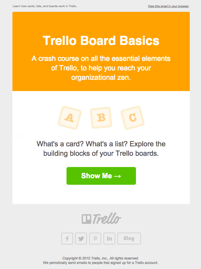
1. Messaging Hierarchy
Messaging hierarchy is the order in which the content is displayed in the email. And for the email to have better usability, it is highly recommended to regard this order with attention.
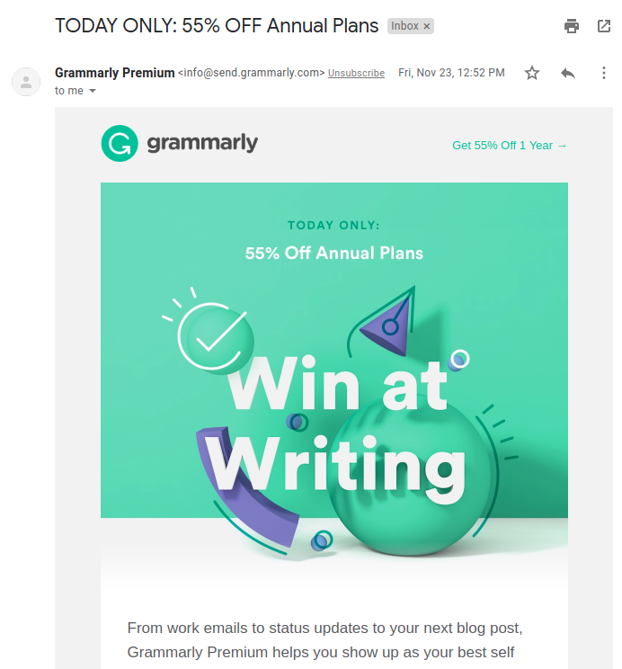
When a customer opens the email you sent them, what do they look for? Naturally, the thing you have mentioned in the subject line. This is what should be at the top, clear as day.
Having the main subject of the email at the top makes it so the customer finds what he/she is looking for instantly, and it is quite satisfying in today’s world of very busy people. The faster the better.
2. Clarity
This one is basically the same as with the book. Now, there are books written using complex words and they are considered masterpieces of sorts, but the most popular, the most read books are those that are easy to read.
So, while it might sometimes be tempting to create intricate patterns of words in your email to show that you are smart and knowledgeable, it is better to be simpler in your wording. Especially in the subject line, preview text, and sender address as these are the first things the customer sees. A simple and clear message is received more favorably by the customer.
3. Whitespace
White space, a.k.a. negative space, is the blank area around certain elements of the email. It is a way better option for emphasizing your point and increasing reading comprehension than making the elements larger.

4. Conventions
Design is all around us, in one way or another. And we have certain expectations when it comes to things around us, called the mental model in UX design. Innovation is all good and well, but for it to be received favorably, most times it needs to be implemented carefully.
This is why it is important for your emails to use the conventions alongside the unique details that belong to your brand. Make the links the same color, or make the images clickable — use the things most companies use since they are familiar, which is good.
Use the above recommendations and your conversion rates will improve significantly.
Read Also
How to Make a Professional Email Signature. 9 Great Tips and Templates Provided
15 Best Promotion Email Templates For Your Business

Get more to your email
Subscribe to our newsletter and access exclusive content and offers available only to MonsterPost subscribers.

Leave a Reply
You must be logged in to post a comment.