Back in 2014, Google introduced the Material Design. These design guidelines had to be applied to all their devices and connect them in one design eco-system with the similar appearance and working concepts. However, it’s now 3 years past the announcement and I still meet people who have no idea what is this and what are the main guidelines to follow while applying the Google Material Design principles in your design projects. So let’s see how it works and what you should know about now in 2017.
A brief introduction
These design principles had been inspired by the real materials and were called to create the most intuitive and simple design for the applications and websites.
Basically, this is a unified design system that works with all the available devices, and it doesn’t mean what kind of device we are talking about: tablet, smartphone or even desktop PC. The system doesn’t matter as well, it can be macOS, Android or Windows, who cares what you work on, just keep it real and ‘material’.
What are the principles?
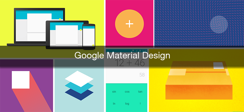
Any design system should have its own principles, and Google Material Design is not an exception. There are only a few of them, and it’s one of the proofs that the whole design system was designed to be simple and intuitive.
- In Google Material Design the properties of the real paper are translated right to the user’s screen. It means that the typography, scale, space, grids and other imagery should be presented like in the print-based design.
- Basically, the reason why it was called ‘material’ design is simple. The main principle is taking the interaction experience with the screen to the new level where you feel it like you interact with the real material (paper).
- The motion should be clear and subtle. I believe that this is one of the most obvious principles here, cause when we talk about the real paper and real materials, we all know how to interact them and we all know the outcome of touching them. That’s the experience you should bring to your users when designing an app or website.
Components
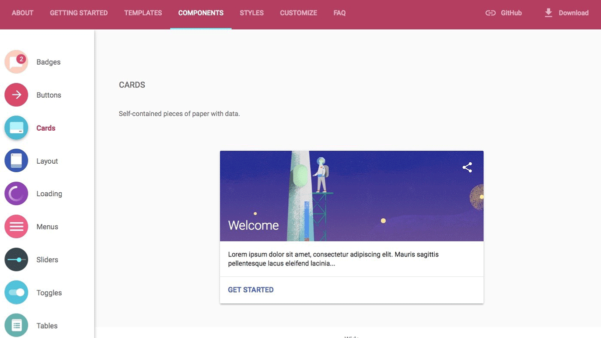
All the components in the Google Material Design system have a full description and strict guidelines on how to create them and use. Basically, they give you a huge knowledge and actual library of the elements you may and should use in your design.
It includes all the small and big things like buttons, toggles, sliders, menus and even pre-loaders or badges.
The separate section describes the layout’s design principles and gives you a brief understanding of main principles applied while creating a layout of your future app or website approaching it with keeping the Material Design in mind.
Material Design colors
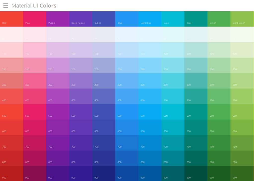
Colors in Material Design play a very big role. This is one of my favorite parts of it, actually.
The thing is, the UI colors from the Material Design libraries will not make you feel uncomfortable or look unreal.
All these colors had been taken from our day to day life: from the road signs, bus colors or subway maps, it’s all about the colors we see every day.
You can find the color palette of Material design here and even download the color switches for the Photoshop here.
What’s up with the icons?
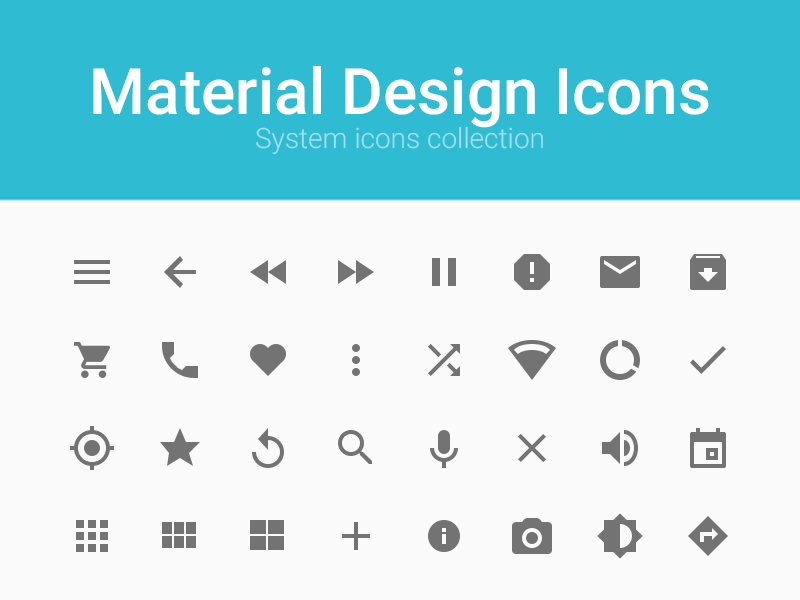
If you developed the Android Apps before, you may know that for some time Google gave out the icons for the developers for free, but the actual library of icons has been so small! Developers had to look for some of the icons on their own in Google and tune them in for the usage in their apps, which was not so easy I must admit.
With the Google Material Design announcement, Google brought a huge library of icons for the developers and made their life much easier.
All these icons have been prepared to meet the Material Design requirements and using them gives you a feel of real material as well. You can download them on the GitHub right now and test out yourself!
Animations - the coolest feature of the Material Design
I adore the animation principles that Google brought with their Material Design guidelines. They look so real and feel so great!
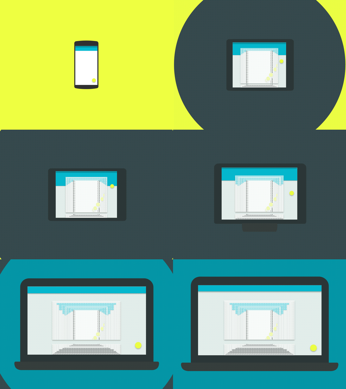
The motion in material design is very smooth and gives you a feeling that you are reading a book or sliding the pages of your favorite magazine.
It gives the feeling that everything you touch on the screen is real and gives you the same feedback the real materials would.
I would say that with the Material Design Motion ideas, Google made a huge step of taking us away from the futuristic concept of the internet, apps, etc. and kicked our butt yelling: everything is real, goddammit!
How you implement it
There are a bunch of ways to implement the Material Design into your projects.
If you are a developer and need to use it in your app or website, you can use the CSS Frameworks (there are a few of them). For example:
- Materialize
- Material UI
- Polymer
I would suggest you testing out each of them and selecting the one you like and the one that fits your needs. I would go with the Materialize, but that’s just me, hey!
Do you want to implement the Material design without any framework and completely on your own? Of course, you can do it!
In this case, all you need to do is to check the Material design guidelines and follow them. They give you a perfect understanding of the do’s and don’ts that you should consider while approaching the Material design.
Wrapping things up
I hope I gave you a brief understanding of what the Google Material Design is. To me, it gave a new breath and a big pack of inspiration. I use material design in most of my projects as of today and if you have never tried to approach it, what are your excuses?
It’s simply too cool not to use it, man!
Related Posts
40 Free Material Design Resources for Designers
Stay in Trend with Material Design: Features & Themes
Material Design Free Icons. New Forms of Visual Expression
Dribbble Shots: Material Design Inspiration
P.S. Just to make sure you will get Material Design Templates in the right place.
Get more to your email
Subscribe to our newsletter and access exclusive content and offers available only to MonsterPost subscribers.

Leave a Reply
You must be logged in to post a comment.