Hand Lettering Practice For Beginners: Creative Calligraphy Techniques
Hand Lettering And Creative Drawing Tips For Beginners

Where To Start [Hand Lettering Practice]?
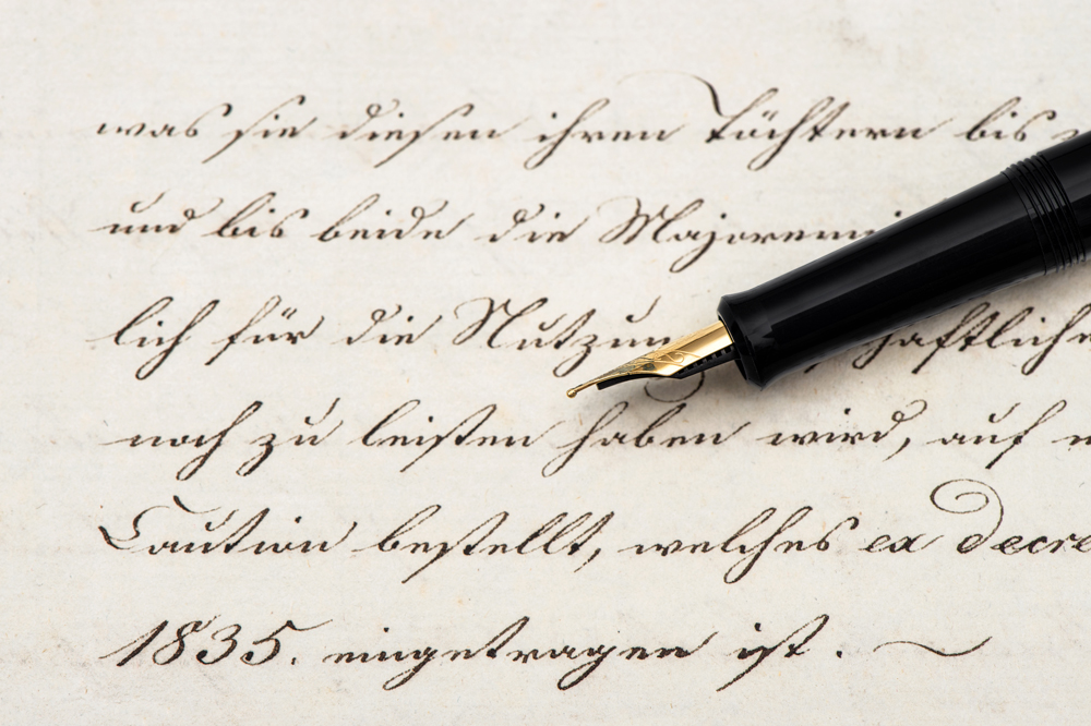
If you want to create hand lettering art, but do not know where to start, we are here to help you by revealing most of the secrets, beginning with the fundamentals. It is much easier than it appears to be. Let’s start with the definition and the difference between calligraphy and lettering. Lots of people find these terms absolutely the same, yet lettering differs from calligraphy being in fact a drawing while the second one refers to improvement of pen movement.
Now that you know the difference, we can move to the materials that are used for hand lettering.
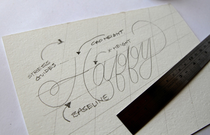
- A ruler is necessary (if the project is not completely freeform) to plan the general appearance of your draft prior to drawing the premium fonts, process the grids and block the letters to let them be spaced properly.
- Another material you will need is a paper. You can choose from three well-known types: ordinary printer paper, paperboard, and graph paper. The first one is best suited for informal projects or within the planning phase. It is less expensive and can be used for anything from which you will not be requiring a copy. However, it is not reliable enough if you want to store it for some time. Printer paper tends to yellow. Bristol board is enduring and perfect for framing. It comes in vellum (or kid) with a softer matte surface and Ultra Smooth (plate) with a smooth as glass finish. Plate Bristol paper is often used for pen and ink while vellum is more acceptable for tension-based media e.g. crayon, chalks, or charcoal. If you prefer the lines to be absolutely straight and you are going to finish the project on the computer, use grid paper to save time on the blocking step. It is inexpensive and easy to obtain.
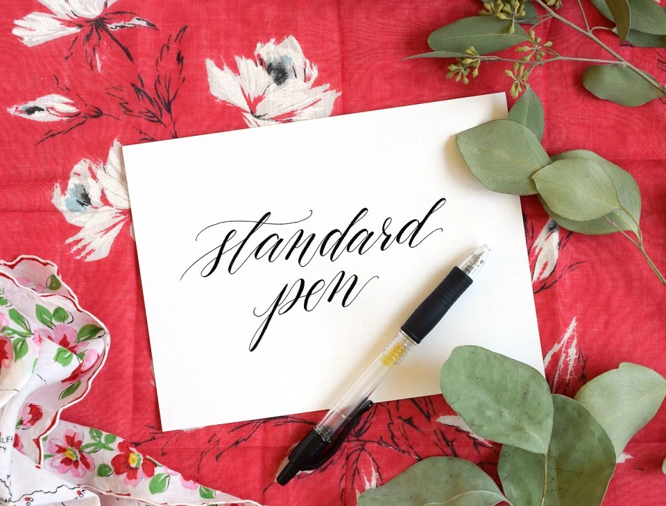
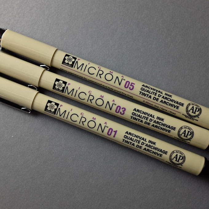
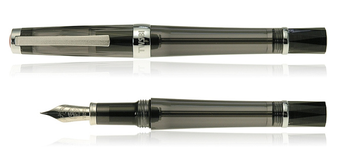
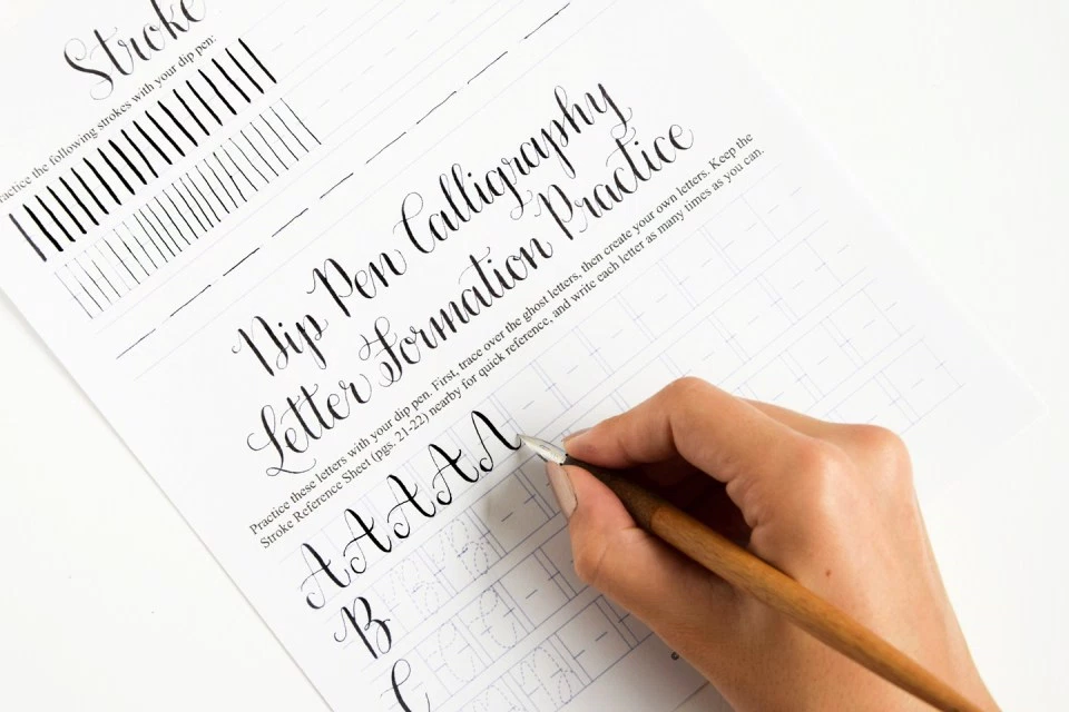
- Pens and pencils. If you are currently working on the layout phase, it makes sense to furnish yourself with #2 or standard mechanical pencils, or ballpoint pens. Markers like Pigma Microns and Prismacolor Premiers are good for average inkers. Though, this may be expensive equipment for hand lettering, because each pen comes with a specific line weight, so you will need a whole pack. Dip pens are for those who want to achieve a professional result in the end. Dip pens are higher maintenance and need to be regularly cared for and washed. Here are some basics that you should know before starting to draw with them. The balance of ink should be right: a sufficient amount to provide an optimal flow, yet not so much that it leaks and splashes. Along with this ink equation you should pay attention to pressure balance as well. Your hand needs to be gentle, if you push too roughly, the nib may be bent and consequently ruined. Still, your strokes should be confident. Each side of the pen produces unequal line weight and moves in a different way. That is why we highly recommend learning how to hold a calligraphy pen.
How To Process?
- Pre-planning. Prior to starting calligraphy, decide on the style of characters you wish to use. If you are a beginner in lettering, you can do an imitation of fonts you like - just print out some of them to use as samples.
- Warming up. Prior to beginning your hand lettering project, we recommend undertaking some practice to warm up your hand. Take a rule and make straight lines on your paper. You may start first with angled straight lines finishing with more complicated curves and shapes as shown in the picture below. This will help maintain balance and kerning. These warming up exercises will also show you how new pencils and pens work.
- Measuring. Make a baseline on top of which you can draft your letters and space horizontal lines equally , so you will mark where the letters will go.
- Lettering. Begin with just a short word or a specific letter you like and try to draw it as many times and in as many ways as possible. Do not worry that you will not cope; look at the lettering as trying something new. Do not give up drawing until you find the version you love. If you are working with a dip pen, remember that you cannot hold the pen vertically to the paper as it may increase ink flow and make the nib catch on the paper fiber - instead there should be 45 degree angle between the nib and paper. When you move the pen upwards, the stroke should be thin, and when the pen is moved down, the stroke has to be thick (video guide).

Conclusion Hand Lettering Practice
Remember that the most important thing in calligraphy and in many other arts is practice which will improve your mastery progressively. We recommend practising with various worksheet sets e.g. Amy or Janet style if you are a total novice in calligraphy. To make the practice more fun, play around with projects such as mail art, place cards or ‘ampersand’ art. We hope that our short guide has been useful to you and your new hobby will turn into a big project.
Read Also

Self-taught copywriter specialized in web design, marketing, and traveling. Graduated with a degree in German and English translation. Obsessed with guides, listings, and long-read blog posts. Open for new information and strives to explore more undisclosed subjects. Social Media Accounts: Fb, Twitter, LinkedIn.
Get more to your email
Subscribe to our newsletter and access exclusive content and offers available only to MonsterPost subscribers.

Leave a Reply
You must be logged in to post a comment.