Picking the Best Template for your WordPress Website
Choosing a WordPress template that fits your business is almost as important as getting your company online in the first place. When deciding if a website is trustworthy, do you think visitors look at content or design? The answer may surprise you.
In a Forbes article looking at the importance of design, they found that 94% of comments regarding mistrust of websites were aimed at design rather than overall content.
Now, that’s not to say content isn’t important. You’ll want to develop meaningful content that visitors will find value in, in order to keep them on your page. However, you first need to get them to read your content, and to do that, they need to trust your brand with a well-designed website.
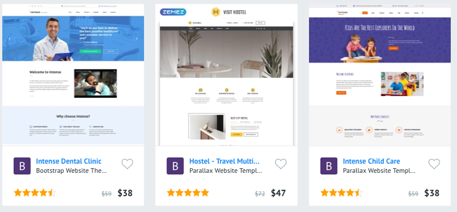
For that, you need a template that matches your brand.
What does this mean exactly? Well, there are certain templates that are appropriate for some businesses and inappropriate for others. Some templates look unprofessional and make your website seem less trustworthy.
Below we’ll go over some of the things that go into picking the perfect template for your business website.

How to pick the right template for your business
WordPress is home to all kinds of different websites. It is by far the most popular CMS available, running over 28% of websites today. Being so large and customizable means that there are lots of templates for you to choose from. With the right research, you can put a template in place that will have visitors flocking to your website.
Where do you start?
1. Know your brand
What are you trying to accomplish with your website?

Understanding your brand and your target audience will go a long way to deciding how you want to set up your templates.
Are you writing a blog? Then you’ll want to shift the attention to your content and use a template that improves your readability.
Do you have an e-commerce store? Then the focus should be on your images. In this case, you’ll want a template that brings the focus to each of your products.
Once you know the kind of website you want to have, you can figure out who your target audience is. Then it’s just a matter of picking a template that adheres to your audiences’ tendencies.
How do you find your target audience?
To start, look at your customer base. Where do your customers come from? What products are they interested in? Every piece of information you can gather will be useful; age, gender, occupation, etc.–all of it is relevant and can be analyzed to your advantage.
Another thing you can do is look at your competition’s websites. Who is their content aimed at? How do they set up their web pages? See what they are doing and look at what you can improve on.
2. Keep it simple
Having an overly complicated template can be overwhelming for visitors to look at. You want to present something that is simple and easy to navigate.
Busy templates can cause a lot of issues. One common issue exists when visitors can’t sort through the clutter to find what they are looking for and will leave quickly.
Having complicated web pages can slow download times, which can also cause visitors to leave. It is estimated that 40% of people will leave a web page if it takes longer than 3 seconds to load. Make sure your template isn’t affecting your overall load time due to complexity.
People also expect web pages to be set up a certain way. You’ll want to have templates that are set up in a similar fashion. First, you’ll need to have your logo in the top left portion of your header. The logo should also be clickable and return visitors to your homepage.

Underneath your logo, at the bottom portion of your header, you’ll want to have a navigation menu for different sections of your website. The main content of your website obviously needs to be placed in the body of the web page for your visitors to see.
You’ll also want to have sidebars that don’t take away from the main content of your site, but if people are interested, they can follow the content there. In the footer, you’ll want more detailed navigation, such as your contact page displayed for your visitors to find.
You don’t want a template that tries to break the mold and changes what people are used to. After all, humans are creatures of habit and come to expect certain things from websites they visit.
3. Avoid faux pas
When it comes to designing a website there are certain things that look good together and certain things that just look bad. The first and one of the most important design tips I can give you is to never use pure white or pure black on your web pages.
Chances are, the main body of your web pages will be white, while your text will be black. Pure white and pure black don’t exist in nature making it difficult for your eyes to look at. You want to use white and black colors that have a little bit of grey in them, making the white darker and the black lighter.
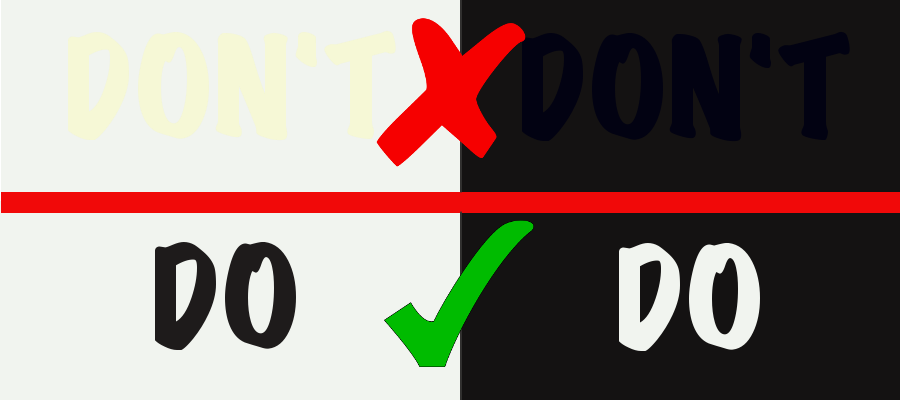
Other design flaws you’ll want to look out for on your templates are light on light and dark on dark. It becomes hard to see text or other parts of your website when you mix dark text with dark backgrounds and light text with light backgrounds. Just take a look below:
Overall, you’ll want a template that matches the feeling of your brand and is appealing to the eyes of your readers.
Templates for your business
Reading about what goes into making a great template is one thing, but actually seeing some examples can go a long way in choosing a template that is right for you. Here are some of the best templates you can use for different business types:
EasyJet – Multipurpose WordPress Theme
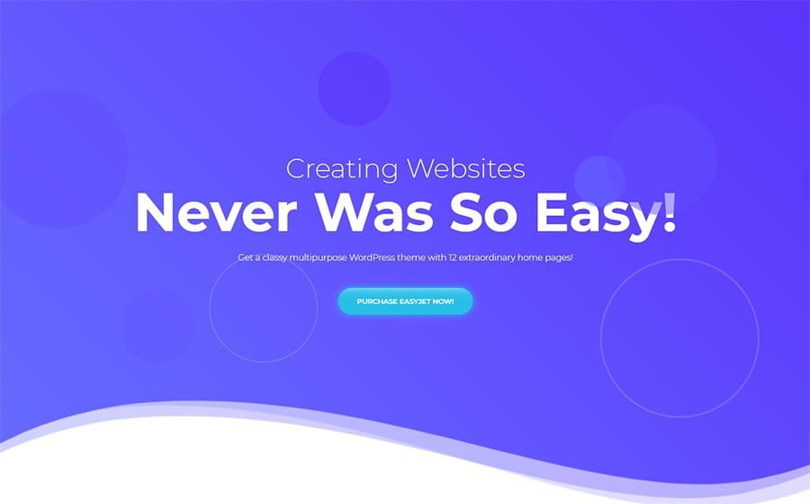
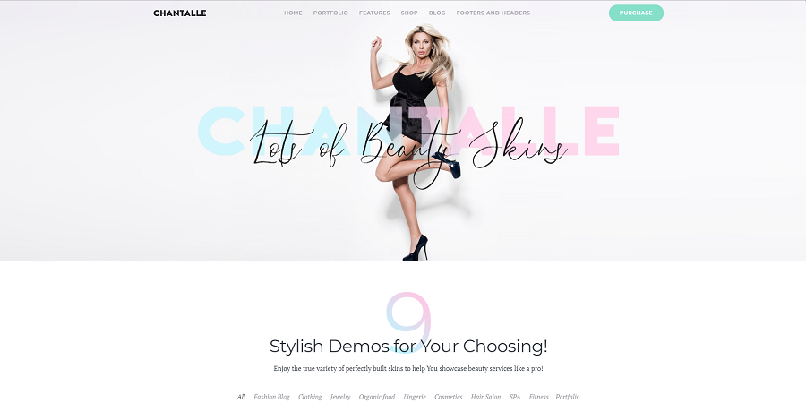
Chantalle – Multipurpose Women Fashion Elementor WordPress Theme
24.Storycle – News Portal Elementor WordPress Theme
Imperion – Corporate WordPress Theme

Conclusion
Finding a template that matches your business, but is also something that intrigues visitors, is important to your online success. This involves some research on your part to find out what kinds of people are interested in your company. Keep your template simple and find one that does a good job showcasing your content.

Read Also
Monstroid 2 vs. Enfold: Which WordPress Theme is Better for You?
WordPress 5.0 – The First “Major” WordPress Update of 2018-19 Named Gutenberg
Top-30 Elementor WordPress Templates In 2018
How to Create a Sticky Menu on WordPress
Don’t miss out these all-time favourites
- The best hosting for a WordPress website. Tap our link to get the best price on the market with 82% off. If HostPapa didn’t impress you check out other alternatives.
- Monthly SEO service and On-Page SEO - to increase your website organic traffic.
- Website Installation service - to get your template up and running within just 6 hours without hassle. No minute is wasted and the work is going.
- ONE Membership - to download unlimited number of WordPress themes, plugins, ppt and other products within one license. Since bigger is always better.
Get more to your email
Subscribe to our newsletter and access exclusive content and offers available only to MonsterPost subscribers.

Leave a Reply
You must be logged in to post a comment.