10+ Logo Design Trends that Will Be Popular in 2020
Each sphere develops its foothold by taking into account current trends. Logo design is no exception. There are certain trends that must be known to both the specialist and the customer. For the specialist, such knowledge is required in order to “professionally survive” in an environment with a high level of competition. For the customer, it is to understand the level of the finished product offered by the supplier.
Table of Contents:
- Introduction
- Simplification
- Letter Stacking
- Lost Fragments
- Focus On Details
- Gradient
- Brand New Geometry
- Roundness
- Delusive Logos
- Slices
- Negative Space
- Overlapping Effect
- Hand-drawn Logos
- Text Logos
- Framed Text
- Chaotic Placement
- Emblems
- Text Destruction
- Final Word
Introduction
What makes a logo recognizable and distinctive? Do we evaluate its creativity and expediency? Does it matter how well we perceive it? And what is the value of the logo? If you want your logo designs to be visible and relevant, you have to follow how the design industry is developing and what trends are there today.
Fashion is always in style. And everything new is well forgotten old. Today, designers more than ever aspire to the trends of the past, while expanding the boundaries with the help of new visual styles. In 2020 there will be bold experiments with color, the desire to tell the whole story, and brave failure to comply with established principles of design.
Today, you can play with artistic styles and design a logo from zero or apply ready-made logo templates finding non-standard uses for the elements. All these bold decisions will definitely shake up the world of logo design. And now, the most popular logo trends for 2020.
Watch a short video on Logo Design Mistakes
Simplification
This trend can be considered classic; it is long-term and is based on the simplification of forms, minimum of colors, and any other graphic elements. Cross-platform and the development of internet technologies are the main reasons for the popularity of this trend. Such a minimalist logo would look perfect both on the company's corporate website and on any billboard, business card, or mobile phone application.
Source: Brand New
Source: Brand New
Source: Brand New
Source: Brand New
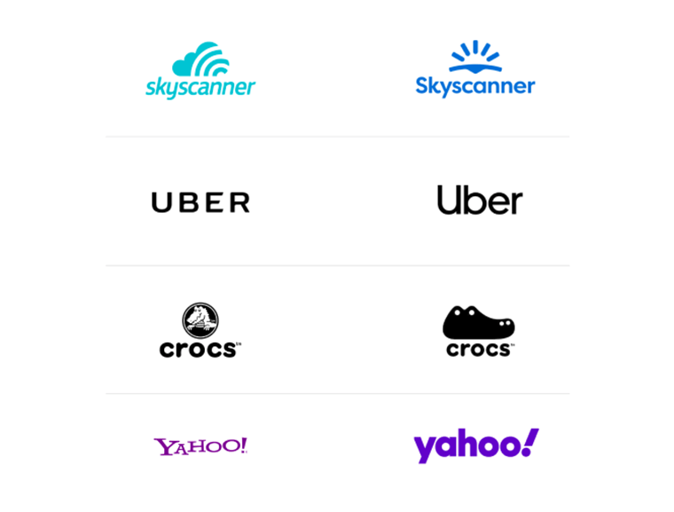
Simplicity is not an excessive modesty, but a long-term trend of graphics. Simple elements and readable fonts are used not only for an aesthetic purpose, but also in order to make the corporate identity more understandable and accessible. This contributes to the quick acquaintance of the target audience with the brand and easy memorization of the sign. For example, the Uber logo was not complicated before rebranding, but the creators decided to go further and remove unnecessary spaces between the letters. This provided a convenient reading and sign navigation. Simple logos are convenient and attractive, so we expect more of them next year.
Letter Stacking
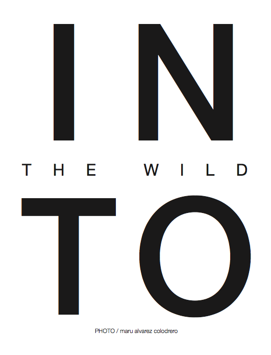
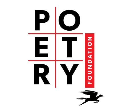
Letter stacking is the construction of logo text in an unordinary column. Additional symbols, various contrasting colors, and other effects are also welcome, as long as they don't distract attention or interfere with the perception of the logo. This method is far from new; it has been observed for three previous years, and it will continue to be popular. In 2020, vertical orientation will go even further, and the texts will be complemented by icons and other graphic elements. This is a bold decision, as it may be difficult to use such vertical logos. Will this trend be long-term? Time will tell.
Source: Brand New
Source: La Petite Magazine
Source: Poetry Foundation
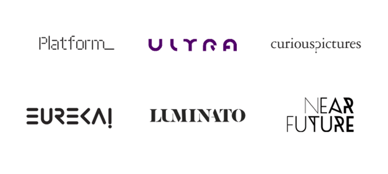
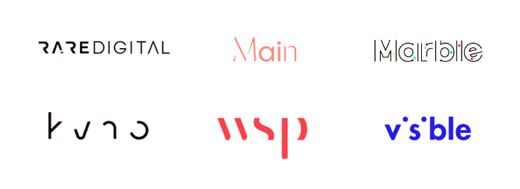
Lost Fragments
One simplification option: removing parts of a text logo makes it more original and recognizable. You feel the influence of the negative space because our brain “adds” the missing information areas and forms a holistic picture. The main thing is not to overdo with the removal of parts and preserve readability! It should be an instant recognition for the brain to process, not a technical puzzle to be solved.
Source: Brand New
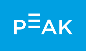
Source: Peak Brain Training
Source: Brand New
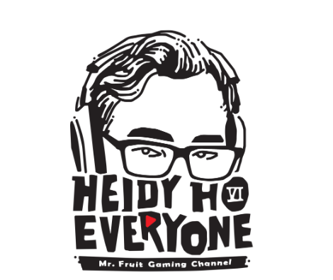
Focus On Details
Emphasizing a part of the logo due to the disproportion of its size or shape is an original trend, the influence of which may grow further in 2020. The asymmetry and slight imbalance attracts attention and makes the logo memorable.
Source: Brand New
Source: Brand New
Source: Brand New
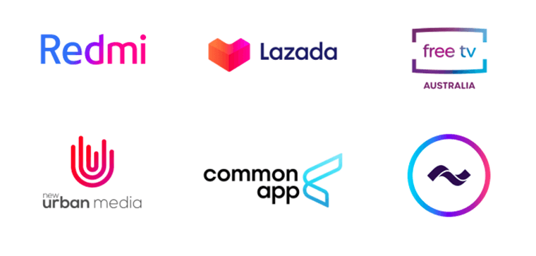
Gradient
The use of a gradient gives designers the opportunity to obtain an interesting visual effect or a new color, giving the logo freshness and originality. In 2020 the gradient will be actively used to give logos depth and volume.
The gradient is formed in two ways: by switching from one color to another or by reducing the saturation of the same shade. The first option is well demonstrated on the logo of the Instagram social network, and the second can be found on the logo of the Common app. This effect is used to create volume and shadow on the icon. Quite restrained gradients are expected on the logos in 2020. They will be mainly used for the transmission of natural overflow of elements. However, despite the spectacular color transitions, the popularity of this trend wanes over time.
Source: Brand New
Source: Mindset Human Logo Template
Source: Brand New
Source: Brand New
Source: Brand New
Brand New Geometry
The use of geometric shapes in logos cannot be called an innovative design solution. But if you want to emphasize the reliability, strength, and stability of your company - you should pay attention to this trend.
In 2020, logo creators seek to ruin the established boundaries and balance the rigorous geometric design with bright colors and pleasant, unusual compositions. They want to depict figures more creatively and boldly, without any hint of boring and monotonous design. The whole essence of this trend is to add some warmth to geometric logos.
Geometry is not a new trend in graphic design. However, it has been mostly used as a frame or as an additional decoration. A fresh look at geometry has expanded the scope of its use, turning it into an independent original style, which forms new directions and trends. For example, the first stage of three-dimensional modeling, which forms outline elements using geometric shapes, is now a popular style called Low poly. This and many other interesting geometric solutions await us in 2020 branding.
Source: Brand New
Source: Square Vitamins Logo Template
Source: BlueMount Logo Template
The letters made of shapes are a combination of several trends together: functional geometry and decorative typography. This is the mix that awaits us in 2020 branding. The requirements for geometric fonts are the same as for the rest: it is important to maintain the readability and aesthetics of the logo. A high-quality selection of elements and color schemes will allow you to create a simple but original brand name. Gradation of shades is also very appropriate in such cases.
Roundness
Another example from the category of entertaining geometry is roundness, or rather, the creation of text, graphical and combined logos from circles and their segments. As a result, the smooth lines of the segmented areas cause a sense of natural mobility and create a feeling of comfort.
Source: Brand New
Source: Solaris S Letter Logo Template
Source: Brand New
Source: Brand New
Source: Brand New
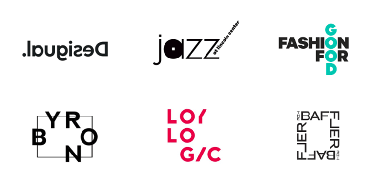
Delusive Logos
This innovative approach is also one of the leading trends in 2020: logos seeking to deceive our vision. All this is achieved through skillful manipulation of distortion and perspective. Visually broken and deformed logos are the essence of this trend.
Source: Brand New
Source: 99Designs
Source: 99Designs
Source: 99Designs
Slices
Placed in the composition, parallel slices create a sense of movement, which usually helps to emphasize the progressiveness of the company and its desire for growth and development.
Source: Stairway Stage Logo Template
Source: Brand New
Source: Arrow Fast Logo Template
Source: Brand New
Source: Brand New
Negative Space
Anyone who is interested in logo trends has probably heard about this trend in the past few years. Therefore, it is likely that logos with hidden images will be popular in 2020. Now hidden images appear more actively in the text component of the logo. Either the intersection of letters or the letter itself is now becoming a place to show an image in a hidden space. Excluding something from the design, you attract even more attention to this area. Such experiments lead to a nontrivial use of negative space, turning it into a separate category.
Source: Burning Cogwheel Logo Template
Source: Brand New
Source: Brand New
Source: Dribble
Source: Brand New
Source: Dribble
Overlapping Effect
The use of bright forms, which are overlapping each other, is very popular this year. The new color (sometimes referred to as duotone) is created in the overlap zone of the other two, making the logo stand out. This is a very interesting solution for companies seeking a spectacular rebranding approach. Such logos carry an interesting meaning. In 2020, designers will begin to fully apply all the features of this trend.
Source: Brand New
Source: Brand New
Source: Behance
Hand-drawn Logos
Think about non-solid lines. Clean, but at the same time maximally natural colors. Various drawing techniques from watercolor to pencil cartoons. All of these are part of a hand-drawn trend which stands apart from the rest of the trends, offers this all. Such logos are suitable for demonstrating your individuality and uniqueness both to individuals and companies that want to emphasize their creativity.
Source: Find Music Logo Template
Source: Human Tree Logo Template
Source: logoinspirations
Source: Brand New
Source: 99Designs
Text Logos
In 2020, designers will continue to experiment with fonts and use effects such as text styling, kerning, and a combination of styles. This trend will provide an opportunity to “refresh” the text logo and make it more interesting for perception in the eyes of the target audience.
Only 5% of all logos do without a text element and consist solely of an icon. This suggests that trademarks primarily use text for the name and slogan. Therefore, the selection of an attractive font is fundamentally important. Consumers get tired of the usual decisions and require something unusual. This has been an important task for the designers for many years, and it also remains relevant in the next year. We will see a radically new and original typography in 2020, and already familiar fonts will find interesting combinations and improvements.
Source: Brand New
Source: LogoMoose
Source: Brand New
Source: Yoke’s Fresh Markets
Framed Text
This technique helps to effectively focus customer attention on the name of your company or brand message. This is a proven way to create an attractive logo.
Source: Etsy
Source: Etsy
Source: Brand New
Source: Etsy
Chaotic Placement
The farther, the harder it is to surprise the customer. Styles and techniques of graphic design are constantly replacing each other and improving to bring a unique rule of attracting customer attention. But in 2020, the rules will be violated, because the chaotic, asymmetric placement of elements on the logo will become trendy. A little rebellion will reveal the character of the brand. The main thing is not to allow chaos to harm the information content and accessibility of corporate identity.
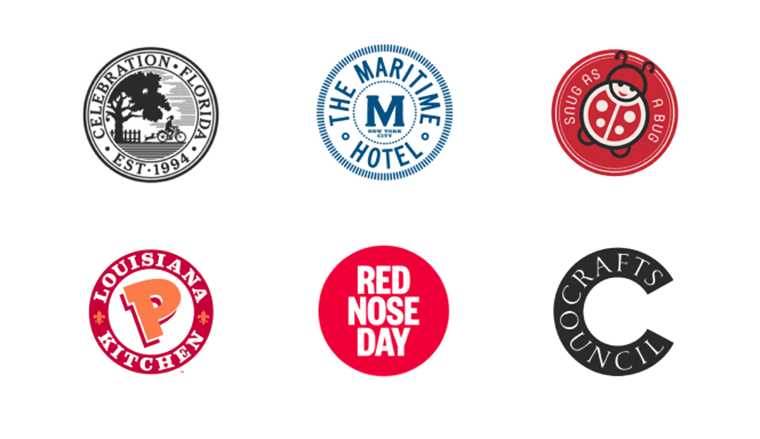
Emblems
Minimalism has gone beyond the limits of one trend and has become a trend that is used in a variety of ways. Thus, complex elements are simplified and remain trendy and in demand. This is exactly what happened with the emblems. This type of brand name has been familiar to humanity since the time of the family coat of arms, but now classic emblems are rare. Traditional details harm the scalability and mobility of the mark. Therefore, the conservative emblem in 2020 will change its appearance, becoming more symbolic and simplified.
Text Destruction
It is another example of how one trend continued its existence in a more perfect form. The text destruction that we expect to see on the 2020 logos originates from the “lost fragments” trend, which is relevant in 2020. However, now the decorative destruction of typography will consist not only of missing font elements, but also with fading letters, the disappearance of the outline, and burning the text out. These and many other “imperfections” in typography will give it a special charm and creativity.
Final Word
As you can see, in terms of logo design, this year will be very interesting and unusual. All these trends not only coexist alongside each other but also form a successful union. Logo design experiments are becoming more and more popular. Every year we wait for bolder decisions. Bold but beautiful. Strange but balanced. You have to break the rules to stand out. Indeed, within the rules framework, everything has already been invented. Be creative. And we will observe with interest what future trends will leave a bright mark on the world of design and creativity in 2019.
UI Tips For Web Design Enthusiasts [Free Ebook]
By clicking the button you agree to the Privacy Policy and Terms and Conditions.
Read Also
How to Design a Logo: 40+ Tutorials from Zero to Hero
The 10 Best FREE Logo Makers & Logo Generators for 2018
Top 30 Creative Logo Design Ideas
10 Typography Trends to Stick to in 2019

I'm an Elementor lover and a specialist in TM templates. It is much more convenient to get a theme from a thematic listing than seeking it by yourself, isn't it? Everything for your convenience! Victoria Maksimenko on LinkedIn
Get more to your email
Subscribe to our newsletter and access exclusive content and offers available only to MonsterPost subscribers.
