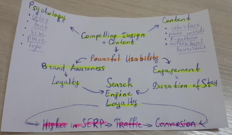
How to Use Content-Design Combo for More Powerful Usability
We all are savvy designers and digital marketers here.
We use dozens of tools to unleash creative decisions; Google's every word sets our hearts aflutter, and we scour trends to create beautiful websites for higher ROI.
We realize that content is king, trying to create copies visitors would give a damn about.
But you know what?
As far as you keep reading this article simply because I've used the neuro copywriting trick in the introduction, big chances are you understand that all the above-mentioned is a bulls**t if you don't know the following:- why and how a website's design influences visitors' perception of your brand, its loyalty, and message;
- how to implement psychological principles to visual and textual elements of your website to strengthen its awareness and credibility;
- how to combine web design and content to raise readers' engagement, consideration, and, therefore, your traffic and conversion.
Just a quick question:
What do marketers consider a good conversion rate today?Is your answer 2–5%, and you've reached it? Congrats, you are in the team of average marketers!
Wanna join that 10% of unicorns with sky-high conversion rates? Don't underestimate the combination of visual and textual details, central to your website ranking.
And keep on reading.
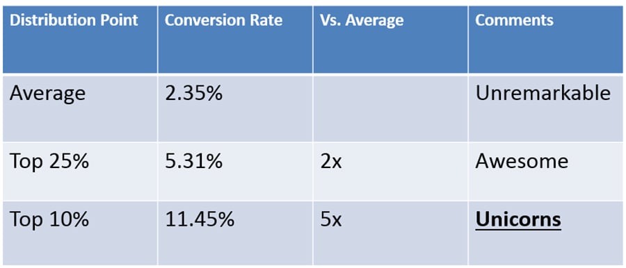 Conversion rate unicorns, based on WordStream wisdom.
He Who Has Eyes to See, Let Him See
You know a picture is worth a thousand words. (In fact, it’s worth 500 billion, but whatever.)You know that 93% of all communication is nonverbal, and 65% of people are visual learners bumped by content shock and, therefore, concentrated on images to fall under the impression and initial attitude towards your brand and message.
It's the case when nice dress helps to impress, so the more's the pity to meet a kind of that online:
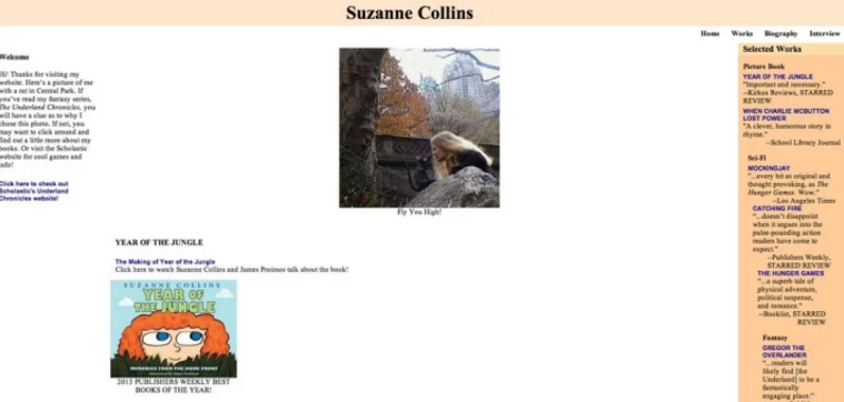 Yes, in 2017! Sorry, Suzanne.
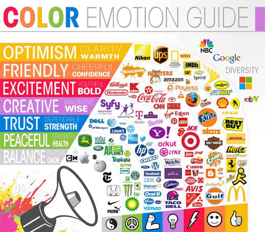
Color Psychology
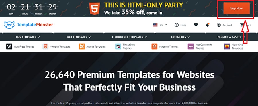
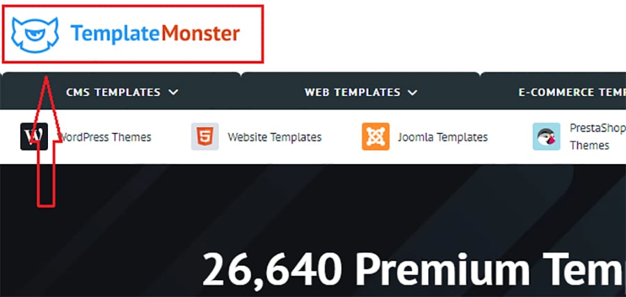
To give one example:Have you ever thought why orange is one of the most popular colors for CTA? Warm and bright, it influences emotions and affects actions, inviting us to click.
That's what Template Monster does:
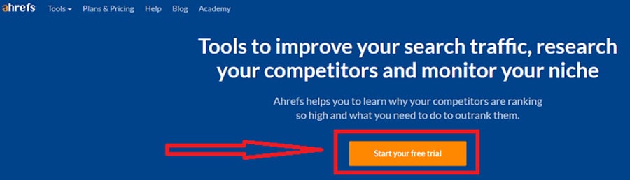
Ahrefs stays abreast, too:
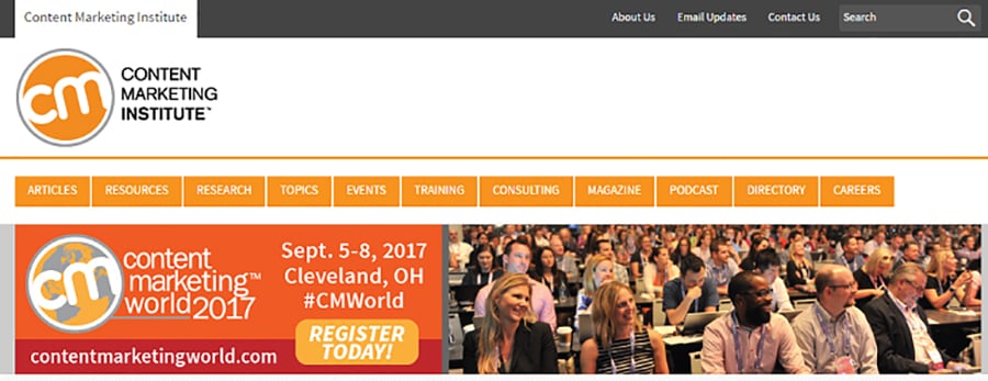
CMI goes beyond and makes the whole website orange, i.e. friendly and cheerful:
The psychology behind colors is crucial for marketers to understand because a website palette can help to stand out as well as negatively change the impact of your message. Use colors consistently, and you'll be able to influence consumer behavior and decision making.
To give another example:
WishPond increased conversion by 14.5% after they changed the CTA button color to yellow from green. Also, a 60% increase in conversions appeared after they made two links contrast from one another with color.
Fancy that, huh?
Here go psychological impacts hidden behind main colors:
 Thank you, Help Scout, you are awesome!
Another thing to consider is the contrast between a website's background and text. If too little, it becomes exhausting to read, frustrates visitors, and stirs them into leaving your page.
With no less than 5:1 color-contrast ratio working best, try instruments like GitHub to choose and adjust it to your website.
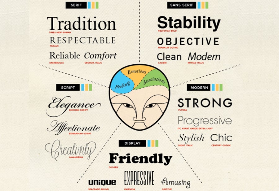
Font and Shape Psychology
A quick reminder:- People don't read but scan your content.
- Reading online is 25% slower than from print.
With that said, do you still ignore web typography and take the liberty of losing visitors simply because they can’t visually perceive your content?
To hit your marketing message over the fence, learn the psychology behind typography to choose the font that would evoke required emotions and associations from your readers:
Ted Hunt shares the psychology of font choices at Crazy Egg.
- Our brain is in love with threes, so use this number of different font sizes at the website.
- Though 16-pixel font was believed the most appropriate one, try to maintain line height and length for your content accordingly: the larger font size, the bigger line height you should use. Chris Pearson’s tool might help to establish it.
- As for line width, make it between 50-60 characters or try the formula of Robert Bringhurst: multiply your font size by 30.
All these manipulations with sizes and colors improve the reading experience, make your brand recognizable, create a sense of trust, and help people feel like they've made the right decision when choosing you.
So does the shape of logos and other visual elements at your website.
Human brain responds to shapes in different ways: circles mean love and unity, triangles signal about strength and professionalism, and vertical lines scream about aggression. To elicit particular emotions and associations from the audience, to infer particular qualities about your brand, and to imply required meanings to your marketing messages, pay attention to what your designers do.
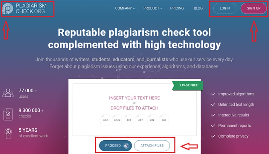
Circles of Template Monster speak volumes:
So do visual elements of Plagiarism Check:
In the Beginning Was the Word
Once you've enhanced conversion with web design, stir it with snazzy content to get lip-smacking results and influence visitors' consideration.Words are virtually the only yet powerful weapon of creating sales copies: one wrong lexical item can kill your conversion efforts and turn potential leads away.
In lieu of reckoning with certainty on scanning, diagonal, and F-pattern reading in hope readers don't give a damn about words, optimize your web content with the psychology of decision-making in mind.
Navigation Elements
My article for SEMrush makes it clear:- People ignore huge blocks of text while scanning your website.
- They pay attention to menu and navigation buttons.
- The one-column format works better.
- Having a usability map of your website is a must.
- Your text is an interface.
The sooner visitors find target information at the website, the better are chances they will do a required action. To help them, use simple, short, and structured texts that are keyworded and hyperlinked.
Words you use in textual elements, as well as tricks you follow to design them for better navigation, enable to grab visitors' attention and shorten its spans. Consider the Reticular Activating System (RAS) to succeed here.
RAS is a filter sorting out what is important information for us. It monitors everything in the environment and makes people subconsciously decide whether a particular stuff is worth attention or not. Also, RAS sends signals to brains when noticing changes related to our names, physical needs, self-made choices, and emotions.
Also, we pay more attention to stuff that is new to our experience. Known as the principle of novelty, it can help you with marketing endeavors.
To keep visitors' attention sustained and get as many people as possible to read your content, ensure to present novelty every now and then because it appears to be an essential need of human mind.
How to do that?
- Introduce information in unusual ways: consider Venngage Infographics to make it visual, don't ignore slides, make videos and podcasts, etc.
- Add the element of a sin to your content: play upon the LSD-topics such as laugh, sex, death.
- Demonstrate contrast.
More tricks needed? Jeff Bullas' blog can help.
Make Them Convert Like Crazies
Okay, your design and text navigation grabbed attention as well as brought conversion. A kind of. Teeny-tiny conversion, you would say.Captured by visual elements, people start reading sales copies as well as informative/educational/entertaining blog posts at the website. So it's high time to worry about your content, its consistency, clarity, tone, and voice.
To turn readers into leads, tinker with your texts. Enchanting marketing tricks here are:
- Information scent. Ensure that people see visual clues to follow at your page, don't overload it with calls to action; in other words, make it meaty yet easy to read.
- Surplus value. What does make your content stand out from other websites'? Ensure that it answers the "So what?" question.
- Power words. Compelling and persuasive, they appeal to emotions and make people feel a certain way about your message.
- Your tone and voice. Decide on the consistent terminology to use for all brand copies. Who is your brand? How does it communicate with users? And, by the way, are they users or customers? Or, maybe fellows? Do you give them a service or an offer?

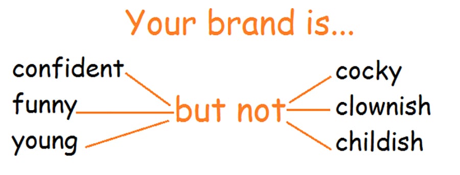
And what does your brand sound? Voice and tone matter!
- Neuro copywriting tricks for headings and subheads. Try writing two numbers or adjectives in titles, ask questions or share quotations in subheadings, group different types of subheads in one text.
- Humor. Don't be afraid of humor in copies: take your product/service and clients seriously but yourself – easy. Use contextual rather than context humor – it's comprehensible for everyone.
- The language you speak with people. Three statements are here to remember: stick to words everybody knows; long words are bad words; long sentences are bad sentences.
In a Word...
Despite a huge number of conversion killers SEOs and digital marketers try to avoid, they often forget about the most obvious ones.Both design and content are instruments making our campaigns persuasive, and their combo is a powerful tactic to yield the desired outcome. So why not redouble efforts to make your website sparkle and your conversion rates – skyrocket?
Related Posts
SEO Tactics that will See Your SME Dominate Search Engines In 2017
50 Shades of SEO for Copywriters
Simple But Cool Ways to Boost your Content
Why Content Marketing Isn’t as Difficult as You Think
Content Marketing Done Right [Free Ebook]

Posting contributed articles about the major web design highlights and novelties. Come across a handful of useful tutorials and guides shared by experts in the web design and online marketing fields.
Get more to your email
Subscribe to our newsletter and access exclusive content and offers available only to MonsterPost subscribers.

Leave a Reply
You must be logged in to post a comment.